Wednesday, 30 December 2015

Worshipping The Wicked + The Divine #17

Or a look at the importance of a blank page in WicDiv #17
by Kieron Gillen, Brandon Graham, Jamie McKelvie, and Matt Wilson; Image Comics


A thing about comics that I sometimes think doesn't get enough wonky attention is how important page order is to story experience. Individual pages function in printed comics are like discrete storytelling units, and controlling the rate and way readers encounter these units can dramatically alter the way the story is experienced. On a very basic level, the order of pages matters to how a comic is read much like how the order of panels matters. The most obvious example of this is the page turn, where readers suddenly get access to a new page that was previously hidden, making a kind of quick cut and the potential for a surprising reveal or comedic moment. But it goes beyond that, and I think WicDiv #17 does something interesting and really smart using a blank page to optimize the page reading order in the issue.

(This is also, a thing that I think is important to talk about because, incidentally corporate comics *SUCK* at this by jamming ads for like, beholder bobbleheads and Gumby the collectable card game into their magazines screwing with the delicate order.)

There will be *SPOILERS* for WicDiv #17 below. Like, serious spoilers!


Now before I try and convince everyone that what is basically a blank page is super interesting and ignoring the rest of the comic, I just want to point out that WicDiv #17 is pretty great ad features Brandon Graham's great artwork and style in the fantastic world of Gillen/McKelvie/Wilson's WicDiv world and that results of this collaboration are frequently pretty great. Like, there are few people who can draw an orgy that is somehow sexy and goofy looking and still somehow not exploitive or could make a scene where a dangerously unstable cat goddess wallowing outside the cage of a bird goddess look so lackadaisically charming. There are some really fun, unique moments in this comic.


(For the record, a 4.9 earthquake happened right now and... woah! It's been a while since a big one's hit in these here parts, and the first one I've lived on a double digit apartment floor for. Quite a lot of swing and torque, it turns out...)

There is also some really astute storytelling on display throughout the issue. I especially love this page and how it uses reader tracking to make the pacing of the page fit the action perfectly. The tangents in the first panel that cruise through the background lend that panel a sense of speed (which works beautifully against the static Baal). Or the second tier of panels which has a hard left-to-right directionality that captures the motion of the sequence wonderfully. The second panel also takes advantage of the transition from the first panel to the second row, and slams the reading motion in opposition to it making for an extra impactful panel (that additionally shows the a consequence of the motion that already happened). The next panel has also has a pretty great abrupt stop built into the panel. The bottom three panels have a looping meandering path through artwork and dialogue captures the lazy, calm after the intense top panels. Collectively this page, I think, captures the polarity of Sakhmet, her danger and fury, but also her playful laziness in how the page is read, and therefore experienced.


So knowing that WicDiv #17 is a pretty great comic for a lot of reasons, let's talk about how great the solid black page in the comic is. The story of this sequence is that Sakhmet has descended on her childhood home and murdered and eaten her father. This sequence works as well as it does because it reveals this information in a series of growing surprise reveals. The first page sets up the sequence, and looks downright benign, with Sakhmet reminiscing and smiling pleasantly (such a perfect panel btw) and then we get the all black page. It's ominous and empty, a long hard cut that it implies the passage of time and a significant story shift. The next page, which benefits from being after the page turn, shows cavalry arriving in an ominious situation. It's obvious something horrible has happened and that Sakhmet has been involved in some sort of altercation, probably violent and probably involving her dad. But it isn't until after the next page turn that we learn Sakhmet has *eaten* her father and the downright casual way she is reacting to that. It's a scene of slowly building horror that really benefits from having two adjacent page turns to ramp up and then up again the fuckedness quotient of the situation. And that black page shifts the other pages around just enough to make this construct work. Which is such a little thing, but such a smart, smart choice.


Wednesday, 23 December 2015

Listening to Phonogram: The Immaterial Girl #5

Or a look at active backgrounds and smart layouts in Phonogram: TIG #5
by Kieron Gillen, Jamie McKelvie, Matt Wilson, and Clayton Cowles


The thing about comics storytelling is that as readers we often get sucked in to the big exciting storytelling. The glorious splash pages! The crazy, deconstructionist, genre-bending layout we've never seen before! The totally rad super punch! But sometimes the smartest or most interesting parts of comics are quiet, deceptively simple constructions that effortlessly convey a more mundane chunk of story. And some of these moments are really worth examining as a lesson of savvy comics.

Phonogram: The Immaterial Girl has one of these deceptively simple, great bit of comics.

There will be *SPOILERS* for Phonogram: TIM #5 below.


The story of this page is pretty simple: David Kohl, the sometime ally and friend of Emily Astor goes to the other phonomancers of his coven to try and recruit them into helping save Emily from herself. He delivers a his speech over and over to each potential ally, and they each, in turn, decide not to help him and that Emily Astor can essentially go and fuck herself. It's a pretty simple bit of story.

The thing is, it's delivered in the absolutely perfect way. We get to see Kohl give his talk in one unbroken sequence, and then, in a series of snapshots we get the reactions. Which... if you stop and think about it, should seem like a really disjointed bit of story: a long talk followed by a careening series of scene changes. And yet, these two pages relate so well, that it feels like an organic whole.


What I think makes this pair of pages work as well is how layout, setting, and colour work to obviously pair panels on either page. The two pages have identical six panel structures, that gives them, when viewed next to each other, common feeling and the potential for an interwoven story. In this situation then, the distinctive backgrounds and unique colouring palettes, become active storytelling elements that inform the reader how the panels on the left and right pages relate. It's this flawless fusion of layout and setting to create an effortless sequence that is logistically very complex. It's so well done, that I'm almost willing to bet you missed just how cool these pages are. 

Previously:
So I Read Phonogram: Rue Britainia
So I Read Phonogram: The Singles Club

Deep Sequencing: Phonogram: TIM#3: Magical layouts

Deep Sequencing: Phono-Infogram: Plot Maps
Deep Sequencing: Phono-Infogram: Timeline

Deep Sequencing: Phono-Infogram: Setting


Wednesday, 16 December 2015

Deep Sequencing: Pantone Heels.

Or a look at nuance, restraint, and sexiness in Casanova: Acedia Vol. 1
by Matt Fraction, Fabio Moon, Michael Chabon, Gabriel Ba, Dustin Harbin, and Cris Peter; Image Comics


Casanova is a sexy comic. And... I wrote 2000+ words of a thesis draft today and marked lab reports, so my ability to write a cogent preamble on demand is kind of lacking. So, uh, without further ado, there is a panel in Casanova: Acedia Vol. 1 that I think really highlights why I find Casanova such a clever, sexy comic.

There will be mild *SPOILERS* for Casanova: Acedia pt. 1


This page, actually really just the bottom panel on this page, absolutely encapsulates why I find Casanova such a fundamentally sexy comic. The key of which is, I think, the inherent restraint of the utilized perspective: rather than show a nude, or semi-nude woman in a more conventionally provocative pose, this panel leaves most of the woman out of view, giving us a tantalizing peek and allowing our imaginations to impart a potentially infinite amount of seductiveness just out of view. Another great aspect of this panel is that it puts the focus on the woman's high heal shoes. Now, I recognize that heels are somewhat problematic, but when worn with agency and intention, I think they are pretty sexy. I'm kind of interested in fashion as like, a form of communication lately (semaphore you can wear!) and high heels can send a  message that the person wearing them wants to feel and look sexy. Which given the broader context of the above scene (and some earlier flirtation) definitely communicates the woman's sexy intentions in this scene. The other thing that makes the heels shot so great is the way the woman dangles her toes into the pool. This gesture is just... perfect: dipping expensive pumps like that in water would almost certainly ruin them. This conveys a certain... disregard for consequences and propriety (fuck the cost, fuck the people who designed and made the shoes) on the part of the mysterious woman. Which lends the woman a certain naughty, dangerous air that manages to give her a certain power and the scene a decidedly transgressive air. And all of this is built into a single nuanced, restrained panel of comics that completely establishes a sense of seduction. Which is great comics and just, sexy as hell.

(Also, while we are comics wonking, the relative size of the woman and Casanova in the panel also does a great job establishing the power differential between the two and that fact we are being told that, in this moment at least, the woman is control of the situation.)

Previously:
Deep Sequencing: Imposter Syndrome and Casanova

So I Read Casanova: Luxuria
So I Read Casanova: Gula

So I Read Casanova: Avaritia


Wednesday, 9 December 2015

Sussing Spider-Woman #1 (Again)

Or a look at navigating crowd scenes in Spider-Woman #1 (again)
by Dennis Hopeless, Javier Rodriguez, Alvaro Lopez, and Travis Lanham; Marvel Comics


A whole new Spider-Woman is starting! With a new #1 issue! With the same creative team! The same on-going narrative and aesthetic look! Which is really... dumb. 

(Seriously, Marvel needs to tone it down a bit with the #1 parade. It's getting comically asinine and increasingly difficult to keep blog posts straight.)

Fortunately, the creative team behind the current Spider-Woman are pretty great and the on-going story continues to hit the madcap fun of the last story arch. The new wrinkle, that Jessica Drew is very pregnant, is something I generally find a bit dubious, but thought was handled with charm and a sense of humour. (The montage of her on maternity leave and maximum pregnant was pretty great and very true of my wife's recent gravid experiences.) I'm still a little worried about how this story is going to play out, but I'm willing to give the creative team a chance to win me over. They pretty much earned it.

(Also, I totally have a theory about what's happening...)

Anyway, there is a page in Spider-Woman #1 that I think is pretty interesting.

There will be *SPOILERS* for Spider-Woman #1 below.


There are a lot of competing factors at play whenever a page gets made. Events and dialogue need to be placed in the page in a way that conveys narrative. Ideally this is done in a way that is clear to the reader and is visually interesting and aesthetically pleasing. It also has to be produced in an economical way: creative teams live under a constant threat of looming deadlines. Crowd scenes, which involve many characters, lots of detail and narrative clutter, present a slew of storytelling challenges that make them hard to pull, and yet, are pretty fun when done well.

What I love about this page is how efficient it is. The page establishes that a big fun party is happening on a rooftop (with a bunch of fun cameos). The crowd scene here serves to build the feeling of a well populated party in a way that lingers so that subsequent pages can focus on smaller groups of characters while still feeling like part of a gathering. This page is also pretty great as it manages to pack in two separate strands of story advancing, fun dialogue in a way that doesn't compromise the scale of the crowd scene, or burn an entire page on an establishing shot. I also love how it captures the sense of being at a party: moving through a crowd while mingling with individuals and the fact that parties are comprised of smaller, simultaneous conversations and interactions. It's a really clever concept for a page.


This page is also constructed in a pretty interesting way on a structural basis. Each narrative stream pops out of the surrounding crowd using smartly place dialogue boxes and the colours of the pinciple characters. The white dialogue boxes and the red of Jessica Drew's dress, Spidey's costume, and Iron Man's armour creates clear visual guides against the back drop of the mostly more muted other partygoers. That said, I did find this page a little confusing to read on the first pass, since my natural instinct was to turn the corner from the Spider-persons conversation right into the Iron Man and Captain Marvel's conversation, which isn't the intended reading path. I mean, it was pretty obvious this was a mistake, and a simple thing to reorient, but a perfect page would not have this moment of ambiguity. This is part of why I found this page so interesting: it is overall really good and contains some strong technical storytelling, but in its ambition, it also introduces what I would consider a minor problem. Which I think makes this page an intriguing example of a compromise between the different storytelling forces acting on the page. 

Comics are so cool guys. So cool.

Spider-Woman #8: turning down the background
Spider-Woman #7: the brilliance of the inset panel
Spider-Woman #6: Guided chaos and multiple reading paths
Spider-Woman #5: Character Design and composition


Wednesday, 2 December 2015

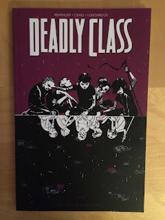
So I Read Deadly Class: Kids Of The Black Hole

A 250 word (or less) review of Deadly Class Vol. 2
by Rick Remender, Wes Craig, Lee Loughridge, Rus Wooton; Image Comics


This is a review of an ongoing series. To read about the first chapter go here.

Deadly Class continues to be a wildly schizophrenic experience for me. The artwork in Deadly Class is superlative: Craig and Loughridge fuse dynamic layouts with particularly active colouring to create some truly innovative and remarkable storytelling. I really enjoyed exploring the art. That said, I *really* do not like the story of Deadly Class. Volume 2 continues where the last issue left off with Marcus Lopez, an orphan turned student at an assassin school who plans to kill Ronald Reagan. This chapter specifically deals with his traumatic orphanage years and the evil redneck from his past come for vengeance.  This is supposed to be a subversive story about growing up, youthful jerkiness, and fucked up violence... but it mostly doesn't work for me. A lot of it is just taste, I think. I found most of the over-the-top attempts at shock to be crass or dumb or boring. (A white trash teenager saying horrible, tourettic things while being high on meth, for instance, is just so... not something I care to read.) Some of it, though, is structural: Deadly Class, in my opinion, skips a lot of the character and setting work that makes the big moments feel earned or makes the characters relatable and interesting. Which, when the comic veered on tangents, made it really difficult to be invested. Story problems aside, I still think Deadly Class is a worthwhile comic to read because the artwork is really, really excellent and totally worth the price of admission.

Word count: 248

Previously:
Deadly Class Vol. 1

Deadly class colours
Deadly class layouts

Monday, 30 November 2015

Deep Sequencing: Colourful Magic

Or a look at the use of colour as magic in Phonogram #4 and Doctor Strange #1
by Kieron Gillen, Jamie McKelvie, Matt Wilson, Clayton Cowles/Jason Aaron, Chris Bachalo, Tim Townsend, Cory Petit


An aspect of comics that I've found pretty fascinating lately is how different creators find ways to convey magic in their artwork. Making impossible, natural rule-breaking phenomena feel interesting and weird and significant can really help make a story work so finding a way to make magic visually cool is pretty important. I have seen all kinds of tricks used, including some endlessly cool compositions that violate the rules of comics storytelling in fourth-wall-breaking, disbelief stretching ways. Which, of course, works really well! But the thing is, sometimes simpler storytelling tricks work really well too, and one of the most effective ways of making magic feel significant is a really straightforward use of colours.

There will be *SPOILERS* for Phonogram #4 and Doctor Strange #1


 One of the central conceits of Phonogram is that music literally is magic. Which, as someone who enjoys music, but isn't really transcended by it, is a cool metaphor for a metaphor for being really into something. But even I have to admit that magic has an ability to recontextualize a moment: I have definitely caught myself strutting to the badass tones of Tomoyasu Hotei's Battle Without Honour of Humanity while walking to the bus first thing in the morning. Which is an experience of music involuntarily changing my motion and attitude in a way that is beyond casual explanation; that is basically magical. Or put another way: the music coloured my experience. And Phonogram uses literal colour to show the magic of music in it's pages. It's a choice that does a brilliant job demarcating the bleak mundanity of normal, music-less life, and the way music can cut through the mundanity to generate magical, new experiences. Even strutting to the bus first thing in the morning.


Part of the first issue of Doctor Strange is the idea that the Sorcerer Supreme is lives in a supernatural, unseen world that straddles our own, doing weird doctor things to benefit we mundane folk. The comic uses a similar trick to Phonogram, where colour is used to highlight magical events. In this case though, the magical-colour shares space with a black-and-white mundane word. The brilliance of this is it showcases how vibrant and, well, strange the supernatural world is when compared to the everyday world of regular people. It also does a great job at highlighting the super position of the two worlds: the magical world is layered over the mundane world in a way that is completely distinct and separate, yet still inhabiting a common storytelling space. This is how this magical world exists here, and this is how Dr. Strange is able to move between them as a magician in a very simple, understandable comic composition. Which is really effective storytelling.


Friday, 27 November 2015

Pondering About Pretty Deadly #6

Or a look at narrative structure in Pretty Deadly #6
by Kelly Sue DeConnick, Emma Rios, Jordie Bellaire, and Clayton Cowles; Image Comics


A return of Pretty Deadly means a return to essays talking about why this comic is so, so good. I don't really have any preamble: so without further ado, I'm going to take a look at how artwork, script, and lettering intersect to create different modes of storytelling in Pretty Deadly in what I think is a pretty spiffy way.

There will of course be *SPOILERS* for Pretty Deadly below.


I've written a lot about what I like Pretty Deadly, pulling specific examples of how individual sequences are constructed to artful, or impactful, or just generally effective storytelling. What was maybe lacking is some of the broad factors of Pretty Deadly, the general things this comic does exceptionally well that help make it such a pleasure to read. One of these things, I think, is how the story is organized on a structural level, and how this creates these discrete moments.

Take this page here: the main story of the comic opens with a wide open establishing shot of a wild west homestead. Then the story provides this palette establishing sequence of snapshots: tight, singular moments of noise or sensation that build this moment or feeling. In this case a bleak frontier roughness and a kind of undefined sadness. With this emotional moment established the comic moves into new story information: a sickroom and an obviously old woman being given a drink before the page deploys it's final moment and coda. A final moment that structurally the whole page builds towards, and which comes to this sharp point that redefines and provides the context of entire preceding sequence. A final moment that is also sharp and barbed, which cuts to the truth of the page in a pretty brutal and honest way, and opens the way for the story going forward. It's a very effective way of pacing the page and creating this moment of narrative clarity that I found very engaging.


These inverted storytelling triangles can be found throughout Pretty Deadly #6. Emotion palettes are established, a wider angle panel shows the main events, and then the composition hones in on that key moment of frisson that completes a narrative moment and advances the story. It's this repeating storytelling device that builds and delivers a complete narrative moment. Which... it's like a stanza of comics. Which is an interesting approach since it lends Pretty Deadly #6 a decided poetic sensibility and also gives much of the comic a structured, deliberate rhythm. Which makes this triangle device not only an effective way to generate beautifully charged story moments, but also a metric that provides the majority of the comic a narrative identity.


The sense of narrative identity that the inverted-triangle-stanza delivers becomes important in the most supernatural moments of Pretty Deadly #6 which have a completely different story structure. Instead of the tight, mechanical layouts used to make the triangle-sections work, the mystical moments of the comic adopt a more open format and a swirling, organic flow of the narration and artwork. This creates a clear demarcation between the mundane and magical portions of the comic, which goes a long way to making the supernatural parts of the comic feel distinct and special. It's a really smart use of contrasting layout approaches.

Which is all evidence of the kind of general storytelling brilliance on display in Pretty Deadly and how macroscopic, repetitive storytelling choices can be really effective.

Previously:

Wednesday, 25 November 2015

So I Read Russian Olive to Red King

A 250 word (or less) review of the Russian Olive to Red King graphic novel,
by Kathryn Immonen and Stuart Immonen; Adhouse Books


Russian Olive to Red King is a bleak comic. It is a beautifully crafted, achingly sparse story of depression, despair, resolution, and loss. In the comic Olive, an archeologist, is leaving on a work trip to a remote northern location. Her lover Red is staying behind with her dog to struggle with his writers block and finally turn in an overdue article. Tragedy strikes and Olive's small plane crashes in north, forcing her to struggle to survive. Red, meanwhile, cut off from Olive and ignorant to whether she might still be alive, is left to keep the faith. It is, as I've said, a bleak comic. It is also achingly beautiful: whether depicting arctic wilds or huddling in a bedroom, Russian Olive to Red King captures a kind of majestic stillness. It's an aesthetic choice that resonates with enormity and isolation of the story. While the story of the comic is powerful, for me the artwork is its best selling feature and the reason to seek out this comic. It's spectacular. One thing you should be aware of, though, is that the final third of the comic is a lengthy prose section. I found this part of the book as bleak, artful, and powerful as the comic and the perfect way to end the book (and a great statement on the power of art as a mechanism for dealing with emotion). But, your mileage may vary, and reading a comic that ends with an essay may not be your speed.

Word count: 250

Monday, 23 November 2015

Deep Sequencing: Hostile Babylon

Or a look at depictions of violence in East of West. Vol. 4
by Jonathan Hickman, Nick Dragotta, Frank Martin, Rus Wooton; Image Comics


I think violence is seldom portrayed in truly visceral, satisfying ways in most media. In comics, I find depictions of violence tend to be mitigated, rendered down to a palatable, symbolic state that conveys that injuries and pain are happening in a story sense without the felt-in-the-guts-horror of the violence being depicted. A lot of this, I think, comes from the tamed down nature of most depictions: a lot of violence in comics reflects that weird videogame/movie/TV language where consequences are cartoonishly minimized. (In a way that I find endlessly messed up when I actually think about it. Selling, like, gun violence as commonplace or where victims of gunshot wounds basically walk it off as opposed to being irrevocably damaged is super fucked up.) So I always find it interesting when comics find a way to depict violence in a way that captures the sheer awfulness of it.

Generally, I find most effective depictions of violence use two general strategies. The first is that they make heavy use of eye-guiding and layout to build a significant element of velocity into the artwork, making every action kinetic and maximizing every impact. The second is that they portray realistic violence: realistically drawn people are injured in the horrible ways that real people would be if stabbed, or bludgeoned, or shot. It's authentic and traumatic in a way that more sterilized depictions just aren't. A great example of a kinetic, realistic, and horrible depiction of violence was in the Ellis/Shavley/Bellaire run of Moon Knight.

What is interesting about East of West is that it uses a very different approach to depicting visceral violence that is pretty interesting.

There will be *SPOILERS* for East of West Vol. 4 below.


The context for the next sequence has to do with Babylon, the son of Death, who is the harbinger of the end times. Or, at least the fated harbinger of the End Times. Right now, Babylon is just a generally innocent child, raised by an AI in seclusion who is being manipulated by pro-apocolypse forces into growing up to end the world. In the course of Volume 4, his AI "balloon" is reprogrammed to push young Babylon into choosing to do violent, evil things in an effort to catalyze his development into a monster.


What I find so interesting about this effective sequence of violence, where Babylon is driven to kill a herd of wild pigs, is how it uses omission to create a visceral portrayal of violence. Rather than show snapshots of Babylon murdering the pigs, this sequence uses shadows and splatters to hint at the violence being done. This allows the reader's imagination to fill in whatever grisly moments of violence they picture occurring, which I find a weirdly effective choice. Part of this is the size of an imagination compared to the size of a page: the reader can picture more events, more moments of graphic violence than there is space in the page to show. Similarly, by not showing the actual events, the creators leave an ambiguity that allows the reader to picture an endless spectrum of depravity. It's a really cool use of the reader/creator/comic relationship to encode extra meaning and to use minimalist storytelling to make a really visceral moment.

Another aspect of this choice that I find interesting is even a bit more meta. By inviting the reader to envision the horrible things Babylon is doing to his victims, the comic is essentially making the reader choose to kill the pigs in their imagination. It's putting us in the characters place, putting us ideologically through the same process as Babylon, and making us complicit in his acts of violence. It's a really effective, transgressive bit of comics.


Of course, despite the apparent simplicity of the sequence, this bit of comics is filled with some really astute bits of layout and tracking to make the page kinetic and exciting. The central tool being used throughout this sequence is tangent lines (or honestly, I've always thought of them as "speed lines", but I have no idea if that is a term of art... but screw it, let's call them speed lines). Anyway, these speed lines, give every panel a sense of motion and an orientation of that motion. This makes every stab and slash, bloody splatter and splash, feel dynamic and in motion which substantially increases the drama of the sequence. It is also significant how the vectors of the action clash with each other and work against much of the eye tracking in the page giving each action a brutality and sense of chaos that wonderfully feeds into the ambiguity of the panels. Which I think is the true magic here: the exciting and dramatic storytelling creates a sense of danger and violence that allows the ambiguity to drive the reader into manufacturing a truly horrific episode of violence. 


Another aspect of this sequence that I think is kind of cool has to do with the character design of Babylon. When the sequence starts, an innocent Babylon is dresses in his all-white outfit. However, after enacting his slaughter of the pig herd, Babylon becomes covered in blood and gore, which shows prominently on his white garb. This works as a wonderful visual metaphor for the corruption that Babylon is undergoing in this sequence. It's a seemingly small choice, but it evocatively depicts the evolving status of the character.


Previously:

Friday, 13 November 2015

Atoll Comics Round 25

Or changes to my Top-Ten comics

Due to having an entertainment budget and an urge to buy better comics, I have decided to be selective about which superhero comics I read. Harnessing the Awesome Power of Maths, I have determined that I can afford to read 10 ongoing titles. So I get to read 10, and only 10, titles published by either Marvel or DC as well as one trade paperback a week of my choosing.

A complication of this is that I am forced to drop an on-going title if I want to try reading a new on-going title, an act of very tough love. Being financially responsible is the worst.

I will be adding Doctor Strange and dropping Howard The Duck.


Why Doctor Strange: I have never read a great Doctor Strange comic, since I am apparently a Marvel Tourist, I am excited to climb aboard the Strange train and see if the current iteration will be my definitive take. I've read a couple issues and so far I am encouraged: the creative team clearly has a take for the character and there is evidence of a larger story preparing to spring on the comic. I also love the visual style of the comic: its chaotic, exaggerated style full of impossible clutter is fun to look at and seems like a great metaphor for the bizarre magical world of Doctor Strange. It's only been a couple issues, but it's been the most enjoyable of the new Marvel comics I've tried so I'm on board for the time being.


Why not Howard The Duck: Howard the Duck is a fun comic. It's goofy hijinks of a Space Duck and his shapeshifting lady friend in the Marvel world. I read a bunch of issues and had some fun. But... it seems like that fun is all there is to it? The comic hasn't really made that transition from a fun premise to a fulfilling story. Which is making it hard for me to sustain interest in the series. And if I feel like I need to make an effort to be interested in a comic, it's probably a sign that I shouldn't be reading it. So I guess my overall assessment of Howard the Duck was that is a fun comic to try, but probably not a comic you'll read longterm. 

Previously: