Or how narrative caption layout generates a sense of scale in Godzilla: Half Century War
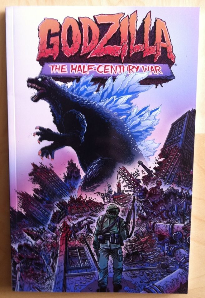
By James Stokoe; IDW Publishing
James Stokoe's Godzilla: The Half-Century War is a fun comic with some distinct, gorgeous artwork. It tells the progression of the Godzilla mythos and the ever escalating and evolving nature of the giant monster-lizard through the lens of of the humans tasked with controlling the beast. It's good comics.
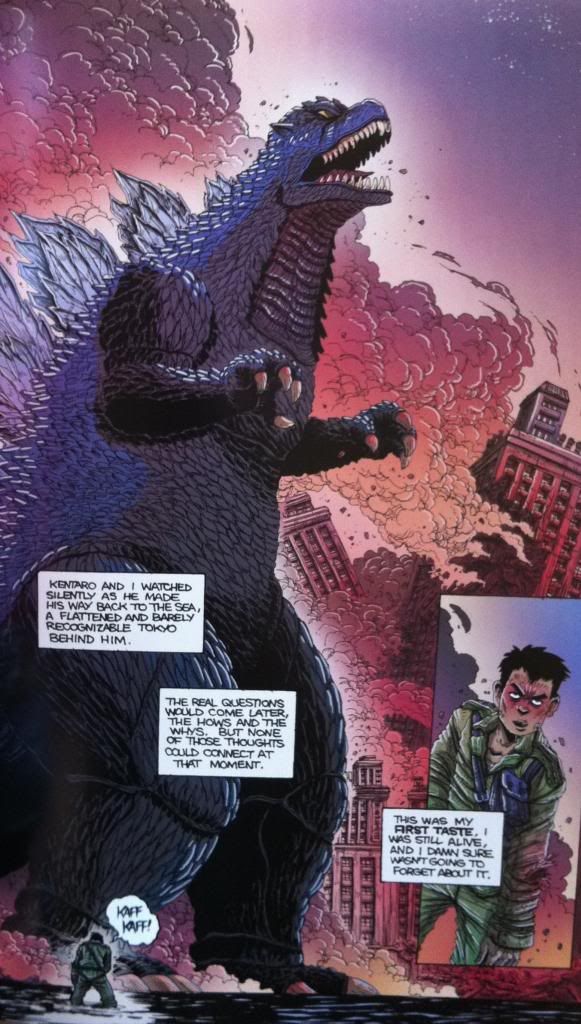
As far as I'm concerned, there are two key elements to a convincing Godzilla comic (which can probably be extended to Kaiju stories in any media): the giant monsters have to feel massive, and intricate environments need to be smashed to pieces. Stokoe is pretty much a goddamn master at drawing interesting, and intricate environments and he uses this skill to satisfy this second element in spades. As for the issue of scale in Godzilla: The Half-Century War, Stokoe comes up with a really simple, elegant solution:
Stokoe places the narration captions in the lower half of the page. It's that simple. Instead of the normal convention of placing the boxes along the top of the page, the narration sits in the middle. And this in turn makes the page feel extra tall, as if additional page height had to be added just to capture the full height of Godzilla. Which, when coupled with an upshot, and a small human in the forground makes for a Kaiju that feels absolutely huge. Like he towers over the comic. It's really smart comics.
It also, I think, emphasizes how important and effective lettering placement can be as a storytelling tool. Lettering, like colouring, is an under appreciated comics artform that, while often invisible-seeming, is integral to comics.


No comments:
Post a Comment