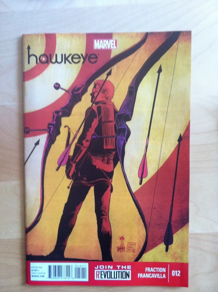
By Matt Fraction and Francesco Francavilla
Hawkeye is a stupidly good comic.
The story being created is exciting, emotionally involving, hilarious, and accessible. The artwork is gorgeous and brilliant in really subtle, technical ways. It's kind of the definition of great comics. It is also, in a way that always floors me, a really experimental comic. It is the comic that, more than any other, if you aren't reading, you are being dumb.
A pretty great aspect of Hawkeye is how well the series manages consistent quality despite a rotating cast of creators substituting in for Team Hawkguy. I mean, when your most regular series artist is David Aja making issues like Hawkeye #11, the fact that non-Aja issues don't feel like a let down is pretty remarkable. So respect to the Marvel editors who are making this happen, presumably Stephen Wacker, Tom Brennan, and Sana Amanat.
Hawkeye #12 once again sees Francesco Francavilla on art duties (last seen on Hawkeye #10). The issue deals with the arrival of Barney, the trick archer and brother of Clint, as well as a series of flashbacks to their awful childhood. It's another great issue in a great series. And like always there are some cool comics tricks on display.
This one is going to be *SPOILER* intensive, so please read the comic first.
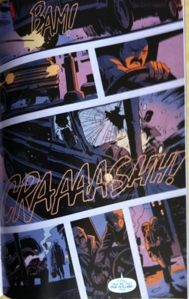
The single moment in this comic that grabbed me the most was the car crash splash page towards the back of the comic. It just completely reached out and grabbed me with emotion and weight and the horror of the moment.
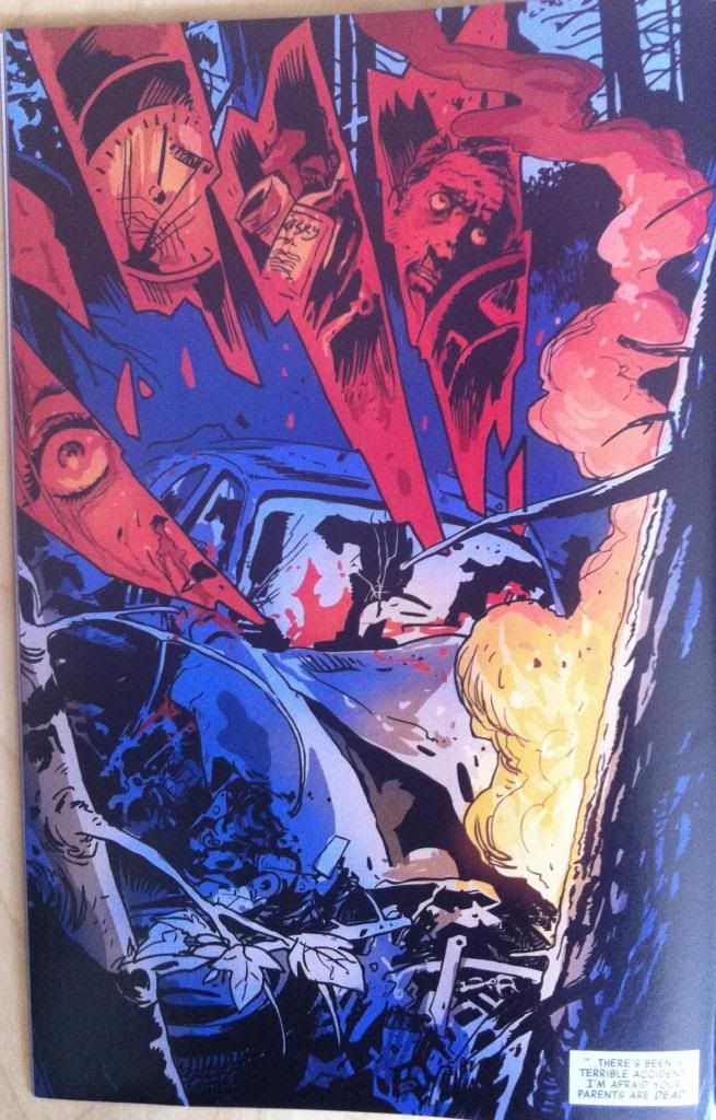
Now part of why I found this page so arresting is that it's a plenty horrific image. Francavilla paints a vivid image of twisted vehicular carnage with fire and windshield blood and jagged shards of bloodred glass showing dead faces and liquor and a broken speedometer. It's a terrifying nightmare image that ruthlessly and efficiently depicts the details of the crash. This picture would be shocking all by itself.
But, because Hawkeye #12 is a very, very smart comic there is more at work here.
The first is page progression. Because, as we read the comic, we go from this...

...turning the page.....
...To, suddenly, this:
And that is pretty surprsing! We go from a page of a character celebrating his cash windfall by indulging in his apparently problematic drinking... and then WHAM! a horrific scene of a car crash. And really with no clear warning: the preceding page leads into its horrific tail with the caption "Boys...". And while previous details in the comic clearly establish that Clint and Barney had a rough childhood (which gives the horrific car crash some narrative context), there was no obvious sign this was in the works. While hiding a surprising or important page (or pages) after a page-turn might be The-Oldest-Trick-In-The-Book-TM, the sheer explosive suddenness of its appearance carried tremendous emotional weight. Like being in a car accident, or hearing news of a loved on involved in one. It's really effective.
(I am of course assuming this was an intentional choice and not just fortuitous happenstance of ad placement. Because, I mean, this was just too perfect to be an accident, right?)
But I don't think the page-turn effect is the only systemic one adding to the weight of this image's appearance. I think layout throughout the issue also played a role in increasing the impact of the car crash page as well.
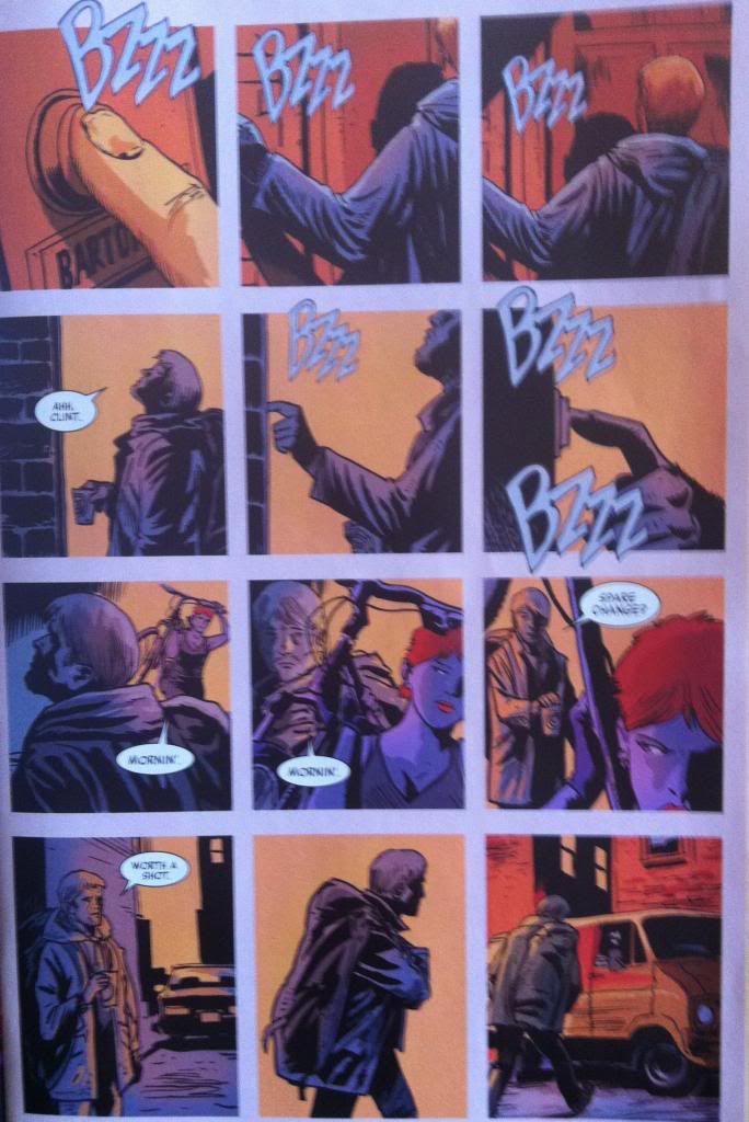
Nearly every page of Hawkeye #12 has a layout similar to this one. The page is a number of square or rectangular boxes separated by a noticeable, significant white gutter. (How great is the progression of events from left to right in each tier of this page? It's like four stacked independent strips that function individually but also as a larger whole. Francavilla, man.)
Anyway, you see this squares with a white border layout. And then you see it again.

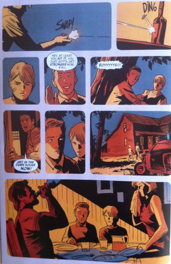
And with subtle variations, again and again and again. Until you get used to seeing this layout, until it becomes the fabric of reality as its depicted in the comic.
And then you turn a page... and...
...and the rules, the common layout disappears. You are confronted, suddenly, with a page that lacks the common layout of boxes with a white gutter. It's bigger and full page. It has red, jagged subframes. It is, from a layout perspective completely different from everything that comes before it, completely outside the subtly established conventions of the comic. And this just makes it feel different, makes it jump out even more as an exclamation point. Maybe even makes it feel like a transgression against the order of the comic.
Anyway, this page absolutely levelled me. And I would argue that the suddenness of its appearance and the dramatic change of layout helped increase the weight of this horrific and dramatic moment. It's great comics.
Also, while I'm talking about Hawkeye #12, I'd like to point out some other really great choices in this issue:
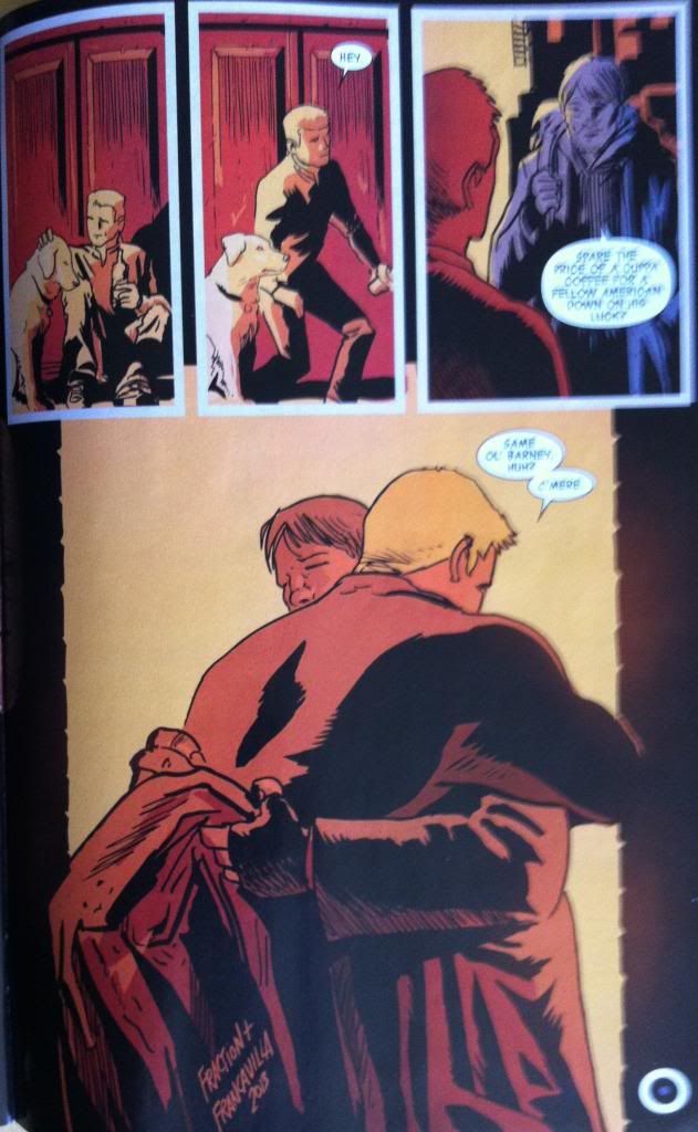
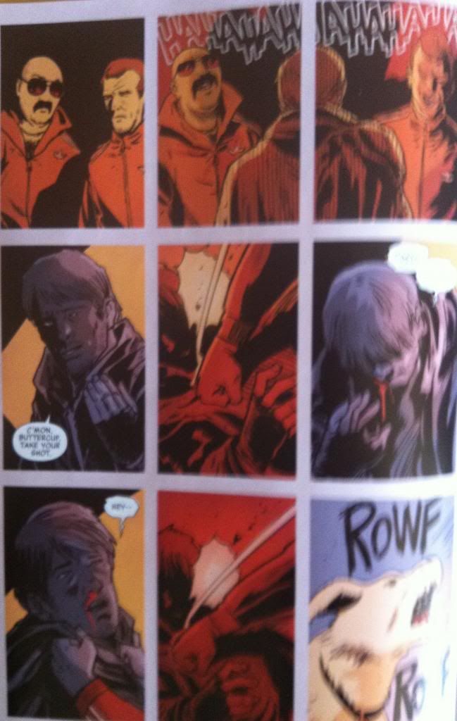
So the only other time the white barriers between frames breaks down in Hawkeye #12 is when Barney and Clint reunite and hug it out. I like to imagine this was a choice made to emphasize the loss of isolation for Barney, the closeness of the brothers, and the warmth of the moment. (But I fear I may be reading into this too much.)
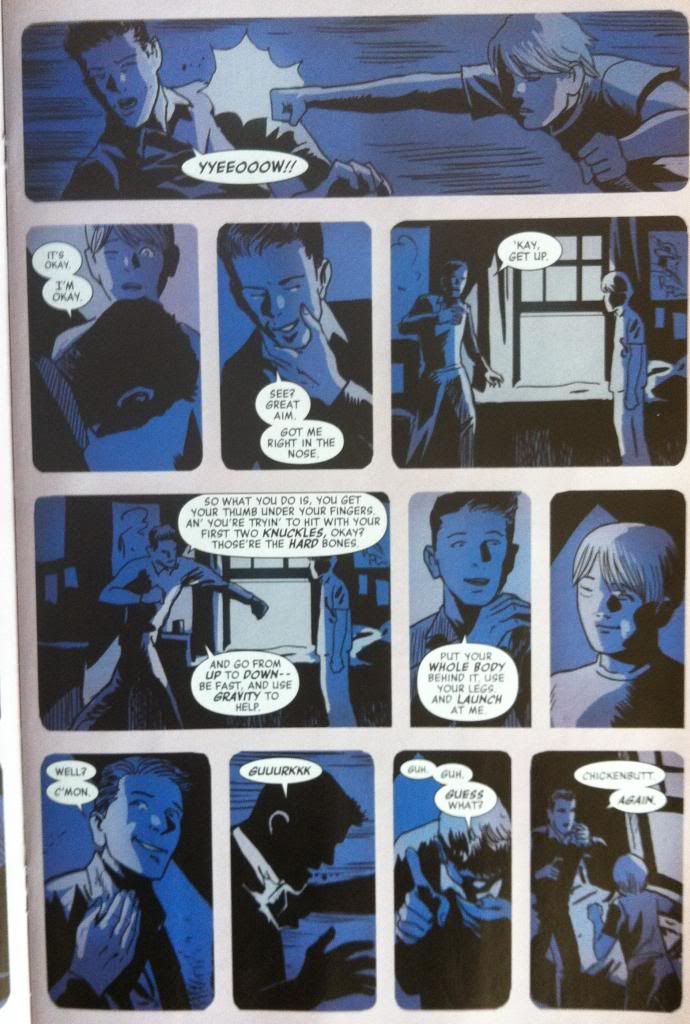
Another slight exception to the standard layout is this page which cants all of the panels on the page on a slight angle to emphasize the loss of control of the crashing van. It's subtle but exciting and effective.
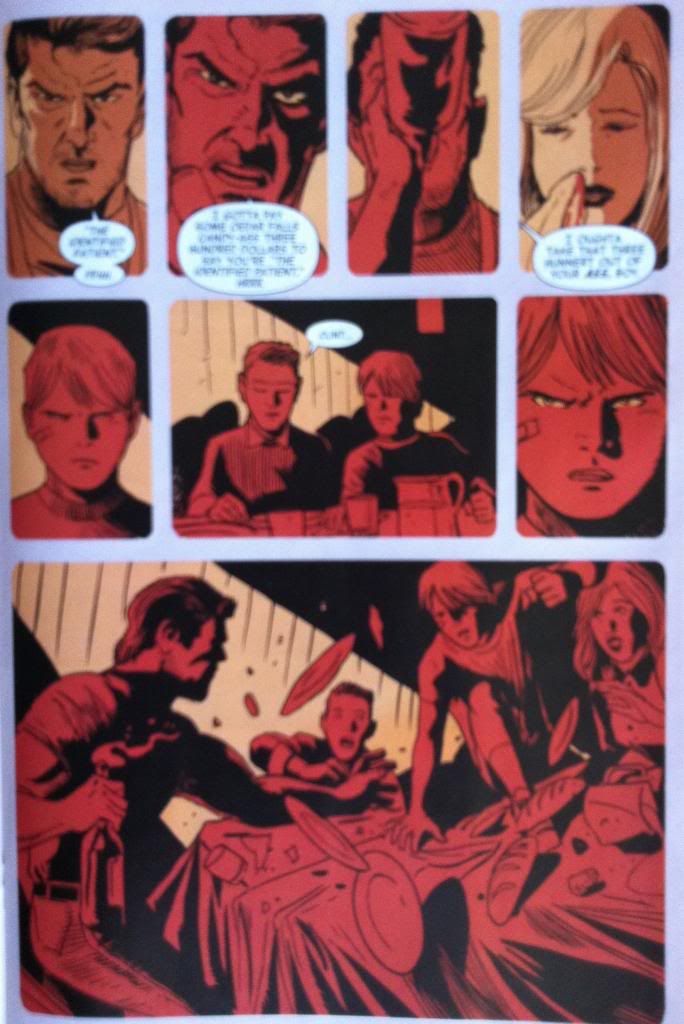
I absolutely love the use of colour in this issue, Francavilla makes all kinds of great choices. This page in particular is a great example, the way red and black are used to capture rage just increases the emotion and the tension in this page by orders of magnitude.
Previously:
This comment has been removed by a blog administrator.
ReplyDeleteThis comment has been removed by a blog administrator.
ReplyDeleteThis comment has been removed by a blog administrator.
ReplyDelete