Or highlighting unconventional layouts in Young Avengers #7
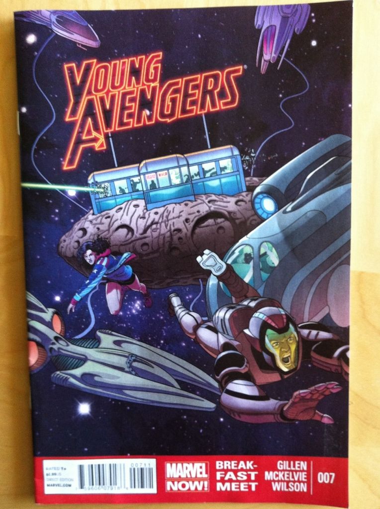
By Kieron Gillen, Jamie McKelvie, and Matthew Wilson; Marvel Comics
I'm really enjoying the Young Avengers. The story is fun, the characters are great and developing in really interesting ways, and the book is consistently gorgeous. It's great comics.
But it is also experimental comics. The creative team behind Young Avengers keeps trying new things with layout and design that are super effective and manage to convey additional story and character information. These choices are remarkable and worth taking a closer look at.
In Young Avengers #7 there are three such great comics layouts:
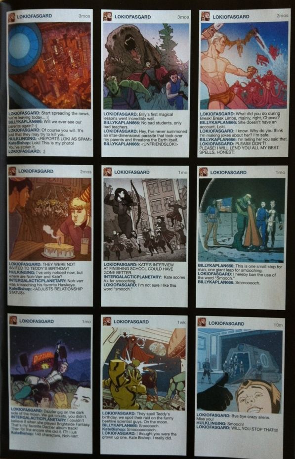
This page here shows an instagram-like stream of photos depicting the hijinks of the Young Avengers resplendent with social media comments on the bottom. From a purely story perspective it works as a great little montage that manages to convey the passage of time (literally indicated in the top right hand corner of every box) in a way that keeps us readers up with what happened during the 3 month gap. It also shows the Young Avengers being friends, so that when we reconnect with them 3 months later, we get why they all sort of fit together better than they did when they were first thrust together. It's really smart.
This layout also does some really great character work. From the comments under each picture we get all kinds of information. Like that Loki is a total social media twerp, but that, since this is his faux-instagram, he is kind of the glue that holds the team together. Or we see that Noh-Varr is enthusiastic but kind of daft. Or that Miss America is too cool for social media. Or that Kate is at once kind of mature but also silly and cool. But I think most importantly, this spread solidifies that fact that the Young Avengers are YOUNG. It shows them being goofy teenagers, which is something that maybe gets lost a bit in all of the superheroic melodrama. It's a great page.
The next great bit of experimental layout work is this double page spread, which I think qualifies as THE experimental double page spread of this issue. From a story perspective it shows a flashback of Prodigy watching the Young Avengers fight the parent-interdimensional-parasite-monster-thing. And all of these events are layed out in the shape of Prodigy's face and trademark glasses. It looks pretty cool and conveys the flashback in an interesting, and unorthodox way (it is literally in his head).
But beyond that, it tells us a lot about the character of Prodigy. First of all, it tells us how introverted he is: events literally take place in his head and, since he is depicted there, he is literally living in his own mind. What's more, I think this layout conveys how isolated Prodigy is from the rest of the world. His face layouts are surrounded by a white empty space, his flashback, the way he views the world, has a whole different mode of representation, and, hell, he is even in pressing his hands against the fourth wall of his face as if he were trapped there. I think these pages do a tremendous job of selling Prodigy as a smart guy who is maybe lonely and not great at socializing.
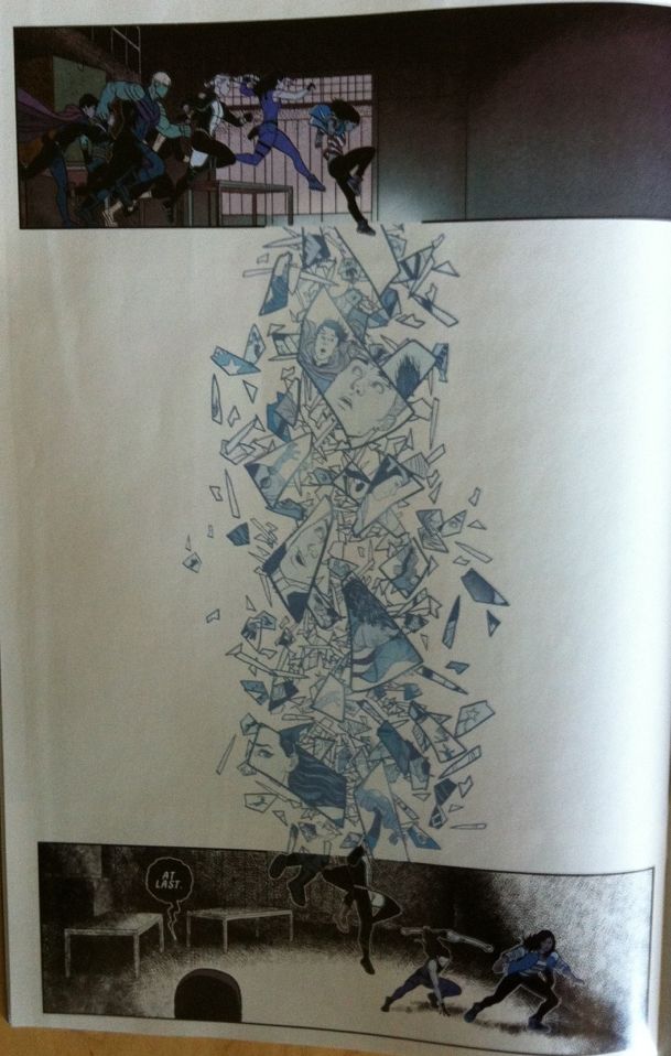
One of the cooler things about Young Avengers is how it visually conveys supernatural events. In issue #7 it deals with some magic/superscience with this bit of comics-breaking layouts. In the top the characters jump into an interdimensional portal and literally break through the panel, fall through a splintery white space, and smash into a frame with a whole different aesthetic look and colouring style. The Young Avengers creative team take us from the usual-looking Young Avengers comic, take us into an impossible, comic-rule-breaking territory, and then deposit us into a comic world that looks completely different. And it totally sells the weird, amazing event of jumping from one dimension to another. It's more great comics.
Previously:
Favouring The Young Avengers #6
Favouring The Young Avengers #5
Favouring The Young Avengers #1-4


No comments:
Post a Comment