By Matt Fraction, Javier Pulido, Matt Hollingsworth, and Clayton Cowles; Marvel Comics
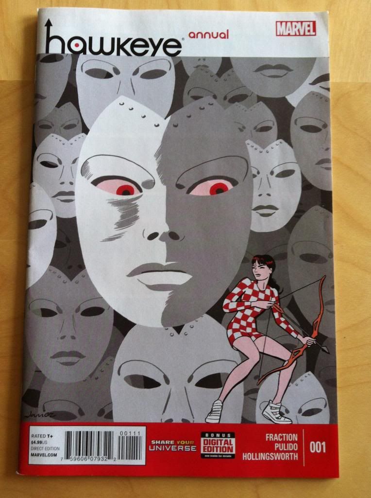
The Hawkeye Annual is another great comic in the Hawkguy tradition. This issue follows Kate Bishop Hawkeye, Lady Hawkguy, as she packs her bags and Pizza Dog, travels to California, and has a run in with an old foe. It is a really fun issue. Because I am apparently becoming this series internet stalker, I noticed some smart creative decisions that are maybe worth unpacking.
As always *SPOILERS* will follow. Read the comic first.
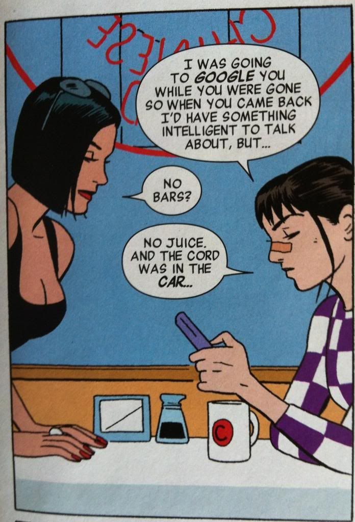
The first thing I love about this comic is that Katey-Kate got the Hawkguy treatment: she gets beat up fighting some goons and gets to wear the trademark nose-bridge-bandaid. Which, actually, is a pretty great visual representation of how out of her element she is. In previous issues Kate has always been the Hawkeye with her life more-or-less together, and unlike Clint, she manages not to get her butt kicked and seldom is bandaged up. This is really the first issue that you see Kate scattered, and unprepared, and injured. It's fun.
(Also, I love how Pulido's Kate looks like a teenager. The contrast between her and Whitney Frost really emphasizes how young and inexperienced she is. I kind of love it when younger characters look young in comics.)
(Also, also, the decision to have a femme fatale go after a female character by using her glamour and kind of just being a nice person is a pretty refreshing twist on the archetype.)
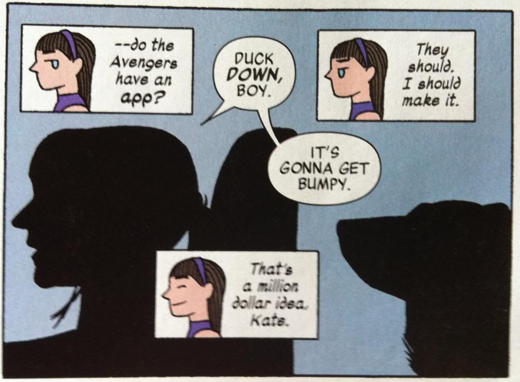
Another neat aspect of the Hakweye Annual are the thought captions. For one, they are pretty cute, and frequently pretty funny and fun. But, I think they are also really smart for a couple reasons. The first is character: the cartoony faces, loose hand written font, and frequently goofy thoughts really help cement the youth and inexperience of Kate. Also, the range of thoughts and wildly expressive faces in these thought captions really bely the cool exterior of Kate we have seen throughout Hawkeye, so these captions really add a depth to her previous appearances. As cool as she may have looked, her internal life in these previous issues were probably alive with these kinds of thoughts. These captions are also really cool from a comics-information-encoding perspective by directly showing the emotions of Kate that come with each thought. Normal, text-only captions only show the language of the thoughts, so you can only infer the accompanying emotions, but the captions in the Hawkeye Annual unambiguously convey the emotions coupled to each thought. It's kind of like the comics equivalent of how internal monologues in film have the tone of the actor's voice to convey emotion. It's a straight forward approach that really enhances Kate's internal life.
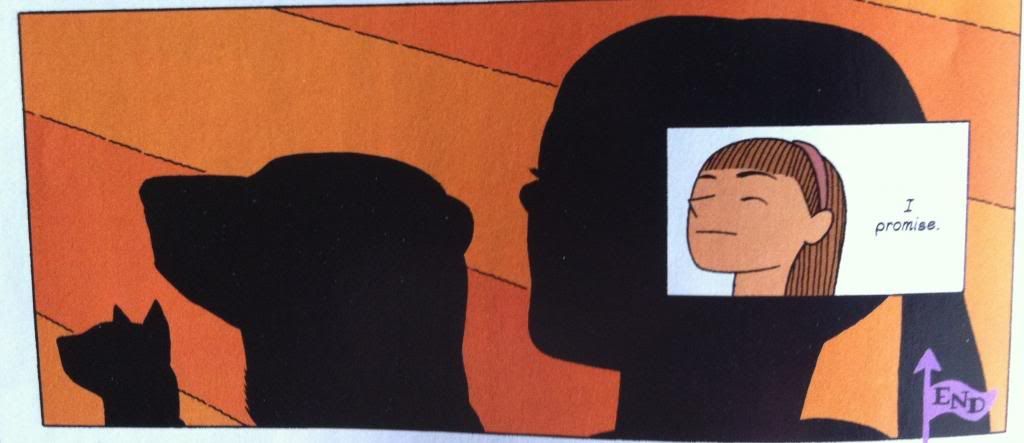
But, I think the neatest technical thing about the Hawkeye Annual is how the silhouette motif is used during some of the scenes. Now, representing characters by their black outlines occurs throughout the issue, and in a lot of scenes seems to be mostly a stylistic choice. But, in certain scenes the silhouettes seem designed to enhance certain personal disconnects between characters. Let me explain...
Okay. I feel like arguments, particularly hurtful ones, are about a breakdown in empathy. Instead of having a reasoned discussion, considering the needs and perspective of all involved, and reaching some kind of consensus or reasonable compromise, people just focus on what they want or how they feel and go with that. Maybe they say things that aren't true about the other person, but true of a kind of emotionally constructed version of the person they are arguing with. And maybe, as they become more hurt, arguing people say things they don't mean, that don't accurately reflect how they feel. This argument between Kate and Clint from the beginning of the Annual seems like that kind of argument.
And I think silhouettes are used in this conversation to emphasize the emotional disconnect and lack of empathy between Clint and Kate in this situation. When they say hurtful things, things that are not strictly fair and hurtful, they say them to silhouettes as if they aren't actually seeing each other. Moreover, when they say these hurtful things they are also represented in outline, as if they are not being themselves either when they say these things. And in those moments when Kate and Clint are genuinely concerned with people outside themselves we see them in detail: when Clint takes a moment to consider what Kate says in the first row, or seriously asks where she is going, or when Kate brings Pizza Dog with her out of concern for him we see the characters and they see each other. It's a really clever choice that adds a lot of tension to the argument.
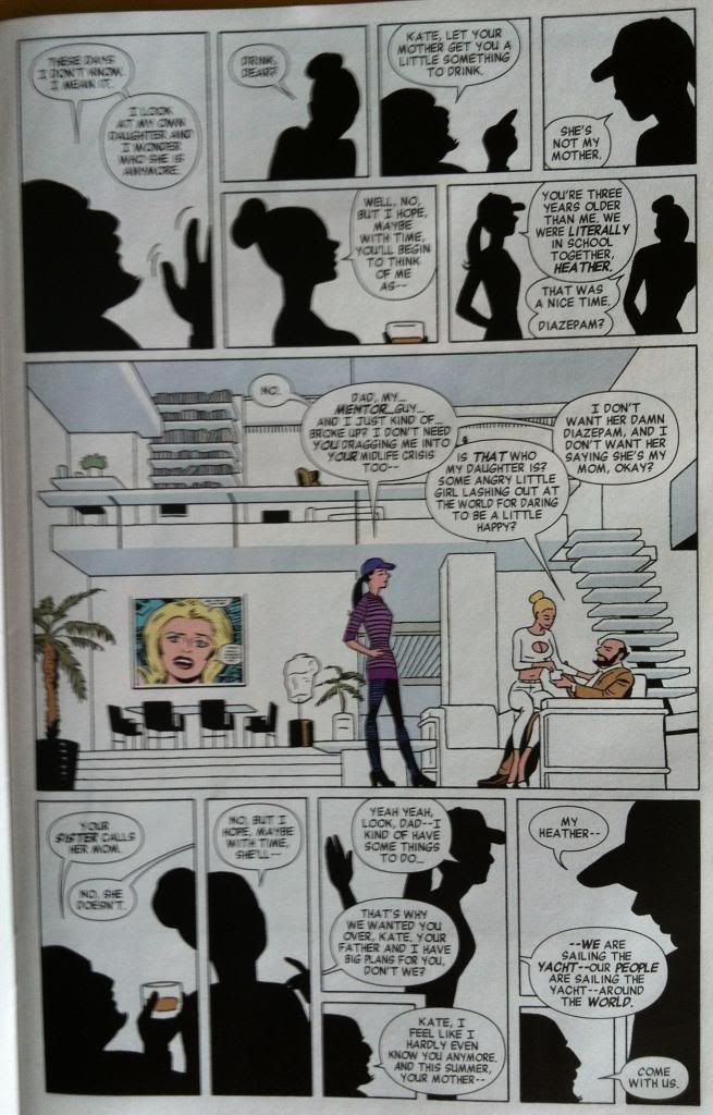
This page here has kind of the same thing happening. In it Kate and her dad and his partner have another fight and again silhouettes are intelligently used to show emotional disconnects. Every person, Kate, Kate's Dad, Kate's Dad's wife (Hawkdad? Hawkspouse?) are all concerned with their own feelings and needs. Kate clearly wants to be treated as an adult and doesn't approve of her father's choice of spouse. Kate's Dad wants Kate to respect his choice and to spend time with him and be his daughter. And Kate's Dad's wife, I think, just wants Kate to like her a bit. But, they aren't really empathizing with each other, I mean other than the central third of the strip where, for a moment, actual conversation happens (and we see the characters). And so most of this conversation happens as shadowy not-people.
Which is kind of a perfect representation of a teenagers relationship with their parents (at least in some moments). Parents maybe see their teen children as kids and have a certain expectation of obedience while teens see their parents maybe as family institutions more than people while also rebelling against their parental authority. And in this context parents and teens don't necessarily relate to each others' perspectives with all of the love and baggage that clouds their interactions. And so these parent-teen fights are about arguing with silhouettes, representations of each other, rather than necessarily with each other. Which makes the use of outlines in this section kind of brilliant.
The Hawkeye Annual is a great comic and worth checking out even if you usually hate annuals.
Previously:

No comments:
Post a Comment