Or some thoughts on the brilliantly insane layouts in Young Avengers
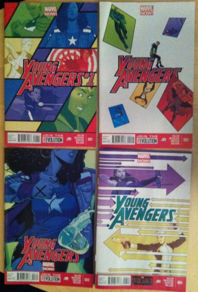
Despite the lack of regular essays on the comic, I'm really enjoying Kieron Gillen, Jaimie McKelvie, Mike Norton and Matt Wilson's Young Avengers. It's a fun book, with a well conceived plot, delightful thematic discussion, and just amazing artwork. Also, perhaps as a result of shared creators, Young Avengers bears a remarkable resemblance to Phonogram, making it serve as a kind of methadone for that particular addiction of mine. It's great!
In various interviews about the internet, Kieron Gillen has discussed the fight scenes in Young Avengers as being heavily inspired by music videos. Now, I belong to the lost generation of music videos: I became interested in pop music during the time which music channels stopped playing music videos but before youtube was a thing. I have SEEN music videos, and understand that the idea behind them seems to revolve around talented, up-and-coming directors making short, visually distinct mini-films designed for maximum emotional response and sense of cool. But beyond this intellectual wiki stub.... this concept doesn't really tell me that much about the visual style of Young Avengers.
What I do know, upon encountering the book, is that Young Avengers has some spectacular and very unorthodox storytelling in it. And it bears further examination.
There are, of course, *SPOILERS* in this.
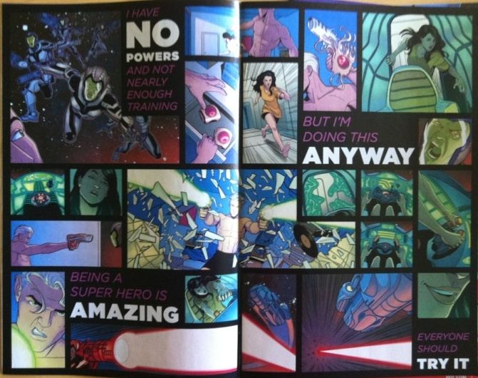
Take this double page spread from right near the beginning of YA #1. These two pages have 22 panels of artwork with an addition four panel-equivalents of text, and simultaneously portrays attacking aliens, Marvel Boy (Sorry, Noh-Varr) arming himself and repelling the invaders, Hawkeye (Kate) figuring out how to fly a spaceship, and text that feels like the mission statement of the series. (It also goes a long way to explaining how Noh-Varr's technology works.) All of these story elements are spread around the page with a chaotic, nearly random order, that still manages to be perfectly understandable. It's just a brilliant introduction to Young Avengers that I think absolutely sells the comics mission of being something new, and different, and unexpected.
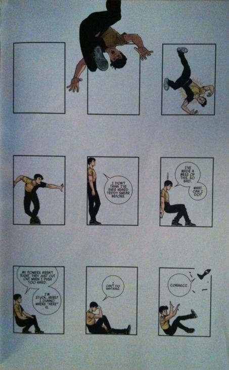
Or look at this page from YA #2 where Billy (Wiccan) is imprisoned in a cell summoned from the very panels of the comic book he is in. This is just such a clever, if fourth wall breaky, idea. Moreover, the page utilizes the unseen third dimension (the space from us to the page) and "drops" Billy into the panel-prison cell. It's a super unconventional approach that completely sells that there is something magical afoot (this shouldn't be possible!!) and that the central villain of the story, an interdimensional parasitic organism that is posing/absorbing the Young Avenger's parents, is a fantastically powerful threat.
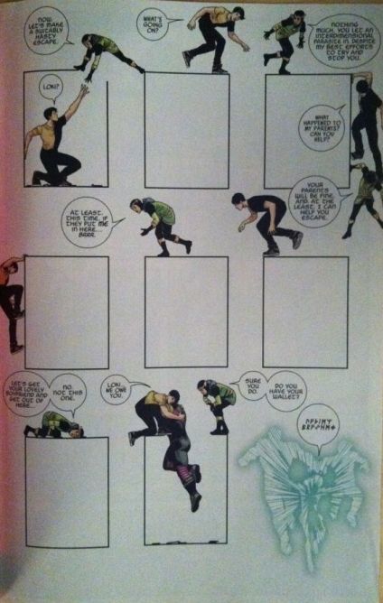
And then on the next page we have Loki freeing Billy and Teddy from these panel prison cells by literally travelling BETWEEN the panels. Now, the idea of action "taking place between panels" gets thrown around a lot as a metaphor for the events that occur between the rendered snapshots of sequential storytelling, but this for me, is the first time I've seen the idea taken literally. It's pretty cheeky. It is also a brilliant representation of Loki as a magical trickster who operates outside the rules and can make the impossible happen.
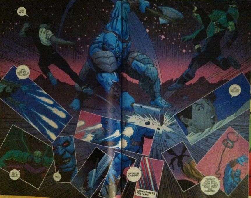
From YA #3 we get this double page spread during the combat scenes that sees a large open background with a chaotic oversplash of tight, closeup moments of action. It's epic and psychedelic and just wonderfully portrays how unreal fighting a Frost Giant from Norse Mythology in the shadow of a flying city of gods is. Which in turn, I think, conveys just how far out of their element Billy and Teddy are; just the scope of the problem the Young Avengers are in. Basically, more great stuff.
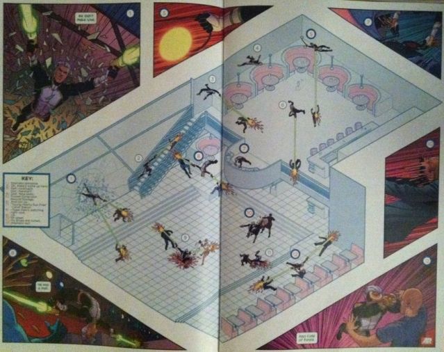
Finally, we get to this double page spread from YA #4, the layout that finally kicked (like an angry Miss America Chavez) me into writing this thing. This composition is ASTONISHING. In it Noh-Var breaks into a dance club to save the captured Young Avengers from the Parents-monster. This action takes the form of an isometric diagram of the club, where Noh-Var's actions take place all at once with their sequence demarcated by number annotations (which have a legend). Key moments of this action are further added to the extra space in the gutters of the page and connected to the action in the diagram with corresponding highlighted numbers. And on top of this, seen only in the action snapshots, is some pithy dialogue that serves to show just how quickly all of this decompressed action is happening. All of this together goes so far to establishing Noh-Varr as an absolute badass, but also as a Spaceboy from the future who is so far beyond the curve that conventional comics storytelling cannot capture him. It's fucking brilliant comics.
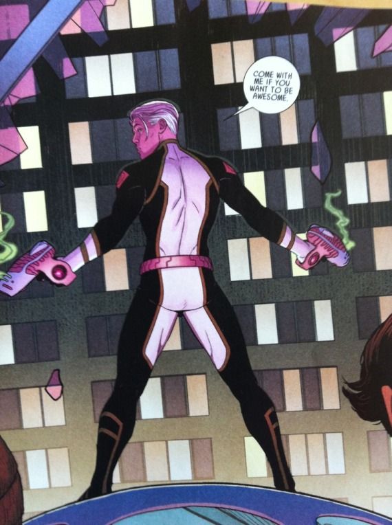
Keeping in mind that Young Avengers is a hyper-collabrative comic and credit should probably be shared, (Kieron Gillen and Jamie McKelvie actually meet in person to hash things out!), Jaimie McKelvie is a bloody genius. Now, I've always thought that he was a uniquely talented illustrator: he has one of the most expressive and elegant photo-realistic styles I have ever seen, that, unlike many of the illustrators with similar styles, doesn't sacrifice any storytelling. He is also absolutely the best illustrator of clothes ever. But in Young Avengers, there is something more going on... Okay, so I am also a huge fan of Hawkeye and David Aja, it's another great comic where Aja makes dozens of subtle, intelligent choices within the rules of comics that elevate the storytelling to... I'm going to say transcendent levels. It's like comics optimized. What McKelvie is doing in Young Avengers is to constantly experiment, and in doing so is both rejecting the standard rules of comics and showing readers things they have never seen before. It's comics REVOLUTIONIZED. And I love it.
And the thing is this revolutionary approach to storytelling is an essential part of the thematic discussion of Young Avengers. YA, as far as it can be boiled down to a single thing, is about that particular new-ness and vitality that youth have and how it strains to be free and different from the constraints imposed by established generations. Clearly, a lot of this outs itself in the plot: the Young Avengers are fighting a parasitic life-form that is literally their parents. Which is pretty on the nose. But the artwork, these never-seen-before layouts, support this theme brilliantly. When action happens, we don't see the conventional story-telling of established generations and instead we something new, something vital, something revolutionary that absolutely captures what Young Avengers is all about. And I'm really enjoying it.
No comments:
Post a Comment