Wednesday, 7 August 2013

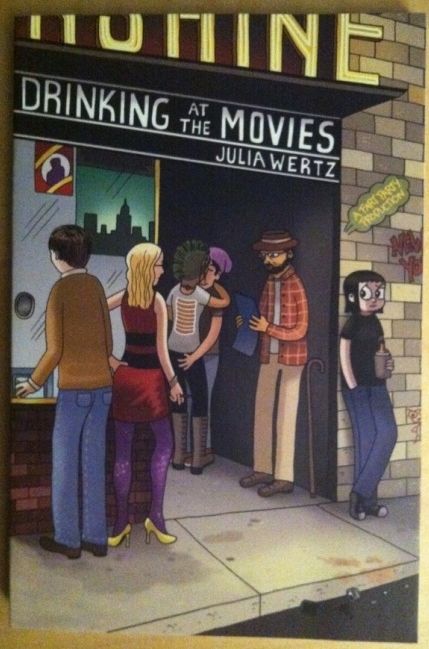
So I Read Drinking At The Movies

A 250 word (or less) review of Drinking At The Movies
by Julia Wertz, Three Rivers Press


Honesty has a weird relationship with narrative. One kind of narrative storytelling is fiction, which is essentially entertaining lies that encapsulate some kind of narrative honesty. The other kind, narrative non-fiction and autobiography, uses real events to tell a story. The trouble is that a lot of this true style of narrative is somewhat dishonest. There is a temptation, I think, to try to take real life and construct a compelling, higher-truth kind of literary narrative. If you have at all lived a life, you know this is very seldomly how things work. Real life is messy: for all the excitement and fun and tragedy there is an equal measure of pointlessness, routine, and miscellany. Basically, in real life people have got to buy groceries and poop. What I like most about Drinking At The Movies, the autobiographical tale of anti-ingenue Julia Wertz moving to the Big Apple for profoundly unprofound reasons, is that it is uncut narrative honesty. Wertz invites the reader into her life with all of its intimate drama and banal misery and just shares it with a satisfyingly self-aware lens and a razor-edged sense of humour. It's simply a conduit to life as Wertz. And of course all of this is delivered in Wertz's equally honest feeling cartoon style. Drinking At The Movies is an enjoyable autobiographical comic that manages to be an amusing and unpretentious slice of life. And if nothing else it has the refreshing feeling of being honest.

Word count: 245

Previously:
So I Read The Infinite Wait and Other Stories

Monday, 5 August 2013

Favouring The Young Avengers #8

Or the use of colour and layout to establish inter-dimensional travel in Young Avengers #8
By Kieron Gillen, Jamie McKelvie, Mike Norton, Matt Wilson, and Clayton Cowles; Marvel Comics


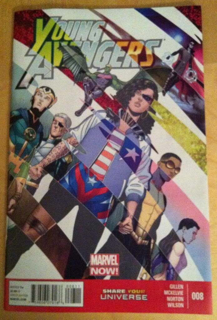
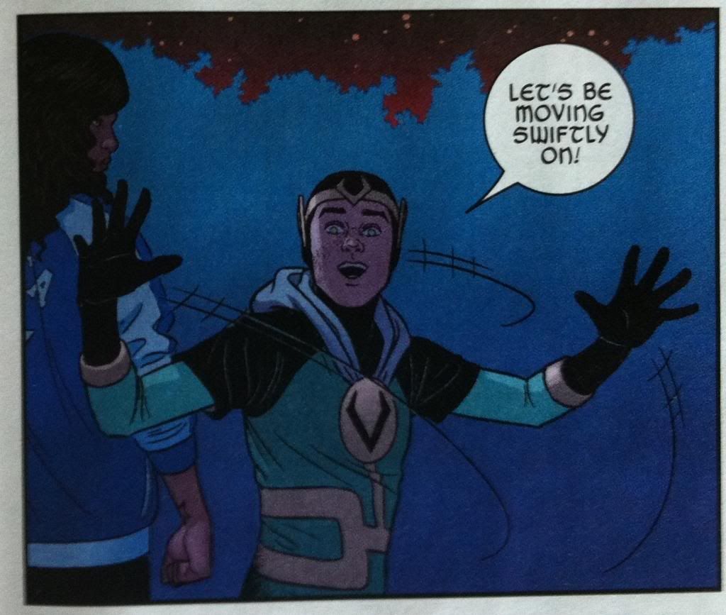
Young Avengers is another great issue in the Young Avengers series. Issue #8 deals with our intrepid heroes tracking their mysterious foe through the multiverse.  As such, the comic features a number of different dimensions each with its own distinct look and feel. And a lot of this distinction is due to subtly altering the colour palettes going from one world to the next. I think it is worth unpacking.

There will be *SPOILERS* for Young Avengers # 8 so please read the issue first before continuing.


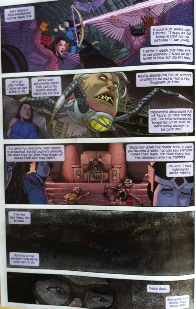
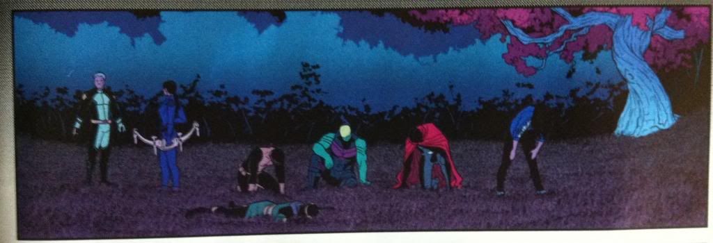
In total the Young Avengers visit 9 different dimensions. The first four (above) are shown only as glimpses and are demarcated mostly by their crazy contents. As such, they do not have established motifs (or if they do, it is difficult to pick out since each world is left too quickly to find trends.) The rest of the worlds have multiple panels and each have their own look, largely established through colours. (as all worlds are drawn in Jamie McKelvie and Mike Norton's particular, great style).


So for the five established dimensions, there seems to be the following colour motifs:

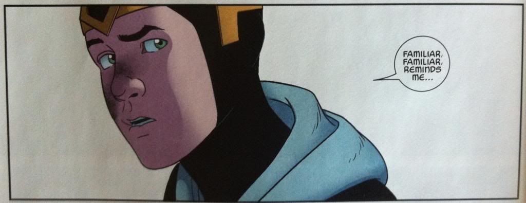
1: Earth-212, which is a kind of Super-Earth+, has a colour scheme close to the rest of the comic series but with a certain glowy-ness. As if everything was near a neon sign, or has an internal candle. This gives this dimension a warmth that is coupled to its relative safety as a place to visit.

2: This reality is a Dystopian-Kree world and it is a dimension of shades of grey, scribbled through with a mess of cross-hatches. Characters in the environment are also heavily shadowed, with their colours subtly muted. It's a place that looks as harsh as its depicted contents.

3: The Demiurge reality is kind of a magic dreamworld. It is dictated by a colour palette that diverges from nature: pinky-red and purpley-blue appear in places they should not, replacing foliage or the sky. It's surreal, and beautiful, and a little creepy, just like this dimension.

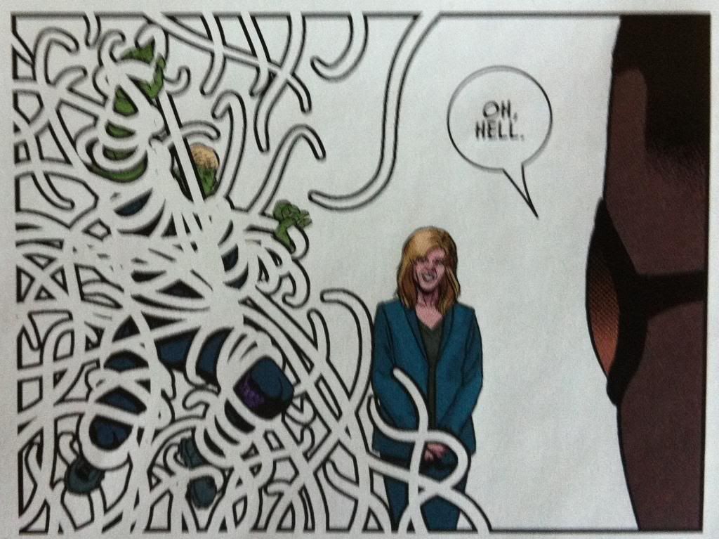
4: Mother's home dimension. It is harsh white open space, a place where the normal fabric and rules of comics, and therefore reality, do not apply. It's a surreal and scary place, stark and difficult to understand, much like Mother.

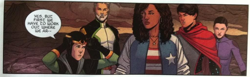
5: Hellish-looking-place. It has a, well, hellish quality. The background is governed by hot grey tones as far as the eye can see, while characters are illuminated by a bright, ubiquitous glow. Not a soft, warm one like the candley effect of Earth-212, but instead a fierce one, like being caught in sun-glare or standing too close to a fire. It's menacing, much like I think this reality is likely to be given cliff-hangers.

Varying colours like this between realities is a really straight forward, subtle way to create distinct and strange seeming places. Yet more evidence that colouring is so incredibly important to good comics.


One of the more interesting aspects of Young Avengers is how the creative team represents super natural or magical elements and YA #8 has some really neat sequences. Specifically, the comic has panels where the frames of the panels themselves attack characters. Which is some pretty fourth-wall breaking, trippy stuff. This all occurs within Mother's Home dimension, and is a great visual way to display the power of Mother and her absolute mastery of her home reality. Hulkling and Prodigy are pretty screwed.
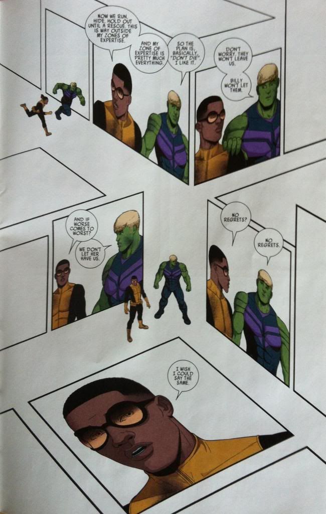

Speaking of which... this is the most experimental layout in Young Avengers #8. (I love the experimental layouts in YA's.) As usual, this crazy layout manages to perform a dual story telling and character/thematic duty. From a pure storytelling perspective, this page shows Hulkling and Prodigy running as they try to escape Mother as well as a conversation where the pair take stock of their situation in an interesting way. This page additionally continues to build just how weird (comic rule breaking) Mother's dimension is, and how daunting a prospect of overcoming Mother is while being trapped there. I think this layout also, by portraying Hulkling and Prodigy in proximity over and over again, while in the empty, bleak, surreal landscape, emphasizes how the two are alone with each other. It's just them versus Mother's crazy world. It's a great layout that schowcases our heroes predicament and tonally sets up the gasp-enducing final page reveal of the issue. It's great comics.


Previously:
Favouring The Young Avengers #7

Friday, 2 August 2013

Eye On Hawkeye # Annual 1 Pt. 2

Or having some fun with the caption boxes of the first Hawkeye Annual using a sequence from Hawkeye #3
Collectively by Matt Fraction, Javier Pulido, David Aja, Matt Hollingsworth, Clayton Cowles, and Chris Eliopoulus


This post is going to involve serious *SPOILERS* from Hawkeye #3 and potentially mild *SPOILERS* from the new Hawkeye Annual. Be aware.


One of my favourite things about the Hawkeye Annual is the way thought captions are presented in the issue. The combination of hilarious, idiosyncratic dialogue, playful font, and expressive cartoon face is a lot of fun. But these captions are also great for a variety of reasons I have discussed previously. But, to sum up, they are innovative because they provide direct info about Kate's emotions, provide additional character details, and develop Kate's internal life. It's good stuff.

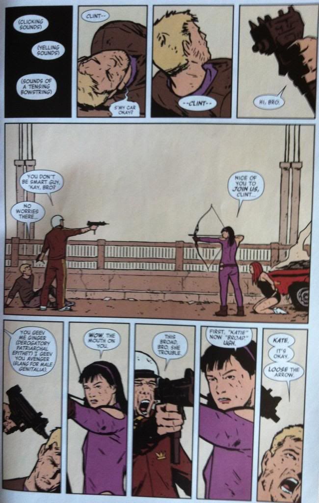
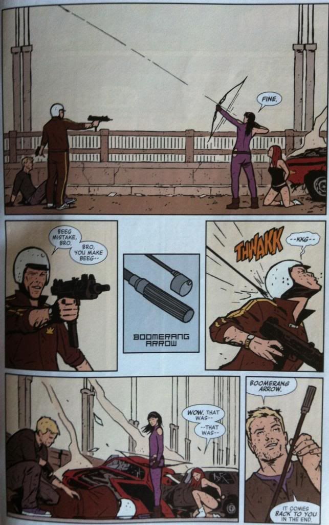
But, I can't help but apply this kind of thought process to what we have already seen of Kate in Hawkeye. Because, if this is what and how she is thinking in the Hawkeye Annual, than she is likely thinking like this in previous issues too. Say, like in the Hawkeye #3, the car chase one.

And actually.... I think it might be fun to apply some of the captions from the Annual to Hawkeye #3. 


So I'm going to take these two pages here, and add try adding Kate thought captions and see how it works out. This is what I came up with:


So what do you think? Does it work? Should dropping in comic-Kate thought captions into other issues of Hawkeye or Young Avengers be a thing? 

I think it could be a thing.


Previously:

Wednesday, 31 July 2013

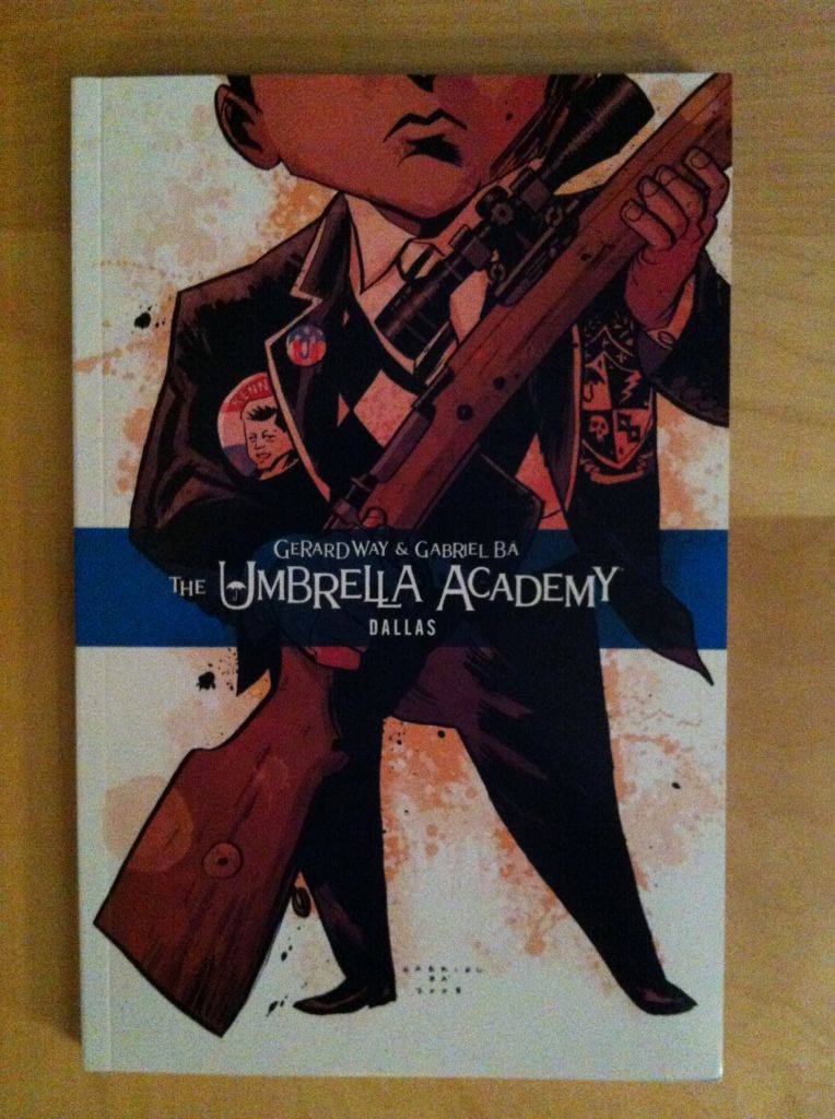
So I Read The Umbrella Academy: Dallas


A 250 word (or less) review of the second The Umbrella Academy collection
By Gerard Way and Gabriel Ba; Dark Horse Books


Now this is more like it! I liked the first collection of The Umbrella Academy, Apocalypse Suite. I thought it had some neat ideas, amazing art, and solid storytelling, but felt that it was maybe too conventional? Too adverse to risk? Like, that the premise had a certain amount of untapped potential, which, if it could be wedded to Ba’s astounding art, could make The Umbrella Academy a truly great comic. I am happy to report that Dallas lives up to the full The Umbrella Academy potential. Dallas picks up where Apocalypse Suite leaves off, with the super-powered orphans of the academy traumatized, maimed, and scattered from the fallout of the previous chapter. Against this stark tableau the secret future/history of Number 5 is revealed as well as the horrific mission he and his family must undertake to save the future.  It is, more than anything, a confounding and brave comic. Where Apocalypse suite is kind of an avant garde take on the Superhero formula, Dallas is just balls out crazy originality.  It’s almost as if, with the basic foundations of The Umbrella Academy world established, Way and Ba are free to capitalize on their creativity. Every single page crackles with this manic energy and nearly every scene goes in an unexpected, yet satisfying direction. The entire comic is expansive and interesting and just utterly weird. Dallas is absolutely its own thing and it’s great. The Umbrella Academy: Dallas is the complete, realized Umbrella Academy package. It’s well worth reading.

Monday, 29 July 2013

Eye on Hawkeye # Annual 1 Pt. 1

Or the use of silhouettes to make arguments better in the first Hawkeye Annual
By Matt Fraction, Javier Pulido, Matt Hollingsworth, and Clayton Cowles; Marvel Comics


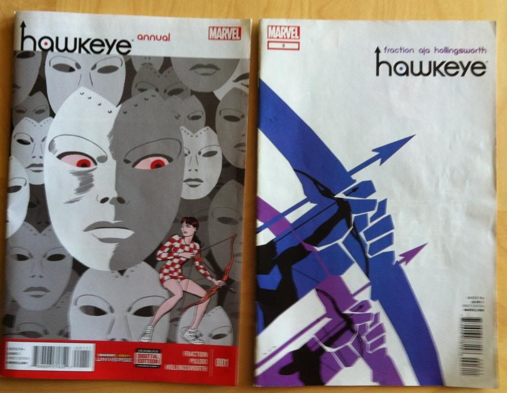
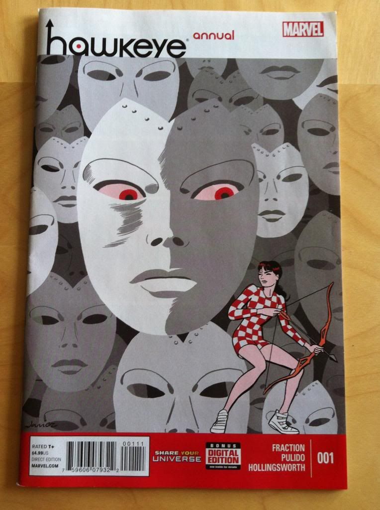
The Hawkeye Annual is another great comic in the Hawkguy tradition. This issue follows Kate Bishop Hawkeye, Lady Hawkguy, as she packs her bags and Pizza Dog, travels to California, and has a run in with an old foe. It is a really fun issue. Because I am apparently becoming this series internet stalker, I noticed some smart creative decisions that are maybe worth unpacking.

As always *SPOILERS* will follow. Read the comic first.


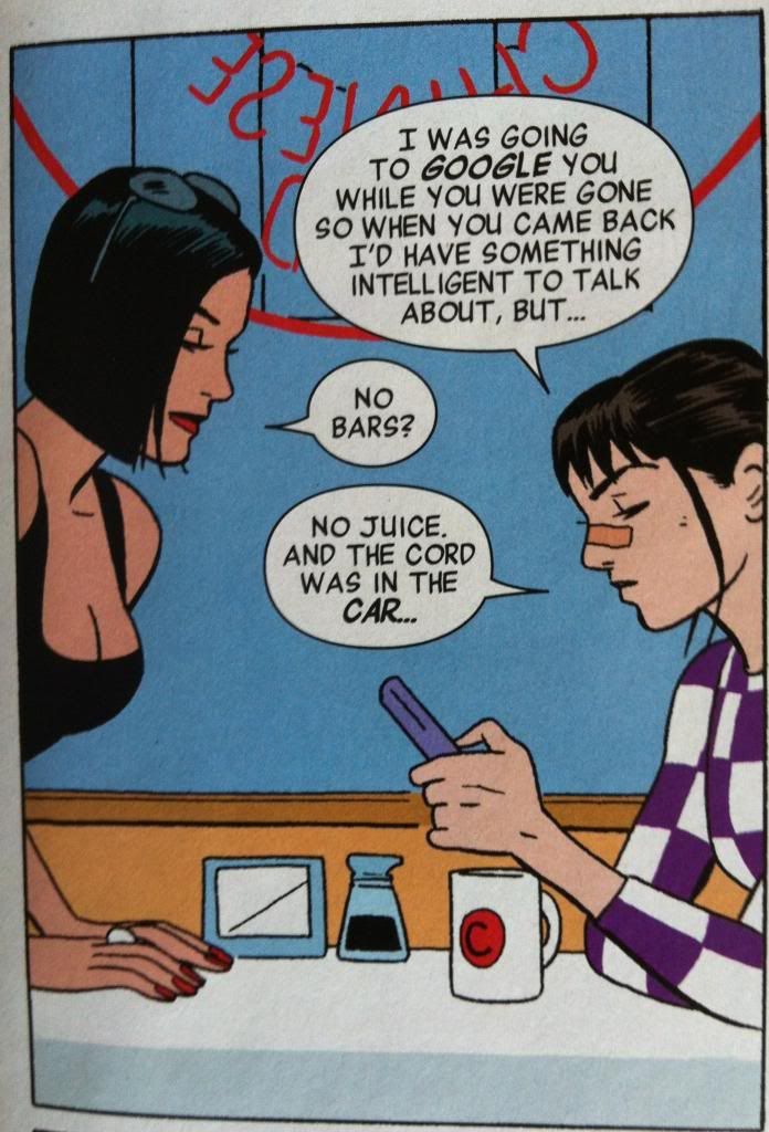
The first thing I love about this comic is that Katey-Kate got the Hawkguy treatment: she gets beat up fighting some goons and gets to wear the trademark nose-bridge-bandaid. Which, actually, is a pretty great visual representation of how out of her element she is. In previous issues Kate has always been the Hawkeye with her life more-or-less together, and unlike Clint, she manages not to get her butt kicked and seldom is bandaged up. This is really the first issue that you see Kate scattered, and unprepared, and injured. It's fun.

(Also, I love how Pulido's Kate looks like a teenager. The contrast between her and Whitney Frost really emphasizes how young and inexperienced she is. I kind of love it when younger characters look young in comics.)

(Also, also, the decision to have a femme fatale go after a female character by using her glamour and kind of just being a nice person is a pretty refreshing twist on the archetype.)


Another neat aspect of the Hakweye Annual are the thought captions. For one, they are pretty cute, and frequently pretty funny and fun. But, I think they are also really smart for a couple reasons. The first is character: the cartoony faces, loose hand written font, and frequently goofy thoughts really help cement the youth and inexperience of Kate. Also, the range of thoughts and wildly expressive faces in these thought captions really bely the cool exterior of Kate we have seen throughout Hawkeye, so these captions really add a depth to her previous appearances. As cool as she may have looked, her internal life in these previous issues were probably alive with these kinds of thoughts. These captions are also really cool from a comics-information-encoding perspective by directly showing the emotions of Kate that come with each thought. Normal, text-only captions only show the language of the thoughts, so you can only infer the accompanying emotions, but the captions in the Hawkeye Annual unambiguously convey the emotions coupled to each thought. It's kind of like the comics equivalent of how internal monologues in film have the tone of the actor's voice to convey emotion. It's a straight forward approach that really enhances Kate's internal life. 

But, I think the neatest technical thing about the Hawkeye Annual is how the silhouette motif is used during some of the scenes. Now, representing characters by their black outlines occurs throughout the issue, and in a lot of scenes seems to be mostly a stylistic choice. But, in certain scenes the silhouettes seem designed to enhance certain personal disconnects between characters. Let me explain...


Okay. I feel like arguments, particularly hurtful ones, are about a breakdown in empathy. Instead of having a reasoned discussion, considering the needs and perspective of all involved, and reaching some kind of consensus or reasonable compromise, people just focus on what they want or how they feel and go with that. Maybe they say things that aren't true about the other person, but true of a kind of emotionally constructed version of the person they are arguing with. And maybe, as they become more hurt, arguing people say things they don't mean, that don't accurately reflect how they feel. This argument between Kate and Clint from the beginning of the Annual seems like that kind of argument.

And I think silhouettes are used in this conversation to emphasize the emotional disconnect and lack of empathy between Clint and Kate in this situation. When they say hurtful things, things that are not strictly fair and hurtful, they say them to silhouettes as if they aren't actually seeing each other. Moreover, when they say these hurtful things they are also represented in outline, as if they are not being themselves either when they say these things. And in those moments when Kate and Clint are genuinely concerned with people outside themselves we see them in detail: when Clint takes a moment to consider what Kate says in the first row, or seriously asks where she is going, or when Kate brings Pizza Dog with her out of concern for him we see the characters and they see each other. It's a really clever choice that adds a lot of tension to the argument.


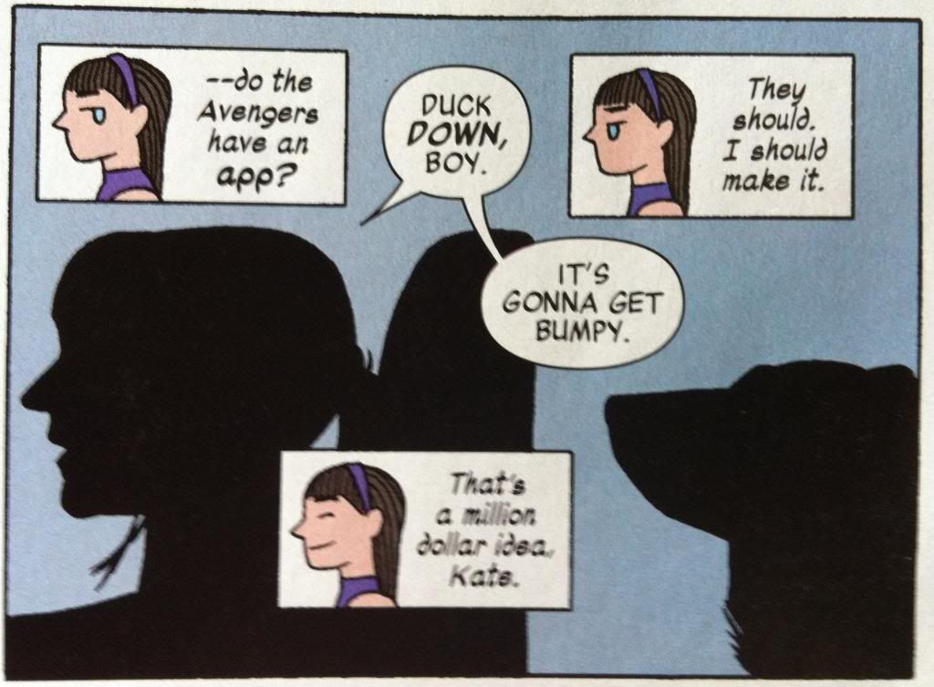
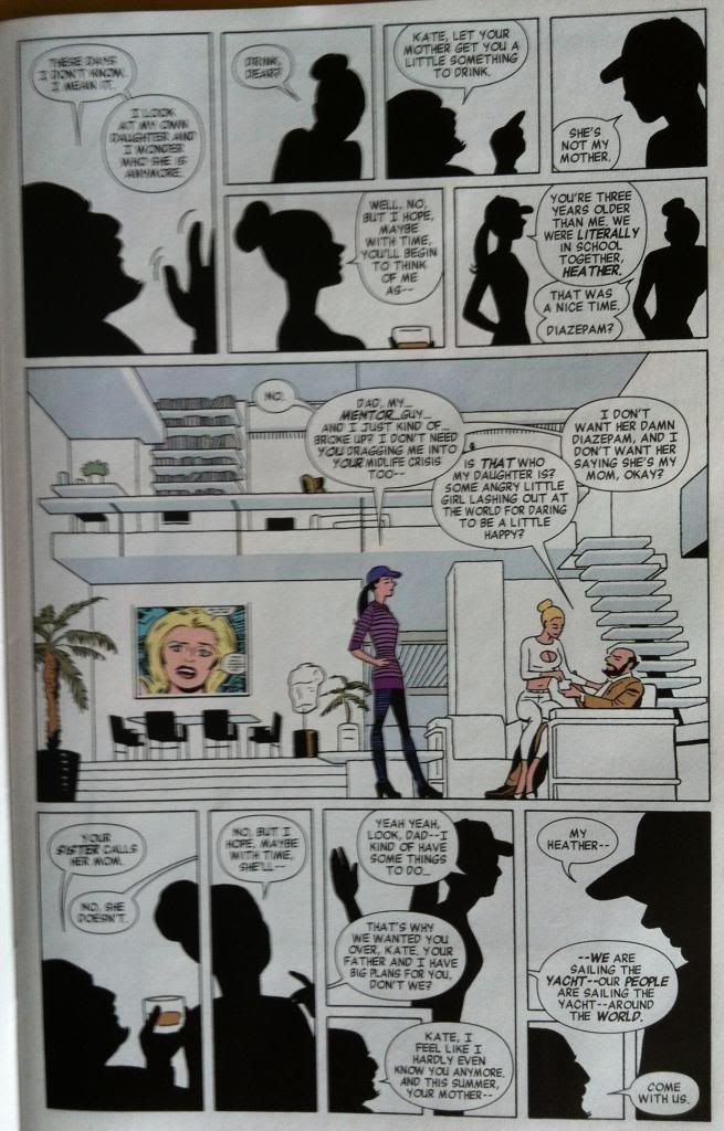
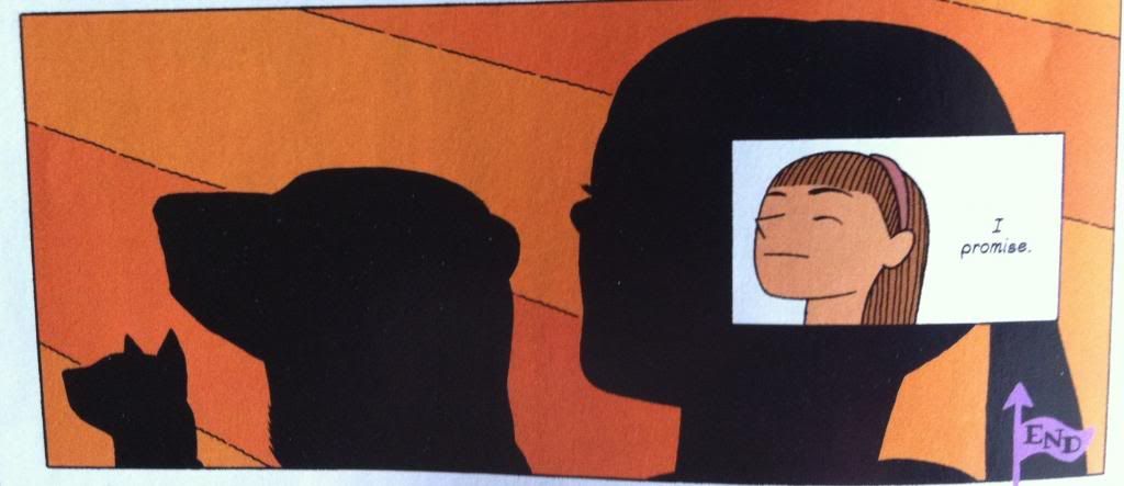
This page here has kind of the same thing happening. In it Kate and her dad and his partner have another fight and again silhouettes are intelligently used to show emotional disconnects. Every person, Kate, Kate's Dad, Kate's Dad's wife (Hawkdad? Hawkspouse?) are all concerned with their own feelings and needs. Kate clearly wants to be treated as an adult and doesn't approve of her father's choice of spouse. Kate's Dad wants Kate to respect his choice and to spend time with him and be his daughter. And Kate's Dad's wife, I think, just wants Kate to like her a bit. But, they aren't really empathizing with each other, I mean other than the central third of the strip where, for a moment, actual conversation happens (and we see the characters). And so most of this conversation happens as shadowy not-people.

Which is kind of a perfect representation of a teenagers relationship with their parents (at least in some moments). Parents maybe see their teen children as kids and have a certain expectation of obedience while teens see their parents maybe as family institutions more than people while also rebelling against their parental authority. And in this context parents and teens don't necessarily relate to each others' perspectives with all of the love and baggage that clouds their interactions. And so these parent-teen fights are about arguing with silhouettes, representations of each other, rather than necessarily with each other. Which makes the use of outlines in this section kind of brilliant.

The Hawkeye Annual is a great comic and worth checking out even if you usually hate annuals.


Previously:

Friday, 26 July 2013

Atoll Comics Round 9

Or changes to my top-ten


Due to poverty and an urge to buy better comics, I have decided to be super-selective about which superhero comics I read. Harnessing the Awesome Power of Maths, I have determined that I can afford to read 10 ongoing titles. So I get to read 10, and only 10, titles published by either Marvel or DC as well as one trade paperback a week of my choosing.

A complication of this is that I am forced to drop an on-going title if I want to try reading a new on-going title, an act of very tough love. Being financially responsible is the worst.

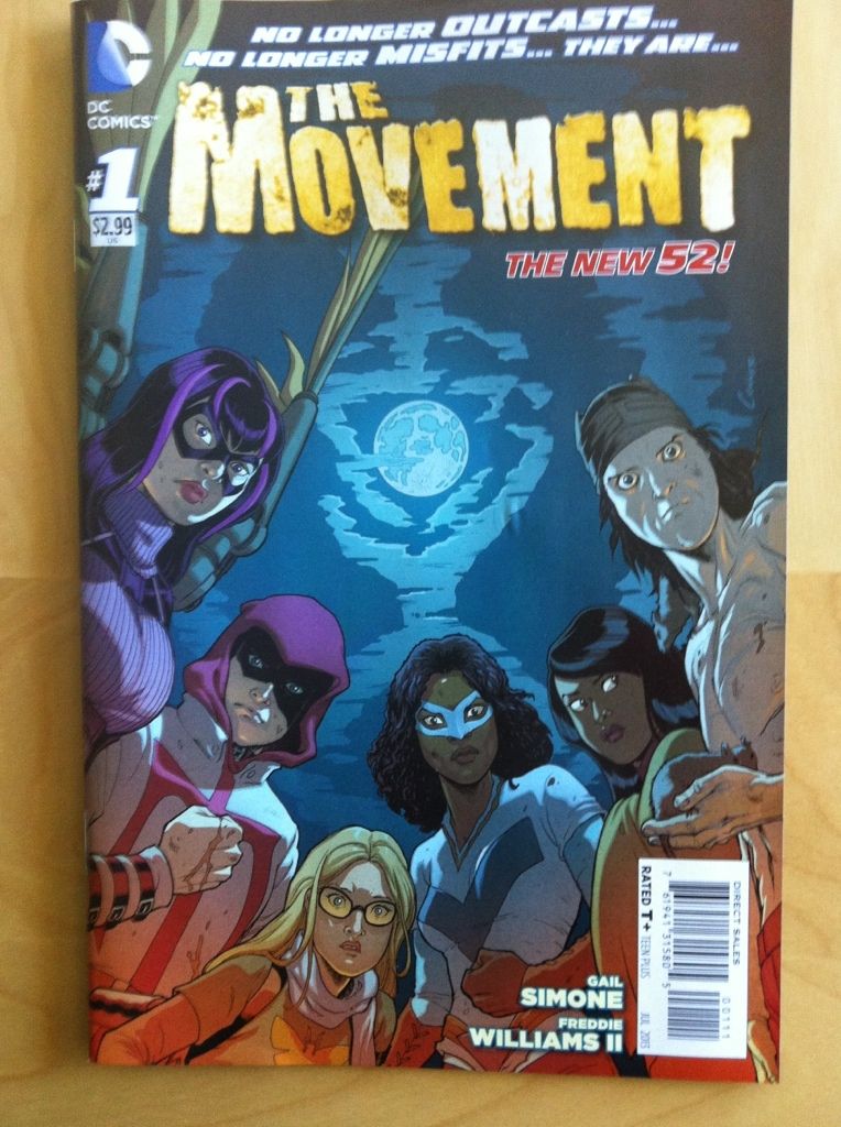
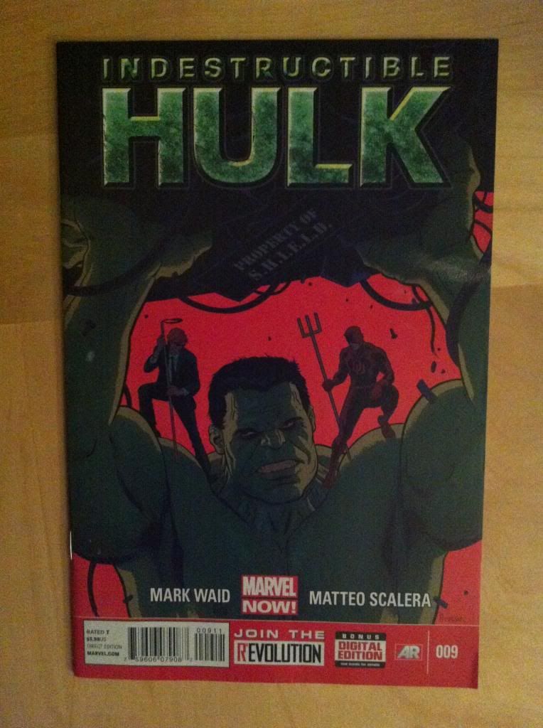
I will be adding The Movement and dropping The Indestructible Hulk.


Why The Movement: Gail Simone and Secret Six. Secret Six was this absolutely perfect moment of a comic: twisted, perverse, hilarious, and heartfelt. It was great and now it is gone. And with it a giant Secret Six sized hole opened within me that goes un-filled week after week and month after month. It is my hope that with some room to grow The Movement may become something nearly as good as Secret Six. It has a diverse cast of outsiders fighting back, in a super-heroed-violenced-up-Occupy style, against authorities who have ceased to care for their people. Which is an interesting concept. But what really nabs me is the potential: I see moments of Gail Simone's amazing humour, sharp dialogue, and fantastic compassion. I see characters capable of profound empathy and passionate infighting and startling psychosis. I see the bones of a comic that is good and, if it can sort out its growing pains, could be fantastic. And I would like to be reading it when it does.


Why not The Indestructible Hulk: Too much Hulk, not enough Banner essentially. Mark Waid absolutely hooked me with the his take on Banner as a Science guy who just wants to make a contribution to humanity when he isn't giant and green and smashy. And so each issue followed, in a very loose way, something about Banner and his Science-team and something about Hulk breaking things. And for a while it was exactly what I wanted. The trouble is that Hulk kept getting in the way of the Banner sections I was more interested in... and at a certain point, since I'm only allowed to read ten on-going comics, it just wasn't enough of what I wanted. It didn't become the Banner centric thing I was hoping it would. Also, Lenil Francis Yu, the starting artist who was a big part of my jumping on board The Indestrutible Hulk, was moved onto other projects at Marvel which also contributed to this comics shrinking stature. It is still good comics, great comics even, just not what I had hoped it would be in a time when I'm only reading ten comics....

Previously:
Atoll Comics Round 8: The Indestructible Hulk and FF in and Uncanny Avengers out
Atoll Comics Round 7: Young Avengers in and Winter Solider out
Atoll Comics Round 6: Either The Indestructible Hulk or FF in and Batwoman out
Atoll Comics Round 5: Avengers in and Fantastic Four/FF out
Atoll Comics Round 4: Avengers Assemble in and The Invincible Ironman out
Atoll Comics Round 3: Uncanny Avengers in and Ultimate Spider-Man out
Atoll Comics Round 2: Hawkeye in and The Flash out
Atoll Comics Round 1: Captain Marvel in and Thunderbots/Dark Avengers out
Atoll Comics Round 0: The originals

Wednesday, 24 July 2013

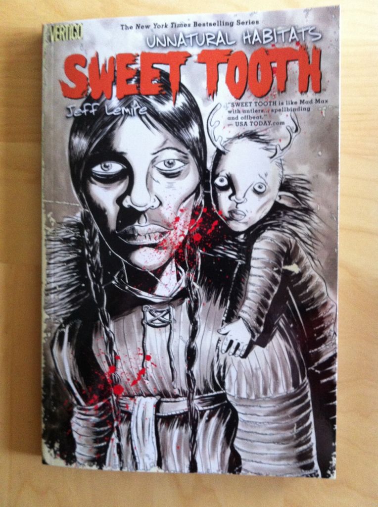
So I Read Sweet Tooth: Unnatural Habitats


A 250 word (or less) review of Sweet Tooth volume 5
By Jeff Lemire and Matt Kindt, Vertigo Comics


Sweet Tooth: Unnatural Habitats continues Jeff Lemire’s post-apocalyptic story about a mysterious plague decimating humanity and the emergence of mysterious animal-hybrid children. Specifically Sweet Tooth focuses on Gus, a teenage human-deer hybrid, and Jeppard, a hard man and consummate survivor, as they try to unravel the mystery behind the plague. Unnatural Habitats is split into two stories. The first, set in 1911, tells the tale of an expedition to Alaska to rescue Jesuit missionaries which uncovers a horrible secret. The second chunk of Unnatural Habitats returns the lens of the story to Gus and Jeppard and their journey to Alaska for answers. This part of the comic feels like the conclusion of the second act: it concludes a bunch of lingering storylines and seems to set the stage for the conclusion of the story. It’s a satisfying read that pays off a lot of what comes before. Something occurred to me while I was working my way through this chapter: the juxtaposition of cartoony, animal-children with all the bleak and monstrous things in Sweet Tooth is CREEPY. I mean, the expressionist artwork of Lemire and Kindt is expressive and uncouth enough to generate a metric ton of atmosphere alone, but render some adorable pig and deer kids and suddenly there is this uncomfortable dramatic tension between the grim reality of post-plague life and the optimism, potential, and innocence of children. It’s an effective storytelling approach. Anyway, Sweet Tooth: Unnatural Habitats is a great chapter in a great comic.

Word count: 248

Previously: