Or a look at colour tagging in Secret Avengers #4
by Ales Kot, Michael Walsh, Matt Wilson, and Clayton Cowles; Marvel Comics
I love the little details that make comics tick.
Sure, Secret Avengers #4 continues the super fun, crazy team Superhero espionage story that is, frankly, delightful to read. It also manages to take a very fun comic and add a layer of transgressive tension to the story that adds a substantial new dimension to the comic. It sets its story in Kowloon, which if you know nothing about Kowloon is a fascinating subject in its own right. So, sure, Secret Avengers #4 is a great comic for a lot of complicated, big picture reasons.
But instead of focussing on any of that, I'm going to highlight a little detail in Secret Avengers #4 that I think really enhanced storytelling in a subtle and clever ways.
There will be *SPOILERS* for Secret Avengers #4 within.
The story of Secret Avengers #4 finds Hawkeye (Clint Barton Hawkeye) and Nicholas Fury (the new-retconned in Nick Fury from the movies) lead a team of anonymous Shield Agents into the ghostly, manifested city of the demolished, lawless city of Kowloon in pursuit of the killer robot The Fury. The bulk of the issue revolves around Fury and Hawkeye with agents in small rooms searching for The Fury. To see in the dark Team Shield put on night vision goggles that emit a bright green glow.
The Fury, meanwhile is a big, lumpy black robot man-thing that is characterized by a distinctive cluster of orange-red lights on its... I want to say head.
What this means is that you can instantly keep all of the characters straight from the emission of their optics. Most of this comic takes place in a greyscale shadowscape where characters in various black and blue garments, many of whom are nameless and forgettable, sneak around. But, due to their green nightvision goggles, we readers can instantly tell, yep, those are good guys and not The Fury or random ghost-Kowloon denizens. It also instantly conveys any presence, no matter how periphery, of The Fury, since his red optics also stand out dramatically in the greyscale shadow scape. Which creates really great sequences like this where, silently, we can watch green-goggled-good-guys march into a room unsuspecting while the red-eyed-stare of The Fury tells us it is lurking in the background. Which is pretty clever.

And then there is this sequence. Fury (Nick) and Hawkeye (Clint) come up with a plan to catch The Fury (robot) that involves Hawkeye (Clint again) distracting the killer robot. He runs into an apartment, rides a ceiling fan, slides under a pursuing The Fury (robot) and then runs into Fury (Nick again). This is a sequence that is largely based on silhouettes in a dark room, in pretty tight, small panels. And yet, it is completely clear what is going on because all you really need is the blurred green and red lights of the characters optics. You can keep track of which silhouette is Clint and which is killer robot purely based on the bright smear of green and red. You can track the motion of each character by following the direction of the green or red glowing blurs. This is a beautiful example of how smart colouring can convey narrative information and how investing in this kind of colour tagging can really enhance all kinds of storytelling sequences within a comic.
Secret Avengers, big crazy awesome espionage comic that does some cool stuff with goggle colours.
Previously:
Secret Avengers #2-3: Smart layouts.
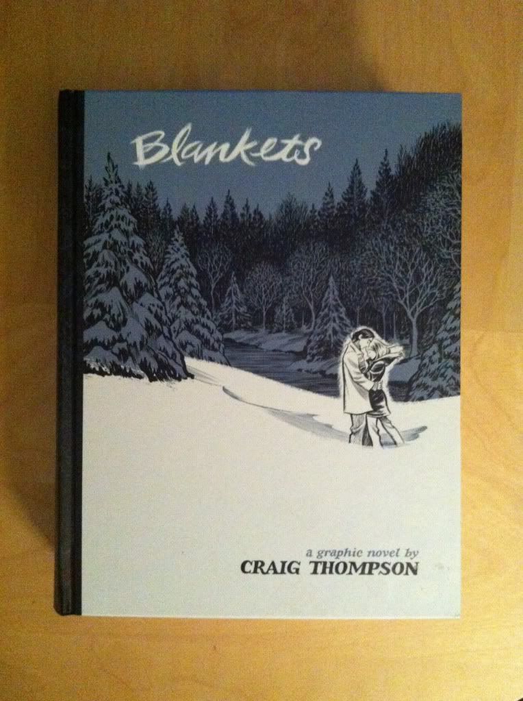
Or how everyday events are elevated in clever ways in Blankets,
by Craig Thompson; Top Shelf Productions
Blankets is an autobiographical comic about its author Craig Thompson. It tells the story of its author falling in love as a teenager, his struggles with fundamentalist christianity, and his rough, abusive childhood. It's a very, very well crafted comic that weds a really beautiful and fascinating artistic approach to a really personal and bravely told story. It's also a comic that I have some reservations about how myopic and self-centred it is: the story is ABOUT CRAIG and really fails to reckon with the fairly shitty way he interacts with a lot of characters and some of the gross attitudes he displays. Blankets is a comic that is spectacular and flawed, in a way that is, I think, deeply entrenched in the nature of its autobiography.
The one thing I am unambiguously in love with about Blankets, though, is how wonderfully the artwork captures the giant scope of remembered emotion.
To explain what I mean by this, I'm going to get Sciencey and wishy-washy for a bit. But, for people who want to make with the comics, TLDR: Old memories mutate and become exaggerated emotionally. I think.
Alright, so here goes. Memory is an imperfect machine. When forming memories we mash sensory inputs against the conceptual/emotional framework of our mental processing and create an interpretation of events which we then store in our brain as a memory. What this means is that the original copy of our experiences is shaped by a ton of brain conjecture and elements of other existing memories. So these original memories operate as painted representations of events instead of literal records of what happened. Which means that no memory is perfect, they all begin distorted by emotions and shaped by perception. And this is a feature that only gets worse. Every time we remember memories we change them a little and add new associations with other recollections and new emotions to the mix (the Science of this seems to be that the physical cellular machinery involved in memory goes from a static storage state, to a plastic readable state and that there is a certain amount of data slippage). It's.... like how files stored on a computer warp, and degrade a bit with every copy or read... but in your brain. Now, this is just me waving my hands around, but, it seems to me a major feature of this memory alteration is that memories become exaggerated: that the key features (the weightlessness of falling out of a tree) are expanded with each remembrance (that falling sensation becomes more important and central to the moment than the desperate grab for the branch of the bone breaking impact of the ground) and the whole memory is contaminated with extra emotions (a fundamental dread and sense of being overwhelmed that usually triggers that memory) and you are left with a much different memory (a fall that lasts so much longer, thats so much more filled with dread than the actual second or two of hang time ever was). It becomes a caricature of the original memory that is simplified and exaggerated to be a certain representation of a thing more than the event it originally was. If that makes sense.
My point here, is that my earliest memories of puppy love and childhood misadventure are clouded by huge emotions and a... certain looseness with the actual reality of what happened. I feel these memories more than I remember them,
Blankets, does a really, really good job capturing just this effect in comics form to create emotionally evocative panels that resonate with my own personal sense of nostalgia.
There will be *SPOILERS* for Blankets in the rest of this post.
This panel of Craig and his brother's abusive father is a great example of this.The way he looms, gigantic over the tiny frightened boys, his words giant and bolded in a panel weighted by fury, absolutely captures the emotion of powerlessness you have as a child in the face of a frightening, adult authority figure. It's the feeling of being tiny, facing impossible odds made literal in comics form.
I can guarantee that this event, as it actually happened did not look like this: Craig and his brother did not shrink in face of their angry father and their father did not really Hulk out. Instead this drawing, instead of being a literal representation is the EMOTIONAL representation of the moment. And because it nails it so perfectly, I am left feeling the smallness of when my own furious parents scolded me as a child.

Here is another emotion evoking, magic panel. On this page the various christian teens at the fundamentalist camp Craig is sent to all join in song while Craig does not. Craig doesn't sing because he doesn't buy into the community spirit of the camp and because he just doesn't like to sing. And to be the person on the outside, particularly in a community activity like song, is a fantastically shitty feeling. This panel absolutely catches this feeling by depicting Craig apparently collasping in anguish, unnoticed as the song joins everyone else together and elevates them. Again, while it's not literally what happened, it perfectly catches the emotion of the moment. As a dude who hates singing, I cringe just looking at it.

This panel shows Craig and Raina, his love interest, in a quiet intimate moment. The two have found a hidden refuge under a game machine in the camps bustling arcade. Sheltered from the crowds and noise of the camp Raina curls up to nap and Craig protectively watches over her. (Sleep being this fuzzy-virginal pure version of intimacy between the two.) This panel is great because it depicts the world falling away, leaving this perfect little moment of privacy, comfort, and togetherness that perfectly captures that feeling of staying up all night with a crush gabbing on the sidewalk or cuddled up on the couch with your spouse. It's pretty great.

This page here is a really interesting example of the evocative artwork in Blankets. While many of the best examples (including the other ones I picked) work their magic by bending the bounds of reality to emphasize certain aspects of the composition, this page focuses on certain senses to beautifully call up memories. This page takes place just after Craig and Raina enjoy a makeout session that comes as close to sex as any interaction they have. The pair, still somewhat undressed, fall asleep in each other's arms. This panel focuses on the sensations of breathing and heart sounds, which are such intimate, private noises that work together to take me back to when sleeping in the same bed as a romantic partner was wonderful and new (and not pleasantly comfortable and a ritualized form of blanket possession combat). It's a wonderfully composed panel, and just such an astute use of non-visual information to be nostalgia inducing.
And this is what I love about Blankets: for all of its problems, Blankets is one of the best comics I've read for evoking memory associated emotional responses and generating nostalgia. It's a comic I recommend, you will enjoy the artwork, and there is a lot to learn and appreciate from it.
Previously:
So I Read Blankets
A 250 word (or less) review of the Blankets graphic novel
by Craig Thompson; Top Shelf Productions
I
think autobiography is a tricky to pull off. The truthiness of the biography,
the dramatic narrative, and the very personal relationship between the author and
reader must all balance. And, if nothing else, autobiography is an act of
amazing bravery and incredible hubris. Blankets is an autobiographical comic
by Craig Thompson about his first highschool love and his difficult family
life. It tells the story of a glorious two-week trip to visit
"Raina", the first love of his life, as he struggles with a past
shaped by fundamentalist Christianity, poverty, and abuse. It's a very well
crafted comic with a solid central narrative and some really adept, gorgeous
artwork. Thompson does a magnificent job elevating everyday occurrences with
clever comics and elaborate designs. Blankets is also supremely evocative: it
takes me right back to my own highschool views and my first puppy-love romance.
But this is, I think, where Blankets loses me... it reflects teenage
self-involvement, a kind of idealized objectification of women, and a certain
lack of compassion that is all treated with, perhaps, a lack of self-awareness.
Blankets, instead of awakening feelings of nostalgia, just makes me uncomfortable.
I mean, it's a remarkably beautiful comic and an act of bravery, but this is
balanced by its egocentrism and borderline myopia. Maybe I am just projecting my own
insecurities, but I'm not sure I can unequivocally recommend this comic.
However, I feel like the quality of the sequential art and the personal experience
are probably worth a look.
Word
count: 250
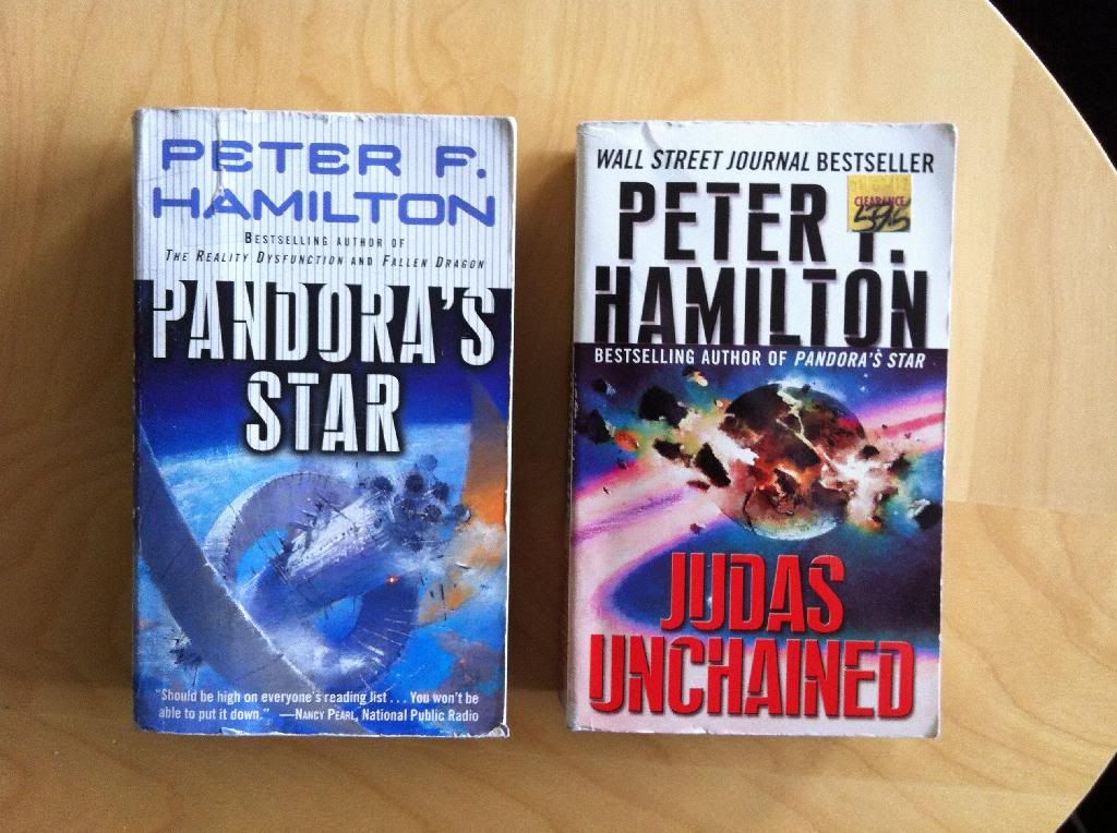
Or some thoughts on why you could read Commonwealth Saga by Peter F Hamilton
When I was a strapping young lad (hopelessly dorky teen) I went through a phase where I read mainly Star Wars novels followed by a phase were I read nothing but pulpy Fantasy novels. It was a random trip to the local library and a novel chosen there that sent me back into Science Fiction and made me a life long fan of the genre. And that book was Pandora's Star.
I recently decided to reread Pandora's Star and its sequel Judas Unchained. Together these novels tell the story of humanity, about three hundred years in the future, after the discovery of wormhole technology and indefinite life-extending technology. In this future, humanity has formed an interstellar commonwealth of planets linked by wormholes carrying trains which is run in a sort-of democratic manner in a pretty status quo way. So the vast majority of humanity lives more or less peacefully, coexisting with a few alien species, under the fairly benevolent rule of an oligarchy of immortal humans. That is until a pair of distant stars disappear instantaneously, launching an investigatory mission that will have dire repercussions for all of humanity and shed light on a dangerous force within the Commonwealth.
Pandora's Star and Judas Unchained, collectively, the Commonwealth Saga, are a Space Opera. Which is a form of Sci-fi characterized by EPIC storytelling with a broad lens catching multiple settings, dozens of characters, and sweeping stakes. They also tend to be looong books: the Commonwealth Saga, all told, weighs in at about 2000 pages which makes it a pretty substantial piece of writing. We are talking about so much book.
There is a lot to like about Pandora's Star and Judas Unchained. Hamilton really creatives a vivid collection of worlds and lays out a thoughtful long stakes plot with oodles of exciting action. The story structure is pretty great too: the way these novels weave and balance radically different story threads to tell the larger story is quite impressive. Hamilton plays the long game and some of the payoffs are spectacular. The Sci-fi in the novel is pretty fun too: an interstellar civilization that runs on train tables is charming, and a society of immortal humans is pretty interesting. I can still see elements of the novel that as a teen I thought was a glorious beacon of mature, contemporary Science Fiction.
The trouble is Pandora's Star and Judas Unchained are horrendously sexist. The way these novels treat women is startlingly toxic. Part of it are these weird burps of condensed misogyny, like every ambitious career driven woman in the novels gets described as a ballbreaker. (Top tip: if you have one male character you want to portray as a sexist jerk have him call a woman a ballbreaker, but if you have more than two dudes call two or more women ballbreakers than YOU the author look like the sexist jerk.) But there is also pervasive systemic gender problems throughout the novel. So many women characters function as wish fulfilment engines for men as much as they do characters. One of the most significant female characters in the book is particularly used as a sexy-fantasy machine: she is basically an idealized nymphomaniac who runs around pleasing men and is literally prostituted in ways that deny her any real agency. It's endlessly fucked up. And it's also really stupid: the way these books approach human personal and sexual relationships has the nuance and depth of my fifteen yearold self's limited imagination (and he was a horny idiot). So any sexual thing in these books ends up being deplorable AND silly and boring. The whole thing is really disappointing and like a textbook definition of the patriarchy.
(The Patriarchy: Horrible to women and boring in bed.)
Incidentally, The Commonwealth literally has "fathers" in the book.
I have a litmus test for fiction that I call the Fraser test after one of my best friends who is a giant Sci-fi fan and a very savvy feminist. The test is basically, can I lend this book to an intelligent woman without the contents of the book offending her. And Pandora's Star and Judas Unchained both massively fail this test: I could never give these books to a woman without being hugely embarrassed by the shameful way they treat women.
(There is a game called Sci-fi apologetics, where you take something stupid, or problematic in a Sci-fi story and assume it's that way for a reason internally consistent with the setting. For the Commonwealth Saga one could argue that the rampant sexism and secret ruling class of hyper-rich industrialists is a consequence of indefinite life extending technology. Without death to weed out the bigots and gender creeps society becomes static and can't evolve past sexist malarky. Similarly, a lack of death allows the wealthy to accumulate more and more wealth to the point where of course the rich secretly rule everything. You could basically read these novels as a dystopian epic about static societies in a world without death.)
So can I recommend this book? Well, I think it's a shitty book to read if you are a woman, so I think this HALF OF HUMANITY is better served with less outrageously offensive books. And since I can't recommend this book to half of the human race, really, I shouldn't be recommending this book to anyone. There are better written, smarter Sci-fi books out there that don't treat people like shit. You should probably read those books instead.
I was honestly really disappointed by these novels: I mean, I can still see the skeleton of the books that blew me away as a teen, but there is just so much stupid, obnoxious crap in there I couldn't seriously enjoy them. It is crazy to me that these books meant as much to me as they did.
It's always sad when your heroes turn out to be frauds.
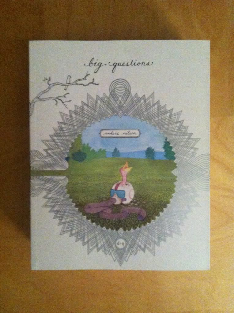
Or some thoughts on the syle of Big Questions
By Anders Brekhus Nilsen; Drawn & Quarterly
Big Questions is not the kind of comic I would normally pick up. It's the size of a phonebook, carries a fairly hefty price tag, is by an artist/writer I'm unfamilair with, and at first glance is the kind of fussy art/literary comic that I sometimes find hard to enjoy. (What can I say, I'm a dyed in the wool genre kid.) But when I asked my best friend what literary comics I should try, she recommended Big Questions as a comic I absolutely had to read.
There will be mild *SPOILERS* for Big Questions in this post.
Big Questions is drawn in a very minimalistic way. The comic features a flock of finches developing belief systems to interpret the world around them, particularly when the human world intrudes in unexpected and dangerous ways. The artwork that tells this story is this deceptively simple, open, black and white world full of empty spaces, with lightly defined features and populated with charismatically simple characters. At first glance it looks almost like a rudimentary comic.

But the thing that emerges from this seemingly simple artwork is just how clear the storytelling is. For being (and this is exaggeratedly unfair) a comic of crudely drawn birds in poorly defined environments, the narrative chops on display are immense. The simple birds emote, the minimalist backgrounds become expansive and bleak, and the overall flow of the narrative from panel to panel is perfect. Instead of coming off lazy and crude, the artwork in Big Questions emerges as elegantly designed and environmental in its yawning repetition.

Then there are pages like this. Just look at it! This is a page of a nonchalant idiot reflected on the engine cowling of a crashing airplane as it zooms past. And it is beautiful, and haunting, and crazy! This is one of the most interesting and exciting panels I've experienced in comics: it's drawn with such a masterful and haunting composition. It's basically perfect. And it's contrasted against the elegant simplicity of the majority of the comic so that this image just carries so much more weight. It's fantastic comics.
Big Questions is a comic that has a really fascinating, philosophical story and despite its deceptively simple art style offers some remarkable storytelling and some draw dropping exclamation mark moments. You really ought to try it out.
A 250 words (or less) review of the Big Questions graphic novel
by Anders Brekhus Nilsen; Drawn & Quarterly
There are certain questions that have plagued the greatest human thinkers throughout history. What is the meaning of life? Is there a god? How can happiness be attained? Where are these delicious donut crumbs coming from? Big Questions is a comic about a flock of tiny grey finches struggling to interpret existence as a violent human world intrudes. It's a comic filled with, well, big questions asked by charismatic little birds as they face tragedy and try to explain inexplicable new events in insightful and unexpected ways. Big Questions is a philosophical textbook presented in a charming, accessible story filled with humour, unexpected violence and horror, and the breadth of life. The artwork of Big Questions is absolutely beautiful: a deceptively simple style that is at once childlike and ghostly stark. This is a graphic novel of immense craftsmanship filled with tiny-bird-grafted humanity and some truly profound thoughts and moments. If you have ever stared up at the sky and wondered what the point of it all is, this is a comic you ought to read. If you just like perfectly crafted and original comics, this is also a must read. Because it is perplexing great comics.
Word count: 197
Or some pretty excellent onomatopoeia in Daredevil #3
by Mark Waid, Chris Samnee, Javier Rodriguez, and Joe Caramagna; Marvel Comics
Daredevil is one of the most consistent comics in my top ten: it is always good. The stories from are fun and exciting and usually revolve around some thematic aspect of Daredevil's blindness. Couple that to some of the clearest storytelling in comics from Samnee and Rodriguez, and Daredevil just does not disappoint. One of my favourite things about Daredevil, is how the creative team works to represent Daredevil's powers in really interesting and innovative ways with topographic radar vision and some really adept use of onomatopoeia. Daredevil #3 has some really great examples of the use of sound effects I'd like to take a closer look at.
There will be *SPOILERS* for Daredevil #3. Typey typey type.
Usually I'm not a terribly big fan of onomatopoeia in comics (or typing it). When done poorly, it can look tacky and be a distraction from the dialogue and the acting in the panels... it's extra telling instead of showing. But in Daredevil it's just so thematically appropriate and handled with such skill that I kind of love it. From the blocky mechanical lettering of the gun action noises to the long, bright green arc of the whistle (itself dragging attention to Matt like a real life whistle) to the italicized, shakey sound of the phone vibrator, to the panel commanding in-your-face size of the SLAM, to the low-to-ground progression of the stomping, it's all perfect. In each instance the location, shape, size, and font of the lettering captures the emotional feeling of the sound. It really adds a lot to the comic.

While this is not onomatopoeia, per se, it's in a similar vein and I love it. The sort-of dialogue box with the deathstare symbol really captures the emotional weight of getting eye-knives thrown at you. A properly good glare is able to convey, non-verbally, a paragraph of information and the decision to give the glare here a dialogue box is very cognizant of this. A top-level deathstare also doesn't feel like just a person glaring at you, it feels like an entire universe of negative attention directed your way. So I think it's really adept that the deathstare logo means that Foggy is caught in the crossfire of two glares. The jolly-roger glare is such a small choice, but it really makes this panel and character interaction work for me.

But this, this is my favourite bit of onomatopoeia in the entire issue of Daredevil #3. I had previously written a big long thing about why the ECG squiggle that is synonymous with heart sounds in comics bugs me because it's actually a symbol of the electrical signalling of the heart and has nothing to do with sound. It especially bothered me because hearts have a characteristic "lub dub" sound, so there really is no need to use the ECG squiggle (it's like using beep-beep-beep sounds instead of heart sounds in a film). But, since the ECG squiggle is so synonymous with heart rate in comics these days, as a symbol that conveys meaning its pretty important. What I LOVE about this onomatopoeia here is that it synthesizes the sound and the squiggle to create a new symbol that is based on sound of a heart beat but still has the ECG symbol that readers know means heart stuff. It's the perfect solution to my comics pet peeve and I fucking love it.
(Incidentally, I would love to know if Team Daredevil read my previous essay on heart sounds and if that had anything to do with the change in heart sound symbology. I'm going to have to go shopping for my next Science gig in the next year and think it would be super fun to have that on my CV...)
Previously:
Describing Daredevil 34: before and after
Describing Daredevil 33: condensed motion
Describing Daredevil 30: the vectors of artwork
Describing Daredevil 29: A great page