Or the moment that destroyed me and its historical context in The Manhattan Projects: Volume One
By Jonathan Hickman, Nick Pitarra, and Jordie Bellaire; Image Comics
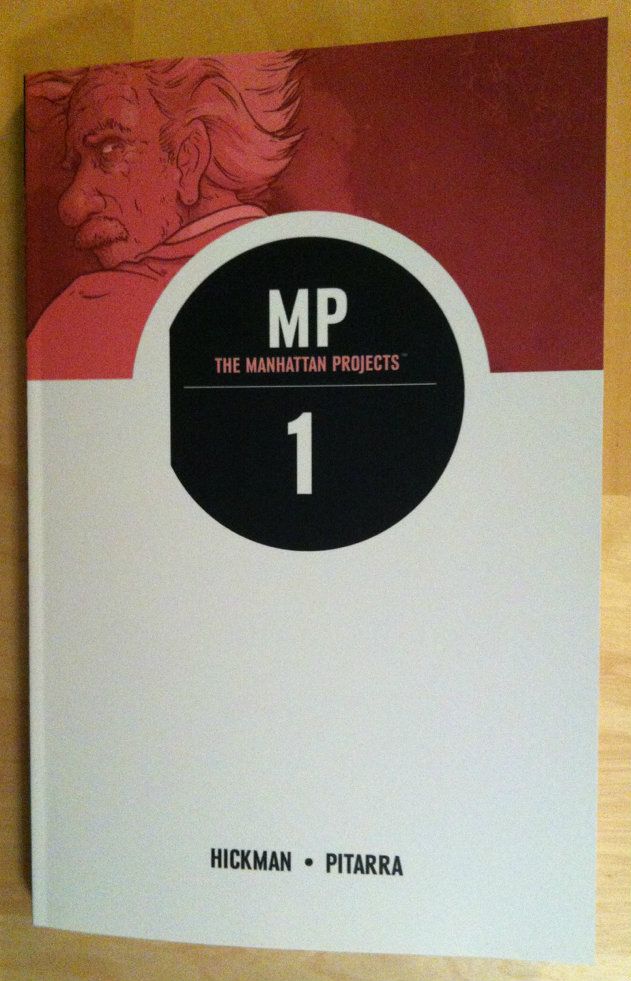
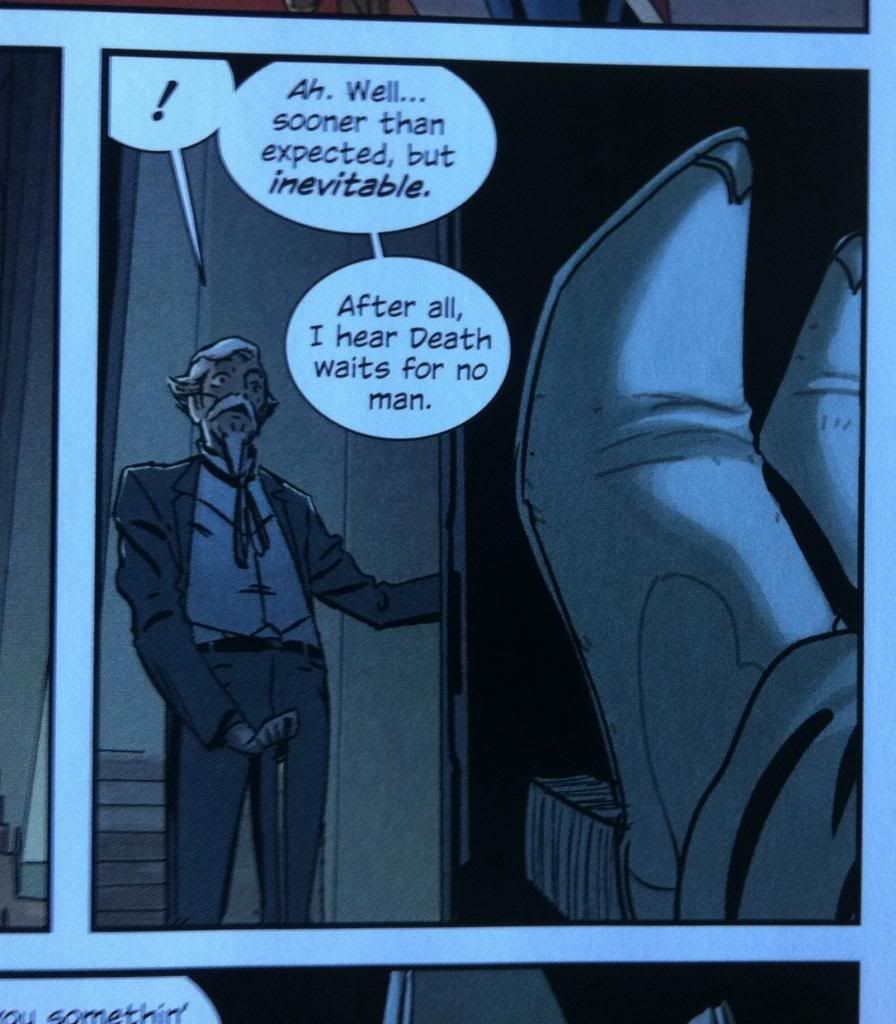
Before The Manhattan Projects took a sharp turn to completely fantastical, gruesome Mad Science, it briefly flirted with the real life history of The Manhattan Project and the development and deployment of the Atomic Bomb. The chapter of Volume One, The Bomb, which tells an alternate story of bombing Hiroshima, is one of the most tense, arresting single issues of comics I have ever read: the way it plays with true history and the bizarre carnival mirror of the comic is profound and horrifying and a thought provoking look at the intersection between Science/Technology and Society/Politics. (You really ought to read it; if I were teaching a Philosophy of Science class I'd make my students read it.) That said, there is a single moment in tThe Bomb that is so rip-out-your-heart perfect that I still think about it more than a year after reading it. And I would like to explain why.
This post will have *SPOILERS* for Manhattan Projects: Volume One. Be warned.
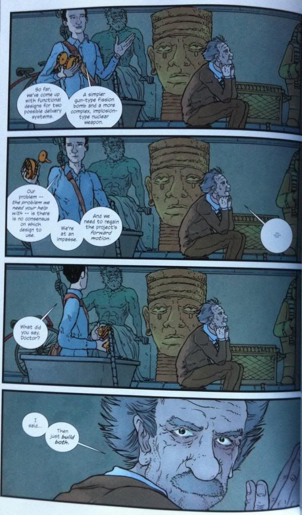
In this sequence amoral-mirror-Richard Feynman goes to evil-parallel-universe-doppleganger-Albert Einstein with the engineering question of whether the Manhattan Projects should focus on constructing a relatively simple "gun-type" nuclear fission bomb, or a more complex "implosion-type" device. The part of this that resounds with me and absolutely guts me, is that not-Einstein replies simply that they should "just build both".
Which is just so completely fucking, oh my god brilliant and awful and perfect.
Because the real-life Manhattan Projects really did build both.
The thing about nuclear bombs is that they are perversely simple. For a nuclear fission explosion, all you need is enough stuff, a sufficiently massive lump of high purity fissionable material will undergo a runaway nuclear chain reaction and explode. So all a nuclear fission device is, is a machine that takes a chunk of radioactive material which is too small to have this exponentially growing nuclear reaction and pushes it over the mass threshold needed to explode. The simplest way to do this is to hold two chunks of fissionable material apart, and then rapidly stick them together to make a big enough chunk to blow up. And this is literally what a gun-type device is.
The real challenge of nuclear bombs is the fuel for the explosion. Naturally occurring high quality fissionable material is exceedingly rare, and even then the most reactive isotopes have to be painstakingly separated from slightly more common less or un-reactive isotopes. Many of the better nuclear fuels are not naturally occuring in sizeable amounts and have to be produced in labs, usually using other nuclear reactors. (Incidentally a bunch of super important medical isotopes are becoming increasingly rare as many countries shut down their reactors.) So the real life history of The Manhattan Project is shaped by the history of the production and availability of high quality radioactive isotopes.
Initially, the project lacked sufficient pure radioisotopes of any kind of fuel to build any type of bomb. However, the project did have access to naturally occurring Uranium from a variety of mines and over time developed the a technique to separate desirable Uranium-235 from the inert, majority Uranium-238. This meant that The Manhattan Project had the capability to construct an enriched-Uranium nuclear device. Because the The Manhattan Project was in a rush to build atomic weapons to use in the war, they opted to keep it simple, and build a gun-type device that shoots a small chunk of U-235 into a larger chunk to set off an explosion. This is the first bomb they built called the Thin Man and later, The Little Boy.
However, during development of this first bomb, a new, better fuel source, Plutonium, became available. While The Manhattan Project was developing the bomb, another portion of the project was developing nuclear reactors. Some nuclear reactors make, as a byproduct of fission, plutonium, which is a higher energy fissionable material and so useful amounts of Plutonium became available to The Manhattan Projects. (Science brag: Ive held a warm sphere of lead lined Plutonium in real life.) However, Plutonium did have one other problem: it was too reactive to be used in a gun-type device. A gun-type Plutonium device would "fizzle" by tearing itself apart before a significant amount of the bombs fuel could be reacted, and so the device would lead to a much smaller explosion. And so the real-life Manhattan Project was forced by engineering reasons to develop an implosion style device that basically crushed a ball of Plutonium into a dense enough ball to set off an exponentially growing nuclear reaction and explosion. Trinity and The Fat Man were this type of bomb.
The thing is, this device was, by comparison to the gun-type device, super complicated so The Manhattan Project was not willing to suspend the development of the simpler Uranium gun-type device. So in the end, they built both a gun-type bomb and an implosion-type bomb.
And then they fucking used both.
The bomb the US dropped on Hiroshima Japan was The Little Boy, a uranium gun-type device. The bomb they dropped on Nagasaki three days later was Fat Man, a plutonium implosion-type device. In real life, they built both types of bomb and USED both types of bomb.
And that is at once a perfectly logical, practical Science and Engineering decision and excruciatingly horrifying.
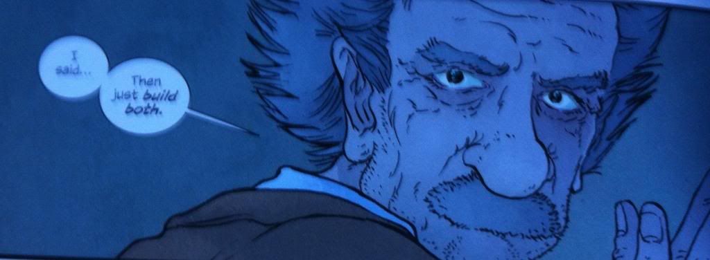
With this real life context, this line by evil-Einstein is just so perfect and so completely awful. This moment encapsulates the mercenary practicality of the decision to develop both devices, the near sociopathic disregard for the consequences of this choice, and the inevitable finality of this decision. It's a carnival mirror reflection of the frigid, inhuman extremes of Science and Engineering.
And so it sticks with me.
Previously:
The Manhattan Projects: Volume 1
The Manhattan Projects: Volume 2
Monday, 19 May 2014
Friday, 16 May 2014
Deep Sequencing: An Atomic Robo Timeline pt. 3
Or an update to my graphical timeline of the first 5 Atomic Robo collected editions.
By Brian Clevinger and Scott Wegener; Red 5 Comics
Atomic Robo is the fantastic, funny comic about, well, Atomic Robo, the adventuring Action Scientist invented by Nicola Tesla. It's an infectiously fun to read comic that is also constructed in really smart, really unorthodox ways. One of these interesting creative decisions is how Atomic Robo uses time.
A lot of comics, particularly the more superhero-y comics have a weird relationship with time. For the most part time in these comics time is squishy, where publication order does not equate to narrative order and Batman is perpetually the same age despite having stories clearly set in multiple decades. In these comics time is less about an exact measure of time than a... kind of inconvenient medium that events pass through.
Atomic Robo, which is a comic about an ageless robot going on Science Fantasy adventures, has really rigorously annotated time settings. Nearly every story not only has the year it is set in, but even the month and day. As a result, the Atomic Robo comic works like a kind of time capsule of human history during the century (and counting) of Robo's life. It makes for neat settings for stories and a fun look at cultural differences through time.
But beyond being a nifty setting device, this thorough chronicling of time demands a 100 year long giant graphical timeline. So, I've made one, and will update it whenever I finish another Atomic Robo comic.
This is Version 2.0 of my Atomic Robo Timeline. Basically, I thought my old timeline was kind of ugly and rushed, so I spent some time making one that is a lot easier to read/better looking. (There was also a hilarious mistake in the old version: Professionalsim!) The added entries are for the years 1930, 1931, 2011, 2021.
There will be mild *SPOILERS* in the timeline. Also, there is an up-to-date text based timeline on the Atomic Robo website. So this might be kind of redundant.
Timeline legend:
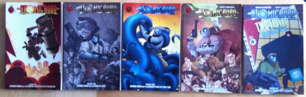
Vol. 1: Atomic Robo and The Fightin' Scientists of Tesladyne
Vol. 2: Atomic Robo and The Dogs of War
Vol. 3: Atomic Robo and The Shadow From Beyond Time
Vol. 4: Atomic Robo and Other Strangeness
Vol. 5: Atomic Robo and The Deadly Art of Science
By Brian Clevinger and Scott Wegener; Red 5 Comics
Atomic Robo is the fantastic, funny comic about, well, Atomic Robo, the adventuring Action Scientist invented by Nicola Tesla. It's an infectiously fun to read comic that is also constructed in really smart, really unorthodox ways. One of these interesting creative decisions is how Atomic Robo uses time.
A lot of comics, particularly the more superhero-y comics have a weird relationship with time. For the most part time in these comics time is squishy, where publication order does not equate to narrative order and Batman is perpetually the same age despite having stories clearly set in multiple decades. In these comics time is less about an exact measure of time than a... kind of inconvenient medium that events pass through.
Atomic Robo, which is a comic about an ageless robot going on Science Fantasy adventures, has really rigorously annotated time settings. Nearly every story not only has the year it is set in, but even the month and day. As a result, the Atomic Robo comic works like a kind of time capsule of human history during the century (and counting) of Robo's life. It makes for neat settings for stories and a fun look at cultural differences through time.
But beyond being a nifty setting device, this thorough chronicling of time demands a 100 year long giant graphical timeline. So, I've made one, and will update it whenever I finish another Atomic Robo comic.
This is Version 2.0 of my Atomic Robo Timeline. Basically, I thought my old timeline was kind of ugly and rushed, so I spent some time making one that is a lot easier to read/better looking. (There was also a hilarious mistake in the old version: Professionalsim!) The added entries are for the years 1930, 1931, 2011, 2021.
There will be mild *SPOILERS* in the timeline. Also, there is an up-to-date text based timeline on the Atomic Robo website. So this might be kind of redundant.
Timeline legend:
Vol. 1: Atomic Robo and The Fightin' Scientists of Tesladyne
Vol. 2: Atomic Robo and The Dogs of War
Vol. 3: Atomic Robo and The Shadow From Beyond Time
Vol. 4: Atomic Robo and Other Strangeness
Vol. 5: Atomic Robo and The Deadly Art of Science
Previously:
Wednesday, 14 May 2014
So I Read Atomic Robo And The Deadly Art Of Science
Or a 250 word (or less) review of Atomic Robo Volume 5
By Brian Clevinger and Scott Wegener; Red 5 Comics
Atomic
Robo remains my favourite mostly-all-ages adventure comic: there is just
something about a hilarious sass-mouthed robot (invented by Nikola Tesla) doing
Action Science that is endlessly fun. Atomic Robo and the Deadly Art of Science
is set in 1930 and follows a young, inexperienced Atomic Robo as he grows bored
assisting an elderly Tesla and forces himself under the wing of
vigilante/gunfighter Jack Tarot. Together, with Tarot's beautiful daughter
Nightingale, they must solve a string of inexplicable Science and occult
thefts. One of the coolest aspects of Atomic Robo is that the entire story
universe takes place in a very granular, linear timeframe. This gives the
series access to a variety of settings and a character that actually develops
and matures. I mention this because the magic of Atomic Robo and the Deadly Art
of Science comes directly out of this: the pulp detective story set in the
great depression is super fun, and young Robo, with his naiveté and boundless
enthusiasm is hilarious and charming. The result is that Atomic Robo Vol. 5 is
(bearing in mind that I’ve really enjoyed all of Atomic Robo to this point) an
especially enjoyable chapter. It’s actually, despite being the fifth
volume, also one of the most accessible chapters and therefore might be a good
volume to see if Atomic Robo is a comic worth further exploring.
Word
count: 226
Previously:
Monday, 12 May 2014
Anathem Is A Good Book
Or why you should read Anathem by Neal Stephenson
Finding a favourite novel is an intensely personal experience. People, all of us, are these exquisitely complex beings made of the interplay of nature (genetics, epigenetics, poorly understood other-RNA-stuff, regulatory protein behaviours, etc) and nurture, that unique set of environmental conditions and experiences that shaped our biology until we end up who we are. We each, as a result, carry our own spectrum of interests and hobbies and experiences which in turn act as the masonry of our perspectives. And so we are all primed to experience, well, everything but for the sake of this: fiction in radically different ways. Which is all a long winded way of getting at the idea that finding that perfect novel, that matrix of ideas and themes and story that just ineffably and perfectly connects to us, is this incredible accident of... for lack of a better way to put it, alignment that it is a kind of magic.
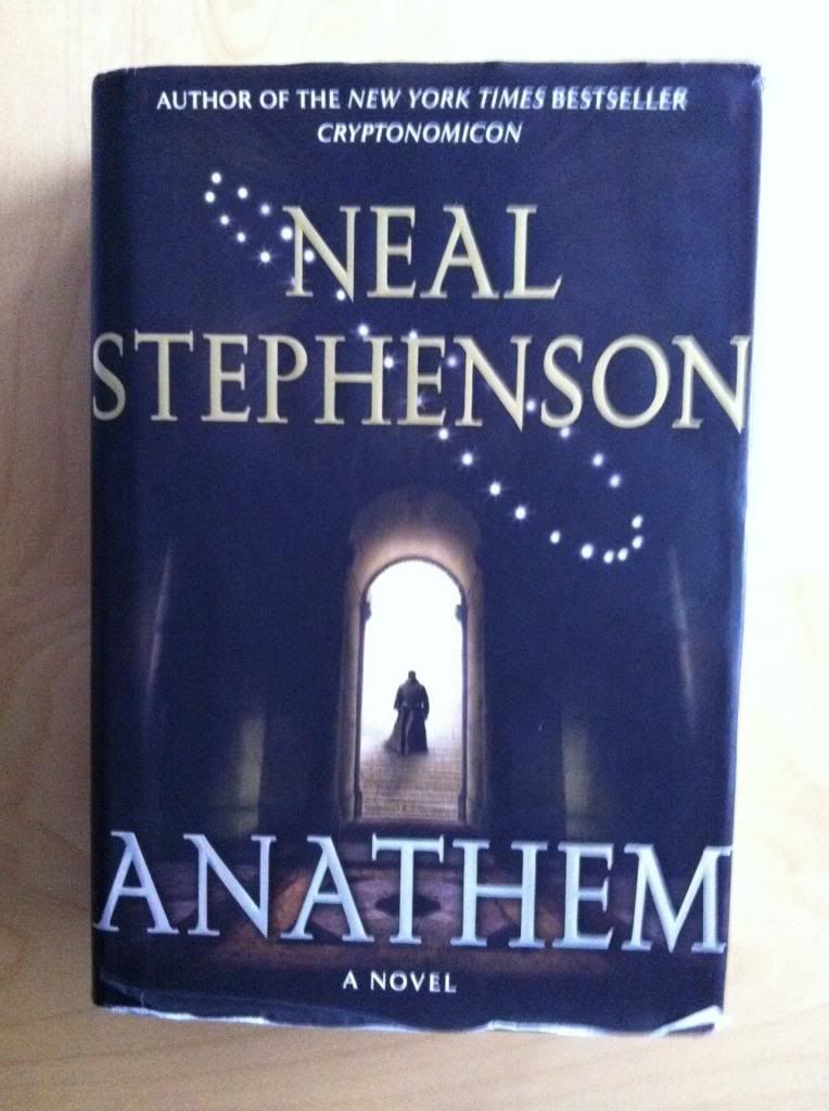
Anathem by Neal Stephenson is maybe my favourite novel.
Anathem is a difficult book to talk about from a plot perspective since so much of its power revolves around the act of discovery. It is very much a novel that throws you into a new world and walks the perfect line between providing enough exposition to understand the context of the fiction, while also leaving subtext open to interpretation, deduction, and theorizing. Anathem is a story about exploration and discovery where is also along on a journey of exploration and discovery. Which is pretty great.
What I can say about the the story of Anathem is that it takes place at a time when society is split between the general population, the saecular world, and the world of academia, The Mathic world. Essentially, in Anathem, academia, particularly science academia, has been literally walled off from everyone else in monastery like cloisters called Concents where they practice a humble ascetic lifestyle and pursue their studies with the limited tools allowed them. These Concents are also divided within themselves with gated quadrants, called Maths, that only open annually, once a decade, once a century, or once a millenia with each group kept seperated from the larger society as well as one another. Anathem focuses on Erasmus, a young Fra in the Decenarian Math of the Concent of Saunt Edhar on the cusp of adulthood and choosing his special area of study. However, this is thrown out of order when his teacher, the astronomer Orolo, makes a startling observation shortly before Apert, when the gates between the Decenarian Math and the Saecular world are due to briefly open. An observation with great implications for both the Mathic and Saecular worlds that promises great discovery and threatens far reaching discord.
(Which maybe sounds a little dry, but trust me, there is adventure and romance and action to be had amongst the smart stuff.)
The reason why this novel might be my favourite is that I find it both eminently relatable and deeply fascinating from a thematic standpoint. For all of the Science Fiction particulars and story developments, Anathem is also a very thorough and thoughtful meditation on the Philosophy of Science and the relationship between Society at Large and Academia. The Mathic world functions as this amazing metaphor for Science Academia, and is used in the novel as a machine to explore the formative norms of the Science as well as the complicated, fraught relationship between ordinary people and Science Academics. As a dude in the midst of a PhD in the Life Sciences who has an extremely wankery fascination with how Science functions as a philosophy and the history of Science I find this super cool. Which makes this book immently relatable and endlessly fascinating to me. As great and engrossing a story as Anathem is, I just absolutely love this aspect of the novel. It feels like Anathem was written just for me.
I would recommend this book for me: it is the perfect alignment of my interests with a fantastic story. It's absolutely perfect for me. Can I recommend it for other people who are not me? Well, it's hard to say. It's a very well written book with rich characters, some great high concepts, and a really epic plot. And the way it opens up as a process of discovery is just incredible. But Anathem is also a very long novel (~900 pages) and can get pretty conceptually dense at times. While it was an investment in time for me, it felt effortless and breezy... but I'm me and I love this book. It is very hard for me to be objective about Anathem, but I'd say if you are a Science student who likes Sci-fi you will certainly enjoy the novel. Anathem would also be a good call for any fan of Neal Stephenson or anyone who likes well written, wicked smart, contemporary Science Fiction.
Previously:
Snow Crash and Diamond Age
Reamde
Finding a favourite novel is an intensely personal experience. People, all of us, are these exquisitely complex beings made of the interplay of nature (genetics, epigenetics, poorly understood other-RNA-stuff, regulatory protein behaviours, etc) and nurture, that unique set of environmental conditions and experiences that shaped our biology until we end up who we are. We each, as a result, carry our own spectrum of interests and hobbies and experiences which in turn act as the masonry of our perspectives. And so we are all primed to experience, well, everything but for the sake of this: fiction in radically different ways. Which is all a long winded way of getting at the idea that finding that perfect novel, that matrix of ideas and themes and story that just ineffably and perfectly connects to us, is this incredible accident of... for lack of a better way to put it, alignment that it is a kind of magic.
Anathem by Neal Stephenson is maybe my favourite novel.
Anathem is a difficult book to talk about from a plot perspective since so much of its power revolves around the act of discovery. It is very much a novel that throws you into a new world and walks the perfect line between providing enough exposition to understand the context of the fiction, while also leaving subtext open to interpretation, deduction, and theorizing. Anathem is a story about exploration and discovery where is also along on a journey of exploration and discovery. Which is pretty great.
What I can say about the the story of Anathem is that it takes place at a time when society is split between the general population, the saecular world, and the world of academia, The Mathic world. Essentially, in Anathem, academia, particularly science academia, has been literally walled off from everyone else in monastery like cloisters called Concents where they practice a humble ascetic lifestyle and pursue their studies with the limited tools allowed them. These Concents are also divided within themselves with gated quadrants, called Maths, that only open annually, once a decade, once a century, or once a millenia with each group kept seperated from the larger society as well as one another. Anathem focuses on Erasmus, a young Fra in the Decenarian Math of the Concent of Saunt Edhar on the cusp of adulthood and choosing his special area of study. However, this is thrown out of order when his teacher, the astronomer Orolo, makes a startling observation shortly before Apert, when the gates between the Decenarian Math and the Saecular world are due to briefly open. An observation with great implications for both the Mathic and Saecular worlds that promises great discovery and threatens far reaching discord.
(Which maybe sounds a little dry, but trust me, there is adventure and romance and action to be had amongst the smart stuff.)
The reason why this novel might be my favourite is that I find it both eminently relatable and deeply fascinating from a thematic standpoint. For all of the Science Fiction particulars and story developments, Anathem is also a very thorough and thoughtful meditation on the Philosophy of Science and the relationship between Society at Large and Academia. The Mathic world functions as this amazing metaphor for Science Academia, and is used in the novel as a machine to explore the formative norms of the Science as well as the complicated, fraught relationship between ordinary people and Science Academics. As a dude in the midst of a PhD in the Life Sciences who has an extremely wankery fascination with how Science functions as a philosophy and the history of Science I find this super cool. Which makes this book immently relatable and endlessly fascinating to me. As great and engrossing a story as Anathem is, I just absolutely love this aspect of the novel. It feels like Anathem was written just for me.
I would recommend this book for me: it is the perfect alignment of my interests with a fantastic story. It's absolutely perfect for me. Can I recommend it for other people who are not me? Well, it's hard to say. It's a very well written book with rich characters, some great high concepts, and a really epic plot. And the way it opens up as a process of discovery is just incredible. But Anathem is also a very long novel (~900 pages) and can get pretty conceptually dense at times. While it was an investment in time for me, it felt effortless and breezy... but I'm me and I love this book. It is very hard for me to be objective about Anathem, but I'd say if you are a Science student who likes Sci-fi you will certainly enjoy the novel. Anathem would also be a good call for any fan of Neal Stephenson or anyone who likes well written, wicked smart, contemporary Science Fiction.
Previously:
Snow Crash and Diamond Age
Reamde
Friday, 9 May 2014
Deep Sequencing: Focus On The Exit
Or using focus and colouring in an interesting way in Exit Wounds
By Rutu Modan; Drawn and Quarterly
Exit Wounds is a great comic with a lot a of really remarkable character work, a really clean, distinct style, and an interesting story filled with truth, humour, and mystery. There is a lot in this comic to like. But I love finding interesting solutions to comic problems and Exit Wounds has a short sequence that I think is worth taking a closer look at.
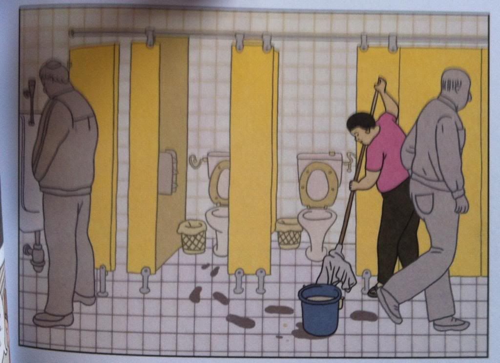
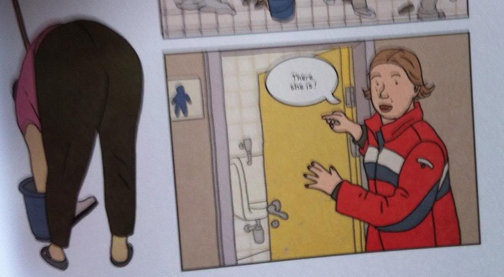
Over the course of Exit Wounds, the protagonists are looking for a particular cleaning woman because she might have information that will help our heroes find the man they are looking for. This is the panel we see when they enter the bathroom looking for the woman and question. And I kind of love it,
What it does, is simplify everything in the panel that is not the cleaning woman. The small square pattern of white tiles emphasizes all of the larger, colour blocked items in the composition. Meanwhile the men in the bathroom who are not the person of interest are greyed out so that they are present but don't unduly distract from the cleaning lady. The result is this perfect visual for searching where when you spot the person you are looking for, everything else just becomes secondary. It's like the blurring out that happens when you recognize a face in the crowd done entirely in static comics. It's great stuff.
Previously:
Exit Wounds
By Rutu Modan; Drawn and Quarterly
Exit Wounds is a great comic with a lot a of really remarkable character work, a really clean, distinct style, and an interesting story filled with truth, humour, and mystery. There is a lot in this comic to like. But I love finding interesting solutions to comic problems and Exit Wounds has a short sequence that I think is worth taking a closer look at.
Over the course of Exit Wounds, the protagonists are looking for a particular cleaning woman because she might have information that will help our heroes find the man they are looking for. This is the panel we see when they enter the bathroom looking for the woman and question. And I kind of love it,
What it does, is simplify everything in the panel that is not the cleaning woman. The small square pattern of white tiles emphasizes all of the larger, colour blocked items in the composition. Meanwhile the men in the bathroom who are not the person of interest are greyed out so that they are present but don't unduly distract from the cleaning lady. The result is this perfect visual for searching where when you spot the person you are looking for, everything else just becomes secondary. It's like the blurring out that happens when you recognize a face in the crowd done entirely in static comics. It's great stuff.
Previously:
Exit Wounds
Wednesday, 7 May 2014
So I Read Exit Wounds
A 250 word (or less) review of the Exit Wounds graphic novel,
By Rutu Modan; Drawn and Quarterly
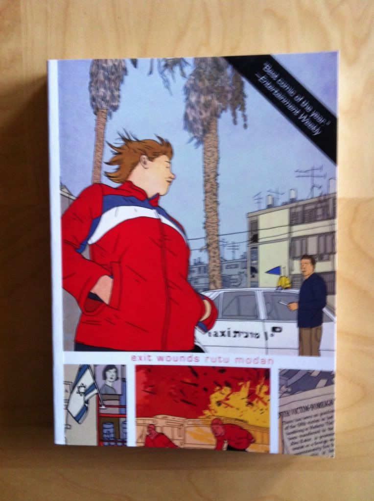
Exit Wounds is a comic about finding closure with a person who is already gone. In the comic Koby, an Israeli cab driver, is told by a young woman that his estranged father has been killed in a suicide bombing. The young woman, Numi, his father's lover, needs Koby's help to prove that his father has indeed been killed. Koby, citing his father's unreliability and wayward past suspects that his father has merely abandoned Numi. The comic then, is the story of these strangers coming to terms with the absence of Koby's father and figuring out how to say goodbye to someone who is already absent. Exit Wounds is a pretty great comic: the central story is universal, tragic, and interesting, while the narrative retains a certain levity and humour that adds a counter-note of levity and fun. Similarly the artwork, with a very clean Herge style, manages to be beautifully expressive and wonderfully accesible. Exit Wounds is a very balanced read that is, at the end of the day, a really well made human story about an aspect of human life. It's the kind of comic that isn't explicitly for fans of genre fiction and, for lack of a better classification, reads as contemporary literary fiction. This coupled with the accessibility of the artwork and storytelling makes me think this is a great comic to lend/recommend to non-comics friends and relatives. (I will actually lend this comic to my mom.) Because it's good, and interesting, and fun to read.
By Rutu Modan; Drawn and Quarterly
Exit Wounds is a comic about finding closure with a person who is already gone. In the comic Koby, an Israeli cab driver, is told by a young woman that his estranged father has been killed in a suicide bombing. The young woman, Numi, his father's lover, needs Koby's help to prove that his father has indeed been killed. Koby, citing his father's unreliability and wayward past suspects that his father has merely abandoned Numi. The comic then, is the story of these strangers coming to terms with the absence of Koby's father and figuring out how to say goodbye to someone who is already absent. Exit Wounds is a pretty great comic: the central story is universal, tragic, and interesting, while the narrative retains a certain levity and humour that adds a counter-note of levity and fun. Similarly the artwork, with a very clean Herge style, manages to be beautifully expressive and wonderfully accesible. Exit Wounds is a very balanced read that is, at the end of the day, a really well made human story about an aspect of human life. It's the kind of comic that isn't explicitly for fans of genre fiction and, for lack of a better classification, reads as contemporary literary fiction. This coupled with the accessibility of the artwork and storytelling makes me think this is a great comic to lend/recommend to non-comics friends and relatives. (I will actually lend this comic to my mom.) Because it's good, and interesting, and fun to read.
Word
count: 250
Monday, 5 May 2014
Deep Sequencing: 100% Dialogue
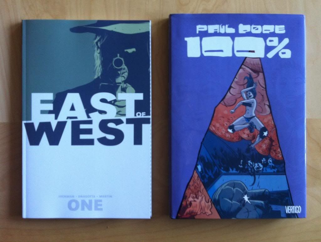
Or an interesting approach to dialogue in Paul Pope's 100% and Jonathan Hickman & Nick Dragotta's East of West: Volume 1
With lettering by John Workman and Russ Wooton
I think one of the most under appreciated aspects of comics is the lettering, that secret art of placing word balloons in just such a way that everything effortlessly works. When done badly, dialogue doesn't follow a comprehensible order and is confusing, and artwork is trampled beneath inelegantly placed text balloons. When done well the dialogue is beautifully and logically arranged on the page in a way that relates to the artwork in an artful, organic way. (And when done perfectly, the placement of text can actually be an asset to help lead the reader through the page.) In this post I'm going to look at two books that have really great, but very different approaches to lettering.
There will be some will *SPOILERS* for East of West: Volume One and 100%.
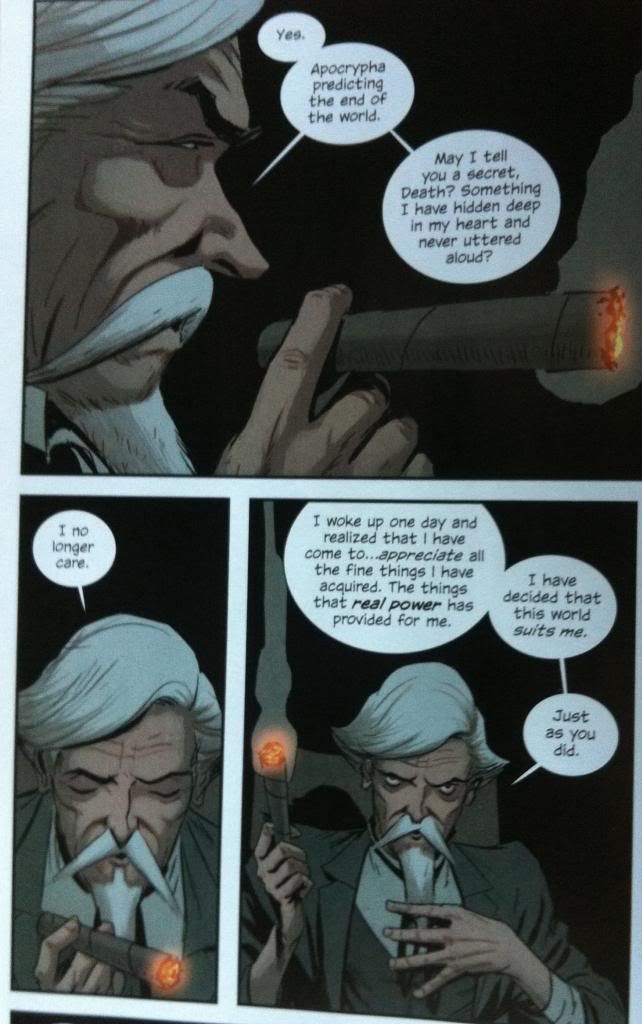
East of West, with lettering by Russ Wooton, has some really expert, really adroit examples of what I would call "conventional" lettering. Most speech bubbles have a single tail, and longer exposition is linked as a series of bubbles. The bubbles are elegant and interacts with the artwork in a really smart way. The two sequences I've picked above are particularly good as they do a great job of leading the eye around the page so that the facial acting in the artwork is encountered in just the right moment. This ensures that the emotional resonance of each word and moment is pitch perfect, which enhances the exposition portrayed and adds tremendous dramatic weight to this sequence. It's great.
The text in this sequence here does some really interesting guide work. For instance in the first panel, we see the man's face before seeing the text which sets the emotional tone. We then read through the dialogue before encountering the glowing tip of the cigar, and important symbol of terrestrial wealth and power throughout this conversation. In the next panel (well I skipped a panel, but the next displayed here) we read the text before seeing the man looking down at the cigar: we see the thought he no longer cares about spiritual things and then see the reason for it (earthly power totem). We then move into the next panel, see the cigar/totem held aloft like a sceptre/torch, and then proceed straight to the text where we read our way around the panel in a circle, eventually arriving back on the man's face as he looks up at who is addressing in challenge. The way the text keeps us from seeing his face until the end of the page, adds a lot of weight to that final glance. It's great comics.
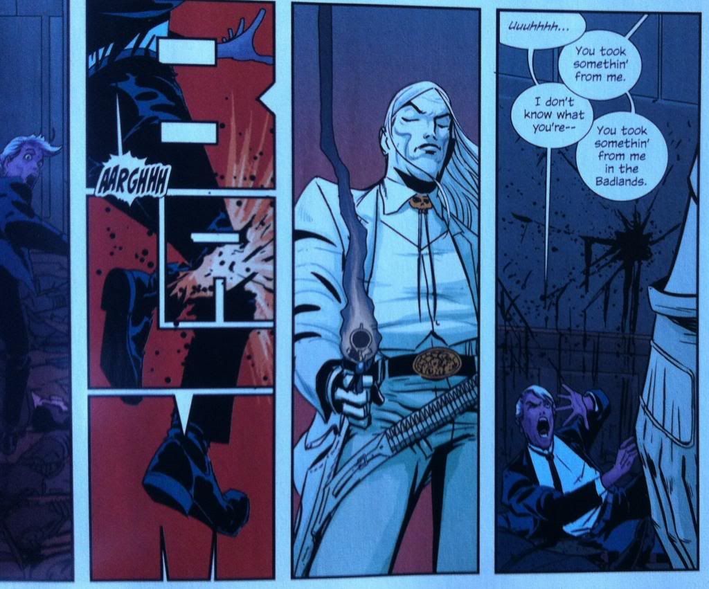
(This sequence here is less about good lettering and more about how much I love the "BLAM" pannel here. I love how the sounds of many words, show the shape of the action or sound. Like "drip", where the "dr" is evocative of water beading, the "i" catches the tiny moment of a drop falling, and the "p" sound catches the noise of a drop hitting a surface. "Blam" works in a similar way where the "Bla" catches the explosive noise, the "m" brings to mind the cavernous echo/silence that follows the report. The fact the "A" of "BLAM" is the point of impact is therefore a stroke of bloody genius. I love it.)
The one problem with conventional dialogue box placement, as pretty as it is, is that sometimes the image of the moment, and the text of the panel don't entirely match. This is an example from East of West this text/image disconnect. We enter this page, read the text, noting the surprise mark and then the transfer to the cool, unflappable dialogue of the character, BEFORE we see the shocked face of the character. The text precedes the face, takes us past the moment of surprise, and then dumps us back in the previous moment. It's not the best lettering in the comic (which is mostly really great!). But to a certain extent this kind of lettering backtracking is unavoidable, a consequence of panel limitations and script being packed in. It is, I think, an inherent risk of the standard lettering approach.
100% by Paul Pope with lettering by John Workman uses a different approach to lettering, and one that I don't see very often. Instead of building dialogue balloons carefully into the artwork with the standard approach, 100% almost always splits the dialogue so that characters are surrounded by their dialogue. We get to experience half the text, see the emotion, and then finish the text. What this does is embed the emotion of the moment right into the centre of the text: the face we see is the face of the whole dialogue moment. It's maybe a bit brute force at times, but it makes sure that the characters acting is always appropriate to the text. Which works really well for a character driven comic about living 100% in the moment. It's really cool comics, and maybe an approach that solves some of the problems of the standard lettering approach.
With lettering by John Workman and Russ Wooton
I think one of the most under appreciated aspects of comics is the lettering, that secret art of placing word balloons in just such a way that everything effortlessly works. When done badly, dialogue doesn't follow a comprehensible order and is confusing, and artwork is trampled beneath inelegantly placed text balloons. When done well the dialogue is beautifully and logically arranged on the page in a way that relates to the artwork in an artful, organic way. (And when done perfectly, the placement of text can actually be an asset to help lead the reader through the page.) In this post I'm going to look at two books that have really great, but very different approaches to lettering.
There will be some will *SPOILERS* for East of West: Volume One and 100%.
East of West, with lettering by Russ Wooton, has some really expert, really adroit examples of what I would call "conventional" lettering. Most speech bubbles have a single tail, and longer exposition is linked as a series of bubbles. The bubbles are elegant and interacts with the artwork in a really smart way. The two sequences I've picked above are particularly good as they do a great job of leading the eye around the page so that the facial acting in the artwork is encountered in just the right moment. This ensures that the emotional resonance of each word and moment is pitch perfect, which enhances the exposition portrayed and adds tremendous dramatic weight to this sequence. It's great.
The text in this sequence here does some really interesting guide work. For instance in the first panel, we see the man's face before seeing the text which sets the emotional tone. We then read through the dialogue before encountering the glowing tip of the cigar, and important symbol of terrestrial wealth and power throughout this conversation. In the next panel (well I skipped a panel, but the next displayed here) we read the text before seeing the man looking down at the cigar: we see the thought he no longer cares about spiritual things and then see the reason for it (earthly power totem). We then move into the next panel, see the cigar/totem held aloft like a sceptre/torch, and then proceed straight to the text where we read our way around the panel in a circle, eventually arriving back on the man's face as he looks up at who is addressing in challenge. The way the text keeps us from seeing his face until the end of the page, adds a lot of weight to that final glance. It's great comics.
(This sequence here is less about good lettering and more about how much I love the "BLAM" pannel here. I love how the sounds of many words, show the shape of the action or sound. Like "drip", where the "dr" is evocative of water beading, the "i" catches the tiny moment of a drop falling, and the "p" sound catches the noise of a drop hitting a surface. "Blam" works in a similar way where the "Bla" catches the explosive noise, the "m" brings to mind the cavernous echo/silence that follows the report. The fact the "A" of "BLAM" is the point of impact is therefore a stroke of bloody genius. I love it.)
The one problem with conventional dialogue box placement, as pretty as it is, is that sometimes the image of the moment, and the text of the panel don't entirely match. This is an example from East of West this text/image disconnect. We enter this page, read the text, noting the surprise mark and then the transfer to the cool, unflappable dialogue of the character, BEFORE we see the shocked face of the character. The text precedes the face, takes us past the moment of surprise, and then dumps us back in the previous moment. It's not the best lettering in the comic (which is mostly really great!). But to a certain extent this kind of lettering backtracking is unavoidable, a consequence of panel limitations and script being packed in. It is, I think, an inherent risk of the standard lettering approach.
100% by Paul Pope with lettering by John Workman uses a different approach to lettering, and one that I don't see very often. Instead of building dialogue balloons carefully into the artwork with the standard approach, 100% almost always splits the dialogue so that characters are surrounded by their dialogue. We get to experience half the text, see the emotion, and then finish the text. What this does is embed the emotion of the moment right into the centre of the text: the face we see is the face of the whole dialogue moment. It's maybe a bit brute force at times, but it makes sure that the characters acting is always appropriate to the text. Which works really well for a character driven comic about living 100% in the moment. It's really cool comics, and maybe an approach that solves some of the problems of the standard lettering approach.
Subscribe to:
Posts (Atom)