Or using focus and colouring in an interesting way in Exit Wounds
By Rutu Modan; Drawn and Quarterly
Exit Wounds is a great comic with a lot a of really remarkable character work, a really clean, distinct style, and an interesting story filled with truth, humour, and mystery. There is a lot in this comic to like. But I love finding interesting solutions to comic problems and Exit Wounds has a short sequence that I think is worth taking a closer look at.
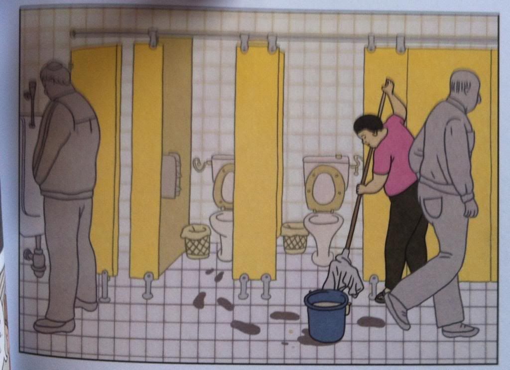
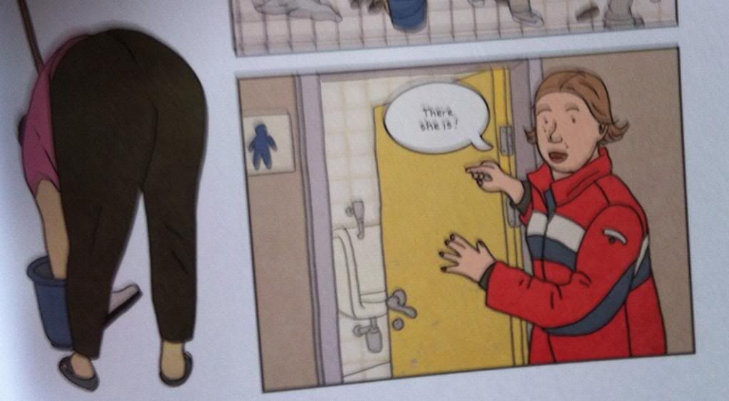
Over the course of Exit Wounds, the protagonists are looking for a particular cleaning woman because she might have information that will help our heroes find the man they are looking for. This is the panel we see when they enter the bathroom looking for the woman and question. And I kind of love it,
What it does, is simplify everything in the panel that is not the cleaning woman. The small square pattern of white tiles emphasizes all of the larger, colour blocked items in the composition. Meanwhile the men in the bathroom who are not the person of interest are greyed out so that they are present but don't unduly distract from the cleaning lady. The result is this perfect visual for searching where when you spot the person you are looking for, everything else just becomes secondary. It's like the blurring out that happens when you recognize a face in the crowd done entirely in static comics. It's great stuff.
Previously:
Exit Wounds


No comments:
Post a Comment