Friday, 7 March 2014

Deep Sequencing: Phono-Infogram Pt.1

Or an infogram of character interactions in Phonogram: Singles Club
By Kieron Gillen, Jamie McKelvie, and Matt Wilson; Image Comics
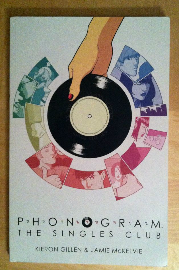


I really like Phonogram: The Singles Club. Phonogram's premise of music as literally a kind of magic is brilliant and a wonderful metaphor for appreciating media. The way The Singles Club grows this idea and complicates it by portraying a more diverse group of Phonmancers enhances everything I loved about the first volume and tells a fantastic story. It is literally the first comic that the one coworker I've got kind of reading comics tried, and its a big part of why she's still kind of reading comics. Basically The Singles Club is a fantastic, smart, fun and accessible comic that everyone should read. 

The thing is, Phonogram: The Singles Club is also kind of a masterpiece of comics craft. Part of this is that The Singles Club is exceptionally well written, with its dynamite premise, engaging troupe of characters, and perfectly tuned dialogue. It's also a comic with beautiful artwork: fantastic acting, dynamic use of space, and aggressively thoughtful colouring (which in hindsight is worthy of its own analysis, seriously). But the thing that makes Phonogram: The Singles Club the kind of comic that everyone should be taking a very close look at, is the way Team Phonogram embeds the story so completely in setting. Structurally, The Singles club tells seven interlocking stories with common settings that occur simultaneously on the same night, and this complicated, multifaceted beast fits together PERFECTLY. This narratives thread like a tapestry, the chapters obey the timeline of the story like a Teutonic train schedule, and the physical spaces are complete enough to pass building codes. Phonogram: The Singles Club is just about the most granular, engineered short comics run I've ever read.

Because Phonogram: The Singles Club is so well crafted, you can literally create page-by-page maps of plot, time, and setting of really remarkable detail. And, because I love making infographics, I've done just that.

Phono-Infograms:
1: Plot Map
2: Timeline 
3: Setting Map 

Plot Map: The idea here is to give a loose appreciation of each characters overall plot that accounts for interactions and provides loose information on sequence and location. Bear in mind that the y-axis on this sucker is set to absolutely no kind of scale, although events within given lines occur in the order shown, and that generally speaking events at the top of the diagram precede events shown further down. In many ways this diagram is meant chiefly to show character interactions, provide overall shape to the plot, and to function as a unifying plot key for the other two infograms. 

(Apologies in advance for any mistakes or omissions.)

This diagram is a plot map so there will be *SPOILERS* in the diagram. Be wary.


A couple kind of cool things pop out once you look at the plot this way. For instance, Penny, the protagonist of Chapter 1, also acts as a framing narrative as she, like the popular party person she is, circulates around the club and touches base with most of the key characters and narratives. Seriously, study this comic!

(Stay tuned for more Singles Club Infographics.)

Previously:
So I Read Phonogram: Rue Britainia
So I Read Phonogram: The Singles Club

Wednesday, 5 March 2014

So I Read Mara

A 250 word (or less) review of the Mara graphic novel
By Brian Wood, Ming Doyle, and Jordie Bellaire; Image Comics


Mara is a Sci-fi-Superhero comic set in a militaristic, hyper-regimented future that is really passionate about volleyball. In the comic Mara, an international volleyball superstar, is living the high life: she's famous, she's got sponsors, she has legions of adoring fans. That is until she exhibits superpowers while on the court and it all comes crashing down. With artwork by Ming Doyle and Jordie Bellaire, Mara is a fantastic looking comic well worth looking at. Unfortunately the script of Mara doesn’t really deliver on the premise or live up to the art quality. When Mara was launched it was hyped as a feminist Sci-fi epic which tackled materialistic, authoritarian themes of modern society and also volleyball. And for me Mara just didn’t deliver enough on these themes. The issue, I think, is that the comic tried to play with too many ideas and included too much plot for the short length of the comic. As a result, Mara failed to really develop the themes, characters, and relationships that were the most interesting to me. And so Mara really felt more like a trippy, Twilight-Zoney Superhero tale than the high concept comic or character study I was hoping for: a short weird story in a cool setting with some heady ideas instead of a fully developed discussion. That said, I think if you approach Mara with an open mind, there is still an enjoyable comics experience to be had. Or at the very least a pretty one.

Word count: 246

Monday, 3 March 2014

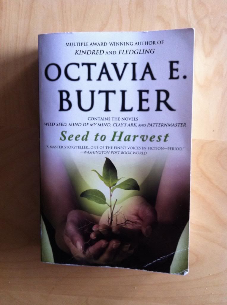
The Seed To Harvest Omnibus Is A Good Book

Or why you should read Wild Seed, Mind Of My Mind, Clay's Ark, and Patternmaster by Octavia E. Butler


Seed to Harvest is a nice big omnibus book that contains a bunch of great novels by Octavia E. Butler. Broadly speaking the novels tell the story of an emergent culture of humans bred for their supernatural powers. Wild Seed tells the story of Anyanwu, an African woman with powers of healing and transformation, who is wooed and collected by Doro, an immortal being who consumes souls to inhabit bodies, and brought to 1700s America to further his plans to breed the perfect people. Mind of My Mind picks up the story hundreds of years later in vaguely contemporary times with the coming of age of Mary, a teenage girl belonging to Doro with the potential to be something unique, something that might be the key to uniting Doro's scattered people. Clay's Ark throws a wrinkle in the story with the arrival of a horrible alien virus that makes people give into their most base animal instincts. Finally, Patternmaster closes the series with a story set in the far future that sees the Patternists, the mentally powerful and rigidly controlled descendants of Doro's people, in a bitter war with the Clayarks, the mutant race of the alien disease, as a struggle emerges over who will be the next Patternmaster, leader of the Patternists. Together they tell the story of several hundred years of human social and biological evolution that explores what it means to be human in a society,

Thematically, the novels of Seed to Harvest are dense books. With elegant and accessible prose these novel ask some really difficult questions in some really brutally honest ways. The most central thematic question is one of control, and the role dominance plays in every facet of human life. For instance in Wild Seed, Butler explores control as an aspect of community and the tension between freedom in isolation and the regimented living of civilization. In Mind of My Mind Butler deals with the same question but moves the lens from the controlled to the master and delves into the role of control and ownership in building communities. Clay's Ark goes the other way and looks at how people are slaves to their animal nature and how thin the barrier of civilization really is. Finally, Patternmaster extrapolates these questions to their conclusion and portrays societies that are diametrically opposed: one structured and intellectual but where every member is relentlessly controlled and the other free but bestial and wretched. Collectively the novels of Seed to Harvest create an engaging space for a lot of really heavy conversations. It's great Science Fiction.

It's also Sci-fi that, I think, is really particular to the novels' author and her particular worldview. Now, most of the novels I read are by really smart white dudes who often have a penchant for geekery. And I think they write great books that are often fairly progressive. The thing is, I can't see a straight white author writing these books: the way they explore themes of control and slavery, belonging and alienation from the perspective of the victimized as well as the powerful is beyond, I think, the ken of those of us exclusively on the powerful side of the fence. Octavia E. Butler is an American woman of African descent and I think this helped inform the worldview that makes these books such insightful works of Sci-fi. I mean, the novels of Seed to Harvest are good books because Octavia E. Butler is a fabulously talented writer, but I still feel like they are improved and informed by her perspective as a woman and person of colour. And I think this unique and interesting perspective makes a pretty compelling argument for trying books by women and minority authors: they have interesting stories to tell that might not occur to mainstream white, male authors and, if nothing else, reading something new is always pretty great.

I would recommend the Seed to Harvest omnibus, and all of its collective novels, to anyone. They are beautifully written, engrossingly plotted, and ask some really interesting and fundamental questions from a really interesting perspective. Seed to Harvest contains big league Science Fiction that has the timelessness of classics and the literary skill of contemporary novels. If you are a serious reader of Science Fiction you really out to read Wild Seed, Mind Of My Mind, Clay's Ark, and Patternmaster. They are really good books.

Friday, 28 February 2014

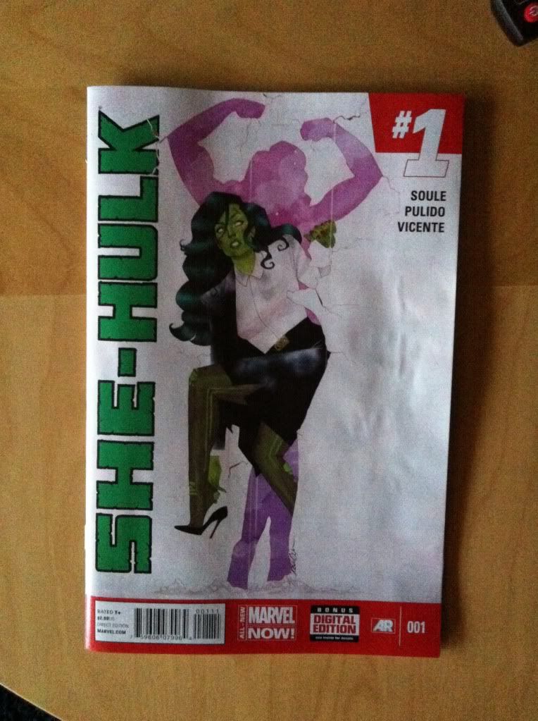
Sentencing She-Hulk #1

Or a look at some really innovative layouts in She-Hulk #1
by Charles Soule, Javier Pulido, Munsta Vicente; Marvel Comics


I really enjoyed She-Hulk #1. The hook of She-Hulk being the star of a law procedural with a light, comedic-ish air, while not completely original, is always good fun and Charles Soule, with his perspective as a practicing lawyer, really portrays the practice of law in an interesting and nuanced way in She-Hulk #1. It's a really fun comic.

She-Hulk #1 is also a really great looking, and technically interesting comic with some absolutely dynamite layouts by Javier Pulido paired with some fantastic colouring by Munsta Vicente. I'm going to take a closer look at a couple of my favourite layouts.

There will be *SPOILERS* for She-Hulk #1, so don't commit a crime against yourself and read the comic first.


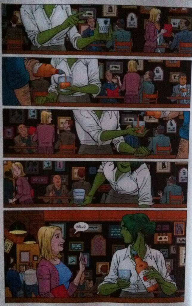
I am absolutely in love with this page: Team Shulkie deliver a really interesting pair of sequences that happen simultaneously. One story on the page is that She-Hulk, having quit her high paying law job hits up the local lawyer bar to unwind with whiskey (as is proper [assuming it is done responsibly]). She-Hulk's story ends in the last panel when a lady suddenly appears and says hello. However, this page has a second story which shows the suddenly-appearing-woman canvassing the lawyer bar with a red folder in the background showing where this woman came from. The way I read the page, I saw the entire She-Hulk story without even noticing the second story of folder-woman, so that I was just as completely surprised by her appearance as She-Hulk. Which is kind of great comics: I experienced the same She-Hulk-self-involvement and then surprise as the protagonist.

Now, admittedly, this might be because I am terrible at reading comics and missed something obvious that everyone else in the world noticed. But, the thing is, I've noticed some design elements that seem designed to trick the reader into only following the She-Hulk story and then doubling back to read folder-lady's tale.


My first pass of this page was governed by She-Hulk. She is the sole character in the foreground and is making a number of interesting, dynamic gestures and motions that change from panel to panel and guide the the reader down the gradual left-to-right line of her positioning. Just by body language and posing there is a rich enough pool of visual information to keep the reader busy and focused on Shulkie. This effect is magnified by the colouring. She-Hulk is coloured her bright, emerald green and is wearing a bright, white blouse, which compared with the drab, cooler colours of the background stands out considerably. Especially, when you account for how BIG the emerald/white colour blocks are compared to the much smaller, broken up colour patches of the people and wall signs in the background. Basically, the colouring of the She-Hulk story is just brighter and bolder and helps keep the reader focused on her story instead of the background.

(And really, the She-Hulk story almost functions without any background since tumblr, bottle, waiters arm, and bar top convey the key setting information in the foreground. Which is a really smart choice if you buy my argument that the artwork is designed to misdirect the reader into paying less attention to the background.)

It was these elements that kept me focusing on She-Hulk and her story on this page and made the appearance of folder-lady such an effective surprise.


Of course, once folder-lady appeared, and I realized she was an important character, I went back through the page and found the whole other story. And many of the same compositional elements used to steer through the foreground are also used to move the reader through the background folder-lady story. Colours highlight the woman's blonder hair and the red of the folder to catch the reader. Similarly the woman's gesture and her relationship to the folder helps make a visual guide that leads the reader through her story so that the folder-lady part of the page ends just as effectively with her looking at She-Hulk. It's a pretty clean, nice little sequence. 

And combined, I think, these two layered sequences make this page super interesting. Misdirection keeps the reader focused on She-Hulk and maximizes surprise, and then rewards the reader with a hidden, yet important story of folder-lady failing to find a lawyer. It's really cool, and honestly, how often do you see comics pages designed to be read twice?


This double page spread is also pretty awesome and does some really cool things with panel shape and perspective to emphasize some really interesting elements of the page that makes the drama/comedy of the page work.


The crux of what I love about this spread is the LOOOoooooooonnnnngggg hallway and how the art emphasizes the heck out of this distance to great effect. The composition, with its 18th floor Ding!, takes from the top of the first panel into the top of the second panel. This places us at the end of the hall and then, as we, look down the very tall panel we see, and experience, just how far away She-Hulk is from the end of the hallway. What's even more great about this is Shulkie is on an angle and facing upwards along the hallway which makes the distance loom larger and emphasizes the uphill-climb-challenge of walking down this very long hallway. This leads into the next two panels which show She-Hulk progressing along the hallway, but also walking uphill, continuing to emphasize the gruelling effort of walking down such a long-ass hallway. The composition then doubles back towards the centre of the page where we meet Legal, Tony Starks lawyer. The result of this doubleback is that the reading path takes just about the longest route possible to get from the elevator to Legal which makes us the reader actually experience the length of the hall. It is absolutely an amazing bit of design and layout work.

She-Hulk #1 is a fantastic comic that has me super excited to read more She-Hulk.


Wednesday, 26 February 2014

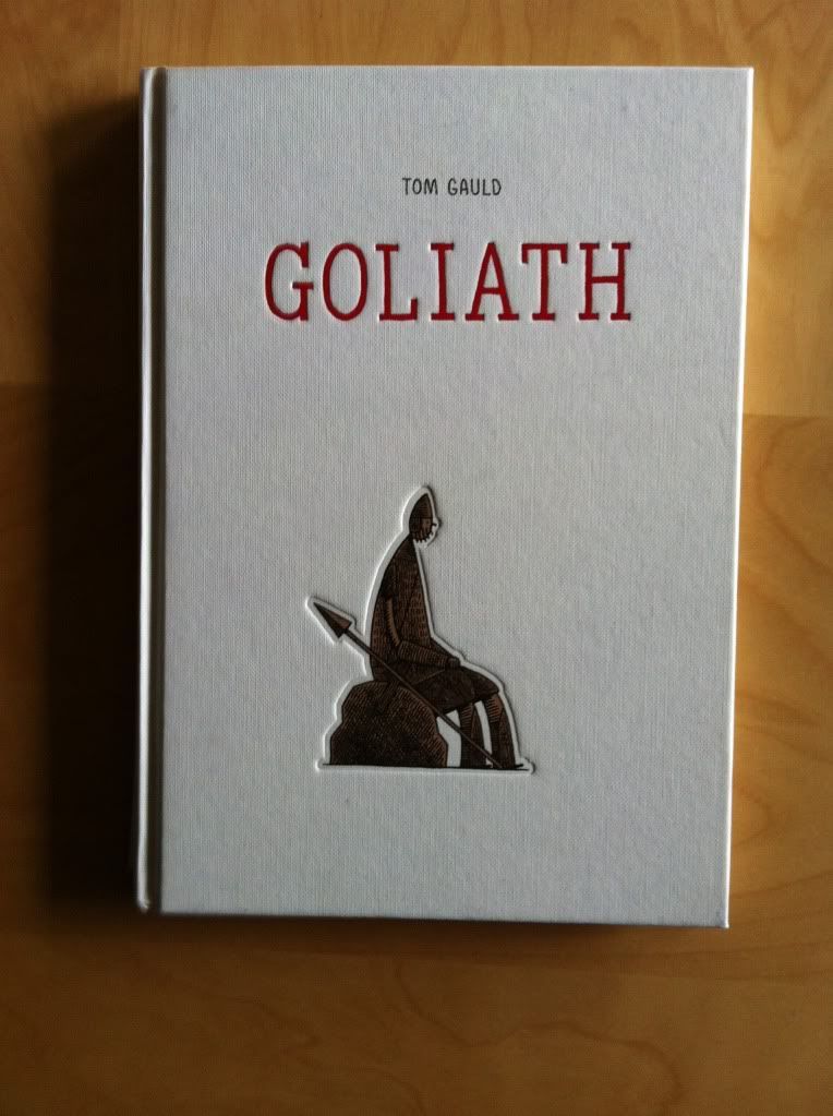
So I Read Goliath

A 250 word (or less) review of the Goliath graphic novel
By Tom Gauld; Drawn and Quarterly


Sometimes it's fun knowing how the story ends. Goliath is a comic about one of the oldest stories in the Judaeo-Christian tradition. A story that pits a humble shepherd against the fearsome giant Goliath in single combat to decide the fate of a war. A story where the shepherd, graced by righteous power of god, strikes down the giant with nothing but a similarly humble stone thrown from a humble sling. It's a story that tells about underdogs defeating favourites, heroes standing up to bullies, and the power of conviction and courage in the face of adversity. Everyone knows it. But what if that version of the story is completely wrong? What if the narrative we all know is a lie written by the victors or a story mistranslated into allegory by eons? Goliath tells the biblical story from the perspective of Goliath, a pretty okay giant guy in a crumby situation, and the series of misunderstandings that lead to the tales bloody ending. It's a really pensive and bleakly funny comic that strains under the gravitas of its inevitable conclusion. It is drawn in this really expansive, open, minimalist way that is the perfect visual palette for the books themes. The resulting comic is.... arresting. Goliath is certainly a comic worth reading despite already knowing the ending.

Word count: 219

Monday, 24 February 2014

Atoll Comics Round 12

Or changes to my top-ten comics 

Due to poverty and an urge to buy better comics, I have decided to be super-selective about which superhero comics I read. Harnessing the Awesome Power of Maths, I have determined that I can afford to read 10 ongoing titles. So I get to read 10, and only 10, titles published by either Marvel or DC as well as one trade paperback a week of my choosing.

A complication of this is that I am forced to drop an on-going title if I want to try reading a new on-going title, an act of very tough love. Being financially responsible is the worst.

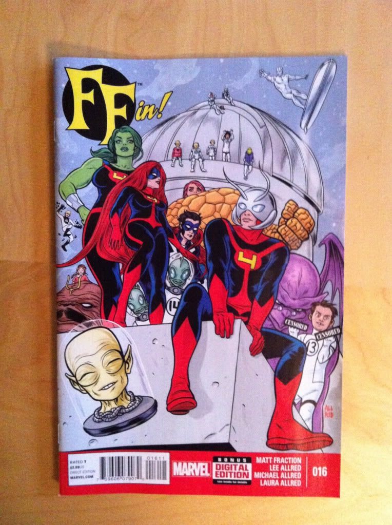
I will be adding She-Hulk and dropping FF.


Why She-Hulk: She-Hulk is absolutely the kind of comic I want to read from mainstream Marvel. It's fun, has an interesting narrative angle (lawyer She-Hulk fixing problems she can't punchout), and is absolutely beautiful with just masterful artwork by Javier Pulido. It's great!

Actually, I think the magic of She-Hulk goes beyond quirk and execution. I'm a career academic who TA's to supplement my income which means I spend a lot of time trying to figure out when people have no idea what they are talking about. So I'd like to think I'm developing a sense for when people are experts or trying to fake it. And the thing is She-Hulk is a comic that is being written by Charles Soule who is an actual, real life lawyer and his expertise really shines through. The result is a comic that feels authentic and nuanced and interesting. While, you know, still being fun and charming and funny. 

And that's not even getting to the art team of Javier Pulido and Muntsa Vicente. She-Hulk is a comic that visually is basically perfect. Javier Pulido has a gorgeous clean style, amazing character acting chops, and just endlessly fascinating approaches to layout that make even the most legal-proceeding heavy sequences interesting to look at. Muntsa Vicente, meanwhile, is the perfect colourist with a bright, pop-arty, flat colouring style that is the perfect partner for Pulido's lineart. She-Hulk is a comic with the kind of art that is worth the price of admission.

If you like my taste in comics, especially those in my top-ten mainstream books, than the first issue of She-Hulk is pretty much a must read. If it is any indication of the kind of book the whole series will be, than it will absolutely be a top-ten comic.


Why not FF: FF is another great comic that has ended. For being a comic I almost didn't buy into, largely because I was so happy with Hickman's FF, I ended up really enjoying the Fraction/Allreds version. This FF wasn't the high concept Sci-fi book that emphasized the weird nature of child genius, but was instead, at its best, a book about a bunch of kooky comic book kids being fun. FF was like this joyful celebration of everything that is great about comics that was also a really well made comic. But like most really great and original mainstream comics, it has an ending and that means it's time to say goodbye and replace it in my Pull List.

Previously:

Friday, 21 February 2014

Deep Sequencing: Travelling Travelogue

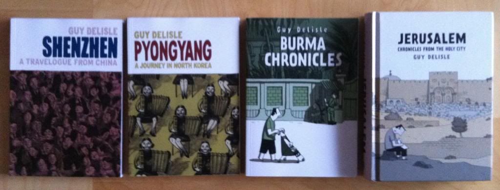
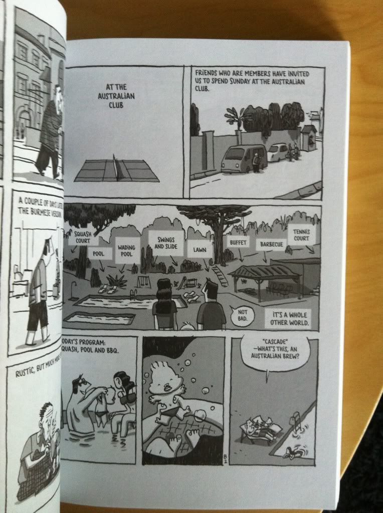
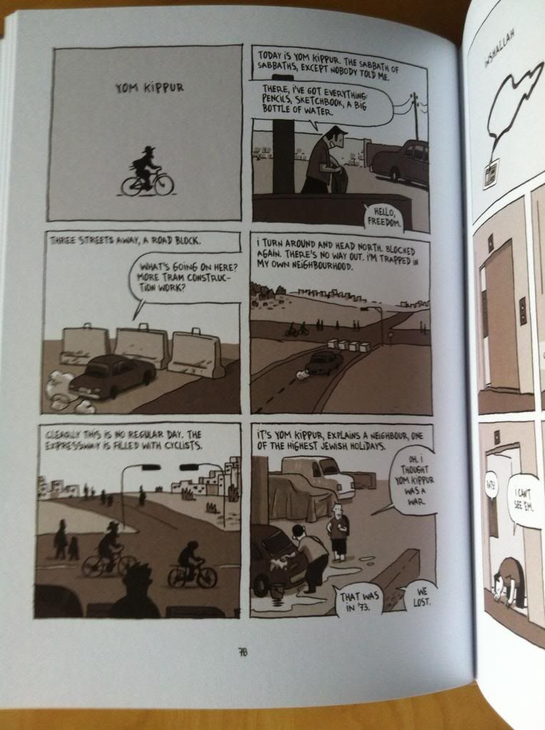
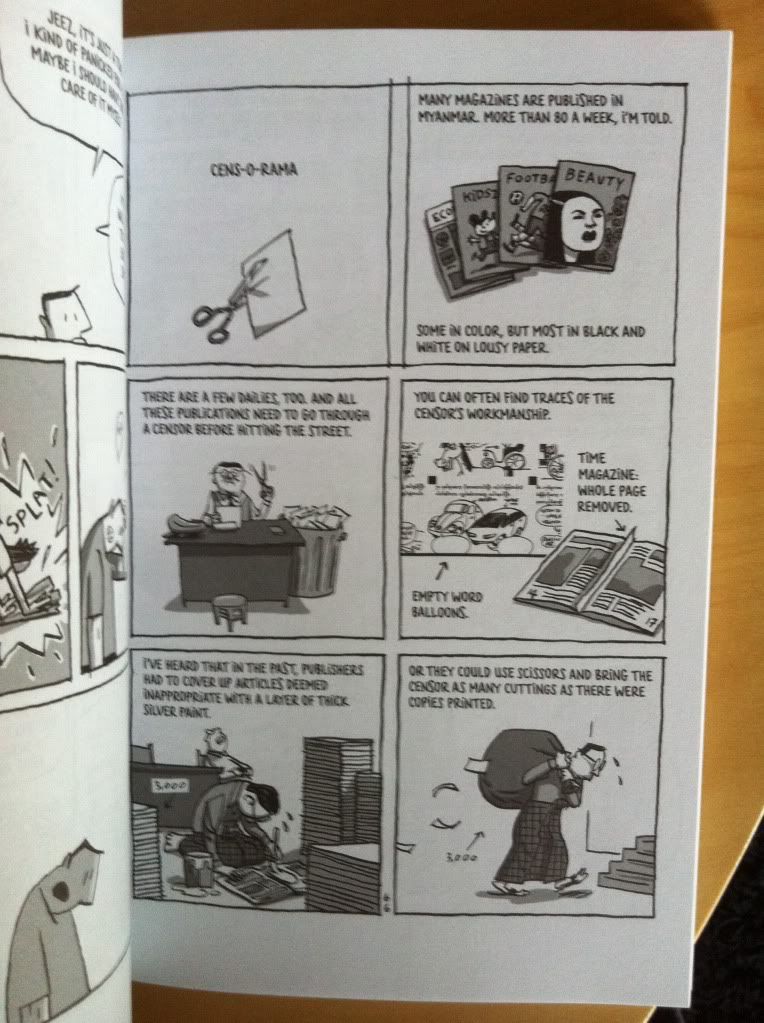
Or a look at why Guy Delisle's travelogue comics make perfect travel companions


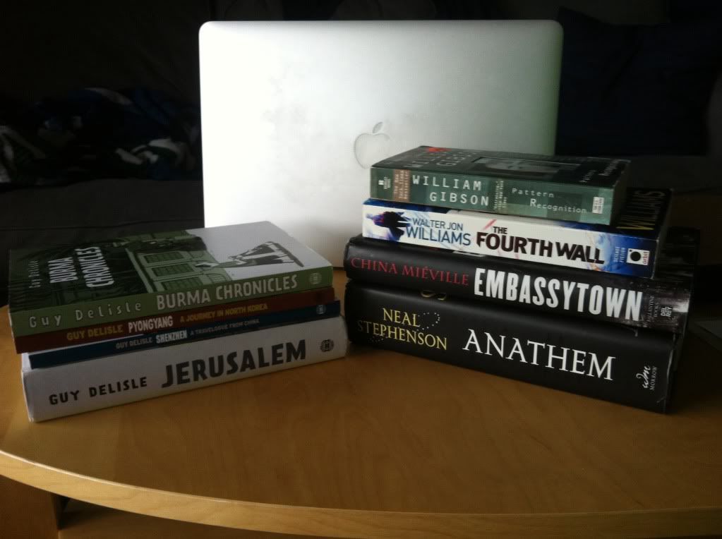
I'm the kind of person who fills up a giant backpack with books and comics whenever international travel happens for time spent on airplanes, in transport, laying on beaches, and especially when I travel alone for work. Reading makes the time stuck in a too-small seat slightly less awful when in the air or on rails and makes time killed in a pub alone more socially acceptable! And whats better than laying on a beach with a cold beverage and an excellent book or comic? Few things!

But travel reading comes with a series of special challenges. Challenges which I think the travelogue comics of Guy Delisle perfectly address.


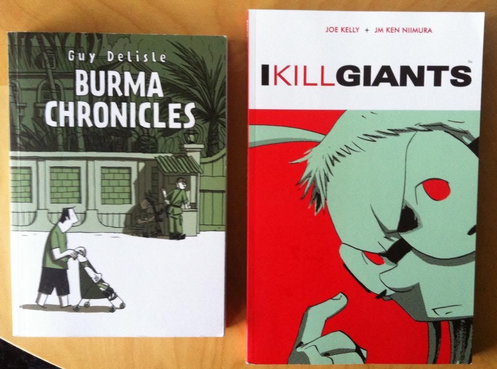
The first challenge is space: whenever travelling involves baggage there is only so much stuff you can pack and since I am a luddite who prefers his reading material to come in dead tree form, this means there is a limit on the number of books and comics I can pack. Guy Delisle's travelogues, while still being a substantial length, are comics that are thinner than a novel. While it's true novels are a denser entertainment medium, if you want a good amount of comic that won't monopolize travel space, these travelogues are about the right size.


The second travel reading challenge is also space: when you are exploring a new city or trying to find the perfect place on the beach it's nice to use a smaller rucksack to carry your water bottles (filter equipped), guidebooks, maps, and other travelling stuff. The cost of this smaller backpack is that tradepaperback sized comics don't fit into the bag. Conveniently, Guy Delisle travelogues, with their novel-like dimensions, will fit right into a small rucksack.


One of the other challenges specific to comics is content. I once tried to read Black Hole on an airplane (before I appreciated how twisted and pornographic a comic it is). It was... a non-starter. Reading on an airplane or in other public places, I think, requires a certain level of consideration for the sensibilities of the people around you. While you can read a filthy novel, like Crooked Little Vein, anywhere without upsetting the people around you, comics are a visual medium which can mean objectionable pictures which means that I think you should choose a comic that you can read in front of children and the elderly without offending people when travelling. Guy Delisle's comics are about life in other places delivered with slapstick humour and is at worst PG13. It's safe for work and travel.

(Also there are some weird laws about what constitutes obscenity or pornography in other countries, and some countries reserve the right to rifle through your books and hard drives. As such, it might actually be wise and not just polite to show some discretion with which comics you bring travelling with you. By all means, read whatever filthy thing you want at home, but maybe choose something like Jerusalem or Burma instead of Black Kiss when abroad.)


When it comes to comics you read while actually getting around the place your visiting the Delisle comics are also a pretty great choice. When it comes to rides on subways or trains into city centres, reading opportunities come in little bursts where you need to quickly quit your reading and rush off to explore and what-not. Since I hate stopping a thing in the middle of a section (chapter, section, whatever), comics and books with short chapters or frequent page breaks are pretty great for travelling. And the Delisle comics are great in that they are broken up into individual strips that usually run a page or two, with the occasional single narrative stream running up to ten pages. It's a way of doing comics where there is always a convenient jumping off spot just a page away.


Then there is the actual subject matter. Guy Delisle's travelogue comics are travelogues: they document prolonged stays in Jerusalem, Burma, Shenzhen and Pyongyang with an eye for the small particulars of life as well as the broader society and social injustice. And what could more perfect to read while travelling than comics about other places? It's like a comics vacation WITHIN a larger vacation. Which, I think, more than the convenient format size, public space appropriate content, and short chapters is what makes Guy Delisle's comics perfect for vacations.