Wednesday, 16 January 2013

So I Read Demo


A 250 word (or less) review of Demo volume one.
By Brian Wood and Becky Cloonan, Vertigo Comics
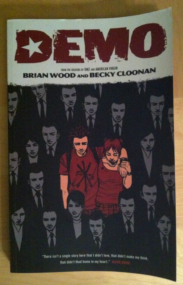

Most mainstream comics are about super heroes: people with special powers who fight some form of evil or injustice for a variety of reasons. Their powers are generally a blessing or sometimes a blessing-that-is-also-a-curse, but at the end of the day are mostly a mechanism for having adventures and punching things. Demo is a book where people have superpowers that are metaphors for how shitty life can be. The comic is basically an anthology of stories about people dealing with realistic life challenges, but with a super powered/supernatural bent that operates as a thematic device. Think a story about a teen whose words can literally hurt others or about a girl whose mother uses drugs to control her out-of-control powers. It's a pretty poignant collection of short stories that really capture the emotional flavour of profoundly difficult life moments. Demo will make you feel feelings. Brian Wood’s writing is sharp and empathic and Becky Cloonan's art conveys tremendous mood and emotion. Actually, Cloonan pulls off a neat trick in this book: she alters her art style between chapters, sort of fluctuating between manga and American influences, to give each story an individual style and sense of identity. She is a remarkably talented artist. Demo is a great book that sort of straddles the line between super hero books and literary comics and is worth checking out. Just be ready to feel feelings.

Word count: 232

Monday, 14 January 2013

Spinal Tapestry Pt. 2: Bringing the Sexy Back

On the under-appreciated art of comic book spines.

I love purchasing collected editions of comics and displaying them as art objects. They're attractive, a visible expression of my interests, and a constantly present collection of some my favourite things. Also, when the Big Earthquake comes, I'll have a great collection of reading material during the daylight hours. 

In the last post I talked about the idea that comic book spines are important in larger formats like tradepaperbacks or graphic novels because on a bookshelf the spine is the most visible part of the comic. I also used the Brian K Vaughan comics to show some examples of what I consider good and bad spine design.

This time I want to highlight some of the best and most interesting comic spines in my slowly growing comics library. These are the book spines that clearly show their designers understand how important a book spine is to a comic's on the shelf appearance. (And perhaps on the importance of standing out on a bookshelf from a retail perspective.)


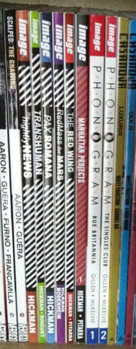
Phonogram: This is kind of the epitome of a good simple spine design for me. The "Phonogram" title uses the font of the cover title, with several logo elements incorporated. This clearly states the books identity in a clear and visually interesting way. Couple that with simple, agreeable colours that don't vary book to book and clean writing that is easily read and you get a great comic book spine. (By Kieron Gillen & Jamie McKelvie: Reviews)

Jonathon Hickman comics: This one is less aesthetically pleasing and more manipulative and clever. Every Jonathon Hickman book has a striped pattern on the spine. When rendered in black and white it is EXTREMELY eye catching (particularly when shelved as a group). The human eye is wired to pay attention to black-white-black lines and the illusion of movement these give off out of some mammals-of-the-savannah evolutionary quirk. So this Hickman block of books is super eye catching. While not the prettiest design, it is uniquely Hickman and identifies his work. More importantly, these books do not get lost on the shelf. (By Jonathan Hickman & Nick Pitarra, JM Ringuet, Ryan Bodenheim: Reviews)


(From a retail perspective this approach might be even more brilliant: only his books have this stripy pattern and its associated attention nabbing effect. If we accept the premise that the point of an eye-catching cover is to get a consumer to pick up a book, then this eye-catching spine design might represent a retail advantage.)

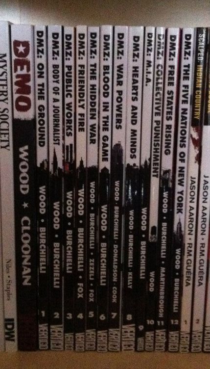
DMZ: This is one of the most clever and aesthetically appealing comic spine designs I've seen. Let me explain, DMZ is the story of a modern civil war fought between the US government and an insurgent movement. A key aspect of this story, and how it works, is the use of Manhattan Island as a war torn battlefield. It creates context for the story and serves to illustrate the horrors of modern warfare in a familiar setting. As such, a key character in DMZ is Manhattan itself. The spines of the DMZ comics are a visually pleasing design that is white behind the title writing and black behind the author text. Brilliantly, a New York landmark is included at the interface between the top and bottom half of the spine. When looking at an individual volume, it's a sharp design.  When looking at the entire series, it creates a miniature and very recognizable New York skyline effect. It's clean, unifying, unique, and highlights a key aspect of DMZ. It's great. (By Brian Wood & Riccardo Burchielli, and others)


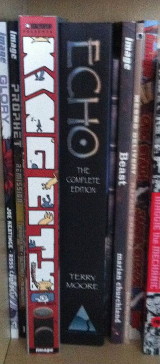
King City: This big, complete series trade shows off what you can do with the real estate of an extra wide collection. The letters that spell out King City, beyond being in an interesting and high catching graffiti-esque font, are also the frames of a tiny comic strips about a cat (presumably Earthling) stalking and dispatching a little cartoon man. It's silly, fun, really well thought out in this making-really-intelligent-use-of-space-and-storytelling kind of way, and pretty representative of the kind of comic King City is on the inside. The spine of King City is a better cover than a lot of covers. (By Brendan Graham: Review)

Also, just kind of as a case in point about the importance of interesting spine design, I've taken a picture of King City next to the extra-wide Echo The Complete Series collection. Echo actually has a pretty nice spine design: simple, has some pretty unique elements, and black always looks nice. But when you put it next to King City with its more creative use of space it kind of gets lost, doesn't it? (Echo by Terry Moore: Review)


Sweet Tooth:
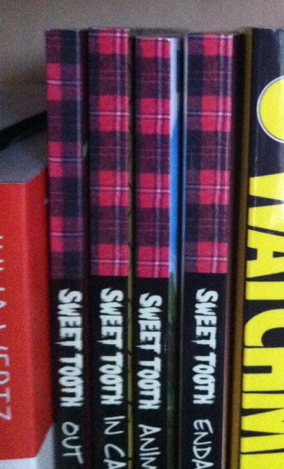
Okay, this one isn't about a good spine design... this is a little thing I noticed. So the concept of Sweet Tooth's spine is pretty solid: clean black spine, unique Sweet Tooth font, and a nice plaid pattern on the top bit of the spine. It catches the quirkiness of the series, and because a red plaid shirt is intrinsically tied to the design of title character Gus, it really catches the feel of the series. Trouble is, I think a mistake was made at some point during the design process. 
If we zoom in on the plaid pattern along the top you can see the plaid checker alternates between Volumes 1 and 2, but then doesn't ever change again. So instead of getting the checker pattern of a plaid shirt across the series (Vol. 1 and 3 matching and complement the opposite pattern on 2 and 4)... we get mismatched, unconnected plaid colours. Which all makes it feel like a great design that was compromised by a mistake or neglect. Hopefully it gets fixed on a future print? (By Jeff Lemire: Review)

In my opinion these are some of the better and more interesting comic designs out there. They manage to look good, make a statement about their series, and stand out from their competition. I certainly appreciate the extra effort.


Friday, 11 January 2013

Spinal Tapestry Pt. 1: Back Support.

On the under-appreciated art of comic book spines.

I love print comics. Love them. Especially the larger tradepaperbacks, collected editions, and original graphic novel formats. Part of it is that I think they are a more satisfying reading experience, especially for the more unconventional and challenging comics out there. It's also pretty great that they are more durable/portable format for sharing with friends. But something I really like about the format is that graphic novel format comics are displayable art objects.


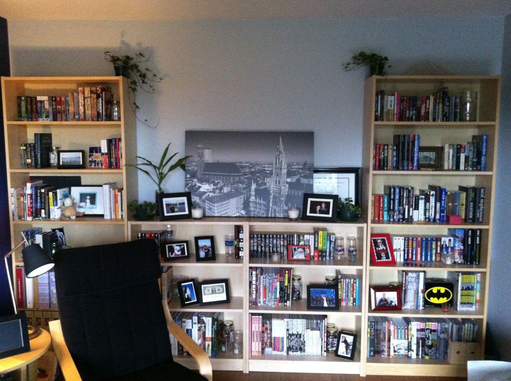
This is the longest non-radiator wall in our apartment, outfitted with bookshelves, which I've been systematically turning into a library of my favourite novels and comics. (It's still a little measly due to my history of public library reading and the used bookstore trade-ins I did when I moved out of my parents house a few years ago... but I'm working on it.)  Besides being an attractive way to decorate an apartment wall, this library really increases the home-iness of my home; all of these amazing worlds that I love are always right there to be seen, appreciated, fondly remembered or visited again. It's great.

But I've come to notice something: all I normally see of these comics are their spines. Actually, for the most part, all any of us see of bigger format comics are their spines: they are shelved at home spines out, shelved in comics shops spines out, and shelved in libraries and book stores spines out. And I think this fact might be under-appreciated by the comics industry.

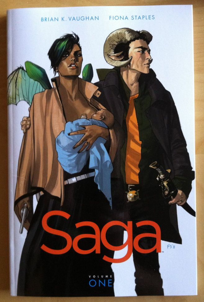
Take Saga: Volume 1, a comic that I absolutely loved reading (review pending). It has an absolutely great title page showing gorgeous artwork by Fiona Staples and a crisp, clean design aesthetic.


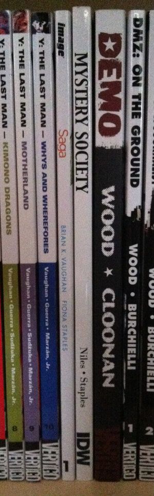
But the spine of Saga: Volume 1 is, well, it's boring. Just a lot of white space with small, bright coloured font that simply gets lost on a bookshelf.


Here is my entire Brian K Vaughan section of my comics library. These are all great comics with solidly attractive and eye-catching covers.  You'll notice though, that all we really see are the comic spines. You might also notice that these Brian K Vaughan comics, spine wise, are not all created equal and include examples of what I think are good and bad comic spine design.


Runaways: I'd call this one adequate spine design. Simple with a clearly visible font. It says what it is and doesn't get lost in the crowd. (Beige is the worst colour on Earth though... so...)

Ex Machina: This one is pretty bad. The spines of this series carries through the artwork on the cover which ends up making the spines black, with random blobs of colours. As a result, there is no unified design across the series. Worse, the title font is small and is obscured by the colour blobs. The only way I know this series is Ex Machina at a glance is its location between Runaways and Y The Last Man. Also, the old wildstorm logo on Ex Machina 5-10 is pretty unattractive.

Y The Last Man: In my opinion this is a pretty good spine design. There is a unified look across the series with each title having its own colour scheme. I can clearly see the series title, each volumes title, and the author credits. There is also a Thumbnail taken from each volumes cover at the top of the spine, which is a nice touch. This spine design is simple, fairly attractive, unified, and conveys the relevant information. I like it.

(Notice the evidence of lending? Huzzah for tradepaperbacks.)

Saga: While it's a little hard to judge with only a single volume, I'd say it isn't good. Less because it's actively bad, and more because it's bland to the point of boring. Maybe it will look better with some friends?

I guess my point in all of this is that comic spine design is an important part of making attractive, displayable print comics. Also, given how most comic shops display the majority of their comics, spine design might be important to actually selling comics. In my experience this design often isn't amazing and could be probably be improved with a bit more attention and love. 

Let's make comics beautiful for bookshelves everywhere.


Wednesday, 9 January 2013

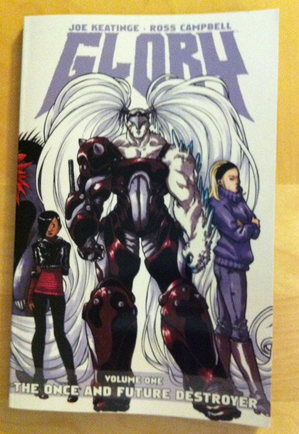
So I Read Glory: The Once And Future Destroyer


A 250 word (or less) review of the first Glory trade
By Joe Keatinge and Ross Campbell, Image Comics


Glory is the second reimagining/relaunch of an old Rob Liefeld property. The original Glory was a kind of Wonder Woman rip-off drawn in exploitative Liefeld excess. Fortunately,  Glory bears little resemblance to these origins. In the current take Glory is the daughter of a goddess and a demon king and was raised to be a weapon of mutually assured destruction to enforce a truce. Instead Glory came to Earth to be a hero and, after an illustrious super hero career, disappeared from the world. Now Riley, a young woman who inexplicably dreams the life of Glory, has set out on a quest to find her. Glory: The Once And Future Destroyer is basically a really good super hero comic. It’s cleverly written and beautifully illustrated and free of continuity baggage and story expectations. Glory is also pretty remarkable in the treatment of its female lead characters. The super hero genre standard is for tall, busty, and thin-waisted superheroines who frequently seem designed more to elicit teenage male hormones than to kick ass. The character designs of Glory are radically different: Glory looks like a bodybuilding convention reproduced with a battletank while Riley is a short, slendor, woman of east asian descent.  It’s an approach to characterization that captures diversity of the female body, but also speaks to Glory (the destroyer) and Riley (the fish-out-of-water) as individuals. It also proves male creators can portray non-exploitative females. I really enjoyed Glory and think it makes for a refreshing super hero alternative.

Word count: 249

Monday, 7 January 2013

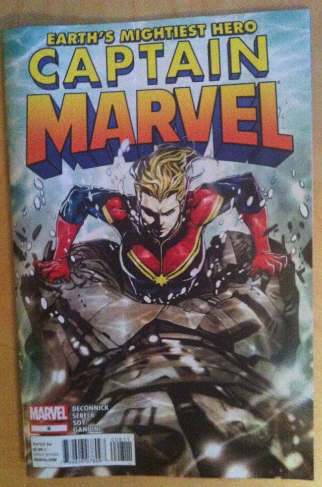
Marvelling at Captain Marvel #7 (not #6)

Or how a comic can be both a kickass Superhero story and a feminist one.


Captain Marvel is the comic telling the ongoing adventures of Carol Danvers, who is in my opinion one of Marvel's more interesting heroes. The book is being written by Kelly Sue DeConnick and drawn/painted by the epically epic Dexter Soy. (The current arc also features the talents of Christopher Sebela on writing.) It's a beautiful written and drawn comic that solidly brings the Super in Superhero while also quietly providing ideas about female heroism. It's pretty great.

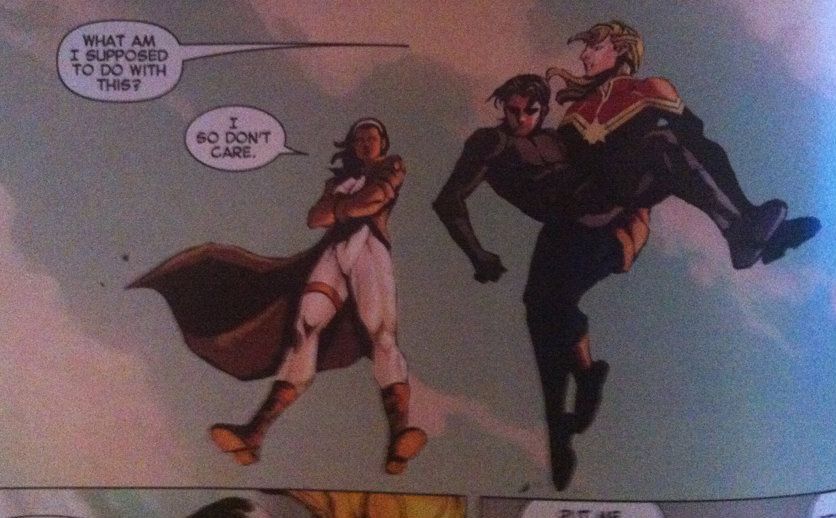
Take issue #6  #7 (EDIT: My mistake... (1))  which features Captain Marvel, and Monica Rambeau, a sometime Captain Marvel herself, fighting a giant robot comprised of sunken ships and crashed aircraft to protect the New Orleans levies. So you know, giant ridiculous Superhero action.

But on this backdrop we have our heroes saving a powerless civilian reporter in distress: and it's a dude:


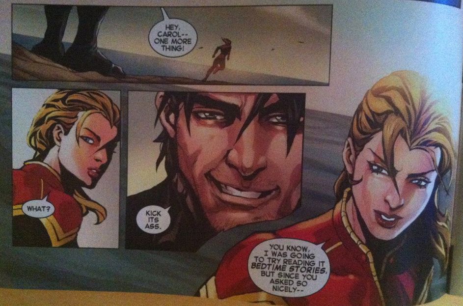
Which, as refreshing as it is, is immediately followed by this little scene:


Look at this! We have the hero of the story being told to go and be amazing by a romantic interest from the sidelines. How many times have we seen the lady love interest of the leading man in a Superhero or Sports movie or comic egg on her man from the sidelines during some conflict or event she lacks the ability to participate in. In my experience, the answer is a lot. This is, as far as I can come up with, the only time I've seen this with a woman being the action star and a man being the supportive but passive one. And it's pretty great to see.

Of course, all of this happens between punching a giant Robot. 

1: As I was snapping pics for this post, I was lending my brother my stack of ~3 months of new comics (comics being one of our few common interests). It occurred to me just as I was handing him the pile of books at a family dinner that I lacked a cover photo. I hastily snapped a quick one of a cover that looked right and wrote the post without the issue in hand. My apologies for messing that up...

Friday, 4 January 2013

Variety Is The Spice Of Comics pt. 2: Year in Review

Or how variety in comics is amazing and generally a good idea.

It's now the year 2013, which means it's now an appropriate time to post some type of top arbitrary-number-of comics list. But since much of this website is about me only reading my favourite ten mainstream comics it always operates as a top ten list. So maybe not the most illuminating entry to write...


The other chunk of this blog is celebrating the amazing Creator-ownederish comics I've been reading and honestly I think they are all pretty amazing in their own ways. The thing is, these books are mostly radically different from one another and span a wide variety of genres and subjects so it's hard to compare them.  Therefore, I think setting these comics up in some sort of hierarchal best of list is kind of unfair and, since there are distinct reasons to read each comic, kind of besides the point. 


So instead, to celebrate this New Year, I'm going to look back over everything I've read in the last... however many months since I started writing this thing and list all the great things I've read. But since that is kind of boring I'm also going to assign all of the books I've read a genre and then compare the distribution of the types of stories in my Mainstream (Marvel and DC) and Creator-ownederish comics reading. Because I think there is something interesting there.


The genres:

Comics don't automatically get assigned genres, and are infrequently sorted by genre in stores. Instead, they tend to get sorted by format (monthlies, tradepaperbacks, original graphic novels etc). So I'm going to assign my own genres to all these comics. For convenience (and ease of graphing) I'm also going to lump a bunch of genres together. To keep us all on the same page these are the genres I'll be using and a short definition of what I mean by them.


Adventure:
An action packed story with elements of travel, journey, and discovery. Usually a bit light hearted. Think Indiana Jones.

Autobiography: A truthful, or semi-truthful account of the authors life. Think... well any autobiography.
Comedy: A sizeable percentage of the story is devoted to making the audience laugh or subverting the premise for comedic/absurd reasons. I'm using this in both the humour and satirical sense. Think: Superbad or Dr. Strangelove.
Crime: A story about criminals and those that live outside the law. Usually has heist and/or thriller elements. Think Drive or Lock Stock and Two Smoking Barrels or even Ocean's 11 (the original please).
Cultural: I'm using this as a catch all for a story that integrally features a commentary on some sort of cultural construction. Think District 9 and apartheid or The West Wing and presidential politics.
Drama: A story whose action is built around emotional tension and consequences. Think Sophies Choice.
Espionage: About spies. Think James Bond
Fantasy: A story involving a supernatural element like magic. I'm going to use it in the context of historic, epic, or mythic elements. Think Lord of The Rings
Historic: Set in the past: actual or alternate. Think Gladiator or Band of Brothers.
Horror: Stories that endeavour to scare, frighten, or creep out its audience. Think The Shining, or if you're me ET.
Mystery: A story that is constructed around solving a mystery or crime. I'm also going to lump police procedurals into this category. Think Law and Order.
Other: Something that defies easy classification. Like, well that's kind of the issue isn't it.
Science Fantasy: A story with fantastical technologies or a story set in the future with fantastical elements without regard for Scientific plausibility. Think Star Wars or Firefly.
Science Fiction: A story that features some sort of societal or technological thought experiment. Think 1984 or I Robot
Slice-of-Life: About the lives of characters in a texture of their everyday life kind of way. That's a terribly nebulous definition... but it works? Think Forest Gump.
Superhero: People with super natural abilities have adventures of some sort. Think Avengers.
Thriller: Excitement! Suspense! Action! Danger! Think Die Hard.
Urban Fantasy: A story set in the present with modest supernatural elements. Think Buffy The Vampire Slayer or Ground Hog Day or American Gods.
Western: A story about the Wild West, cowboys, etc. These stories have their own kinds of genre tropes and narrative feel which goes beyond the subject matter which I think justifies them as having their own genre. Think True Grit or The Good, The Bad, and The Ugly.

Mainstream (Marvel & DC) comics I've read since starting the blog:

So here are all the comics that have been in my Top Ten at some point during the last year. How this is going to work is each title is worth 1 point towards further analysis. Since many titles don't clearly sit in one genre, their 1 point can be broken up and assigned to multiple genres. So for a book with two genres, each genre will get 1/2 a point. Pretty straight forward, right?


So with this scoring system in place these are the books I've read this year and the genres I think they most belong to:

Avengers:
Superhero

Avengers Assemble: Superhero
Batman: Superhero
Batwoman: Superhero
Captain Marvel: Superhero
Daredevil: Superhero
Fantastic Four: Superhero, Science Fiction
FF: Superhero, Science Fiction
Hawkeye: Superhero, Thriller
The Flash: Superhero
The Invincible Ironman: Superhero
Thunderbolts: Superhero
Ultimate Spider-Man: Superhero
Uncanny Avengers: Superhero
Winter Soldier: Superhero, Espionage
Wonder Woman: Superhero, Fantasy

Which gives me the following genre breakdown for Mainstream comics:

Espionage: 0.5
Fantasy: 0.5
Science Fiction: 1
Superhero: 12.5
Thriller: 0.5

Which when graphed looks like this:


Creator-ownederish comics I've read since starting this blog:

In the same period of time I read all or some of the following creator-ownederish comics. Again, each title is worth 1 point, and this point can be chopped into parts for titles that span multiple genres. Oh, and I've included links to all the reviews that have been published. Here's the list:


A Red Mass For Mars: Superhero (Review)
Atomic Robo: Adventure, Comedy (Review)
Beast: Fantasy, Horror
Casanova: Espionage, Science Fiction (Review)
Chew: Mystery, Comedy (Review)
Criminal: Crime (Review)
Daytripper: Slice-of-Life, Drama (Review)
Demo: Superhero, Drama
DMZ: Thriller, Cultural
Echo: Superhero (Review)
Fatale: Crime, Horror (Review)
Fell: Mystery, Horror (Review)
Friends With Boys: Slice-of-Life, Comedy (Review)
Four Eyes: Fantasy, Historic
Glory: Superhero
Ignition City: Science Fantasy, Western (Review)
Jan's Atomic Heart: Science Fiction
King City: Science Fantasy, Comedy (Reviews)
Love and Rockets: Slice-of-Life, Other
Mesmo Delivery: Other (Review)
Moving Pictures: Drama, Historic (Review)
Mystery Society: Science Fantasy
Orc Stain: Fantasy
Pax Romana: Science Fiction, Historic (Review)
Phonogram: Urban Fantasy, Cultural (Review)
Prophet: Science Fiction (Review)
Queen and Country: Espionage (Review)
Saga: Science Fantasy
Saucer Country: Science Fiction, Cultural
Scalped: Crime, Thriller
Scott Pilgrim: Drama, Comedy (Review)
Spaceman: Science Fiction, Crime
Sweet Tooth: Science Fantasy, Horror (Review)
The Death Ray: Superhero, Comedy (Review)
The Infinite Wait and Other Stories: Autobiographical, Comedy
The Manhattan Projects: Science Fantasy, Historic (Review)
The Nightly News: Thriller, Cultural (Review)
The Red Wing: Science Fiction (Review)
The Unwritten: Urban Fantasy, Cultural (Review)
Transhuman: Science Fiction, Comedy (Review)
Umbrella Academy: Superhero (Review)
Underground: Thriller
Whiteout: Thriller
Y The Last Man: Science Fiction, Horror

(The ones without Review links, have reviews in the pending queue. FORESHADOWING!)

Which gives us the following genre breakdown:

Adventure: 0.5
Autobiography: 0.5
Comedy: 4.5
Crime: 2
Cultural: 2.5
Drama: 2
Espionage: 1.5
Fantasy: 2
Historic: 2
Horror: 2.5
Mystery: 1
Other: 1.5
Science Fantasy: 4
Science Fiction: 6
Slice-of-Life: 1.5
Superhero: 5
Thriller: 3.5
Urban Fantasy: 1
Western: 0.5

Which gives us a genre distribution that looks like this:


Comparison and Thoughts:

So, I'd ultimately like to compare the two groups on the same graph, because Science. To do this, I'm going to normalise everything so that each genre appears as a percentage of the total titles read in each category. If I do this and plot Mainstream comics against Creator-ownederish comics I get this guy:


Which of course tells us a bunch of things. Like, I am apparently a huge dork that loves Superhero comics and Science Fiction/Fantasy comics. (So yeah, there is some selection bias in this, obviously.) But despite that, I think its pretty obvious that Creator-ownederish comics are much more diverse from a genre perspective than Mainstream comics, and that Mainstream comics are all about the superheroes.

The fact Mainstream comics are so superhero focused is both obvious and interesting. Since Mainstream books generally outsell Creator-Ownederish comics in the direct market and since virtually all of these books are Superhero or Superhero-hybrid books it's pretty safe to say there is a substantial market for this genre. But at the same time superheroes are all they are selling and I strongly suspect that everyone who wants to read a Superhero comic already is, or knows that they exist and where to get them. And I wonder, to what extent does the narrowness of the Mainstream genre pool hamper comics ability to reach wider audiences? How do Mainstream publishers, who are already publishing very high quality comics, convince new people to try comics without broadening the genres of their books?

On the Creator-ownederish side the diversity of publishing is pretty interesting. Does this variety exist because Mainstream publishing houses have effectively saturated the comics market with high quality Superhero books while neglecting other genres, thus creating a niche for closely related genre fiction? Or is it that the metric independent publishers use to determine which Creator-ownederish comics are made is the potential quality of the product rather than the products potential to satisfy a particular audience (vis-a-vis a Superhero loving one)? Or is that the creators of Creator-ownederish comics use their Superhero ideas on mainstream writing gigs and therefore mostly have ideas left over for other genres? Or are they just completely sick of writing Superhero comics? Whatever the reason for it, the diversity of Creator-ownederish comics is both fun to read and the probable source of their popularity in the book market (they stand out more) and with people who don't typically read comics.

Honestly, I think both approaches have some merit. The focus of Mainstream comics has produced some astonishingly good Superhero comics and is, at least for the moment, a viable and reasonably lucrative business model. At the same time, the variety of Creator-ownederish comics is refreshing: they  are unique and idiosyncratic and surprising which makes them a pleasant break from Superhero books. As someone that was starting to burn out on Superhero books, this ability to find genre variety is an essential part of my comics enjoyment. Being able to find amazing comics of all kinds and supplement them with excellent Superhero books is pretty great. (Did I mention reading a tradepaperback/original graphic novel a week and ten Superhero titles a month is a pretty great way to read comics?)

My one concern is whether the world needs so many Superhero books. I maintain that everyone who wants to read Superhero comics largely already is, and if they are anything like me, they are already spending everything they are going to on these comics. To grow the North American comics audience and to create a more viable long term market I think it would be in the interest of Marvel and DC to inject more diversity into their respective lines. That way they might be able to draw people who have no interest in Superheroes into comics in the same way Image and other Creator-ownederish publishers and imprints have been doing.

So there, that was my year in comics by genre.

Wednesday, 2 January 2013

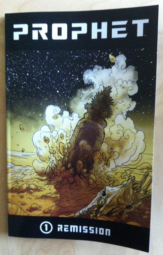
So I Read Prophet: Remission

A 250 word (or less) review of the first collected Prophet trade
By Brandon Graham, Simon Roy, Farel Dalrymple, and Giannis Milogiannis. (and Emma Rios.)


Prophet is a reboot of an old Rob Liefeld book that was essentially about an astronaut-barbarian, which is all you need to know about that since this new Prophet is radically different. Under Graham Prophet is a high concept science fiction epic about, well, something intriguingly enigmatic at this point. The story opens in the future, thousands of years after the fall of something called the Earth Empire, on an Earth made into a hostile alien wilderness by time. The plot revolves around a man named John Prophet as well as other agents of the fallen Earth Empire as they carry out missions to reinstate the Earth Empire. I think my favourite thing about Prophet is the pervasive strangeness of it. The worlds that the writers and artists of Prophet create are at once immense and granular and believable but also bizarre and radically different than anything we have experienced. The aliens in Prophet are, well, alien: they look, interact, and behave in ways that are fundamentally not human. Better yet, even the human, relatable characters are slowly revealed to deviate widely from our social norms. It’s a refreshing thing in Sci-fi when you are confronted with the truly strange. The artwork in Prophet: Remission is every bit as great as the neat concepts and intriguing story. Every one of Prophet’s rotating artists is fantastically talented, and brings a slightly different dynamic and character to the work and builds upon what the last artist did. Remission is a must read.

Word count: 250

Previously:
So I Read King City