I love print comics. Love them. Especially the larger tradepaperbacks, collected editions, and original graphic novel formats. Part of it is that I think they are a more satisfying reading experience, especially for the more unconventional and challenging comics out there. It's also pretty great that they are more durable/portable format for sharing with friends. But something I really like about the format is that graphic novel format comics are displayable art objects.
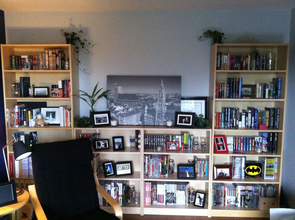
This is the longest non-radiator wall in our apartment, outfitted with bookshelves, which I've been systematically turning into a library of my favourite novels and comics. (It's still a little measly due to my history of public library reading and the used bookstore trade-ins I did when I moved out of my parents house a few years ago... but I'm working on it.) Besides being an attractive way to decorate an apartment wall, this library really increases the home-iness of my home; all of these amazing worlds that I love are always right there to be seen, appreciated, fondly remembered or visited again. It's great.
But I've come to notice something: all I normally see of these comics are their spines. Actually, for the most part, all any of us see of bigger format comics are their spines: they are shelved at home spines out, shelved in comics shops spines out, and shelved in libraries and book stores spines out. And I think this fact might be under-appreciated by the comics industry.
Take Saga: Volume 1, a comic that I absolutely loved reading (review pending). It has an absolutely great title page showing gorgeous artwork by Fiona Staples and a crisp, clean design aesthetic.
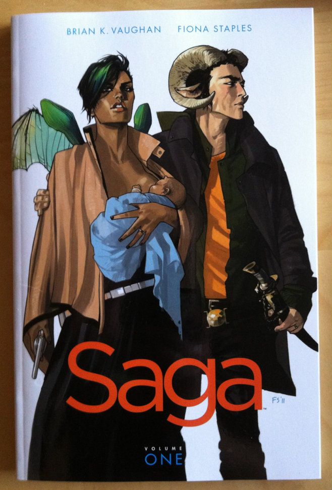
But the spine of Saga: Volume 1 is, well, it's boring. Just a lot of white space with small, bright coloured font that simply gets lost on a bookshelf.
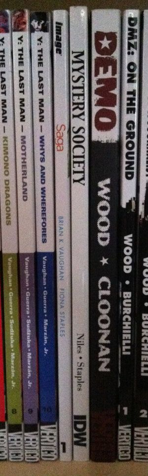
Here is my entire Brian K Vaughan section of my comics library. These are all great comics with solidly attractive and eye-catching covers. You'll notice though, that all we really see are the comic spines. You might also notice that these Brian K Vaughan comics, spine wise, are not all created equal and include examples of what I think are good and bad comic spine design.

Runaways: I'd call this one adequate spine design. Simple with a clearly visible font. It says what it is and doesn't get lost in the crowd. (Beige is the worst colour on Earth though... so...)
Ex Machina: This one is pretty bad. The spines of this series carries through the artwork on the cover which ends up making the spines black, with random blobs of colours. As a result, there is no unified design across the series. Worse, the title font is small and is obscured by the colour blobs. The only way I know this series is Ex Machina at a glance is its location between Runaways and Y The Last Man. Also, the old wildstorm logo on Ex Machina 5-10 is pretty unattractive.
Y The Last Man: In my opinion this is a pretty good spine design. There is a unified look across the series with each title having its own colour scheme. I can clearly see the series title, each volumes title, and the author credits. There is also a Thumbnail taken from each volumes cover at the top of the spine, which is a nice touch. This spine design is simple, fairly attractive, unified, and conveys the relevant information. I like it.
(Notice the evidence of lending? Huzzah for tradepaperbacks.)
Saga: While it's a little hard to judge with only a single volume, I'd say it isn't good. Less because it's actively bad, and more because it's bland to the point of boring. Maybe it will look better with some friends?
I guess my point in all of this is that comic spine design is an important part of making attractive, displayable print comics. Also, given how most comic shops display the majority of their comics, spine design might be important to actually selling comics. In my experience this design often isn't amazing and could be probably be improved with a bit more attention and love.
Let's make comics beautiful for bookshelves everywhere.
No comments:
Post a Comment