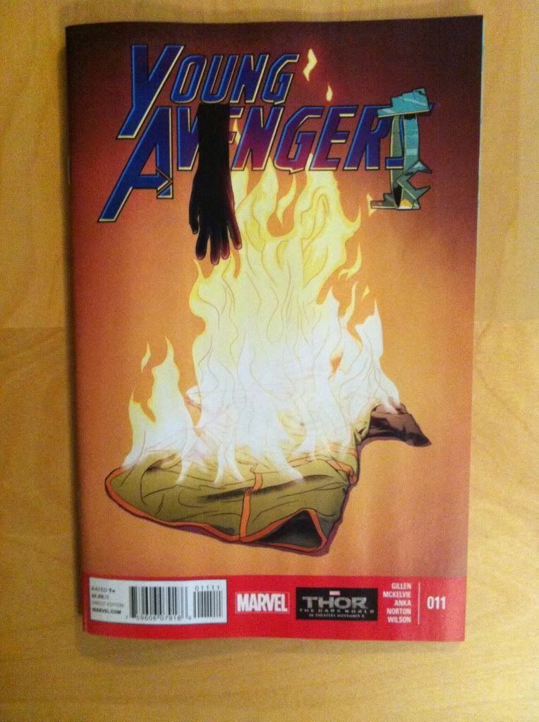
Or more yet more meta in Young Avengers #11
by Kieron Gillen, Jamie McKelvie, Kris Anka, Mike Norton, and Matt Wilson; Marvel Comics
Before we get started I would like to point out that this review will be made of *SPOILERS* for Young Avengers #11. So do NOT read on until you have read the comic. Jeez.
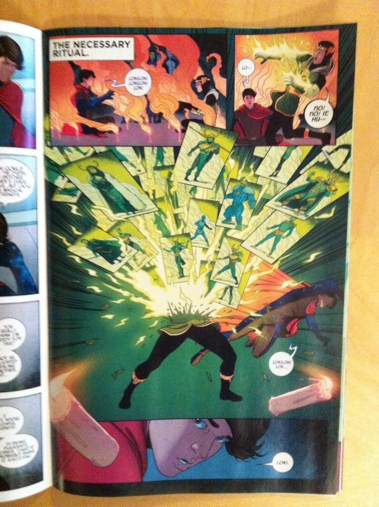
One of my favourite aspects of YA is how the creative team breaks the fourth wall to represent magical phenomenon in the comic. Essentially team YA uses artwork and layouts that violate the rules of comics (people breaking through panels, reaching into captions, etc) to represent the occurrence of things beyond the rules of reality (in this case the comic). It's great stuff and there is another great example of this inside Young Avengers #11.
*SPOILERS*
This sequence occurs during a ritual to recreate Loki in a more powerful form. Along the way Loki breaks open and out pops a bunch of smaller panels containing different aspects and iterations of the character of Loki. As such the flying panels within panels is a pretty great representation of the spell being enacted: it shows Loki being destroyed and reborn in a way that is dynamic and which breaks the rules of the comic universe: being split into panels within a panel is NOT how things usually go, it's impossible and magical. It's more great comics from the creators of Young Avengers.
But it's also more than this. Part of Young Avengers #11 is that Loki gets a serious, and excellent character redesign and this panel of magic is a fantastic visual metaphor for the process of redesigning an established character. The embedded Loki panels provide a survey of both previous character designs and visual representations of character aspects of Loki. As such, these panels let us do the kind of research the designing artist no doubt did: we get to see the different looks of Loki, the common design elements, the uncommon elements which add something interesting, as well as some of the other character aspects (like his frost giant biology) that define the character. And from these panels we can create a sense of Loki, an idea of what the formative elements of Loki are. His clothes will be green with yellow highlight, there will be some sort of horned headgear, maybe some furred or armoured period clothing, and maybe he is a little androgynous. And then we turn the page...
...and there he is. The redesigned Loki who incorporates the constellation of Loki elements in a new and really excellent way. We can immediately tie his character elements back to the constellation of Loki designs on the previous page. (Also love the addition of the scaly armour, such a great overlap of medieval armour and lying serpent.) As such we get to EXPERIENCE the transformative power of the redesign and the magic of the spell. It is fucking brilliant comics, an interesting meta-glimpse at the process of redesign, and a really effective way to increase the dramatic weight of the moment. It's also a fucking brilliant character redesign.
Young Avengers is just such a fantastic comic.
Previously:
Favouring The Young Avengers #10
Favouring The Young Avengers #8
Favouring The Young Avengers #7


No comments:
Post a Comment