Or my apparently regular feature gushing about Matt Fraction and David Aja's Hawkeye because this book is perfect.
Wherein I continue my wonky analysis of how great Hawkeye is and say nice things about the creators. Actually my analysis for number six is going to be two entries because this comic in general, and number six in particular, is just such a... brain meltingly amazingly crafted comic.
Okay, so many *SPOILERS* to follow.
So, in this post I'm going to gush about the art. Now this comic is super collaborative so making distinctions between artist and writer is probably not fair. For simplicity sake I'm going to just write about it like David Aja made all the art descisions, but bear in mind Matt fraction probably deserves some of the credit too.
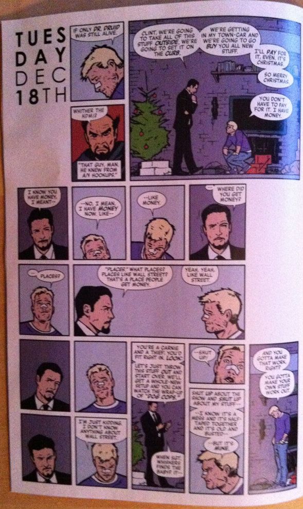
I think a good place to start is that this comic looks amazing. The characters are expressive, kinetic and complex. The backgrounds are incredibly detailed, well designed, and filled with a hundred little amazing tidbits (the neglected Christmas tree, Charlie brown shirt, etc) that make it a real place. And the use of high panel count grids just makes for such a textured (I guess?) read. Such clear story telling and so much style. All you really need to know is that David Aja Is an incredibly talented artist.
But if you want to see me wonk out some of his brilliant use of panel patterning and layout: read on.
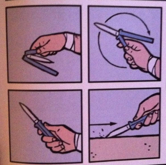
So for most of the book, the pages have an entirely, or mostly, high panel count grid, generally split into three sections (above). This allows for a lot of evets/disussion etc to built into each page and makes for an easy to follow progression of events (below). This, for the reader, becomes the default pace of the story which makes violations of this pattern interesting and informative.
(Also, how simple and beautiful are these four panels? Amazing.)
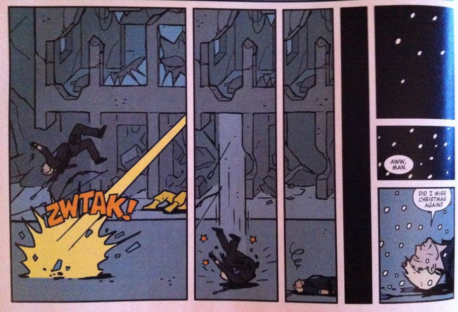
The simplest violation is this little bit here where Hawkeye blacks out. The panels horizontally narrow and blacken and simulate the tunnel vision of losing consciousness. It clearly conveys in a visual language that Hawkeye got his ass knocked out. It's a pretty common technique, but it's a great example of the kind of thing
I want to talk about.
The next violation of grid comes right after Clint comes to. See how the panels are staggered (not vertically aligned) with the first panel in the sequence lower than the second? This is both breaking of the grid pattern and a violation of the sequential art left-to-right, top-to-bottom convention. This momentarily throws things askance, and makes the reader experience Clint's dizziness in a visual way. All from layout. Simple and so, so smart.
Okay, in this one we have our heroes on the roof of their apartment building running to the edge and looking down at some tracksuit Dracula thugs. Here, the right most panel in the top sequence extends down past the following panels. The first thing this does is make the reader look down, which is the same thing our heroes on the roof are doing, which is fun and clever. The second, more practical storytelling thing it does is that it gives everything a sense of place: the heroes are on the roof looking at the thugs below them on the street. It also does a third thing: by overlapping with the following thug panels with this tall panel it suggests that the tall panel both proceeds and follows the thug panels. This suggests that our rooftop heroes remain looking over the side throughout this whole exchange, which adds a time/temporal factor to this scene. Again, so simple but so smart.
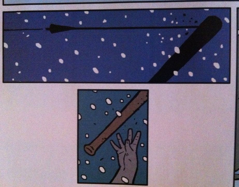
This one is a little more visually complicated. In the top panel the arrow hits the bat. It's double width accommodates the width the arrow but also imparts lateral movement: the width of the panel (compared to the skinnier panels in the grid) means our eyes physically move along it. The next panel of the thug dropping the bat is cut from the top panel to imply time: the arrow strikes the bat a moment before the thug drops it. It's a great little beat that imparts both motion and time through the use of layout.
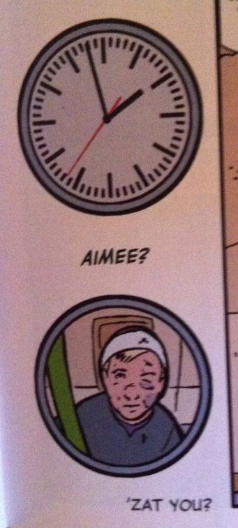
Okay this panel transition here is just too much fun not to include. The clock, as a recurrent device to pace the story (which takes place over six days), leading into a fish eye door lens that uses the same border is just great. (There may have been slow clapping).
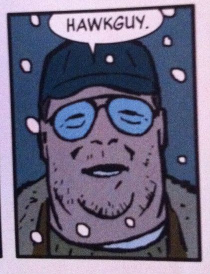
Okay, this isn't a wonky analysis thing, but that's John goodman right? It sure looks like him, and is written like him, and as a result sounds like him in my head... I mean it's totally him.
Someone needs to use coercion, bribery, or threats to make John Goodman say "Hawkguy" on tape. Because it would be amazing.
Alright, so there you have it: more evidence that David Aja and company are genius.
Join me next time for a post about how great the writing of Matt Fraction is in Hawkeye.


No comments:
Post a Comment