Wednesday, 9 April 2014

So I Read Unknown Soldier

A 250 word (or less) review of Unknown Soldier: Haunted House, Easy Kill, Dry Season, Beautiful World
by Joshua Dysart, Alberto Ponticelli, Pat Masioni, Oscar Celestini, and Jose Villarrubia; Vertigo Comics
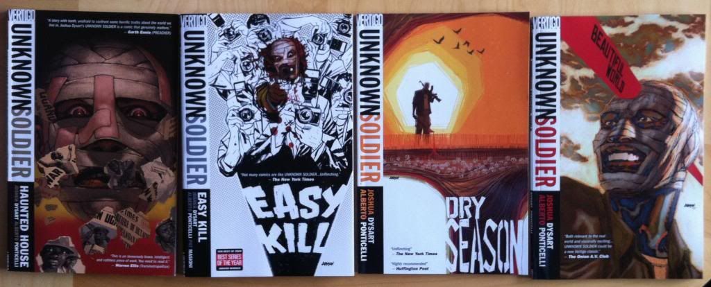


While I think I’m a reasonably well-informed person, I really don't know much about Subsaharan Africa and the conflicts afflicting the region. I think this is typical of many North Americans. Unknown Soldier is a comic that aims to educate an ignorant Western audience about the fight against messianic-madman and insurgent leader Joseph Kony and his Lord's Resistance Army during the height of the conflict in Uganda. The comic provides an unflinching look at this truly monstrous thing, from the use of child soldiers and child sex slaves to the desperate plight of the displaced and marginalized Acholi minority in Uganda. Unknown Soldier uses the lens of Dr. Moses Lwanga, a crusading activist and doctor who returns to Uganda from the United States with the intention of building a better future. However, Dr. Lwanga is heir to a dark secret and the violence that confronts him awakens something that sends him charging into the maelstrom. It’s a brutal comic that takes a really hard, uncomfortable look at these events and attempts to make them understandable through fiction. Unknown Soldier is also an action comic that orbits some pretty engrossing mystery and drama so it's also a pretty exciting comic. Unknown Solder does suffer from a very abruptly ending that leaves story potential untapped and it, out of necessity, shows a very narrow view of life in Uganda which maybe feeds the idea of Africa as an exclusively wretched place. On balance, it's an interesting and informative comic well worth reading.


Word count: 250

Monday, 7 April 2014

Deep Sequencing: Admiring The Hole

Or some of the brilliant design choices and motifs in Transmetropolitan
By Warren Ellis and Darick Robertson; Vertigo Comics


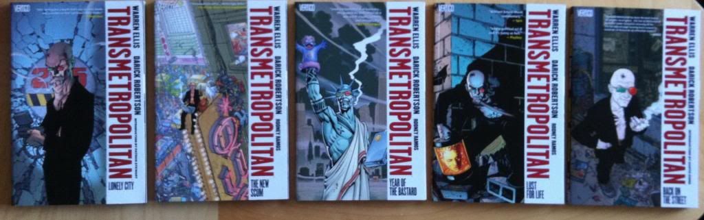
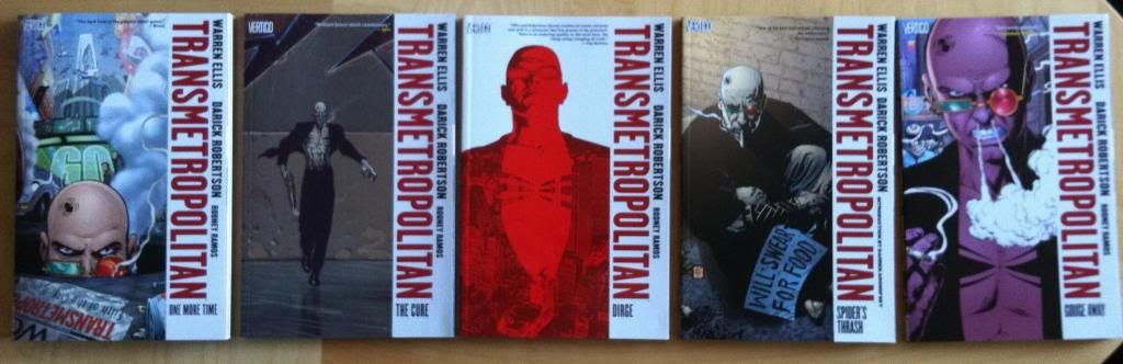
Transmetropolitan is a comic that, I think, is justifiably very well regarded by a lot of people. It's certainly one of my all time favourite comics. And there are a lot of reasons why I am so crazy about this comic: the thematic examination of the intersection of politics and journalism is fascinating, the way tension in the story builds is breath-bating, the gonzo Science Fiction is fun, and the relentlessly juvenile humour is a joy. Transmetropolitan is also a comic with some really adroit artwork and storytelling, with some of my favourite sequences in comics and a superdense, highly developed sense of place. It's a really great comic.

One of the things I am most interested in Transmetropolitan is how certain recurrent visual elements are used to drive theme and character in the comic. Transmet is, buried in all of the bowel disrupters and sex puppets, a comic that does some remarkably smart things with symbols and motifs to subtly relay information to the reader. And since comics blogging is about obsessing about small, interesting choices I'm gonna show you some of my favourite.

There will, as always, be *SPOILERS* for Transmetropolitan in the following.


THE GLASSES: One of the most obvious recurring elements in Transmetropolitan is Spider Jerusalem's glasses. In the story, the eyewear operate as Spider's hightech personal screens and cameras that record the world around him. But they are also a key part of his character design that convey a lot of information about him. Like, the green and red different coloured lenses are reminiscent of 3D glasses and suggest Spider sees the world in greater depth and detail than those around him. Or, and I'm stealing this from a great character design essay by Aaron Diaz of Desden Codak, the shape of glasses give Spider a permanent cocked eyebrow type of look, which is the perfect expression of inquisitiveness, and the basis for a sardonic smirk. But it maybe even goes a little further than that: Spider is a character very much defined by his paradoxical ability to be a massively cynical analyst while still appreciating the truly remarkable aspects of life. And I think this is captured in his glasses which are split between a wide-eyed awed look and an analyzing scowl.

And the glasses are not limited to Spider. As Transmet progresses The Filthy Assistants progress from caregivers/coffee fetchers to junior journalistic comrades, and by the end of the comic they become chain smoking, glasses wearing truth seekers themselves. Admittedly, both women go through a few different phases of eyewear, but the ones they have on at the end,  I think tell us something about their characters. I have a theory that the shape of their glasses are reflective of their character as journalists. Yelena Rossini takes to wearing very narrow shades, maybe representing her evolution as a cynical, Spider Jerusalem style reporter. Channon Yarrow takes up wearing round glasses, which is maybe symbolic of her eventual career path as a novelist with a more big  picture, less cynical view of the world. Which maybe captures the round-lense, dreamer half of Spider's writing views. 


THE TATTOO: Another recurrent element in Transmet that gets used in interesting, subtle ways is Spider Jerusalem's forehead spider tattoo. It's a great piece of character design: a creepy tattoo drawn directly on the face really cements Spider as a counter-culture figure and acts very much as a symbol of him. A spider for Spider. But this tattoo also gets used in this really clever way to subtly hint at the health status of Spider. When he is healthy the tattoo appears as a crisp, unbroken black tattoo. As Spider's brain condition becomes more prominent and he is injured, the spider tattoo is split in a wide, bloody gash. Spider is symbolically cut asunder. Following this the tattoo shows the steps of Spider's recovery, beginning bandaged and hidden, and then emerging broken, split by a new scar. Symbolically Spider is recovered, but still broken and flawed. And all of this is conveyed only by the status of Spider's head ink. 


The Spider tattoo also tells us things about Yelena. As she becomes more of a journalist and begins to become, more and more, a kind of disciple of Spider, she gets the Spider Jerusalem style spider tattoo on her bottom. A symbolic representation of her growing Spider-ness. In the final chapter of the story, when Yelena is her own, mature, journalist we see her with her own spider-ish tattoo: a female symbol with spider legs: kind of an amalgamation of her Spider-ness with her own, special voice. All shown through symbols.


SMOKING: Another ongoing motif I love in Transmet is cigarettes. Throughout Transmetropolitan smoking is used as a signifier of someone telling the truth. Spider Jerusalem, the vulgar truth spilling asspot himself, chain smokes like an industrial chimney and becomes a plume of smoke when he is telling the truth. The Filthy Assistants, as they become journalists take to smoking. Royce, Spider's editor, chain smokes, particularly in scenes where he trumps his papers management to further the truth. Spider's sources, from the vile Fred Christ to the sympathetic Liesl, a former transient hooker, smoke cigarettes while they tell their truths. And even a lowly TV producer lights up when she decides to fuck the censors and display important news damn the consequences. It's a great visual signal that is not only handy, subtle information for readers, but is also just visually great: it's like the truth is a fire in the belly that billows out as smoke. It's great comics.

Previously:
So I Read Transmetropolitan
Deep Sequencing: My favourite Transmet sequence.

Friday, 4 April 2014

Deep Sequencing: Bowel Disruption

Or one of my all time favourite comics sequences that makes me lose my shit in Transmetropolitan
By Warren Ellis and Darick Robertson, Vertigo Comics


Way before I started writing about comics and really looking at sequential art as a series of story telling choices, there were some sequences in comics that were immediately, obviously great. And this sequence in Transmetropolitan has stuck with me forever as a fantastic comics sequence. It's been my example of how smart composition enhances storytelling from before I had any need for such examples. And now that I actually need such examples of great comics, you better believe we are going to take a closer look.

There will be mild *SPOILERS* for Transmetropolitan below.


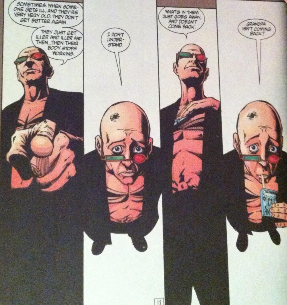
This sequence tells the story of Spider Jerusalem relaying an anecdote about his grandfather's death when he was but a boy. As part of this anecdote Spider delivers the dialogue of the conversation between him and his parent, presumably using affected voices.What I love about the sequence is just how clearly it delineates the adult dialogue from the child dialogue in the anecdote. The crux of this is the way the angle of the panels changes so that the "camera" is aimed down at "child" Spider and aimed up at "adult" Spider-parent. What this essentially does is give the reader alternately the perspective of an adult looking down at child or the gaze of a child looking up at a stern parent. It also, has the added effect of presenting Spider in two very different ways: from above he looks smaller, seems to have a larger, disporportionate amount of head, and you can clearly see his eyes, while from below he looms over the frame and his eyes are hidden behind his glasses. These alternating perspectives make this a pretty good sequence.

But the thing that, for me, that makes this sequence so completely memorable, is how the cigarettes are used throughout the composition. In the third panel, Spider reaches into his coat to grab a pack of smokes, making a very adult, commanding hand gesture, reminiscent of a hand cocked to smack a child. While in the fourth panel, and this is my favourite, Spider pulls a cigarette out of the box with his mouth in a way that looks like he is drinking from a juice box. A very childlike activity. Add, in the next page, "adult" Spider performing the very grown up activity of actually smoking and you have cigarettes used to completely enhance the adult/child split in this composition in a way that is super clever and unique to this series of panels. It's perfect.

Previously:
So I Read Transmetropolitan

Wednesday, 2 April 2014

So I Read Transmetropolitan

A 250 word (or less) review of the complete series of Transmetropolitan,
By Warren Ellis and Darick Robertson; Vertigo Comics


Transmetropolitan is easily one of my all time favourite comics. Easily. The comic is about the power and importance of journalism particularly as an essential brake on the machinations of politicians. To explore this, Transmetropolitan uses the lens of Spider Jerusalem, an infamous journalist and mildly loathsome creature, as he returns to The City in a vulgar and shocking future. Jerusalem takes up a column and along with his Filthy Assistants explores the wondrous, the downtrodden, and the futuristic while fucking with the local authorities and generally running amok with a bowel disrupter. That is until the Presidential Election, where Spider delves into the disgusting truth of politics and makes a powerful new enemy. "Journalism is just a gun. It's only got one bullet in it, but if you aim right, that's all you need. Aim it right, and you can blow a kneecap off the world." Transmetropolitan is a comic chock full of brilliantly deep characters, imaginatively vulgar settings, high concept Sci-fi, holy shit tension, and ineffably beautiful observations of the human condition. It is by far one of the most complete long running comics you can read: from beginning to end it maintains a sterling level of writing and art and manages to be a perfect blend of gripping, funny, smart, and offensive. It's fucking fantastic comics. Read it, and it might just blow a kneecap off your world.

Word count: 230

Monday, 31 March 2014

Eye On Hawkeye #18

Or a look at how colouring is used to manage setting in Hawkeye #18
by Matt Fraction, Annie Wu, and Matt Hollingsworth; Marvel Comics


Hawkeye continues to be that dang comic. 

I didn't write about Hawkeye #17, the Winter Friends issue because its release date managed to land right in the middle of Busy Times, and because I didn't have much to say about the issue other than it was absolutely tons of fun. I mean, there were a great many interesting parallels between the issue and the series as a whole, but they were obvious and no one likes overtly obvious criticism. (Oh my god, you guys! Steve was TOTALLY Clint!!)

Fortunately for my purposes, Hawkeye #18 is a much more conventional issue of Hawkeye that is pregnat with interesting comics to try and figure out. The thing that struck me most about Hawkeye #18 was just how dense an issue of comics it was: it took substantially longer to read than an average super hero comic. Hawkeye #18, I think, gets its density from both a higher than normal panel count (a hallmark of the Hawkeye series), but also by the sheer number of settings in the issue. Seriously, over 20 story pages Hawkeye #18 has  at least 13 discreet settings (and that's being stingy and not counting all of the flashback scenes or in-transit sequences as settings.) This is a lot of settings!

The thing about a comic with so many locations is that there is the potential for the entire beast to be one confusing mess. But Team Hawkguy is really great at making ambitious comics work through studious attention to detail. To solve the problem of multiple settings in a relatively short comic book, Team Hawkguy leverage work done in previous issues by revisiting, in part, some familiar settings. There is also,of course, the clear storytelling of the Wu/Fraction collaboration and the simple fact that every setting is smartly designed and drawn well. But to me, maybe the most interesting way Team Hawkguy effortlessly encodes information about multiple settings is in the colouring of the issue.

There will of course be *SPOILERS* for Hawkeye #18 throughout this post.

One of the main ways Hawkeye #18 managed to seamlessly juggle so many settings discrete settings and handle characters moving from one location to another was through the use of lighting. Every setting, very nearly, had its own discrete lighting which which affected the tone of every colour in the effected composition. This is just a random sampling, but there is the bright, artificial lighting of the grocery store, the semi-dark lighting of an unlit apartment in chaos, the glaring white brilliance of bathroom lighting, the warm glow of being at the beach in direct sunlight, the dark blue shadow of being outside at night, and the gentle lighting of a tastefully lit restaurant. Each of these scenes looks and feels different, despite the same character colours (Hawkeye is always purple), making each place visually and emotionally distinct. Furthermore, changes in lighting, and particularly shadow, really help keep character location straight as the darkness of the LA night makes it very clear when characters leave one location and move to another. Hawkeye #18 is a masterclass in how effective and thoughtful lighting effects in colouring can convey a huge amount of information about setting.


Hawkeye #18 also leverages colour directly to help solidify each setting as a discrete location. Many of the key scenes have a distinct colour palette that makes each feel unique. Kate's trailer is coloured in tones of purple, since everything Hawkeye must be, while the scary mansion is rendered in blacks and shadowy blues. The bathroom is white-white-white while in the flashback sequences the LA skyline is a sunset, nostalgic orange, hollywood parties are opulent red, purple, and pink, and the beach is a study in tan-yellows and skyblues. Even at a cursory inspection, like in the selection above, each of these settings is clearly different and unique both visually and emotionally. Clearly, say, the dark and creepy mansion is in a different physical space and story location than the swank, fancypants Hollywood party. It's great stuff.

(For sake of argument, think about a Batman comic. I love Batman, but when it comes to setting, Gotham is usually rendered universally as this dark, black and blue, urban landscape that heavily features shadowed lighting. It often feels like this looming, monolithic space of indistinct urban-ness, fear, and violence. Which I think often makes Gotham seem less like a place and, maybe intentionally, more of an indistinct nightmare land. Hawkeye, with this smart use of tying colours to locations, feels much more real and diverse in the spaces visited. Which is a choice so subtle that, I think, it's easy to miss: colouring, when done well, is this permeating invisible thing that can drive so much storytelling.)


Hawkeye #18 also has some great exampls of colouring as a storytelling device that go beyond establishing setting. In the top selection the way colour is dropped in the second panel suggests, with no words or artwork to support it, that Hawkeye is focussing on making a tricky arrow shot. The colour, and the world, fall away for a moment of aiming and we the audience understand the story message of the panel based solely on the colouring information. The second selection works this way too: we see the red and blue glare of rollers and understand that our heroes have been stopped by the LAPD. This is again based solely off colouring information, since we never actually see a cop car drawn in any of the preceding or subsequent panels in this sequence. Which is just more evidence that effective colouring choices can be a fantastic storytelling tool. 

Hawkeye #18 is a treasure trove, I tell ya.


Previously:
Eye on Hawkeye #15: Composition, Layout, and colours.

Eye on Hawkeye #16: Smart layouts and chilling moods.
Eye on Hawkeye #14: Repetitive panels as a device.


Friday, 28 March 2014

The Dispossessed Is A Good Book

Or why you should read The Dispossessed by Ursula K Le Guin,


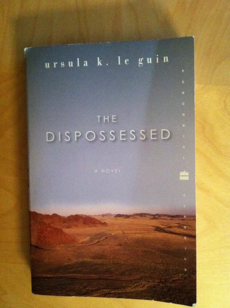
The Dispossessed is a utopian Science Fiction novel about binary contrasts and the human spirit. The novel is set in the twin planets Urras and Anarras in the Tau Ceti star system. Despite their proximity, the two planets are diametric opposites: Urras, is a lush, fertile garden world of plentiful resources while Anarras is a hostile, arid world rich in minerals but poor in natural life. While both planets are inhabited by the Cetain species, the cultures of the two worlds are radically different. Urras is mostly an aggressively capitalist planet, divided into warring nation-states which are governed by vaguely authoritarian governments. Urrasti society, as a result, is very much divided between the rich and the poor, the powerful and the repressed. Anarres, in contrast, is a world without governments, ownership, commerce, or hierarchies. Anarresti society, based on the collectivist/anarchist philosophy of Odo, is defined around equality, sharing, achieving personal happiness, and surviving the harsh Anarras environment and the collective poverty of the world. The two worlds, Urras and Anarres, despite their proximity are, aside from some minor trade, completely isolated from each other and have been for generations. It is against this contrasting background that the novel tells the story of the brilliant Anarresti theoretical physicist Shevek, who in his quest to achieve a General Temporal Theory, must consult alien physicists and chooses to travel to Urras to pursue his research. And in doing so Shevek becomes a lens to explore both societies, both halves of the binary, and in so doing examines what it means to be human in a society. It's a brilliantly smart and humane work of fiction.

I would recommend The Dispossessed to any Science Fiction fan: if you have pretensions of being a serious Sci-fi reader this is a must read book. It's beautifully written, emotionally deep, and painfully intelligent (although in a very accessible way). It is also one of the most astute political explorations I've ever read, and unlike most landmark social speculation novels it does't rely on dystopia. Instead it's a frank look at different societies in a way that is aware that few societies are completely shit: most, for all their problems, also have strengths, and the way The Dispossessed uses and breaks its binaries is really mindful of that. It's pretty refreshing. And so I would also recommend this book to anyone into fiction with a heavy element of social meditation because this is Sci-fi built for political nerds. The Dispossessed is also a novel that I would recommend to people looking for more great Sci-fi by women authors. Part of why I picked this book up was having it pointed out/realizing just how few women authors I read and a desire to find out if I'm missing out on some great Sci-fi. And, well, The Dispossessed is exactly the kind of novel I was afraid I was missing out on.


Wednesday, 26 March 2014

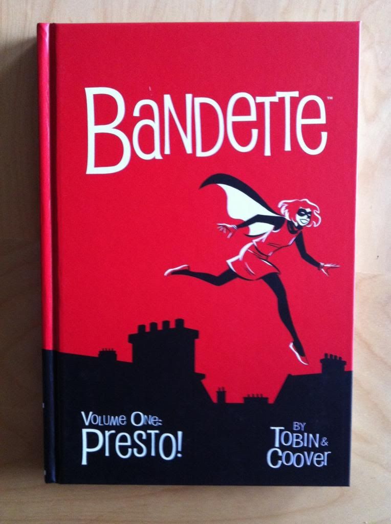
So I Read Bandette: Presto!

A 250 (word or less) review of Bandette Volume One
By Paul Tobin and Colleen Coover; Dark Horse Books/Monkeybrain Comics


Sometimes it's okay for a comic just to be fun. I like brooding drama and intricate mechanical plots with relentless character stakes as much as the next person, but sometimes it's nice to read a comic where everything is pretty okay and all the characters are enjoying themselves. Bandette: Presto! is a relentlessly fun comic. The comic is about Bandette: a French master thief with dubious morals, a penchant for altruism, an infectious zest for the joys of stealing, and a sweet tooth. Presto! introduces Bandette, showcases some of her enjoyable capers, and colours her world with her band of merry urchin accomplices, debonair gentleman rivals, cartoonish inspectors, and Parisian rooftops. Presto! also sets up an ongoing conflict with FINIS and it's leader Absinthe, with a series of crimes meant to infuriate and damage the nefarious organization. The entire package, from the giant grin on Bandette's fez to her chihuahua Pimento, is invitingly, glaringly, relentlessly fun. It's the kind of comic that scampers over rooftops with glee, somersaults gracefully through spells of silliness, and flirts dangerously with the sharp edge of inanity, but somehow manages to tumble through as a really enjoyable, surprisingly mature and smart comic. Bandette is very much the ultra-fun comic for fans who don't typically enjoy silly comics. It's a comic you really ought to try.

Word count: 220