Wednesday, 31 October 2012

So I Read Mesmo Delivery


A 250 word (or less) review of the Mesmo Delivery graphic novel
By Rafael Grampa, Dark Horse Books


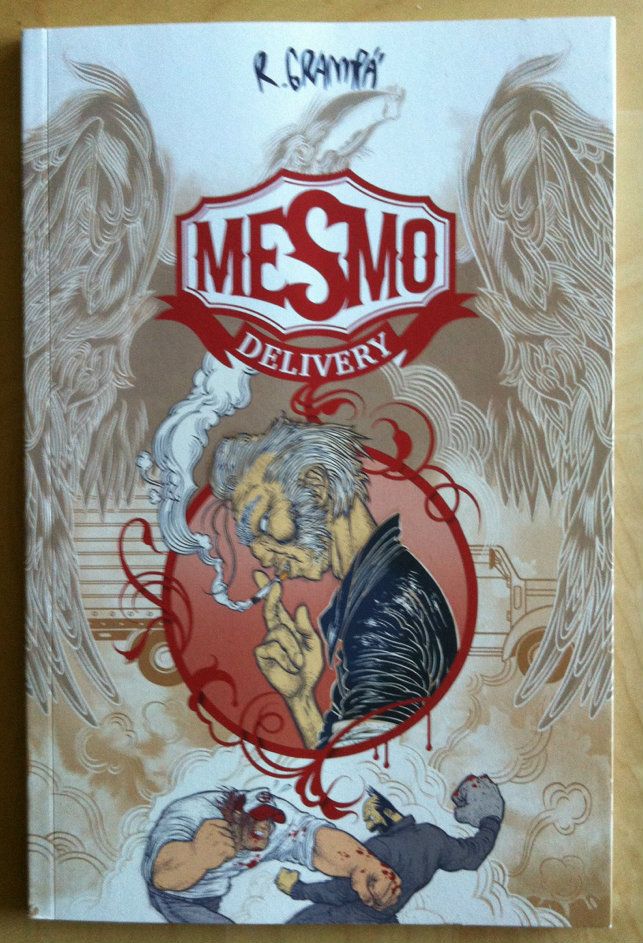
Mesmo Delivery is, plot wise, a very simple book. In it delivery truck drivers Rufo, a retired boxer, and Sangrecco, a sometime Elvis impersonator, visit a truck stop and get into a street fight with some locals with violent and eerie results. But in all honesty, this isn’t a comic you read for the script. Mesmo Delivery exists to showcase Grampa's incredible artwork because holy shit is he talented. Grampa’s art has this exquisitely grotesque quality to it: everything is at once beautifully designed and kind of elegant but also brutal and careworn and abstractly ugly. The characters, backgrounds, and objects in the book are all endlessly fascinating to look at, but it’s the choreography of the book that makes it exceptional to me. The more conventional brawls are stylistic, well posed, and impactful, but as things spiral out of control, some truly amazing and horrifying examples of composition occur. There are things in this book that Rafael Grampa masterfully pulls off that I have never seen anyone even approach trying. At a certain point in the story it's just new thing after new thing after new thing. All pulled off with an effortlessly flair. I can't express how shockingly great and terrible the artwork in this book is. If you give
Mesmo delivery a try I promise that you will see new things and that you'll have a new appreciation for the kinds of visual storytelling that are possible.

Word count: 240


Monday, 29 October 2012

Atoll Comics: Round 3


Or Changes to My Top-Ten Comics

Due to poverty and an urge to buy better comics, I have decided to be super-selective about which superhero comics I read. Harnessing the Awesome Power of Maths, I have determined that I can afford to read 10 ongoing titles. So I get to read 10, and only 10, titles published by either Marvel or DC as well as one trade paperback a week of my choosing.

A complication of this is that I am forced to drop an on-going title if I want to try reading a new on-going title, an act of very tough love. Being financially responsible is the worst.

I will be adding Uncanny Avengers to my ten comic list and dropping Ultimate Spider-Man.

Why after the cut:

Friday, 26 October 2012

My Two Marvels

Or a case study in the effects of fill-in artists.

This age of double shipping each comic every month at Marvel puts a terrible strain on the wrists of artists. As a result, most titles are going to see multiple rotating artists. As often as not this switch is done in a way to maintain the visual tone of the book: a noiry artist filling in for a noiry artist for instance. Sometimes, though, you get artists with radically different styles which produces  radically different issues of the same comic series.

Captain Marvel recently had such a radical shift when Emma Rios filled in for series regular Dexter Soy.

For those of you who aren't reading Captain Marvel, it's a great comic focusing on Marvel's it's-stupid-she-isn't-a-bigger-deal superhero Carol Danvers aka Captain Marvel. She flies, is super strong and durable, and can absorb and project energy blasts. She is also a former airforce fighter pilot with her share of demons and a connection to Cosmic Marvel. Under the writing duties of Kelly Sue DeConnick we see her defined by her strength of character and by her identity as an aviator. Actually, these first several issues of the series sees DeConnick kind of create a retroactive origin for Danvers that ties her to the history of women in aviation. It's a great hook, a great way to contextualize and ground the character, and honestly a pretty great story in itself. I highly recommend this book on the merits of the writing alone.


Captain Marvel #1: Art Dexter Soy, Words Kelly Sue DeConnick


The book has a great regular artist in Dexter Soy. He has this epicly-epic painted style that punctuates the strength, power, and majesty of the superhero genre. If being a geek becomes a religion this is the guy who needs to paint the ceiling frescos (also Fiona Staples). I guess what I'm saying is Soy renders some pretty amazing fight scenes and does a pretty solid job dealing with kind of surreal/horror and cosmic themes as well. Under his brush Captain Marvel just feels, well, EPIC. The comic is brash and... expansive, I guess, and seems to play to his ability to render naked power. It's a distinctive look that is integral to the identity of Captain Marvel.


(At the end of Captain Marvel 4 another fill-in artist pencilled the final few pages and it felt... not like Captain Marvel.)


Captain Marvel #2: Art Emma Rios, Words Kelly Sue DeConnick
Which is why when Emma Rios fills in it feels like a very different comic book. Emma Rios is another stupidly talented artist, but one with a radically different style than Dexter Soy. I'd describe her as a "cartoonist"... in that she uses pencils and inks instead of painting and she doesn't focus on the photorealism of a more traditional "illustrator". The result is this super charming and frenetically animated style. Her characters pop with emotion  (wry looks, sly grins) and seem to careen around the page with movement... until all of a sudden brutal, terrible violence is carried out. Rios' expressive characters can act and emote with the best of them, as well as bring the amazing action. (I mean look at the example). Under Rios, Captain Marvel is a bit more playful and whimsical without sacrificing tension and action. It feels like a much more character driven experience when compared to Soy's Captain Marvel.

So between these two amazing artists we get two very different captain marvels. With Soy we get this darker feeling, epic adventure driven book and with Rios we get a more manic and character centric feeling book. And this is with the same writer (who I'm assuming writes tonally similar scripts for each artist). 

I think this Soy/Rios switch is a perfect example of both the strengths and weaknesses of using fill-in artists. 


This artistic switch can be a weakness because it disturbs the visual tone of the book (especially when the artists have radically different styles) which can alter the overall feel of the book. In this case Rios' artwork is almost a 180 degree shift from Soy's which changes the book from epic adventure to a more expressive, character driven story. The result is two comics that, despite a common writer and protagonist, feel like they come from different series. Being a fan of one does not necessarily make one a fan of both and can really mess with the consistency of a title.

But then again altering artists and styles can also be a strength in comics storytelling as artists with distinct visual styles can be matched to scripts with complimentary tones. For instance a fun, cartoony artist could draw a comedic story arc, and a creepy, disturbing artist could be matched to a horror story arc without the shift feeling inorganic or merely the result of production limitations. To some extent, the Soy/Rios switch is a good example of this.Soy's epically-epic art was a perfect fit for a Sci-fi and Horror infused World War 2 adventure comic (Issues 2-4). Similarly, I can't picture the story of Carol Danvers competing and working with a young Helen Cobb (as seen in issue 5) drawn by anyone other than Rios: she just brings so much moxie to a story defined by it. So maybe these comics were better for the artistic switch.

So I guess what I'm saying is that fill-in artists, while still not my favourite practice since it messes with consistency, can actually be a boon to story telling. Especially if their names are Dexter Soy and Emma Rios.


Also, everyone should give Captain Marvel a try: there are at least two great versions now for you to choose from.
(Also, also: holy crap am I excited for Pretty Deadly by Kelly Sue DeConnick and Emma Rios. If it is anything like Captain Marvel #5, it's going to be fantastic!)


Wednesday, 24 October 2012

So I Read Transhuman


A 250 word (or less) review of the Transhuman graphic novel
By Jonathan Hickman and JM Ringuet, Image Comics.


Do not go into this book expecting a revolutionary and well researched treaties on genetic engineering and cybernetics. Transhuman is NOT the Nighty News II, and if you’re expecting it to be you're going to be disappointed by it. This isn't to say Transhuman isn't a good book; it's very good for what it is. And what it is, is a largely satirical portrayal of the business of innovation and invention. Transhuman’s crunchy intellectual centre isn't about the science of tomorrow but is instead about the crazy-assed way private research is financed and the insane, wildly loathsome people involved in monetizing ideas. It shows how the business end of things takes revolutionary ideas like improving the human condition and makes them subservient to creating a marketable commodity. This satirical core of Transhuman is then liberally coated with a farcical view of the path of synthetic human evolution including mutant monkeys, demented metahumans and ridiculous cybernetic enhancements that is played largely for laughs. This serves to make the book fairly entertaining, but also adds to the atmosphere of absurdity that makes the more satirical elements so biting. Transhuman, then, is really a solid criticism of the business of innovation and a comedy of inanity. When approached as a satire/comedy, Transhuman is a pretty enjoyable read that is unlikely to disappoint.


Word count: 219


Previously:
So I Read The Nightly News
So I Read The Red Wing


Monday, 22 October 2012

Eye On Hawkeye #3

Or my apparently regular feature gushing about Matt Fraction and David Aja's Hawkeye because this book is perfect.

Okay, so many *SPOILERS* to follow.

The boomerang arrow bookend gag was amazing, the use of (and draftsmanship of) Hawkeye's trick arrows was great, and the choice of vintage cars for the main action sequence (Dodge challenger, numbered Minis, and Volkswagen beetle) were inspired. Oh, and Hawkblocking.

But what I want to highlight is some of the panel layouts used during the car chase scenes.


Chase Layout. Aja, Fraction, Hollingsworth.
Pretty much every page in the main car chase used the same panel structure (above): five page-wide panels stacked down the page with a few small square panels superimposed with arrow diagrams or close ups of key action moments. These represent 5 pages out of 20 story pages, and occupy 5 of 8 car chase pages (one of the exceptions is the book open semi-splash and one I'll talk about). Only the car chase scenes use this layout and all the static parts (below) have panels that split the page horizontally and follow a more "normal" grid.


Static Layout. Hawkblocking. Aja, Fraction, Hollingsworth.
This is a ridiculously smart use of page layout. The wide panels instantly imply horizontal distance and movement, and the lower panel count stops visual breaks and makes for a quicker, more kinetic read. But it's even smarter than that. You'll notice the details are spread out across the panel, with word/narration balloons scrunched at the edges. This forces the readers eyes to swing across  each panel which imparts ACTUAL MOVEMENT to the readers experience of the car chase. Not only that, but the page-wide swings feel like careening across the page, like cars weaving through traffic, barely in control around the street. Compared to the conventional layouts of the static scenes the reader just experiences these pages as fast and dangerous and car-chasey.

But wait! There's more.

So we have this established, repetitive layout for the car base that FEELS fast, and since the reader sees it over and over, begins to feel faster.

And then Clint jumps onto another car...


Chase layout. Aja, Fraction, Hollingsworth.
... And things get chaotic and the whole established car chase structure breaks apart in a crash...


Breaking the layout. Aja, Fraction, Hollingsworth
... That feels, due to the break with layout, like a flurry of random motion and an abrupt, bone-crunching stop.

David Aja is fanatastic and I absolutely love this book.

Friday, 19 October 2012

Show me your funny papers

Or the ridiculous idea of geek cred.

I've come to the conclusion that the whole idea of geek cred is deeply flawed. (Yes, I'm still banging on the sexist and counterproductive ad on the back of a Batman comic.)


As far as I can tell the only formative norms of being a geek are enthusiasm for and consumption of certain types of media and products. And yet, we act like geek culture is somehow stratified in some sort of formal hierarchy where some are geekier than others and some are casual or even false geeks. Worse, we act like this matters.

But how do we judge this? How do we measure a person's degree of geekyness? How do we judge the sincerity of their geekyness?

Come to think of it, am I geeky enough? Do I pass judgement? It's hard to know. It's not as if there are degrees in geek offered from the institute of geek technology.

I think I'm a fairly geeky person. I read and consume a wide variety of comic books and am enthusiastic enough to blog about them on a regular basis. Hell, I made comics (that weren't very good) for a few years. I read science fiction and fantasy novels, love Star Trek, and enjoy a subset of Star Wars culture. My favourite movies include The Fifth Element, Monty Python's Holy Grail, and Star Wars: Empire Strikes Back. Firefly was absolutely fucking brilliant. I'm a professional scientist with published research. I wear novelty t-shirts with Science, Sci-fi, or webcomic references. I enjoy single-player, story-intensive video games when I can find the time. 

Does this make me nerdy enough? Am I a level five geek? Can I use the Morningstar of geek imposter smiting? Have I reached the inner circle?

What about all of the not-so-geeky things about me? I play soccer twice a week and am a fanatical fan of ice hockey (go Canucks!). I love to cook and am obsessed with making artisanal bread. I seldom play video games anymore and don't buy toys/collectables/action figures. I find Battlestar Galactica gratingly tense and sexually problematic and immature. I lack the free time or interest to get into Dr Who. I don't understand what the deal with Adventure Time is and find the Venture Brothers not especially funny. I think Star Wars fandom is kind of out of control and I think that while indulging our inner children is great, some geeks would be served by growing up a bit. I don't understand how being a "Gamer" has become a cultural identity.

So am I geek enough for you now? Does not checking every single nerd box on the check list make me a not-very-authentic geek? A poser?


Or does it matter?

I think the whole idea of judging a persons geekyness is ultimately doomed to failure. There is no accepted canon for necessary geek media or any universal metric by which to judge how nerdy a person is and until we invent brain scanning devices there is no way to measure someones sincerity. Moreover, there is just too much damn geek content out there for everyone to stay abreast of all of it. Not only is there too much geek media, it's far too varied to be universally appealing to every person (I'd argue this is a stength). Expecting people to try the whole menu of geek culture and rigorously study it is clearly insane. 

So yeah, we should just accept geeks, even "casual" ones, for who they are and not worry about their status in the hierarchy. 

Or you know, start a geek religion and formalise some rules.

Wednesday, 17 October 2012

So I Read Daytripper

A 250 word (or less) review of the Daytripper graphic novel
By Fabio Moon and Gabriel Ba, Vertigo Comics


I have this idea that the "truly" literary artistic comics of the world are about reducing life down to its mundanity and depressing reality to reveal something transcendental. When done well it's impactful and transformative and really… a bit of a downer. Daytripper tackles the subject matter of mortality, the relationship between life and death, in a quiet-moments-of-life way that manages to be poignant, artistically powerful, and hugely uplifting. It's a highbrow comic about death that makes me feel better about life. The comic is about Bras de Oliva Domingos, an obituary writer, and the story fills in the details of his life and his many deaths. Structurally each chapter tells a story about an important moment in Bras’ life, when he meets the love of his life or his son is born or when he visited his grandparents’ ranch as a child, and ends in his death. Thematically this seems to say savor these important moments because each one could be your last. Or maybe it's a bit more metaphorical than that and it's saying these moments change you so that the person you were dies and a new you is born. Regardless, the book states that death is an important part of life because it adds finality to our stories and fosters change. It's a beautiful book both in its message but also, with art by Fabio Moon, in its execution. If you want a poignant and artistic book that improves your life outlook check out Daytripper.