Monday, 21 July 2014

Worshiping The Wicked + The Divine #2

Or black, black, and more black in The Wicked + The Divine #2
by Kieron Gillen, Jamie McKelvie, Matt Wilson, and Clayton Cowles; Image Comics


Space in a comic is precious. It costs time and money to print a page of comics, and the market being what it is, there is a practical limit to how long a monthly comic can be. Therefore every single inch of a comic is, or at least should be treated as, finite prime real estate to pack in as much story as possible. In an ideal comic, every scrap of space is utilized to optimally convey narrative or action or mood or emotion. And, as a reasonable extension, the more space used on a given story aspect  the more important that thing is, or ought to be.

The Wicked + The Divine devotes a surprising amount of comics real estate to empty black space.

I was going to do something clever and work out the approximate percent of the comic that is just black space, but I've leant my copies of WicDiv to a comics-casual friend. So, yeah, I can't actually do that by deadline. But trust me, it's a lot of black space. Edit: Apparently the issue is actually longer than normal to accommodate this added black space without removing other room for story since Team WicDiv are cool like that. This is what happens when you try to be cute without the issue on hand. Still, I think it's interesting that they felt the need to go so far as to add pages to accommodate the black space.

Which is actually a really effective and interesting storytelling choice.

There will be *SPOILERS* for The Wicked + The Divine #2 in this post.


WicDiv #2 has a few moving parts, but one of the major chunks of story has Laura visiting an underground concert held by The Morrigan. The Morrigan, it would appear, is goth as fuck and holds her shows off the beaten track and down, down in an abandoned (?) section of the London Underground. And the generous use of black in WicDiv #2 is a tool to generate the atmosphere and emotion of The Morrigan's concert.

From a purely story logistics perspective the use of black really emphasizes just how far underground, how subterranean The Morrigan's concert is. Like this page (above) we see Laura approaching the concerts entrance on top of a chain of white dialogue floating in a black void that traces down to the bottom of the page. This tells us that Laura starts on the surface and the story progresses down below the surface of the Earth. So far down that the dialogue climbing into the inky black doesn't yet reach the bottom and continues for additional pages of black. Down and down and down and down. Down that is evocative of a heroes journey to the Underworld down.


This use of black is also really effective at drawing out the anticipation of the moment and building up The Morrigan's concert. By placing so much black space and comic real estate between the entrance to the event and the actual site of the event WicDiv #2 emphasizes how important this conert is by showing the lengths The Morrigan's faithful are willing to go to see her. It becomes at once reminiscent of a night time religious rite, carried out in secret in the darkness, and emblematic of the nature of waiting for a show or event: that special dragged out anticipation for a thing that is about to happen. And by combining these two experiences through the use of blankness and space, WicDiv #2 continues to shows us the common DNA between religious worship and being in an audience at a performance. 

(Also, how great is the use of a cell phone flashlight to highlight Laura on the escalator (stairs?). Such an organic simple choice that instantly makes Laura obvious and jump out on the page.)


But beyond establishing setting, beyond building anticipation, the most effective aspect of the liberal use of black in WicDiv #2 is atmosphere. The Morrigan is goth as fuck, a goddess of the underworld and there is nothing as goth as black. Or rather, there is nothing so goth as DARKNESS. Because there is just something about darkness that our idiot mammal brains interpret as danger and mystery and important. And the magic of the liberal black in WicDiv #2 is that it, in a static, two-dimensional picture, captures expansive darkness. It creates the sense of darkness without discernible boundaries: the depth of a well we can't see the bottom of, or the black weight of cavern ceiling pressing down and the accompanying emotion of enigmatic dread. Which is totally goth as fuck.


My argument is this sense of atmosphere directly rises out of the amount of space devoted to black in WicDiv #2. For the sake of this argument, imagine that all of the pages of black space were condensed into a single page (like above) that has all of the narrative necessary elements but with less black and using less story real estate. Would it work the same? Or would it loose it's mysterious inky depths and the drawn out anticipation for the appearance of The Morrigan. I think the alternate approach is much less effective...

*SPOILERS* *SPOILERS* *SPOILERS*

(Seriously, this next bit has *GIANT SPOILERS* for the issue, so stop here if you haven't read the comic yet.)

.... especially in light of the bait and switch that happens at the end of the issue. This sequence with its black and more black set the stage for The Morrigan to be super impressive and super important. So when the final revelation of the issue is sprung, it felt more shocking and significant. Which is just great comics.

Previously:
WicDiv #1 and popart head-splosions

Friday, 18 July 2014

Monitoring Moon Knight #5

Or how to make a drawn out action sequence not boring in Moon Knight #5
by Warren Ellis, Declan Shalvey, Jordie Bellaire, and Chris Eliopoulus; Marvel Comics


I am deeply interested in comics that solve narrative problems. Comics that dive into some storytelling aspect that is often done poorly and manages to make something banal great are super interesting. Moon Knight #5 is just one of those gutsy problem solving comics.

Paradoxically, for me, extended action sequences are one of the most fraught aspects of comics. They should be kinetic, exciting highlights but I find that the longer they drag on the more boring, confusing, and murky they usually become. Moon Knight #5 is an issue long action sequence that had me hanging off every single panel, every blow, splinter, slash, and contusion. And the way Moon Knight #5 works, the choices the creative team make hat keep the action interesting, are worth examining in further detail.

There will be *SPOILERS* for Moon Knight #5 in this post.


The foundation for any action sequence is its motivation. Why are people fighting? Why should the reader care? If this is not done right, if its two superheroes throwing down over a sandwich based disagreement (or whatever cliche shit) or if the objectives of the conflict are unclear it is hard to get emotionally invested or care about the consequences.  

Moon Knight #5 takes a really simple, straightforward approach to this. A girl has been kidnapped. She is being held captive on the fifth floor of a shithole walkup apartment. Between her and the door is floor after floor of thugs holding her captive. Moon Knight, because he is crazy, plans to walk in the front door and destroy everyone between him and the girl to ultimately affect a rescue. One wacky cape, a stairwell, a dozen or so goons, and a very clear, emotionally affective objective: a scared teenager. The simplicity of this approach helps provide a constant focus on what the point of all the violence is.

 One of the biggest problems with many protracted action sequences is a lack of a well defined location which really makes things feel inauthentic. The simple premise and setup of Moon Knight #5 also does a really effective job establishing a sense of place. By keeping it simple, the stairwell of a shitbox apartment, the comic provides a familiar space that adds a veneer of reality to the proceedings and provides context for all of the resulting action. It seems like such a little thing, but it makes a world of difference.


This little snippet of action here is completely awesome, but also a great example of how action works better with context and spatial positioning. Moon Knight throws scary giant thug off the stairwell and presumably to his death. Now, as a thing a person does, particularly an ostensibly good person, it is crazy and horrific to murder a person by... whatever the balcony equivalent of defenestration is. But, knowing that scary giant thug is involved in the kidnapping of a teenage girl, something that is also crazy and horrific, his dispatch at the hands of Moon Knight feels somewhat justified. We get why this brutal violence is happening. We also, because of the simple well defined layout of the action in a stairwell, understand that Moon Knight has muzzled and thrown scary giant thug through a railing and into the empty space in the centre of the stairwell. Without this sense of space it isn't obvious what the thug is being thrown through or what the consequences of the action are. But with a well established story objective and setting it all works.


Action scenes are a particularly kinetic species of comics. I find that I'm most engaged when the panels are quick to navigate and provide a really clear sequence of events so that they can be read rapidly and clearly. When done perfectly, with additional use of shapes and guides to draw the eye around the page, static panels can feel fast and alive in a really involving way. Moon Knight #5 is great at arranging panels and the events within panels to provide clear snapshots of the ongoing action and to make these snapshots very seamless and organic to read quickly.

 The above sequence is a great example of this: the panels show the three key moments of the scene (Moony grappling with thug, Moony tossing thug, and thug breaking himself on the railing) in a really clean way. Of particular interest in this sequence is how the thug, moving from left to right traces an arc, that takes advantage of our eyes natural progression across the page, to actually capture the feeling of the motion of the toss. It's great comics.


Moon Knight also has some really fantastic examples of fractured panel composition. Continuous composition, which I describe above, shows clear intermediate steps and leads the readers eyes through the composition and along motion vectors, is really good at making a sequence feel quick and kinetic. Fractured panel composition, which is deliberately showing images that don't connect and which have vectors of motion that do not sync up. This discontinuity makes each panel feel heavier: readers have to spend more time on each panel to understand how they relate and how to navigate through the page which makes each panel feel more significant and impactful. This is isn't graceful, this is dragged out, fuck-punching. 

The above collection of panels is a great example of this: as Moony beats the shit out of sideburns thug, there isn't a clear sequence of events from him brandishing his baton to cocking the guy in the face to kneeing him in the stomach to braining him. Which makes each panel a little surprising, and requires us to stop and figure out whats happening at each step. The panels also have very different vectors of motion: the first panel looks to be primarily coming out of the page while the second panel goes bottom left to top right, the motion of the third panel is upward-right, against the grain of the reader carriage-return, and the fourth panel is straight down. It's choppy to read but in a way that enhances the action.

By varying the two approaches throughout the comic, quick elegant violence and brutal, disjointed beat downs, Team Moon Knight gets the best of both worlds: the overall action manages to feel overall quick but punctuated by bone-crushing moments of extreme impact. Alternating panel pacing like this also helps keep the comic interesting. Readers are constantly being forced to adjust the pace of their reading and contend with these different modes of storytelling. And this challenge forces the reader to pay attention and actively decipher the violence. Which is a smart choice.


Long boring action scenes in Superhero comics tend to be weirdly sterile affairs. I mean sure, all of Metropolis might get destroyed in an orgy of property damage, and people are presumably killed in the process, but what we are shown is often nigh-invulnerable superbeings walloping each other while suffering only the most superficial of injuries. In real life violence does not just tear a costume or scratch a person up. Real violence is horrifying and has consequences.

Okay, I play beer league soccer because soccer is fun and jogging is awful, and right now I have a grotesquely swollen and bruised ankle from a sprain I suffered for having the hubris to try and change the direction in which I was moving. Not, you know, being kicked down the stairs by a crazy man in a mask or punched through a wall by a Spacegod. This wasn't even violence and I am hurt in a way that makes standing extremely sucky.

Watch MMA and you will see actual violence: dudes who are fucking beating the shit out of each other for our entertainment and suffering potentially mutilating injuries. (Which is why I cannot watch that stuff...) Humans when beating on one another are damaged and suffer. When scary people set out to hurt each other, people are actually fucking hurt. That is the nature of violence. When a protracted fight scene features untouchable beings throwing lazer beams at one another it does not connect to that frightening, lurid reality and as a result feels inauthentic. 

Moon Knight #5 is one of the most graphic depictions of realistic injury I have seen from mainstream comics. I mean, there are comics where more people are killed, but the granular depiction of realistic injury: the broken wrists, snapped legs, smashed in faces, in this comic are real and viscerally authentic. These are people being hurt in the way people are hurt when terrible violence is done to them. Moon Knight #5 is a comic that when it kicks you in the gut you fucking vomit. And this dedication to depicting the consequences of the action goes a long way to making the action feel real and feel like there are actual stakes. By making everything so goddamn cringe worthy, MK5 makes it impossible to be bored.


Another problem with drawn out superfights is that they tend to be surprisingly unimaginative. Page after page of dudes flying and punching one another in similar ways is not all that engaging. In all things in life, variety is super important.

Moon Knight #5 does a fantastic job of being creative with the application of violence. Moon Knight beats down each thug in a different way while relying on a variety of weapons and tactics in slightly different situations. Like, take the two sequences above where Moony uses the same weapon to dispatch Spider-head and SWAT-ginch thug. Both of these sequences are nothing like each other, and also kind of horrific snowflakes of originality. How often do you see a shuriken driven through the floor of a man's mouth, or a goon tripped down stairs by having a foot stapled to a tread? Not very often in a superhero comic, yeah? And Moon Knight #5 is full of these wild, bizarre feats of asskickery and its this constant experimentation with showing different examples of violence that helps keep such an extended action sequence feeling fresh.

And really, Moon Knight #5 is a comic where a baseline human dispatches other baseline humans on a stairwell. It is both a testament to Team Moon Knight and an indictment of the rest of the superhero comics industry that this very mundane premise is the most creative superhero action sequence I have seen in a long time. In comics where impossible people fight in impossible ways where literally anything imaginable can happen, there shouldn't be boring repetitive action. Ever.

So yeah, if you ever are wondering how to make protracting action super engaging, take a long hard look at Moon Knight #5. Go! Find a copy! 


Previously:
Monitoring Moon Knight #2

Wednesday, 16 July 2014

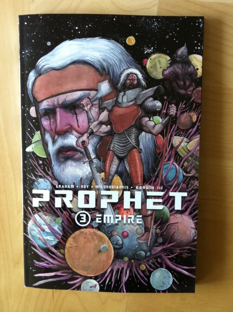
So I Read Prophet: Empire

A 250 word (or less) review of Prophet: Volume 3
by Brandon Graham, Simon Roy, Giannis Milonogiannis, Joseph Bergin III; Image Comics


Prophet: Empire continues the streak of Prophet being the most intriguing Science Fiction comic I'm reading. Empire brings the focus back to the Earth Empire and the summit of diverse Johns congregating following the activation of the beacon by the New Father while also touching base with the old man prophet and his counter-Empire team as the series builds momentum towards a cohesive integrated narrative. I've more or less said it all already: Prophet is that rare Sci-fi story that creates a truly alien future filled with challenging and strange concepts, creatures, and adventures and is a comic series filled with truly impressive artwork. It's great comics. But the thing that Prophet: Empire emphasized for me about the Prophet series is that it's kind of totally rad. Like, for all of its elegant designs and thoughtful Sci-fi, a lot of stuff in the series happens mostly because it would be totally cool. And I think this sense of fun is one of the cornerstones of why I like Prophet so much: it's pretty special to read a comic with such an aggressively auteurish sensibility that still manages to take such infectious pleasure in goofy tangents and over-the-top badassery. So, yeah, Prophet: Empire is the newest chapter in the big deal Science Fiction epic that is also totally bitchin'.

Word count: 218

Previously
So I Read Prophet: Remission

So I Read Prophet: Brothers

Monday, 14 July 2014

Deep Sequencing: Atomic Robo Timeline pt. 4

Or a graphical timeline of the first 6 collected volumes of Atomic Robo
by Brian Clevinger and Scott Wegener, Red 5 Comics


Atomic Robo is the fantastic, funny comic about, well, Atomic Robo, the adventuring Action Scientist invented by Nicola Tesla. It's an infectiously fun to read comic that is also constructed in really smart, really unorthodox ways. One of these interesting creative decisions is how Atomic Robo uses time.

A lot of comics, particularly the more superhero-y comics have a weird relationship with time. For the most part time in these comics time is squishy, where publication order does not equate to narrative order and Batman is perpetually the same age despite having stories clearly set in multiple decades. In these comics time is less about an exact measure of time than a... kind of inconvenient medium that events pass through.

Atomic Robo, which is a comic about an ageless robot going on Science Fantasy adventures, has really rigorously annotated time settings. Nearly every story not only has the year it is set in, but even the month and day. As a result, the Atomic Robo comic works like a kind of time capsule of human history during the century (and counting) of Robo's life. It makes for neat settings for stories and a fun look at cultural differences through time. 

But beyond being a nifty setting device, this thorough chronicling of time demands a 100 year long giant graphical timeline. So, I've made one, and will update it whenever I finish another Atomic Robo comic. 


This is Version 2.1 of my Atomic Robo Timeline. The added entries are for the years 1951, 1952, and 2011.

There will be mild *SPOILERS* in the timeline. Also, there is an up-to-date text based timeline on the Atomic Robo website. So this might be kind of redundant.

Timeline legend:
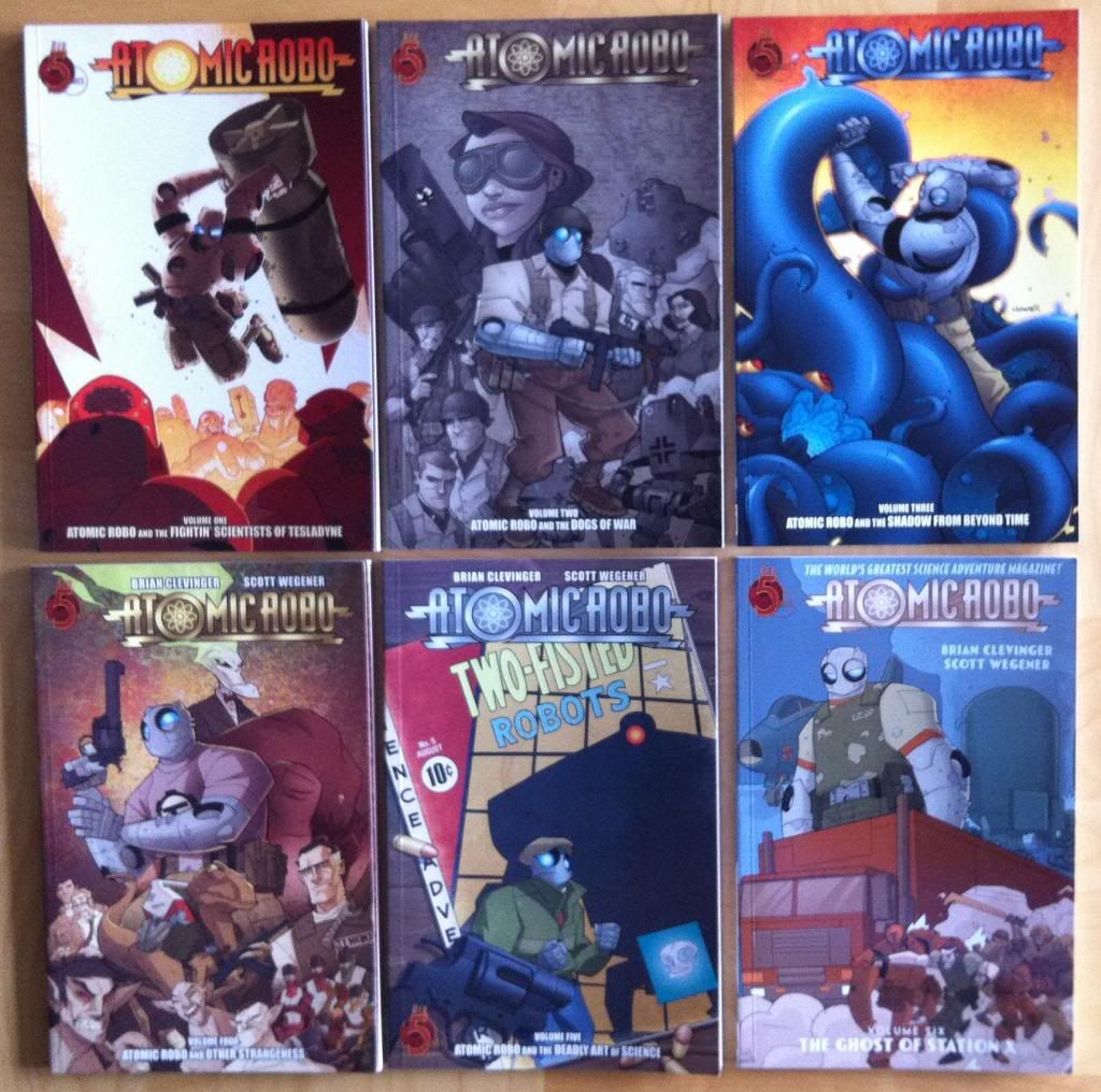
Vol. 1: Atomic Robo and The Fightin' Scientists of Tesladyne
Vol. 2: Atomic Robo and The Dogs of War
Vol. 3: Atomic Robo and The Shadow From Beyond Time

Vol. 4: Atomic Robo and Other Strangeness
Vol. 5: Atomic Robo and The Deadly Art of Science
Vol. 6: Atomic Robo and The Ghost of Station X


Previously:


Friday, 11 July 2014

Deep Sequencing: The Ghost of Station X-Plosions

Or simple layout choices that make for more exciting explosions in Atomic Robo and The Ghost of Station X
by Brian Clevinger and Scott Wegener, Red 5 Comics


Atomic Robo is, I think, best known for being an excellent adventure comic filled with action and humour and a bent towards being respectful and friendly to a large and diverse audience. The thing is, Atomic Robo is also a really well put together comic built around some pretty intricate, high concept stories and with some really deft artwork. And I want to take a look at a sequence I think is especially well put together in Atomic Robo: And The Ghost of Station X.

There is will be very mild *SPOILERS* in this post for Atomic Robo Vol. 6. Be aware.


So this page here I think is really, really well done. At first glance this page is deceptively simple, Atomic Robo shoots a helicopter he is perched on, falls to the ground, then does a jumping punch thing with an explosion. Comics! But the thing is, this page has a really efficient layout that makes excellent use of the way our eyes naturally track around the page to enhance the motion and emotion of every panel in the composition. 


Every panel transition in the composition is designed to take advantage of the movement from panel to panel to capture the moment. In the first two panels, the direction of Robo's gunshot is right along the left-to-right eye path, so we get to fly along the bullets trajectory into the helicopter rotors. The second to third panel transition takes advantage of the carriage return of crossing the page to follow the path of Robo falling from the damaged helicopter. Then the third to fourth panel transition goes down the page and matches the path of the helicopter crashing. And finally, the fourth to fifth panel transition follows the angled onomatopoeia to trace the path of Robo performing his leaping tackle, framed by the explosion. In each of these instances, the eye path matching/guiding enhances the speed and emotional weight of every shot, drop, crash, and explosion in the composition. Individually every choice is great comics. 


The other cool thing about this page is that these same elements that increase the weight of every moment in the sequence also help the reader see the key moments more quickly. This speed of navigation makes this page not only full of emotionally charged action, but also very quick feeling action. It's a fantastic action page and really, really smart comics. Atomic Robo, it's great stuff.

Previously:


Wednesday, 9 July 2014

So I Read Atomic Robo And The Ghost of Station X

Or a 250 word (or less) review of Atomic Robo: Volume 6
By Brian Clevinger and Scott Wegener, Red 5 Comics


Atomic Robo is an interesting comic. You could aptly describe it as an all ages, fun adventure comic with a really snappy sense of humour. But you could also describe Atomic Robo as a meticulously crafted comic with some pretty challenging Sci-fi elements and complex plots. And while I would suggest that Atomic Robo is always both, different storylines can sometimes exemplify the more humour based-adventure aspects of the comic or the more daring, high concept nature of the comic. Atomic Robo and The Ghost of Station X is one of the most elaborate and unflinching chapters in the Atomic Robo saga so far. In the comic Robo and Action Scientists of Tesladyne are simultaneously recruited to solve the mystery of a missing building in Bletchley Park (of Alan Turing fame) and to send a last ditch mission to save NASA astronauts in orbital danger. What they discover will have dire repercussions for Robo, Tesladyne, and perhaps all of humanity. Atomic Robo and The Ghost of Station X, while still containing the charm and humour of the series, is a very mature comic displaying some really masterful craftsmanship. If you are looking for a serious, thoughtful Science Fiction comic (that still somehow manages to remain pretty much kid friendly), Atomic Robo Volume 6 would be an excellent choice. It's really great comics.


Word count: 221

Previously:
Atomic Robo and The Deadly Art of Science 

Monday, 7 July 2014

Motherless Brooklyn Is A Good Book

Or why you should read Motherless Brooklyn by Jonathan Lethem


Motherless Brooklyn is a pulpy detective set in modern-day-ish New York City. The novel focuses on Lionel Essrog, one of a group of orphans taken in by the charismatic Frank Minna. Lionel, along with fellow former denizens of St. Vincent's Home for Boys: Tony, Danny, and Gilbert, have grown to be Minna's men, hardboiled detective thugs working for a small time Brooklyn hustler. But for Lionel, a man who suffers from the vulgar and elaborate tics of a pretty extreme case of Tourette's syndrome, Minna and his men are the only home he has ever known. A home that in Motherless Brooklyn is thrown into disarray when Frank Minna is murdered. 

Part of what makes Motherless Brooklyn such am engrossing read is just how incongruous the whole thing is. The idea of a hardboiled pulp detective, normally a controlled and taciturn archetype, being afflicted with a compulsive mental disorder that makes him bark, randomly utter linguistic nonsense, and generally act without tact or restraint is bizarre genius. Then setting this weird pulp detective tale, filled with characters straight out of the 1940s, in the very polished world of modern New York City adds even more absurdity to the mix. And then steering this twitchy, weird literary orphan into a plot that involves a Zendo, a school of Zen Buddhism involved in Minna's murder, takes it to this place of truly platonic ideal levels of surreal. 

Paired with the zany sense of madness in Motherless Brooklyn is a beating heart of tragedy. Lionel Essrog is a pretty sad figure: for all of his detective acumen, smarts, and general likability, he is indelibly marked and isolated by his mental illness. Tourette's is a very misunderstood and brutal disease. A student in my undergraduate faculty had a Tourettic tic which caused him to incessantly hoot. And seeing how his tic, which in the grand scheme of things was pretty minor, marked him and alienated him from most of his classmates has always stuck with me. The guy was clearly quite smart, he went on to do graduate studies, I think, in a pretty good Botany department, but among our peers he will probably be remembered more as that guy who hooted than as a bosom student comrade or intellectually elite colleague. The way Motherless Brooklyn takes us inside the mind of someone with Tourette's and explores the everyday social cost of the condition really hammers home the challenges of the disease and the value of the afflicted. This is a novel that satisfies Fiction's mandate to operate as an empathy machine. 

I would recommend Motherless Brooklyn to just about anyone. It's pulpy genre heart and mystery keeps the story moving, while the sheer incongruous madness and tragic human soul of the book make it unique and compelling. Motherless Brooklyn is very much a novel that could operate as straightforward page turner as well as a piece of moving literary fiction. It is well worth checking out.