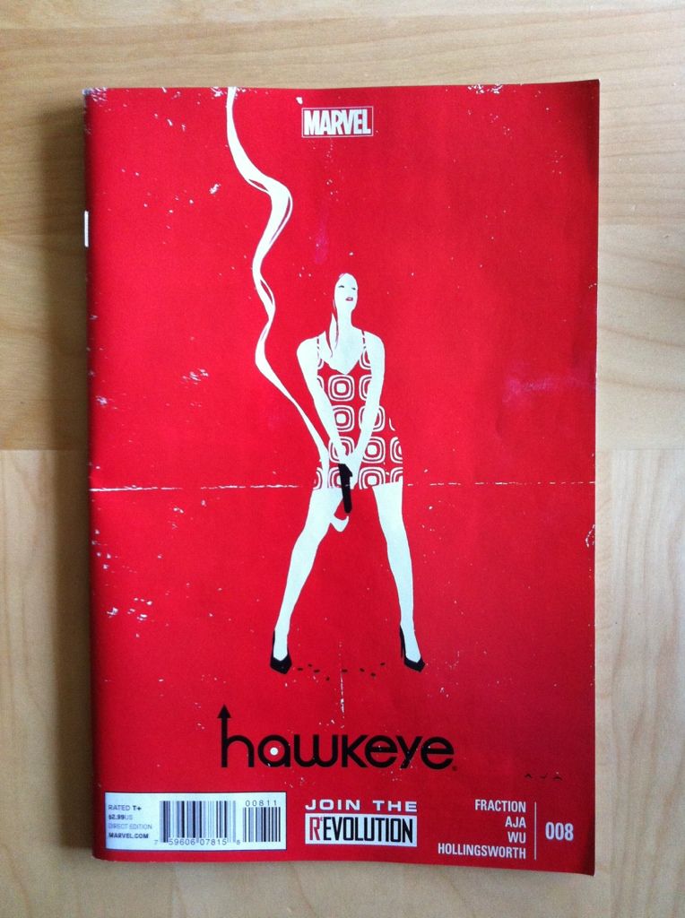
Wherein I continue my wonky analysis of how good Hawkeye is and say nice things about its creators. As usual Hawkeye #8 delivers a great reading experience that sets a standard for what a good comic should be: Matt Fraction's writing is effortless, Matt Hollingsworth's colours are unifying and great, and David Aja's art is stylistic, cerebral, and just oh-my-god amazing. I feel like Hawkeye #8 shows some pretty great examples of a lot of the things I've loved (and written about) in this series so for this issue I'm going to heap some specific wonk love on David Aja with examples.
All the normal caveats apply here: Hawkeye is super collaborative in its creation so it's not always clear who deserves credit for what. I'm going to write this like the art credit belongs to Aja and the writing credit belongs to Fraction, but it's entirely possible I've gotten some of this wrong. If so I apologize to all affected; I'm just trying to say nice things.
You should assume that there will be *SPOILERS* within.
I think it's pretty obvious to everyone who has picked up Hawkeye that David Aja is a pretty remarkable artist. One of the ways he is remarkable is he has, especially for a fairly photorealistic artist, an amazing way of conveying character through how they look. And some of this is remarkably, brilliantly subtle.
Take this panel here. Look at Clint's purple undershirt where it peaks out from beneath his grey shirt at his waist. See that tear and that little hole there? It plays right into the idea of Hawkeye as just a dude who is also an Avenger. He has over the course of this series gotten the crap kicked out of him nearly every issue and this shows in his wardrobe because he is either too poor to replace a slightly damaged shirt or is just too much of a dude to care enough to replace it. Add in his bandaged hand and you have a pretty great statement about Clint as a regular guy who is maybe not so lucky.
(This panel is also a pretty great opening contract moment with the reader, isn't it?)
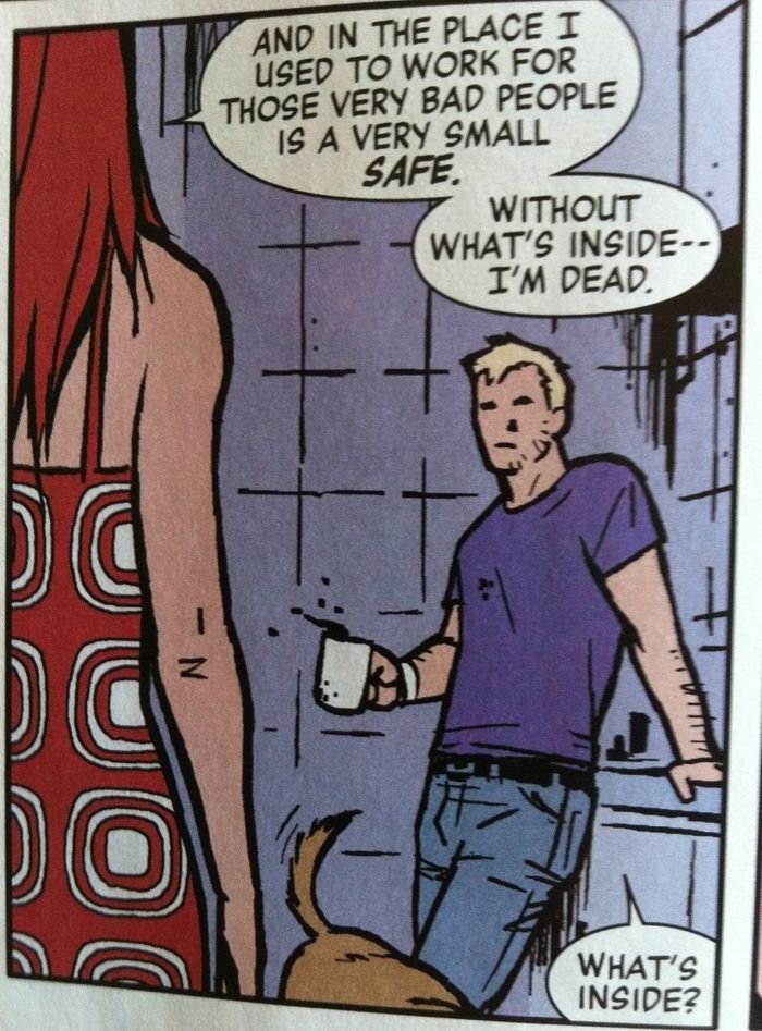
This panel here has another great little, subtle bit of Clint characterization. See that coffee stain on his chest, kind of where his right nipple would be? (Writing nipple is weird, right?) Spilling coffee on ones self isn't really a superhero problem, it's an everyday, shlubby guy problem. I mean, can you imagine Tony Stark spilling his coffee on the Iron Man? Or Captain America being that imprecise with his hot beverage? No, right? Because they are Superheroes and Clint is just a guy who is also a Superhero. This small choice here further helps cement Clint-as-guy throughout this scene.
Another thing I really like about David Aja is that he does unconventional things with panels to pack in additional information and atmosphere. And this skill is also on display in Hawkeye #8.
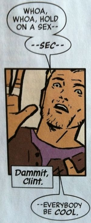
This panel here has Clint trying to defuse a tense, awkward situation and making it worse. The small panel, the perspective, and the partially visible raised hands manage to make Clint look trapped, as if the panel is closing in on him and he is pushing back at it. This all makes the panel look and feel claustrophobic which conveys what Clint must feel like under the suspicious gaze of Avenger women whilst being caught in this awkward social moment. And conveying all of this through panel framing is just brilliant.
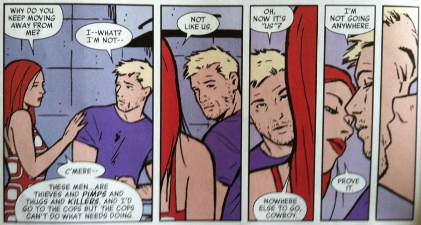
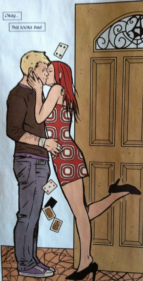
Or take this series here where the panels get skinnier as Penny gets closer to Clint and they kiss. This layout does a great job selling the idea of the intimate approach between the two characters: as they get closer we experience this as the artwork seems to focus in on the kiss. On a more metaphorical level, this focusing effect also, I think, communicates something about Clint's state of mind. Clint (still with coffee stain!) gets somewhat obscured as Penny looms larger and larger as the panels get skinnier and skinnier. This makes it feel like Clint's ability to make a responsible descision is being drowned out by the looming, crushing presence of Penny; he literally doesn't have room to think. And all of this is conveyed by layout.
This isn't to say that Aja's skills are limited to technical small moments. He can break out big, action packed, rockstar moments as well as anyone.
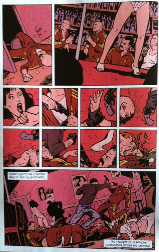
This is my favourite big, bold actiony layout from Hawkeye #8. The choices of what Aja shows and doesn't show just makes this scene work tremendously well. At the top we have panel 1 and 2 establishing location and relation to the last events from the previous page. And then we get eight tight panels that show individual moments of violence with only casual sequential links between them. Finally we have a wideshot with the last moment of action that also displays the sheer fallout from the Clint storming the bar. By showing a before and after separated by moments of pinpoint violence, Aja invites us, the audience, to imagine the moments between these snapshots that would cause the disorder shown in the final panel. This all makes the fight seem faster and more chaotic to me; as if the violence were so swift, efficient, and brutal that Aja could only catch the 8 snapshots he shows us. And this, I think, is better than if he showed us every movement of the fight.
So there you have it, one great comic, that showcases my favourite Aja skills at once that is also stupidly well written and beautifully coloured. If you aren't reading Hawkeye you need to reevaluate your life.
No comments:
Post a Comment