By Kieron Gillen, Jamie McKelvie, Mike Norton, and Matt Wilson; Marvel Comics

One of my favourite things about Young Avengers is just how experimental it is. Nearly every issue of this series has had some example of artwork or design or layout that I've never seen in a superhero comic before. And the way these novel layouts, especially, are married to narrative to convey additional story elements or emotions is frankly brilliant comics. The layouts of the Young Avengers are absolutely worth examining to discover their magic.
Young Avengers #12 dances like it is on fire and has a bunch of cool design elements and amazing layouts.
This post will have *SPOILERS* for Young Avengers #12
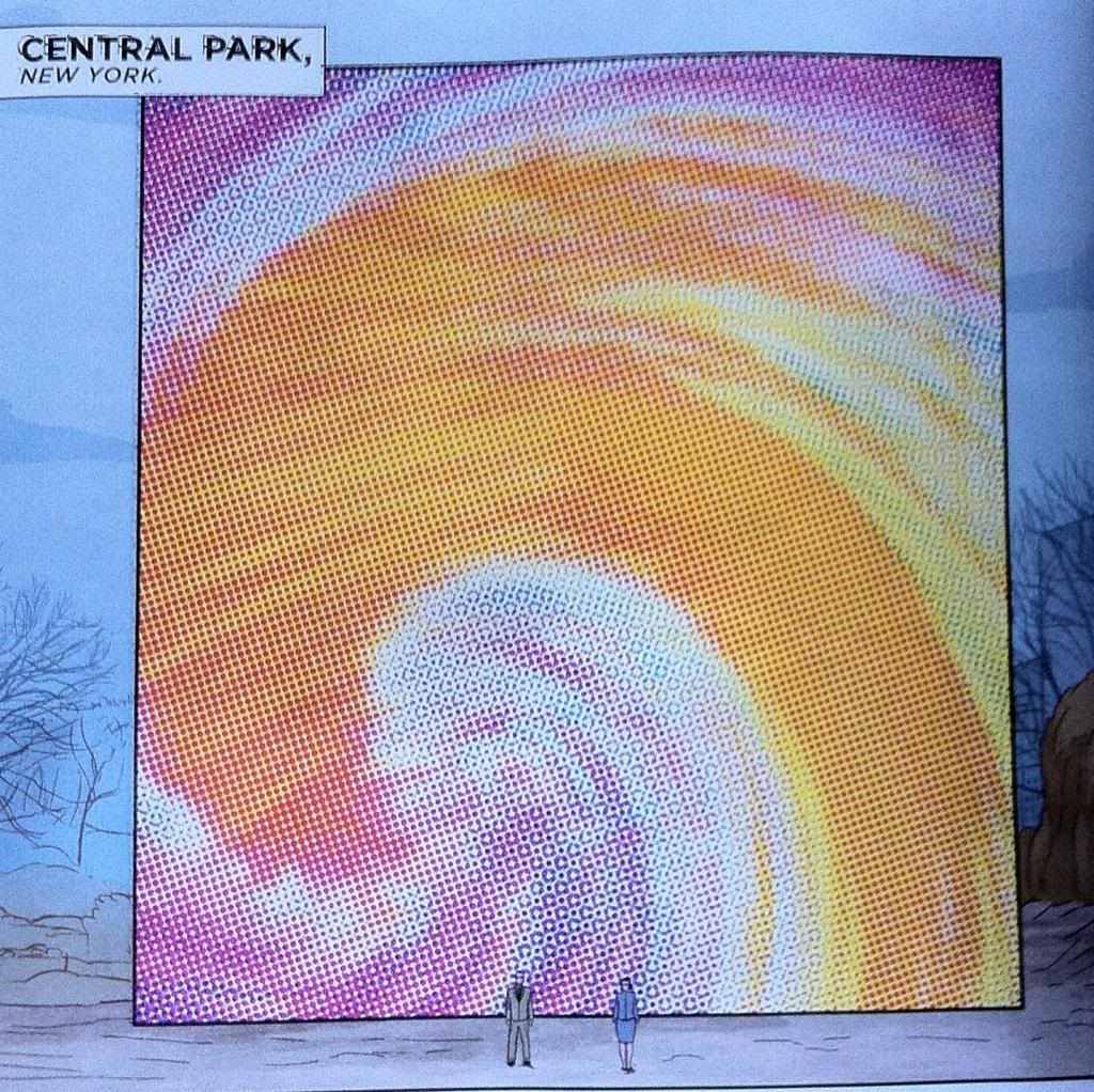
The first bit of uncanny comics in Young Avengers #12 is the portal between Mother's dimension and the home dimension of the Young Avengers. Now, portals in comic books are nothing new: everyone uses portals between planets, places, and dimensions. But the portal in Young Avengers #12 is interesting in that takes the form of an impossible interface between comics and not-comics. Within the context of Young Avengers, comics-as-usual is reality with all of its panels, colours, etc. Mother's Dimension exists as this white space punctuated occasionally by ersatz comic panels, it's a little bit as if Mother's Dimension exists in the gutter space between all comics (if that makes sense). This portal is kind of an intermediate step between the comics of reality and the clean gutter of Mother. It takes the form of a panel embedded in the reality of the comic, which is impossible, but I think you can also look at it kind of like a box of gutter right in the middle of a panel of artwork. The colours play into this two, being broken up by old-timey printing artifacts. It creates the impression of a gutter space or corner that some colour bled onto, which, I think, is like the comic reality bleeding into the white space of Mother's Dimension. Which is kind of exactly what the portal is. It's really cool comics.

This layout here is meant to depict a battle between the collective young heroes of the Marvel Universe vs the fanarty, remixed Young Avenger knockoffs of the Mayfly Dimensions. First off, this layout is totally awesome: it depicts a guy firing a gatling gun mounted to a psychically animated stone man where the bullets are made of a comics battle. (If you don't think that is awesome, you are empirically wrong.) What it also is, is a really clever and original way to portray a large battle scene in a pretty small space. Young Avengers #12 has a lot of plot to cover but still needs to show a particularly epic battle and this single page manages to convey all of the relevant information for an emotionally satisfying brouhaha. For one the epically-epic nature of the photo, with the gatling gun and the golem and the zooming bullets, conveys that this battle is big crazy comic book action. And the 45 (if I counted correctly) bullet panels display the scope of the conflict: there are 45 (or so) separate scenes of different heroes and villains fighting all within this page. But the real brilliance of this is that all of this action, all 45 (!?) panels of action, are all occurring at the same time in the tiny instant of a moment when these bullets were in just this position. Like, in a fraction of an eyeblink there is so much happening in the battle that these 45 (I wish I had more confidence in my counting) bullets caught and reflected this much action. Which of course leaves open to the imagination just how much action we aren't seeing in this instant, or in the larger battle. It's very cool comics.
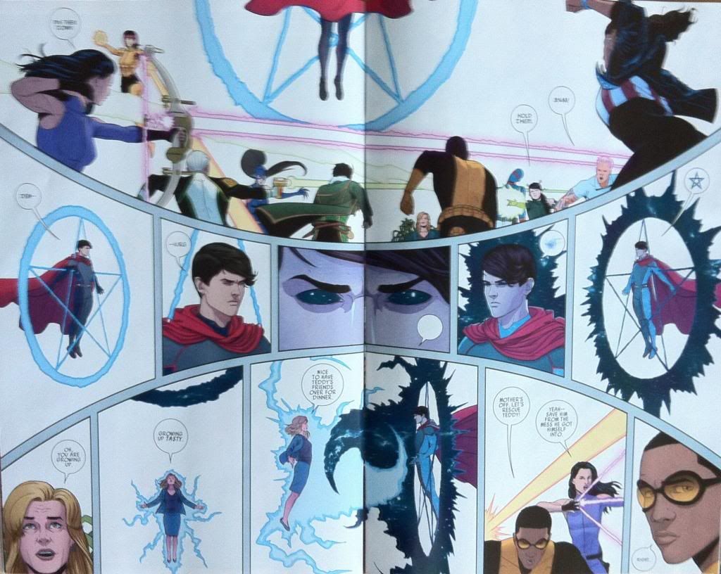
But this two page spread does something else really cool too: it actually uses, or at least accounts for, the seam between the pages. The page seam doesn't just literally split the spread into physical halves, but it also splits the artwork into distinct halves. For instance, in the mid-page band of panels the page seam clearly demarcates the transition point from Billy as Wiccan to Billy as the Demiurge. In the bottom third of the spread the page seam sits right in the middle of the yin-yang vortex between Mother and Billy as they magic-duel it out. This split not only shows a point of demarcation between the two battling godlings, but also splits the lower composition into the left, where the artwork shows mother entering battle, and the right side which focusses on the young avengers and primes the next page. Normally page seams are an annoying reality of double page spreads, but the way the seam is accounted for and maybe even used in this page is really thoughtful and really great comics.
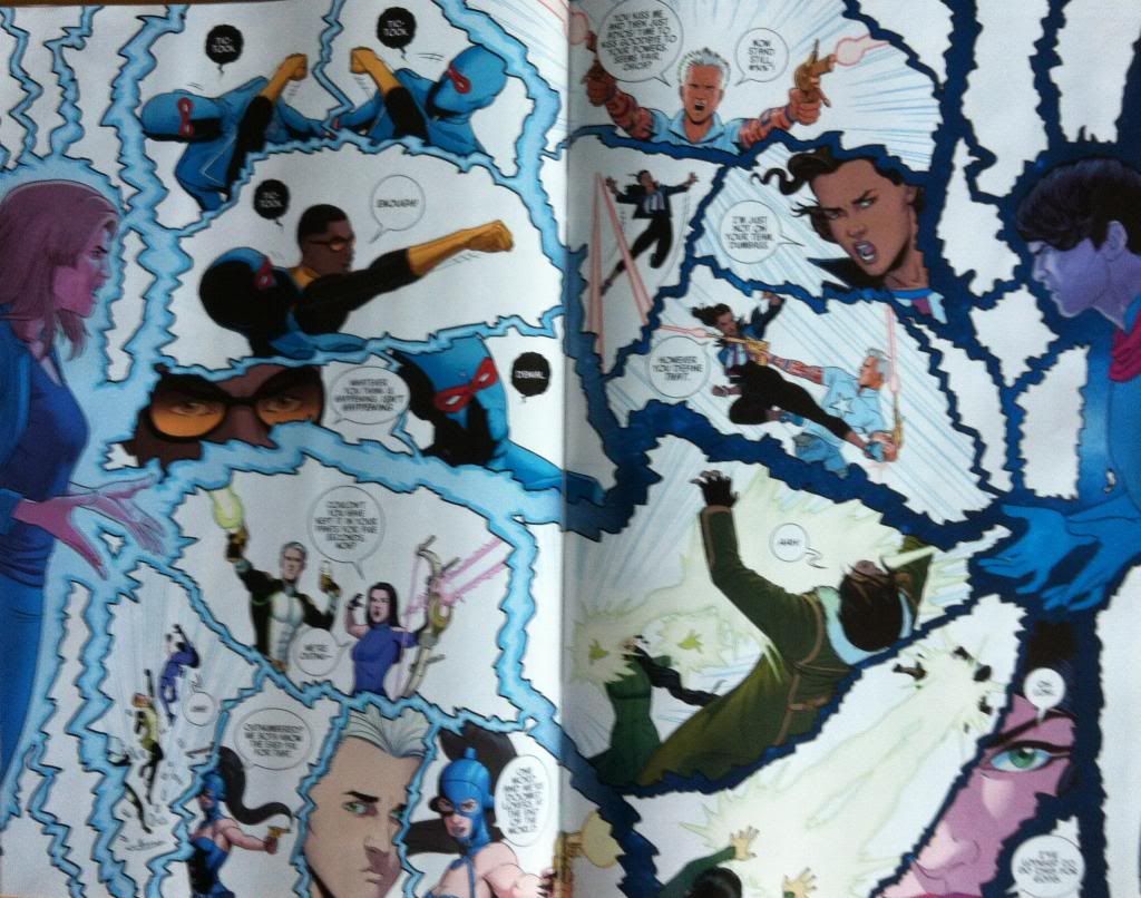
And finally we get to the climatic battle of Billy-vs-Mother, and the Young Avengers against the league of villainous exes. This takes place in yet another really innovative and clever double page spread. The entire page is framed by the magic battle between Mother and Billy with the two godlings superimposed in a plane in front of all the other events. From a story perspective this conveys that the battle between Mother and Billy is more important than the other conflicts and these other events are in some way secondary, or behind, the magic fight. The choice of putting the godling battle in the foreground also allows the composition to be broken up by the lightening bolts of the spellbattle: the thickest forks of power separating the four sub-stories of the page, while the smaller branches of lightning provide the frames/gutters for within each individual story. This provides the structure of the page and also organically ties the whole thing together in a really visually interesting way. (This layout also consciously accounts for the page seam too.) It's more great comics.
There are also some neat colouring choice aspects to this spread as well. The most obvious is that Mother's powers appear as bright blue lightning while Billy's power manifests as lightning with the colour of the night sky, with specs of stars and the Milky Way. What this does is give a very easy to follow visual cue to assess the progress of the magic battle: by seeing how much bright blue and dark blue, and the shape of the that colour, readers can pretty quickly tell what is happening and who is winning the fight. It's pretty smart. But what is even cooler is that on this double page spread the interface between Mother-lightening and Billy-lightening has areas where the colouring rules break down. Instead of following the standard clean colouring of the rest of the issue, the lightening interface has spots of Billy-blue and Mother-blue bleed over into the opposite colour lightening. What this means, practically, is that regions of the lightening look to contain old fashioned comic printing dots. And this in turn feels like comic reality breaking down, as if there is so much power raging where the lightening meets that the comic itself is breaking, that printing errors are happening, and the very structure of the comic threatens to come undone. It is subtle, but such a cool choice.
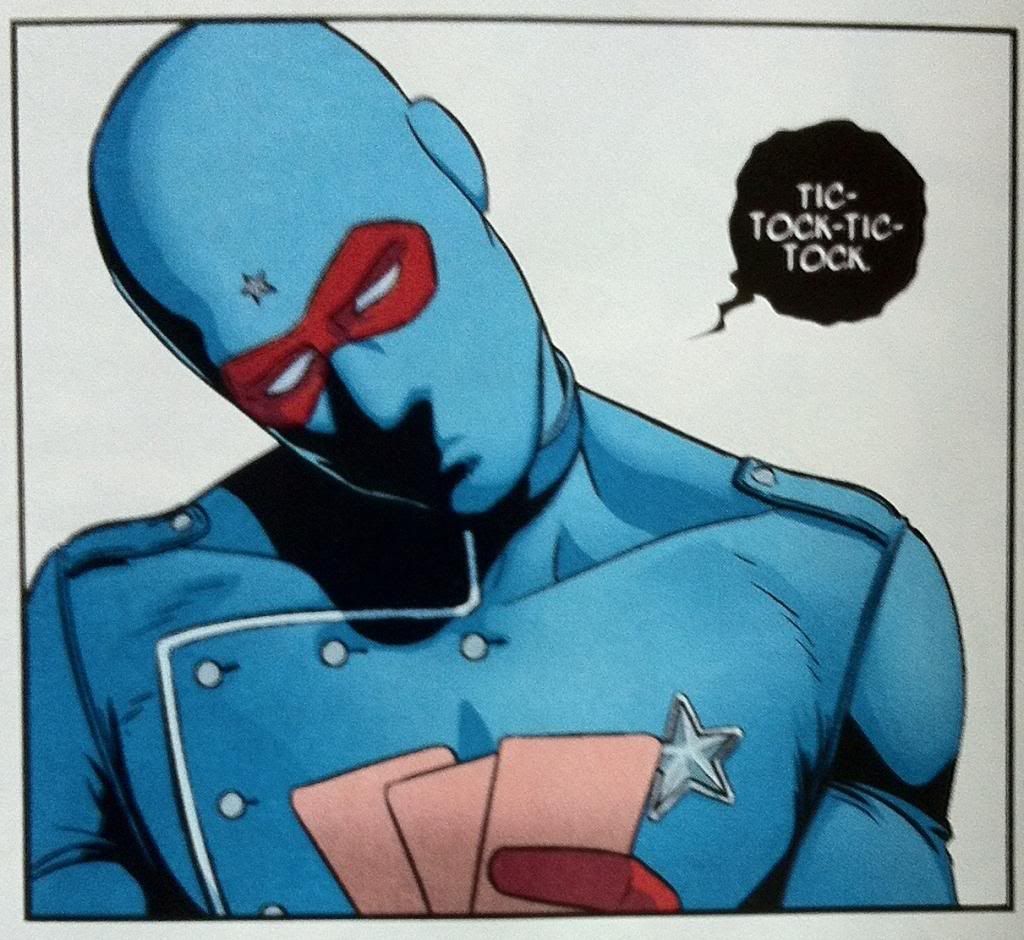
So there you have it, another great instalment of Young Avengers with more really great and interesting comics decisions. Tick-tock, time is running out, but goddamn if it isn't going to be a glorious final few moments.
Previously:
Favouring The Young Avengers #11
Favouring The Young Avengers #10
Favouring The Young Avengers #8
Favouring The Young Avengers #7
No comments:
Post a Comment