Wednesday, 14 January 2015

So I Read Wonton Soup

A 250 word (or less) review of The Complete Wonton Soup
by James Stokoe; Image Comics


Sometimes it's easy to forget that comics are an art form instead of just machines for telling stories. Comics are able to function purely as an aesthetic medium if you look at them a certain way. And the thing about art is that it often involves a certain amount of experimentation: developing a voice, trying new methods, honing skills. A trip to a museum dedicated to a single master will often show the learning phase along with the eventual masterpieces which is super cool to see and proof that every artistic achievement is built on lesser accomplishments and failures. Wonton Soup is the early work experimentation of the comics art of James Stokoe. It tells the story of a pair of space truckers: Johnny Boyo, a talented chef on an inspiration seeking walkabout, and Deacon, a druggy sex-pervert trying to find love after the loss of his Sex Bear. The pair have a number of ridiculous adventures including an iron chef style cooking competition for space culinary school bragging rights, Sex Bear husbandry, and a wild drug trip that maroons the pair in an alien jungle. Mostly, though, the comic functions as a fun background for Stokoe to experiment with storytelling and develop his artisitic voice. I have never read a comic that spans such a profound evolution of style that shows both someone's early work and their later mature aesthetic. It's pretty great and a testament to the hard work needed to be a really great comics artist.

Word count: 249

Previously:
So I Read Godzilla: The Half-Century War
So I Read Orc Stain Vol. 1

Tuesday, 13 January 2015

Gun, With Occasional Music Is A Good Book

Or why you should read Gun, With Occasional Music by Jonathan Lethem


Gun, With Occasional Music is a noirey, gonzo Sci-fi mystery. It follows hardboiled private inquistor Conrad Metcalf in a future where questions are forbidden by law, perception altering drugs are over the counter, and where sentient animals and prematurely intelligent babies are up to no good. It is against this background that Orton Angwine, a desperate man all out of karma, approaches Metcalf desperate for help, convinced he is being framed for the murder of a well known urologist. Metcalf, unable to help himself, takes the case and finds himself in a world of trouble. The dead doctor's wife wants things left alone, the inquisitors want the case buried, and a gun-toting kangaroo tough wants Metcalf to just fuck off. But Metcalf is an inquisitive guy, and he wants to get to the bottom of it,

Gun, With Occasional Music is, more than anything, a really fun book. It dives into the swagger and smarm of pulp detective novels with a vengeance and creates a weird and uncouth Sci-fi world where a gun-toting kangaroo working for a mafia kingpin makes narrative sense. Which isn't to imply that this a novel of style without substance: the central mystery of Gun, With Occasional Music is really convoluted and smart and the Science Fiction elements, as wild as they are, circle some pretty hefty ideas about authority and appeasing the masses. Gun, With Occasional Music also wears its literary influences pretty openly. I read Chandler's The Long Goodbye immediately before Gun, and PDK's The Man In The High Tower a week or so before, so it was impossible for me to ignore the influence of both these authors on the novel, which made for an interesting experience. Seriously, Gun, With Occasional Music is a really fun book.

I would recommend Gun, With Occasional Music to any fan of Sci-fi who is curious about Pulp Detective stories or any Mystery Fiction readers tentatively interested in Sci-fi. It seems like a great gateway book. Gun is also a book that I think would make a great vacation novel: it's fun, an exciting page turner, and short enough to be enjoyed entirely on an airplane ride or casually on a beach. Even if you aren't a genre curious sort or jetting off on a beach trip, Gun is a really clever, fun novel that I think you would probably enjoy, so give it a try.

Monday, 12 January 2015

Describing Daredevil #10 and #11

Or some of the excellent comics worksmanship in Daredevil #10 and #11
by Mark Waid, Chris Samnee, Matt Wilson, Joe Caramagna; Marvel Comics


Daredevil is an absolute horse of a comic, reliably providing exciting, interesting stories delivered with really adept artwork in every issue. It's the kind of comic that is always eminently readable just all round good comics experience. Except, of course, when it's great.

Daredevil #10 and #11 have a bunch of examples of great comics magic worth taking a longer look at.

There will be *SPOILERS* past this point.


One of the most consistently innovative elements of Dare Devil under writer Mark Waid and artists Marcos Martin, Paolo Rivera, Chris Samnee, Javier Rodrigues, and Matt Wilson, is how the comic deals with Daredevil's blindness in innovative ways. Blindness is, if you think about it, a deeply challenging condition to portray in a visually interesting way: it is by definition decreased or a lack of vision. At it's most extreme it would be a solid black panel. Daredevil has taken this head on by creating visual symbols to represent non-visual senses to try to communicate the way which Matt Murdock understands his world. This has included the bright pink topographic silhouettes generated by his radar sense or the really smart, integrated use of onomatopoeia to communicate the importance of sound to Daredevil. It's been really neat comics.


In Daredevil #10 we see the introduction of scent to the fray. When it comes to recognizing other humans, scent is this deeply intimate part of the equation. This is probably especially true for Daredevil who has superhuman smelling powers. So it is really a fantastic choice to use scent symbols, the floral scents of hygiene products for Matt Murdoch's girlfriend, Kirsten McDuffie, and the junkfood and chemo reek of Muroch's friend Foggy Nelson, as recognition keys. We are able to see the specific scent mixtures that act as fingerprints for both characters and how important smell is for Matt in his association with people. What's cool is that this information also provides character information, like Kirsten is scrupulous about her appearance and that Foggy is ill and also a gluttonous slob, which let's us actually recognize the characters using the scent cues. This let's us experience the world as Daredevil for a moment: we see vague radar sense silhouettes and smell symbols and from this we can "visually" identify people. Which is pretty great comics.


This sequence of panels here absolutely guts me. Now a big part of this is the context: Daredevil, Matt Murdoch, is depressed and given his long past with despair and his history of trying to tough it out, so him reaching out and actually asking for help is a HUGE moment. An act of profound bravery from The Man Without Fear. But this sequence is also remarkable for how beautifully it is executed. The simple framing and focus on the phone, heavy with its permanent promise of communication and outside help, really soldifies it's importance. THIS is a lifeline. The way the hand tentatively appears, pulls back, and then grasps the phone is amazing comics. To get that level of emotion from just hand gestures is really fantastic character work. And then there are the colours: a cold blue of isolation in a darkened room, then the introduction of dramatic red as the hand dithers about reaching out for help, and finally true colour as the hand reaches out for help and breaks through the blue murk of isolation. This is fantastic comics delivered with deceptive simplicity.


Daredevil #11 makes the quietly brilliant choice of having Daredevil face off against an actual daredevil, Stuntmaster. As a result, a key feature of this issue is motorcycle stunts! Now, motorbikes jumping things is a very movement based phenomenon, so translating the excitement and drama of these kinds of stunts into a static medium takes some smart choices. The most simple and fundamental of these choices is how page space is used to quickly create a sense of distance. In the above sequence Stuntmaster guns his bike towards a ramp for a jump stunt on a normal single page (one made even narrower seeming by the ad insert). A page turn follows and suddenly the page gapes with horizontal space in a bike jump that spans the complete width of the comic. The sudden contrast between the normal width panels leading up the jump and the wide, short panels, particularly the first double-page wide one, of the airborne motorcycle capture the distance, drama, and excitement of the motorcycle stunt. It's elementary stuff, but it is really effective. 


Daredevil #11 uses this double-page spread approach again to make another, even more dramatic stunt come to life on the page. In this sequence Stuntmaster plans to ride his motorcycle across the suspension wire of the Golden Gate Bridge defying death and common sense. Daredevil, who has been called out by the motorcycle daredevil, shows up to prove his mettle and have a talk with Stuntmaster and plays chicken with the stunt rider. This layout does a fabulous job conveying this story. The top row of panels uses the width of the page to really emphasize the scope of the stunt and the forward progression of Stuntmaster along the suspension wire. This row of panels is also pretty nifty in the the wire forms a clear vision guide that draws the reader quickly, like Stuntmaster's progression, from low left to top right where suddenly there is a Daredevil.  Another interesting aspect of this layout is how panel size is used in the lower portion of the page to amp up the tension. In the second row of panels we see the focus of the panels swap back and forth between Stuntmaster and Daredevil and narrow as the two come together. It creates a sense of increasing focus, proximity, and danger. In the bottom row of panels we see this construction repeated with a wide establishing shot of Stuntmaster and then a series of even smaller, more focused panels which swap between the characters. These tighter reaction panels, when contrasted with the larger ones in the previous row, feel even faster and create even more focus, a greater sense of proximity, and even higher levels of danger. Which brings the sequence to a dramatic head and the wonderfully long and drawn out SCREEEEECH! of the motorbike applying the breaks and skidding to a stop. It's a stunt brought together perfectly.

Daredevil is just so reliably excellent.

Post by Michael Bround

Previously:
Describing Daredevil 9: empathy
Describing Daredevil 3: onomatopoeia 
Describing Daredevil 34: before and after
Describing Daredevil 33: condensed motion
Describing Daredevil 30: the vectors of artwork
Describing Daredevil 29: A great page

Friday, 9 January 2015

Deep Sequencing: Velvety Colours

Or the use of cinematic lighting in Velvet
by Ed Brubaker, Steve Epting, Bettie Breitwesier, Chris Eliopoulus; Image Comics


Velvet is a comic built out of cinematic espionage cool. In the comic, Velvet Templeton is the confidential secretary for the director of super-secret espionage group ARC-7. When a field agent is killed Velvet is implicated and forced to flee from her erstwhile colleagues. Which reveals a secret: Velvet, the middle-aged secretary, might be the finest secret agent alive. It's a thrilling comic that plays with familiar espionage tropes, subverts sexist expectations, and examines the neglected women of the espionage genre. It's pretty great.

It's also a comic done in a really interesting cinematic style that combines photo-realistic drawings with the colour lighting of vintage film.

While I love the total look of Velvet, I find the aspect I most want to explore is the colouring. Velvet has a very painted style that makes heavy use of light and shadow which I think helps sell the cinematic feel of the comic and create this wonderful sense of reality on every page. It looks really good and works beautifully with the pencils and inks to create a really effective comic.

Which is somewhat weird for me: I usually prefer simplified flat colours to the elaborate painting of Velvet-style colours. Flat colours, particularly when married to simplified colour palettes reduce the amount of stuff the reader has to process and often makes the reader focus more on the nuances of the line art and inking. Which can really help make a page feel more kinetic and animated. Add in the emotion that can be generated by carefully curating the simplified colour palette and flat colours can really work in the background to enhance the final comic. The case that Velvet makes is that rendered, highly detailed colours can look just as good as the best flat colours and can be involved in some pretty nifty storytelling.

In this post I want to explore some of the cool, cinematic effects that arise form this style of colouring.

There will of course be *SPOILERS* For Velvet Vol. 1.


One of the greatest advantages of this kind of painted style is how it deals with darkness. In the real world we are very seldom in true, total darkness. Instead we are usually close to some faint, residual light source that partially illuminates the murk providing highlights, brighter areas, and soft, deep shadows. This is particularly true in film where the very nature of the medium requires a certain amount of light to make the cameras work. The painted style of Velvet depicts this perfectly: painted highlights replicate the glow of the light source and then transition smoothly into the judicious black of the inks. It's a look that creates an organic sense of depth to the darkness that feels at once very authentic and very cinematic. Which works splendidly to create the atmosphere of standing in a darkened, shaded room or prowling naked through a lovers belongings while they sleep. It's great comics that can't be accomplished as well in a flatter colouring style.


Velvet's painted style shines through even more when depicting rainy London nights. If urban darkness is defined by light sources, then a rainy night is defined by reflective surfaces. When it rains every wet surface becomes a mirror for surrounding light sources and rain droplets themselves can act as refractive points of light. So making an exciting looking rainy night is all about depicting light in accurate and dynamic ways. Velvet's masterful use of light highlights and wonderfully painted reflections absolutely nails the look and drama of a rainy evening. Which, when viewed in contrast with more conventionally coloured comics, helps set Velvet apart as a cinematic experience. This is also something that painted-style comics can do that flat comics can't; it's pretty amazing stuff.


Another scene that I thought Velvet did especially well was a flash back at a beach resort. The way the colouring captures the suffused glow of tropical sunlight is pretty great. In my limited experience, visiting equatorial places comes with a certain light quality that is quite different than the sunlight of my native Canada, and Velvet absolutely captures this. Velvet also does a really good job depicting the way light interacts with water, and the spray of waves: I am absolutely transported to the beach. This scene is another really great example of just how masterfully light can be used in comics.


Velvet is a great comic for many reasons, from the genre and gender convention challenging story to the evocative pencils, to the vintage cool. It is completely worth checking out just as a comic. But, if you are a comic wonk like me, this is also a comic worth reading to see how the inks and colours work together to tame light and how effective this can be in storytelling. While I might usually prefer flat colours, Velvet really makes a case for how special painted-style comics can be when they are done really well. Because the results are gorgeous. 

Post by Michael Bround

Previously:

Wednesday, 7 January 2015

So I Read Velvet: Before The Living End

Or a 250 word (or less) review of Velvet Volume 1
by Ed Brubaker, Steve Epting, and Betty Breitweiser, Chris Eliopoulos; Image Comics


Everyone loves a good spy story. A story about a debonair secret agent man off fighting, killing, and seducing for the safety of his government. It's a classic male power fantasy. But what if the story wasn't about the dashing secret agent man, but was instead about his boss' middle-aged secretary? And what if she was secretly the greatest agent of all? Velvet tells the story of Velvet Templeton, the confidential secretary for the director of ARC-7, a pan-NATO super secret agency. When agent X-14 is killed on a mission gone wrong, ARC-7 is thrown into disarray in an internal manhunt. A manhunt that soon turns to Velvet, unleashing her secret past as an agent, and sending her on a mission to discover who is the true traitor. Velvet is a comic of pure class: a retro dream of classic spy action rendered in beautiful, cinematic shadow and colour. It's like a classic espionage movie poster sprung to life with all of the class, sex, and danger inherent in its promise. Velvet is also emblematic of the mercenary value of exploring women in fiction: this is a really engaging comic that explores the stories of women in a genre that tends to treat them like props and finds some incredible stuff there. If you are a dude looking for the whats-in-it-for-me of depicting women in fiction, stories like this are one of the reasons why you should care about diversity in media. But mostly Velvet is just a great comic.

Word count: 250

Tuesday, 6 January 2015

Novels Year In Review 2014

Or a look at the novels I've reviewed in 2014 and my top recommendations

2014 was kind of an odd year for novels on Atoll Comics. I only put up 13 novel review posts this year as opposed to the previous two years on the site where novel reviews were a major component of the site. There are a few reasons for this including the fact I've gotten better at finding comics things to write about, am a lot better at working ahead (novel reviews were often my buffer against vacations or laziness), and that I wanted to focus more on writing critically about comics in 2014. Add to that my new Atoll Comics collaborator Jennifer DePrey, and well, I don't NEED novel posts to hit my updates anymore. But I still read a lot of novels and really like writing about them, so starting in 2015 there will be regular prose novel reviews on the site every Tuesday. And to kick off this new segment, I thought we'd take a look back at the novels of 2014.

Despite the smaller sample size of books this year, I still read some great books that you may want to check out in 2015. Specifically I reviewed:


      Genetopia, by Keith Brooke
      Seed To Harvest Omnibus, by Octavia Butler
      Gentlemen Of The Road, by Michael Chabon 
      Telegraph Avenue, by Michael Chabon 
      The Amazing Adventures of Kavalier and Clay, by Michael Chabon
      Wonder Boys, by Michael Chabon 
      The Man In The High Castle, by Philip K Dick 
      Judas Unchained, by Peter F Hamilton 
      Pandora's Star, by Peter F Hamilton
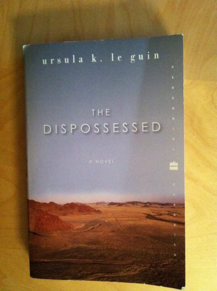
      The Dispossessed, by Ursula K Le Guin
      Motherless Brooklyn, by Jonathan Lethem 
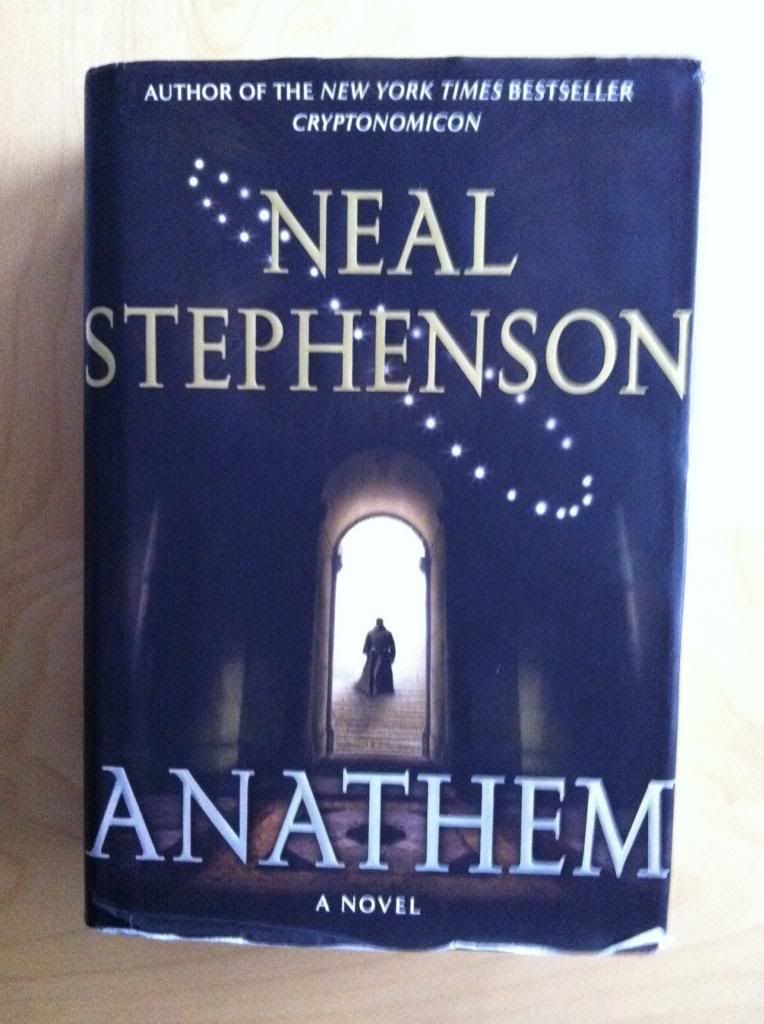
      Anathem, by Neal Stephenson 
      Breakfast of Champions, by Kurt Vonnegut 
      Cat's Cradle, by Kurt Vonnegut 
      Slautherhouse Five, by Kurt Vonnegut 
      The Sirens of Titan, by Kurt Vonnegut 
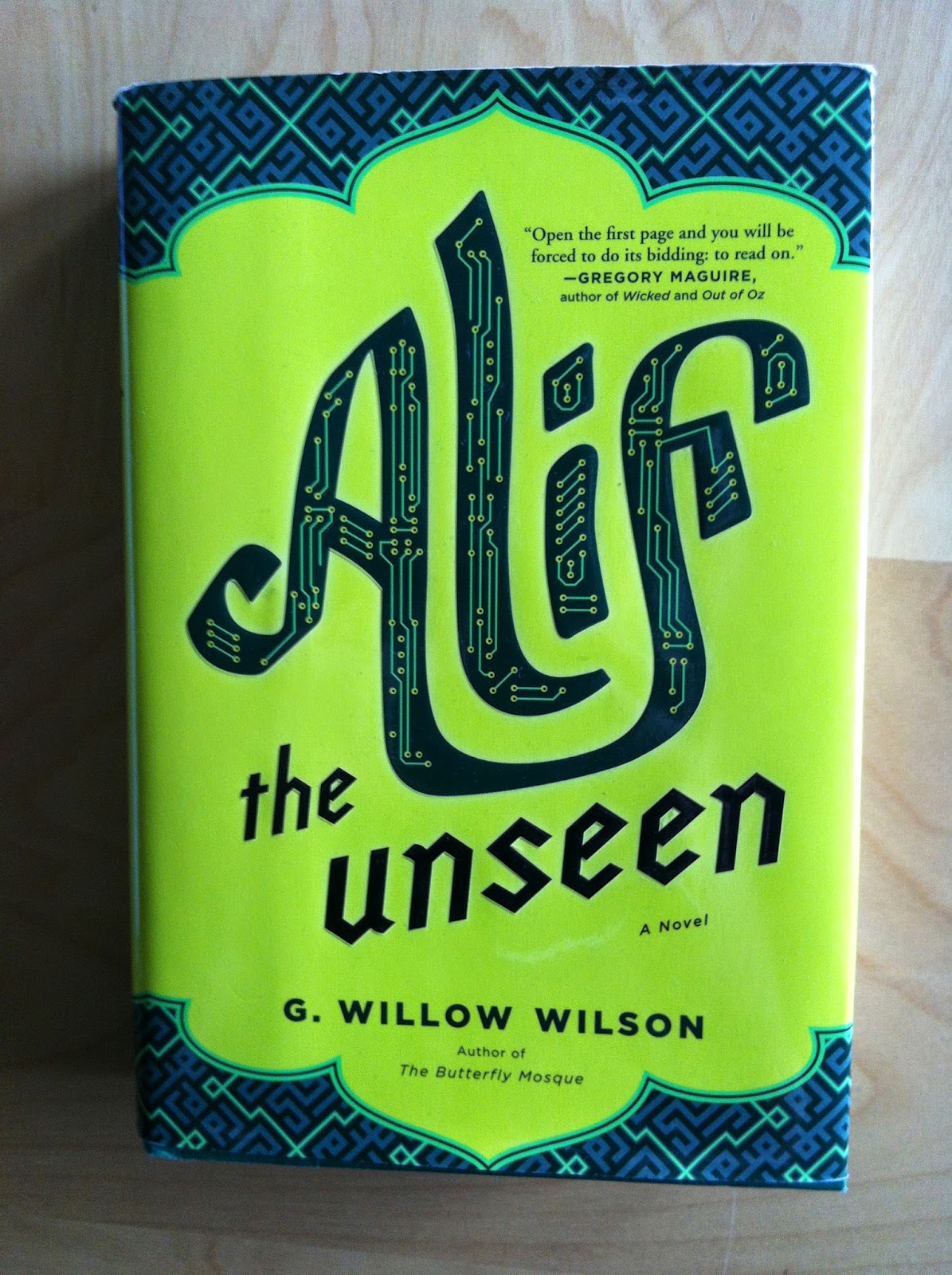
      Alif The Unseen, by G Willow Wilson      

Also, since it's traditional, I'd like to do an abbreviated version of my annual top picks for certain genres.

If You Like Science Fiction:


I would recommend Anathem by Neal Stephenson. This might be one of my very favourite novels. It tells the story of Fra Erasmus, a young Science-monk in a society where the academic world lives apart from the Secular world in ascetic monasteries. During a particularly momentous time in Erasmus' life, a startling observation throws his world into disarray and sets off a chain of events with worldwide consequences. Anathem is a sprawling novel about coming of age and personal growth filled with adventure and romance and camaraderie and Science Fiction. It is also a novel that works as a thematic analysis of the philosophy of Science and the relationship between the academic and non-academic portions of our society. It is super insightful and one of the most emotionally true portrayals of Science academia and the act of discovery I have ever seen. I love this book.


If You Like Fantasy:


I would recommend Alif The Unseen by G Willow Wilson. Alife The Unseen is a novel that explores what if the more mythical-seeming portions of the Quran were literally true; what if humanity lived along an unseen world of supernatural beings. The novel stars Alif a young hacker living in an Arab Emirate who makes his living by helping dissident voices and staying one step ahead from the ruthless government censors. When Insitar, the wealthy daughter of a powerful man, spurns him, Alif writes a powerful software program that threatens to deliver him into the hands of the state censors. Alif flees, inadvertently dragging along his neighbour Dinah, and finds himself lost in a world of mythical monsters and spirits. Alif The Unseen is a book that mixes an exciting technothriller premise with romance, discovery, and the boundless imagination of a wonderfully realized fantasy world. As a pure work of fiction Alif The Unseen is a great read. This novel is also pretty special in that it portrays young people living in the arabic world and explores the collision of modern and tradition that confronts them. Which is really interesting. Also, Alif The Unseen contains one of the most 'shippable romances ever!

If You Like Superhero Comics:


I would recommend The Amazing Adventure of Kavalier & Clay by Michael Chabon. While not directly a superhero novel, Kavalier & Clay is a novel about the cultural primordial soup and people who first invented Superheroes and produced the comics of the Golden Age. The novel features Joe Kavalier, an young jewish artist and refugee, and Sam Clay, a plucky Jewish kid from Brooklyn a they form a partnership and invent The Escapist, a comic book hero who frees people from the shackles of injustice. The novel really illuminates the way social forces, the spectre of Nazi Germany, Vaudeville magicians and strongmen, all fermented in the imaginations of scrappy young people to create the amazing fantasy worlds we all love today. Kavalier and Clay is also constructed out of all the adventure, romance, and bombast of comic books, but applied to the believable lives of its heroes. It's basically a beautifully written novel about comics that tells a great story. Also, serious points for depicting the best first kiss in fiction.


Or If You Just Like Books:


I would recommend The Dispossessed by Ursula K Le Guin. You know when you read books that are clearly Important and Classic and Timeless and yet you never really hear about them? Well The Dispossessed is completely one of these books. The novel is one of the best works of social speculative fiction I have ever read. In the book twin planets, Urras and Anarras, orbit each other in close proximity. Yet, despite this proximity, the inhabitants of these planets could not be more isolated from one another. The Urrasti live on a lush world and live in a capitalistic society of wealth and inequality. The Anarresti however, live on a barren, arid planet and live an ascetic life of anarchic communism to survive. In The Dispossessed, an Anarresti theoretical physicist Shevek travels to Urras to develop and share his theories, breaking the isolation and bringing the two societies into idealogical conflict. The Dispossessed is an absolutely unflinching examination of two societies: western capitalism and an idealized anarchic communism. The novel really shows the strengths and ugliness of both societies and showcases the underlying humanity of people regardless of where they are from. The Dispossessed is a novel that deserves to be held up with the greatest works of social fiction and so I really think you should read it.

Post by Michael Bround

Jennifer DePrey's top pick from 2014:


I would recommend Fangirl by Rainbow RowellFangirl is about Cath, a teenager facing her first year of college. She’s worried about making new friends, leaving home and her father, and finishing her Simon Snow fanfiction before the release of the final book. This coming of age story asks the question of how to begin the process of growing up and still hold onto the interests other people might not understand, but from which we gain strength. Rainbow Rowell’s style is engaging, her dialogue is snappy, and her characters feel like old friends. I was rooting for Cath from page one.

Insert by Jennifer DePrey


Previously:

Novel Reviews 2013

Monday, 5 January 2015

Worshipping The Wicked + The Divine #6

Or a look at possessions and characterization in WicDiv #6
by Kieron Gillen, Jamie McKelvie, Matt Wilson, and Clayton Cowles; Image Comics


The Wicked + The Divine is like a tour de force of finding innovative and effective ways to tell us about its characters. I've talked about how impressive and smart the character design is and I am also really intrigued by the way the god characters use allusion to myth and real life pop stars to imply character. But the thing that WicDiv #6 really cements for me is how clever the comic is in using setting and possessions as machines to further inform the audience about the characters in The Wicked + The Divine.

There will be *SPOILERS* for UP TO WicDiv #6 below.


In The Wicked + The Divine #6 we get an annotated glimpse in Laura's bedroom. We see her collection of god posters on the wall and get a sense through these decorations of how important these pop star deities are to her. But we get even more than that. We get an additional sense of how god obsessed Laura is by the fact she is drawing god fanart (P) (haha Sakhmet looks like Rihanna joke) and the fact Laura took the time to carefully rescue a beat up piece of Inanna memorabilia (K). We see that Laura is infatuated with Baal (N). We understand that maybe Laura isn't too concerned with following rules by her stolen Amaterasu poster (C). Through her small photo of friends, getting far less space than her pop idols, we see how disconnected Laura is from her previous life (G). And we see through the vacant spot on the wall how torn up Laura still is over Luci's death (B). We get a great picture into Laura's headspace just by viewing her room and belongings. It's great comics.

(The fact (L), the annotation for the hidden the magic cigarette and box is itself hidden is really clever. The fact that there is "No L" in an issue of comics that dropped in December is the kind of awful/amazing pun that I doubt is accidental. Well played Team WicDiv, well played on both accounts.)

I think it gets at a central truth about people that I don't see used very often in comics: you can learn a lot about someone by looking at their prominent decorations. Like, my living room, despite being fairly uncluttered and tidy (due to my clutter-averse spouse), still has an entire wall of bookshelves covered in my library of novels and comics. Bookshelves that have an accidentally giant canvas of a photo we took in Munich, Germany that has scaffolding all over one of the bell towers of the Faruenkirche, a sign of when we visited. There is my bachelor's degree diploma and the splatter painting from a coworkers' 27th art birthday party and a plant that started its life as garnish in a bouquet that my mother-in-law saved and gave to us. There is a handsaw that my grandfather confiscated from my dad when he destroyed a coffee table with it and later passed onto me near the tiny antique framed print of Lawren Harris' "Above Lake Superior" which belonged to my great grandmother (and which is maybe the most Canadianna thing I own). There is the cobblestone from the bricked over streetcar line that used to run by my apartment that I "acquired" when they lifted it to replace a water main. And there are a dozen other objects, souvenirs, gifts, keepsakes, and photos that tell a hundred stories about my wife and me on these bookshelves alone. I think you can learn a lot about my wife, me, and this little life we've built just by surveying an annotated photo of this wall. And I think The Wicked + The Divine #6 uses this phenomena really effectively.

And not just WicDiv #6, Team WicDiv have been doing this approach throughout the series.


Like, take this mural of Baal. While it is certainly a great riff on the intersection of religious worship and pop idolatry and a smart commentary on the ostentatiousness of certain pop-rappers, it is also really informative about Baal. This mural really showcases how confident Baal is and that he regards himself as a divine figure. It also displays that it is important to Baal that others see his status and acknowledge it. You don't have a mural of yourself painted if you weren't interested in showing off; it is the very definition of conspicuous consumption. It's also another example of a possession that provides key character information about its owner.


Another example of this is Woden. The summit of the gods in the first arch of WicDiv takes place in Valhalla, Woden's palace/fortress/sanctum/place, and from this we get a picture of Woden almost entirely defined by his belongings. We understand that he is a powerful and central figure to the pantheon as they meet in his magical, Daft-Tron location of his creation. We also learn that he has a cadre of women soldier/performers, the Valkyrie, who wear costumes that fit into his Daft-Tron motif. Significantly we see him clutch one of these women in a very possessive way, which seems to imply that he views the Valkyrie as another possession, another thing he has crafted. This suggests that maybe Woden is the kind of person who views others as things, which is a really nasty thing if its true. At the very least see that Woden lives in a world of things he owns, a world of his making where he is surrounded with beautiful women that he has some sort of seemingly problematic and unequal relationship with. Which I think tells us some unflattering things about Woden. (I mean, assuming that this impression is based on reliable information.)

What The Wicked + The Divine makes abundantly clear is that EVERYTHING in a comic can be used to teach us about the characters and story occurring within the panels. Which is the kind of great comics I'm proud to add to my own character defining possessions.

Previously:
WicDiv #1 and popart head-splosions
WicDiv #2 and the use of black-space
WicDiv #3 and character design

WicDiv #4 and body language 

WicDiv#5 and facial acting