Or a look at some of the subtle but great story telling choices in Batgril #36
by Cameron Stewart, Brenden Fletcher, Babs Tarr, Maris Wicks, and Jared K Fletcher; DC Comics
Batgirl is a pretty fascinating comic right now. The title is part of this breath-of-fresh-air movement at DC comics that is introducing fun comics made by fresh creative teams which seem targeted at audiences outside of DC's core readership. In the case of Batgirl we are getting stories about a 20-something Barbara Gordon balancing her life as a trendy young adult with her caped adventures. The comic is fun and getting a lot of justifiable praise for its diversity, social justice elements, and attention to the style and fashion of actual young people. Personally, I'm really interested in the seamless and authentic way the comic deals with the integration of information technology into the characters's lives. Basically, Batgirl is a comic that is really good and interesting in some exotic and important ways.
The thing is, Batgirl is also a really technically solid comic.
And I would like to showcase some of my favourite layouts from the Batgirl #36 to prove this to you.
There will be *SPOILERS* for Batgirl #36 in this post.
One of the things I look for in comics is how panel shape and placement is used to enhance the storytelling in given moments. When used effectively as a tool, layout can really add a ton of information and emotion to portrayed events. This sequence from Batgirl really showcases this. The panels depicted Batgirl putting on her costume are pitch perfect: the tall skinny panel depicting zipping up the jacket enhances the vertical nature of the motion, while the wider panel depicting shoelacing catches the horizontal motion of tugging on the laces. Similarly the little central cape-snaps panel captures the small, fast nature of the snaps. The small, interspersed panels depicting such discrete moments also help create the sense of a miniature montage and helps create the emotional sense of a lot of things happening in a short duration. It's a bunch of little choices that on the page absolutely sell the moment.

This page of motorcycle attack action is also filled with small choices that make the page really work. The most obvious is the tilt given to the panels: instead of being rectangles with vertical sections perpendicular to the top of the page, the panels are parallelograms the tile in the direction of reading. This gives the panels a kinetic feel, as if they were racing at highspeed in the direction of the story. Coupled to this is a page that has a minimum of background detail and dialogue and this is a page that reads really quickly and feels very fast. Which makes the motorcycle attacks depicted feel extra dangerous and interesting.
I also really like the way that Batgirl's backflip dodge in the bottom left panel actually breaks into the panel above it. It really exaggerates the motion and instills the feeling of Batgirl leaping out of the path of the motorcyclists.

One of the interesting aspects of Batgirl the character is that she has an eidetic memory, near perfect recall of events she has seen. One of the more interesting aspects of Batgirl the series is how the creative team decides to represent this talent visually. This page here shows Batgirl remembering a cartoon she saw as a child which shows the key to defeating her foes. The way the sequence shows Batgirl watching herself, but also inhabiting the role of her younger self really captures the idea of reliving a memory: she is at once separate from the memory (in that she knows its a memory), but she still kind of relives it, in that she remembers the experience of the being the little girl and emotions she felt. It's all very clear to read and visually interesting.

I think, though, that this is my favourite page from a storytelling perspective. Every panel on this page is perfectly designed to make the page work. The first panel is oriented such that we read along the vector of the motion (left to right) and experience the motion of batgirl wrangling the motorcycle. The following panel is very narrow and tilted, giving it a squinty, concentrative feel that portrays Barabra's determination. The next panel gives us the status quo of her opponents. The next panel spans the page and shows the global landscape of the scene and lets the reader know that Batgril and her opponents are about to play motorcycle chicken. We next see five small montage panels of grimacing faces, and the kind revving preparation for action shots that motorcycle chicken fights are built on. What's extra great about these panels is that Babs' face is portrayed on the far left like in the previous panel, while her opponent is portrayed on the far right. The next two panels depict squealing tires as the motorcycles accelerate towards each other. In another great touch, these panels are tilted for speed effects, but in the OPPOSITE direction which helps cement the emotion of the motorcycles accelerating at one another. We then see a panel showing the motorcycles approaching, and then Batgirl knee her opponents in their helmeted faces in a panel-less white space. The lack of panels here making this moment pop out and feel like a collision strong enough to break free of the panel structure of the page. It's a great choice on an effortless seeming but deeply thought out page.
I'm enjoying Batgirl for a lot of reasons, and the great comics storytelling is certainly one of them.
Previously:
Batgirl #35: the tech issue
Or a look at the representations of networked life in Batgirl #35
by Cameron Stewart, Brenden Fletcher, Babs Tarr, Maris Wicks, and Jared K Fletcher; DC Comics
Batgirl seems to be a comic that is very interested in depicting a realistic and relatable version of Barabara Gordon as a 20-something millennial living in a trendy satellite neighbourhood of Gotham. She has stylish roommates who throw rocking parties filled with diverse sexy young adults. People drink, sexy times happen, and hangovers are treated with coffee. There are undercuts, so many undercuts! Slight irony aside, the comic really does a great job portraying an authentic feeling group of young people in a setting that is only mildly TVed up. I think team Batgirl did a really great job and I had a lot of fun reading the comic.
One thing that I thought really stood out about Batgirl is the seamless way the comic integrates networked life into the narrative. More than all of the sexy times or undercuts, this is the aspect of the comic that I feel like best captured what it means to be 20-something and I'd like to unpack it.
There will be *SPOILERS* as we go on.
Technically speaking, I'm a millennial. I mean, I'm on the older end of the demographic, so I think I might be older than Babs is, but I'm still kind of a peer. And for me, more than the stylish hairdos, economic underachievement, or a progressive world view, it's the advent of portable computers that define my demographic. We've come of age at a time when the internet is EVERYWHERE and computers more powerful than the desktop towers I used in high school fit in our pockets. We are constantly networked, always carrying around gigabytes of data, and constantly using information technology in ways big and small. And this reality is constantly bleeding into our lives.

Batgirl does a really great job depicting this technological bleed through. Characters communicate constantly via text message, Babs checks her emails while running to the coffee shop, people check photo apps to keep tabs partygoers, there are dating apps, and Babs throws on her tunes while she makes her new (awesome) costume. There are a thousand little ways information technology peeks into the comic in these small momentary bursts that feels at once very organic and very true to the experience of being 20-something right now. The machine is always on, always there.

This depiction of being networked also bleeds over into Batgirls IRL adventures. One of the interesting aspects of Babs is that she has an eidetic memory: like a computer she is able to remember a lot of information and recall it nearly perfectly. Batgirl #1 depicts this aspect of Barbara by kind of invoking language and symbology similar to the information technology that is littered within the issue. We see Babs use her memory to work her way through her memory of a party room, like her mind is some sort of image database. When Barbara pursues a tablet thief, she uses her memory of the area to cut him off, and we see this represented as a mental googlemaps with periodic streetview memories of key locations. Which again plays into the familiarity and ubiquity of information technology in the world, but also makes Barbara's very abstract mental gift relatable. It's an interesting storytelling choice.

And I think this incorporation of information technology into Batgirl is significant and important to the character. I always found Barbara Gordon more compelling as Oracle than Batgirl in large part because as a computer guru Oracle offered a fairly unique skill set while Batgirl always felt like a fairly interchangeable tie-in property of Batman. Making information technology such a central facet of the issue, and maybe the series, not only helps really ground Babs as a tech-savvy millennial, but maybe moves towards synthesizing the two identities.
Maybe? I might be reading too much into this first issue...
Regardless, I really enjoyed the comic.
Or how colour is used to emphasize separation in Young Avengers #15
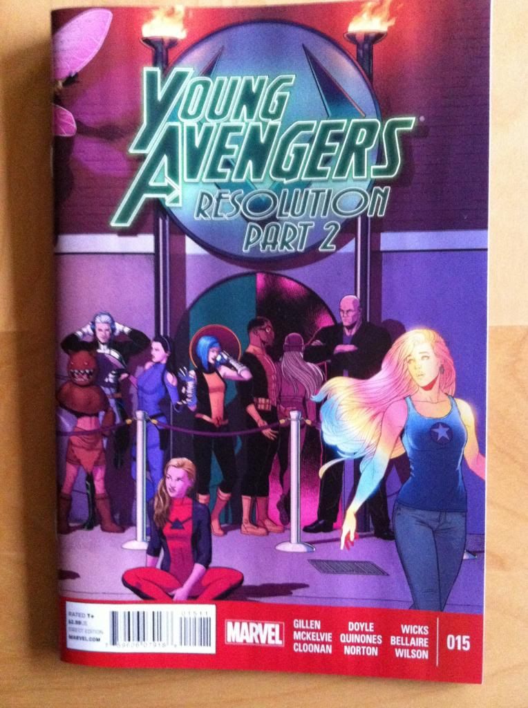
by Kieron Gillen, Jamie McKelvie, Becky Cloonan, Ming Doyle, Joe Quinones, Jordie Bellaire, Maris Wicks, Matthew Wilson; Marvel Comics
Young Avengers #15 is the final, goodbye issue of Young Avengers. It's pretty much a pitch perfect issue that, along with #14, does a really great job providing closure to the various character-plots of the series in a fun and VERY Young Avengers way. YA#15 is a testament to everything I love about the series and a perfect note to go out on.
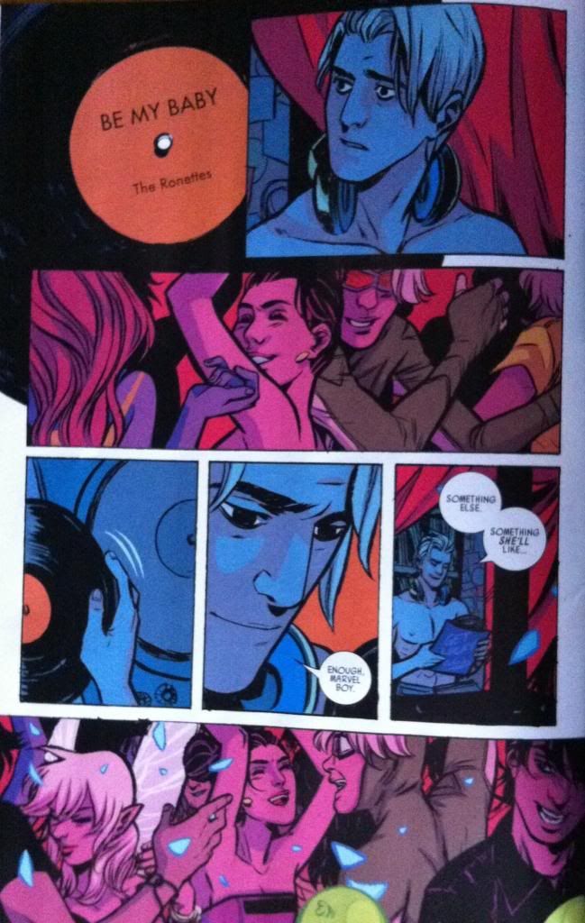
Young Aveners #15 is also a comic that features a Noh-Varr section, with art by Becky Cloonan and Jordie Bellaire, with some really clever colouring. Colouring is an aspect of comics that I find really fascinating and important, but given the subtlety of it, pretty difficult to talk about. That said, YA#15 features colouring that is obvious in its intelligence and effectiveness.
There will of course be *SPOILERS* for Young Avengers #15 in this post.
Actually, before I get to the colouring of this section of YA#15, I'd like to point out how great the pencils by Becky Cloonan are. The characters are alive with emotion, the story telling is crisp and clear, and the entire composition lives every moment in a really evocative way. The Noh-Varr section of the comic may be short but it really highlights the tremendous acting, compositional chops, and the ineffable magic of Cloonan's artwork. It's always a pleasure to read comics drawn by Becky Cloonan.
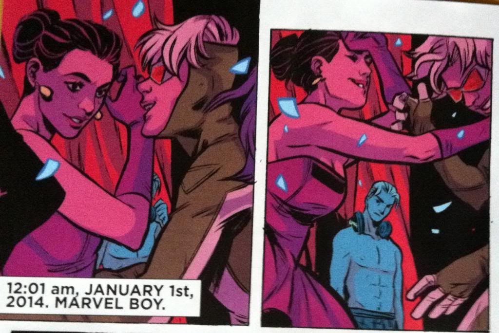
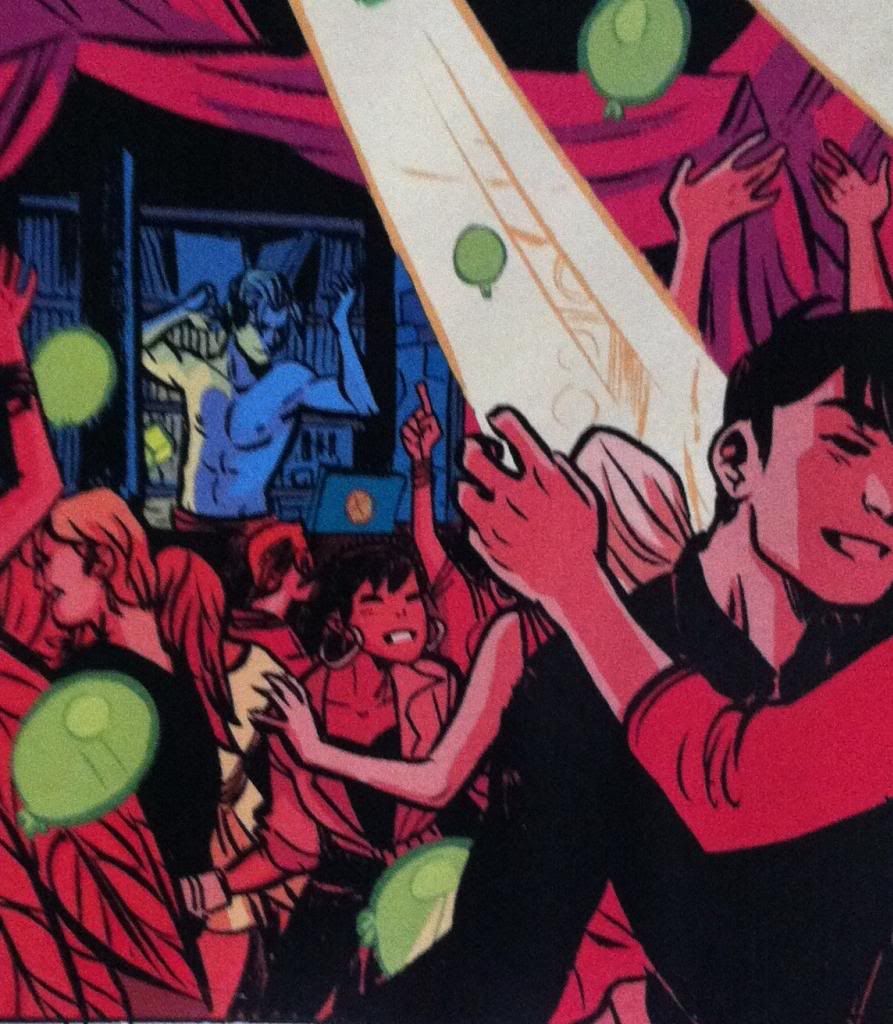
The plot of the Noh-Varr portion of YA#15 is essentially that Marvel Boy is ruminating on how his relationship with Hawkeye ended and meditating on the bittersweet flavour of love lost. This is all played out while Noh-Varr is behind the mixing table DJing and watching Kate having fun and being beautiful on the dance floor. As such, much of the dramatic weight of this sequence is the physical and emotional separation between Kate and Noh. This is accomplished in a bunch of ways: from the very discrete ideological demarcation between DJ and crowd (cerberal-observant/emotional-active) to the way the pencils separate the two groups physically and contrast Noh-Varrs aloneness in the booth to Kate's position in the people of the dance floor. But I think one of the most effective ways the separation between the two characters is emphasized is through the way the sequence is coloured.


The brilliance of the colouring is that it colours Noh-Varr in a different way than Kate and the dancing crowd and this contrast in colour emphasizes the separation between characters. Simple stated, Noh-Varr is colouring in a cool, shadowy blue, while Kate and the dancing crowd are bathed in a red glow that permeates every aspect of their colouring. Now, this fits very well into the plot of the series as the dancers are all lit by the dancefloor lighting which is the in-story source of the red glow, while Noh-Varr working in the DJ booth is not lit-up and therefore living in the shadows. So this colour separation makes perfect story sense. But it also makes really great emotional sense too: the cool blue of Noh-Varr fits his melancholy (he is literally blue!) while the hot, passionate red captures the fun and energy of the dancers. This difference in colouring, then, manages to emphasize both the physical separation (booth/dancefloor), the emotional difference (sad/celebrating), and the story distance between the Kate and Noh-Varr in a seamless way that brilliantly enhances the composition and storytelling. It's great colouring and great comics.

Previously:
Favouring The Young Avengers #14
Favouring The Young Avengers #13
Favouring The Young Avengers #12 (pt. 2)
Favouring The Young Avengers #12 (pt. 1)
Favouring The Young Avengers #11
Favouring The Young Avengers #10
Favouring The Young Avengers #8
Favouring The Young Avengers #7