Showing posts with label Pondering Pretty Deadly. Show all posts

Monday, 21 April 2014

Pondering About Pretty Deadly #5

Or how Pretty Deadly #5 pulled it off.
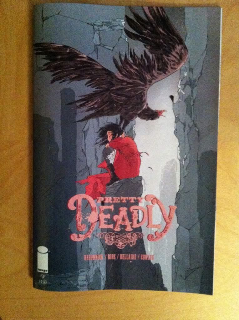
by Kelly Sue DeConnick, Emma Rios, Jordie Bellaire, and Clayton Cowles; Image Comics


As a rule I try very hard to approach media with an open mind, to unladen myself of expectations and try to judge things for what they are. In my experience being sucked into the hype of a thing, or investing great towers of imagination on just how gobsmackingly good a thing should be just leads to hurt feelings and ruined experiences. This is especially true of beloved culture, stories you love by creators you admire, because the temptation to become emotionally invested in unrealistic expectations is so great, and the eventual disappointment of heroes found lacking is crushing. I did everything I could to stop myself from building up how good the finale of Pretty Deadly could be.

Yet, for all my good intentions, I went into Pretty Deadly #5 with grossly unfair expectations. This was a comic that HAD to be amazing in almost every rspect or else I would be heartbroken at how it let the rest of the series down, how it let me down as a reader. This was a comic that had to be unrealistically good for me to be more than just okay with it.

And for all of that, for all my shitty, unfair hope, Pretty Deadly #5 pulled it off and destroyed me.

It is such a rare thing to go into a comic expecting it to be amazing and to be left aghast at how much better it is than you dreamt it could be. This comic took everything I've loved about Pretty Deadly so far: all of the wild dialogue and thoughtful kinetic artwork, all the brutal violence and the disembowelling emotional weight, all of the mystery and cuss-out-loud badassery, and closed the circle while, magically, showing me new heights of what Pretty Deadly can do. It is, in just about every respect, the ending this chapter of Pretty Deadly deserved and the ending that I needed to be happy.

And I would like to talk to you about the reasons, big and small, this issue cut me so deeply.

This analysis is basically going to be made out of *SPOILERS* so, if ever you have even thought of taking my advice about comics before, track down Pretty Deadly and read it, or wait a few weeks for the trade paperback, and come back here. Pretty Deadly is not a comic to be missed or trifled with.

Seriously, *SPOILERS*


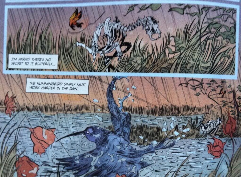
One of my favourite aspects of Pretty Deadly, and really a lot of Kelly Sue DeConnick written comics, is how story theme is introduced right at the beginning of an issue/chapter/whatever and then serves as the foundation for the remaining narrative. The great Bones Bunny and Butterfly parable from Pretty Deadly number five features two giant rattlesnakes fighting to the death, while hidden in the grass is the Kingsnake, who bides his time, allowing the combatants to weaken and defeat each other, before he strikes. Framed in the Bunny/Butterfly vaguely-children's story mode, it's a pretty grim and chilling little lesson. But it is also a really smart indication that Pretty Deadly #5 will feature a climactic battle where an unexpected ambush or betrayal will change the course of the story. We readers are taught to be wary right from the beginning which, whether we realize consciously or not, sets a tone of tension that will carry throughout the issue. As much as Kelly Sue DeConnick receives justifiable accolades for her sense of dialogue, the way she and her collaborators engage with theme on a structural level is pretty special.


This sequence also really crystallized for me just how thoughtful the parables of Bones Bunny and the Butterfly are. All of the little framing narratives really reveal some larger aspect of the story: cowardice, denial, struggling in adversity during issues that deal directly, at least in part, with those themes. For instance, the Hummingbird that simply has to work harder in the rain comes in an issue where the characters of Pretty Deadly barely survive a flash flood and where some truly horrendous violence is dealt. I'm also halfway convinced that the design similarities between Bones Bunny and Death, The Butterfly and Big Alice are deeply significant, and that the opening framing narrative where young Ginny kills not-yet-Bones Bunny is meant to thematically presage the overall shape of Pretty Deadly. Maybe.


An aspect of Pretty Deadly I've loved, which issue #5 continues to have in spades, is an amazing attention to detail and really firm grasp of how composition can convey mood or story in really subtle, elegant ways. This panel here is a great example of this. The characters, Ginny, Sissy, Fox and company are climbing the supernatural path to confront Death himself and are accosted by Big Alice who wants to claim Sissy. The heavy black landscape palette against the seething, unnatural pink/red of the sky is atmospheric and conveys the nightmare aspect of the world and feeds emotions of dread. But the thing I find most impressive about this panel has to do with the relative positions of Alice and Ginny: Alice towers above the other characters from a position of superior height. This instantly conveys to the reader at this gut level that Alice is in a position of power here, that the other characters are out matched by her. It's subtle stuff, but really delivers a sense of unease to the readers.


Another little sequence that captures the attention to detail in Pretty Deadly is this one here. What I find impressive about it largely has to do with the order of events the reader experiences. We see Ginny holding her gun, read her dialogue, and look down the barrel of the gun, maybe notice Johnny Coyote lurking in the background (remember the Kingsnake?), and finally see a targeted Big Alice. In the next panel, which is for me the really special one, we see a finger cocking the hammer of the revolver, and then the sound of the action catching, and then we look down the now ready to fire barrel. Or, to put it another way, we experience the action, then the sound of the threat, and then the weight of it. A tail rattle thrumming behind a coiled snake. It's the perfect order to see the moment to maximize its emotional impact.

This little sequence also really captures the strength of the joint dialogue/acting that Team Deadly brings to the page. "Make your choice," Ginny says as she, in a perfectly composed panel, arms her weapon, illustrating the consequences of the wrong choice. "I never had a choice," Alice replies while, eyes tragically downcast yet calculating, in a blackened panel designed to draw focus to her face, as she leans in a way that will carry through to a flurry of motion on the next page. For all of the brutal action of Pretty Deadly, the way the creative team maximizes even the smallest moments in Pretty Deadly #5 make everything a discovery.

As much as I tried to just read this comic on a first pass and enjoy it before cracking it open for analysis, I still spent a LITERAL HOUR crawling through every moment, artistic flourish, and beat of dialogue in this comic.


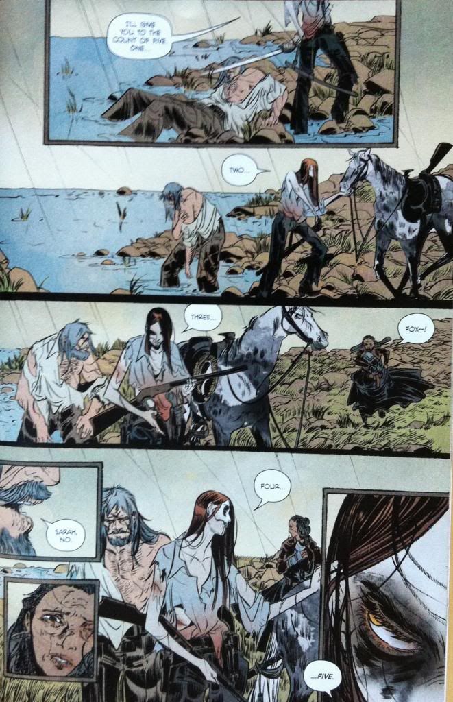
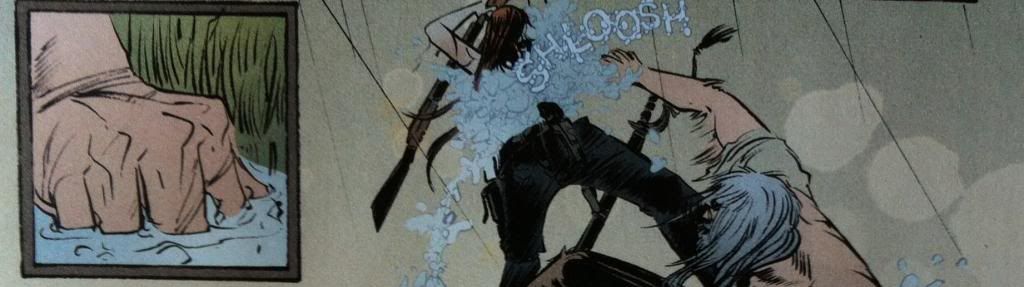
The way Pretty Deadly portrays action is startling and interesting and another thing I absolutely love about the series. This brief fight between Deathface Ginny and Big Alice is a great example of Emma Rios' approach throughout Pretty Deadly. In tight, small panels, are these vicious little moments of action: the first trio a gorgeous study in hands and the second trio a gallery of carnage. In both cases the actions are disjointed, not leading logically from one to another suggesting they are only small portions of a larger narrative of violence. These tight boxes also, in their small size, feel rapid, and yet, given their weight as actual panels in a free composition, feel significant and heavy. They are this perfect blend of chaotic and fast and painful and when contrasted with the somewhat static, wide angle looks at the fighting figures, they give the fight this very see-saw, desperate feeling. Flurries of action against strained pauses. It's kind of perfect.

And there in the background is Johnny Coyote, watching two wild serpents fight, awfully close to that shotgun.


Remember the Kingsnake and the opening parable theme of the predator that waits for combatants to finish before ambushing? As the fight between Deathface Ginny and Big Alice grinds to an end with both women battered and Ginny all but defeated, a waiting Johnny Coyote pounces. It's a moment that feels very earned, the culmination of Johnny's subplot of cowardice when he finally stands up, although in a manner still shaded by his lack of courage. It's also a pretty fulfilling moment, instead of an act of deus ex machina, as Johnny's indecision is present throughout the battle and in that the theme of ambush was ingrained in the very beginning of the comic.

It's also a really nuanced choice from a story structure perspective. The ambush of Johnny Coyote on Alice seemingly closes the circle opened in the Parable of the Kingsnake. This makes this moment feel like the end of this portion of the story, which opens up the remainder of the comic thematically. As a reader it creates a sense of uncertainty, we no longer really know what to expect next. Closing this thematic circle is also pretty great in that it drives attention away from the themes of ambush and betrayal established at the beginning of the comic. The reader is no longer hyper vigilant for this theme so that any future ambushes are poised to be more surprising, but still feel thematically coherent and earned.

Seriously, this comic.


Yet another ongoing aspect of Pretty Deadly I find really fascinating is the almost-sexual imagery associated with Big Alice and violence. In Pretty Deadly #2, when Alice cuts Ginny's death face into her mug on the tip of Ginny's sword, the panel shots had a decidedly sexual overtone which, along with the self harm, made the entire sequence seem really transgressive and creepy. I think this sequence here has many of the same mechanics at play. Much like the sword tip, the gun barrel is a pretty phallic object and the way the barrel is gently grasped on the left and and elevated in the right is pretty sexual. Which makes this whole scene of Coyote dispatching Big Alice feel deeply transgressive instead of triumphant. This choice also, with its implied intimacy, hints at larger history between Alice and Johnny, that the two are familiar with one another or were maybe once lovers. It's great stuff.


For all of the layout wizardry in Pretty Deadly, issue #5 manages to show another completely different mode of storytelling. Where the terrestrial world of the real is defined by wide, flowing vistas interspersed with tight, constrained boxes of motion, or sound, or action, the underworld of the dead has some of these amazing, unworldly pages where the established comic rules break down. This particular example is noteworthy for the sheer amount of narrative information encoded in the page. On the left side of the page the fable of the Shield Maid is told in a really nifty layout that emphasizes the duality of the Shield Maids, of day and night, of life and death. It's a rich, succinct story in of itself.


On the right side of the page the central narrative of the comic, of Ginny, Sissy and company going to confront Death, is told in a flowing column. Despite no clear panel breaks, this story is delivered in a clear manner that splits the story into four clear panel-zones. It's also a pretty smart storytelling choice because it turns this string of narrative into a vertical direction, such that the story seems to travel down and towards the reader, as if the characters are descending a stairway to hell. Pretty Deadly, for all of its magic, continues to display flourishes of innovation.


I feel like Pretty Deadly has a reputation for how daring and violent a comic it is... because it is. I know I'm guilty for selling the Holy Shit elements of this comic to anyone who will listen to me. What is maybe not being looked at as closely is just how great the character driven moments, the dialogue and acting, are throughout Pretty Deadly. This sequence here is so small, and simple: eight straight panels of Sissy's face and dialogue that provides a soliloquy into her emotional state and a pretty key decision. And look at the anguish, the calculation, the resignation, and the resolution on Sissy's face: this sequence captures an entire emotional arc. Emma Rios, for all her motion and dynamism as an artist, is also, in a way that is maybe missed in all of the thunder, a brilliant acting artist. 

Also, I love the foreshadowing in the bottom left panel here. 


(Hee. Gallows Humour.)


Speaking of Holy Shit moments, Pretty Deadly has some fucking swagger. "Which are you--Reaper, God, or Mortal?"....bursting free of a barn ablaze, guns flashing, 'I'm all three." Shiiiiiiiiit.

(By all means, go read Superman. He is probably going to save some people or something. I'll be right here reading Pretty Deadly.)

Okay. Seriously. *SPOILERS*


Remember the fable of the Kingsnake? The predator that waits to ambush two fearsome combatants after they exhaust themselves in combat? Sure, we saw Johnny Coyote strike like the Kingsnake to dispatch Big Alice but what if that was a red herring designed to throw us off the scent of the true Kingsnake?


Here we finally see the true, hidden Kingsnake, The Beauty, revenge herself upon Death and gain her long awaited freedom. This betrayal, this ambush, finally closes the circle set out in the opening parable. It's the completely surprising and satisfying culmination of Pretty Deadly #5 and the entire Pretty Deadly story. However good an ending I imagined for Pretty Deadly, this is one I hadn't anticipated, one that has more depth than I was prepared for.

This page is also brilliant comics. Broadly speaking the layout spreads to encompass both pages which gives the scene an extra sense of import and really drives the speed, and weight of the left to right thrust of the beauty's sword. This layout also breaks the page into three layers of narrative with sequences that tell the respective ends of Death, The Beauty, and Sissy's stories all in the same space. This is a really clever and efficient use of space. It's also a layout that lends itself to some really cool comparisons: the crumbling of the vanquished Death on the far left contrasts with the ascension of The Beauty in the middle tier, while the face of Death emerging from his skull mantle parallels beautifully the face of Sissy being engulfed by the skull of her new form. This perfectly encompasses the cycle, the shared nature of their transitions, between Sissy and Death. It's great.

Also, the symbol of the bird, a symbol of Sissy, standing over the rodent, a symbol of Death, impaled on a branch, a symbol of the flower of The Beauty, is some clever stuff too. Pretty Deadly has some pretty profound depth to it.

I don't like the idea of favourite comics. I feel like having one, best piece of media that you love above all others lacks nuance or the reality that you really don't have to choose. But, Pretty Deadly #5, and Pretty Deadly in general, is the kind of comic that's so good that I couldn't wait for its trade. If you are only going to try one new comic Pretty Deadly is absolutely the comic you should check out. The trade is out soon, and it's just about the complete package.


Previously:


Friday, 7 February 2014

Pondering About Pretty Deadly #4

Or my favourite impacts from Pretty Deadly #4
by Kelly Sue DeConnick, Emma Rios, Jordie Bellaire, Clayton Cowles; Image Comics


So my usual tactic when writing Pretty Deadly is to talk about the Holy Shit moments of the comic and highlight some of my favourite interesting features of the issue. The trouble with Pretty Deadly #4 is that, unlike other issues which have revelation based, discrete HSMs, PD#4 is an issue that plays out in one grand, brutal payoff that had me "Oh Jesus Wept"-ing all the way through. As such, it's either one very large, drawn out Holy Shit Moment, or a kind of fractal landscape made entirely of tiny Holy Shit Moments. Regardless, HOLY SHIT!... and my usual approach falls apart. So I'm just going to write about some of the cool comics in Pretty Deadly #4, and why I think this comic is such an effective and badass machine.

This issue, climactic as it is, is going to make this post VERY *SPOILERS* heavy. So only read on if you are up-to-date with your Pretty Deadly. (Because you really ought to be reading this comic.)


As much as Pretty Deadly is an unflinchingly brutal comic about supernatural vengeance, it's also a comic with some really pretty artwork and poetic moments. Just, you know, kind of brutal little poetic moments. I point this out because this moment here is pretty amazing and emblematic of the eerily beautiful comic that lurks amongst all the hyper violence, sex, and villainy. And I feel like this aspect of the comic: the beauty and innocence threaded throughout the Pretty Deadly provides a kind of emotional anchor for the story that is a constant contrast with the more horrific aspects of the comic. Things always seem darker with a little light, yeah?


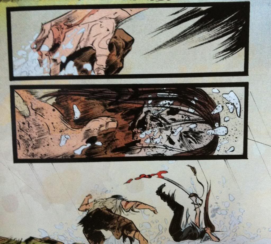
The central story thrust of Pretty Deadly #4 is the climatic battle between Ginny and Fox (aka the Mason). It is by far the most brutal and visceral fight we've seen in Pretty Deadly thus far (which is saying a lot). Part of this is the emotional buildup and context of the conflict: we see a battered, unarmed Foxy being pitted against Deathface Ginny, a woman who we've seen scythe through a gang of armed men and stand toe-to-toe with the fearsome Big Alice. And then there are the stakes: not only is Fox's life in danger, but Sissy's life also hangs in the balance of the conflict. When a fight has context and emotional repercussions, it is so much more dramatic and exciting than some dumb fight with planetary consequences but no soul.

But I think there are also a number of interesting art decisions that make this fight more impactful and different than previous conflicts in Pretty Deadly.


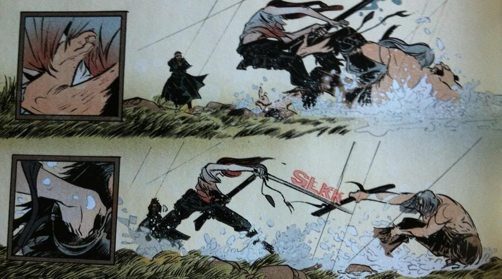
The first of these differences has to do with how the small ad large panels relate to each other. In previous issues of Pretty Deadly the small panels tended to exist within the actions of the page as kind of glimpses of noise or emotion or noise. In this sequence the big and small panels have a kind of cause and effect relationship where the small panels show glimpses of specific actions taken by the combatants and the larger panels show the repercussions of the decisions. The result is a fight broken into these lurching burst of decisions and violence. Which, as opposed to the very-guided, brutally elegant fights in previous issues,  is a much more stumbley, rolling bout. Less glorious spectacle, more dragged out grudge fight. This approach to storytelling also plays into the thematic idea of the stakes of the fight: every burst of violence are these little chains of violence and consequences. It's a really interesting way to present a fight in sequential art.


Another difference has to do with the arrangement of motion. In past conflicts Team Deadly has presented events in a way where motions flow organically from panel to panel so the reader moves along the paths of motion to enhance the speed of every slash, shot, and blow. Pretty Deadly #4 often takes a different approach where many moments of violence actually act against the motion of the readers vision. 


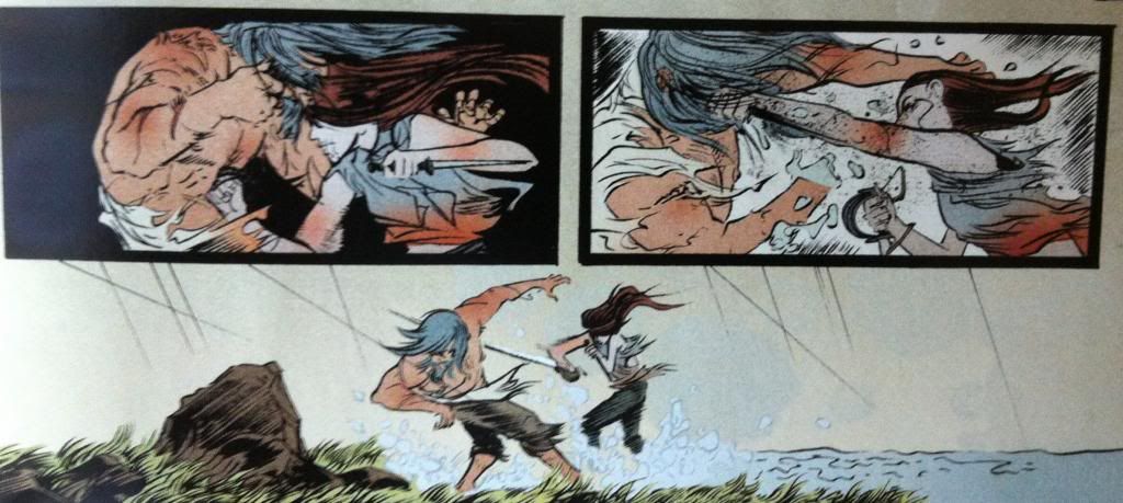
To break down this example of anti-motion composition, the eye moves in a simple straight across the panels from left to right. However, the main motion of the composition is the right to left punch in the second panel, which acts against the readers eye motion. What's more, the main motion in the first panel (well one of them, since there is a punch too) is the dagger-holding hand cocking back in a left to right direction, which means the two motions in the panels act against each other. They are disconnected in a way that disrupts a quick, directed reading of the panels. Which, I thinks provides each panel with a weight they wouldn't have if they had a more connected, flowing progression.


For the sake of comparison, I flipped the panels so that now the the punching motion moves with the direction of the readers eye. Which, for me at least makes the pair of panels connect a lot more, and makes them much easier to read through quickly. It also, I think, adds a certain elegance to the punching motion that isn't present in the other arrangement. 


So if we directly compare the two arrangements, the actual, broken layout as well as my modified flowing approach we can directly see the difference between them. Which is, in my opinion, that the actual layout is much more impactful and brutal. By making the panels harder to work through and avoiding an elegant guiding path, the panels feel disconnected and jarring in a way that absolutely enhances the weight of the blow and the emotional resonance of the violence depicted. It's really great comics.


Between the writing, the context, and brutality enhancing artwork Pretty Deadly #4 is absolutely a big drawn out spectacle of violence and Holy Shit Moments.

Previously:

Monday, 30 December 2013

Pondering About Pretty Deadly #3

Or more Holy Shit artwork and moments from Pretty Deadly #3
By Kelly Sue DeConnick, Emma Rios, Jordie Bellaire,Clayton Cowles; Image Comics


Pretty Deadly continues to be a pretty mind explodingly good comic filled with awesome artwork and cuss-out-loud moments of storytelling. Pretty Deadly #3 is very much a comic worth taking a closer look at, and since the approach of working through an issue's Holy Shit moments and artistic highlights seemed to work alright last time, I'm going try that again. That said, Pretty Deadly #3 works as the issue that sets the stage of what I think may be the ongoing conflict of the series, and two Holy Shit moments are pretty important revelations so this review is going to be VERY *SPOILERS*.

Seriously folks, if you haven't read Pretty Deadly #3 there will be fury-inducing *SPOILERS*. If you have never read Pretty Deadly and want to gauge if the series is for you, this post is Spoiler free, and this more indepth post is Spoiler-lite. Okay? I would absolutely hate to ruin some of the surprises in this issue for you...


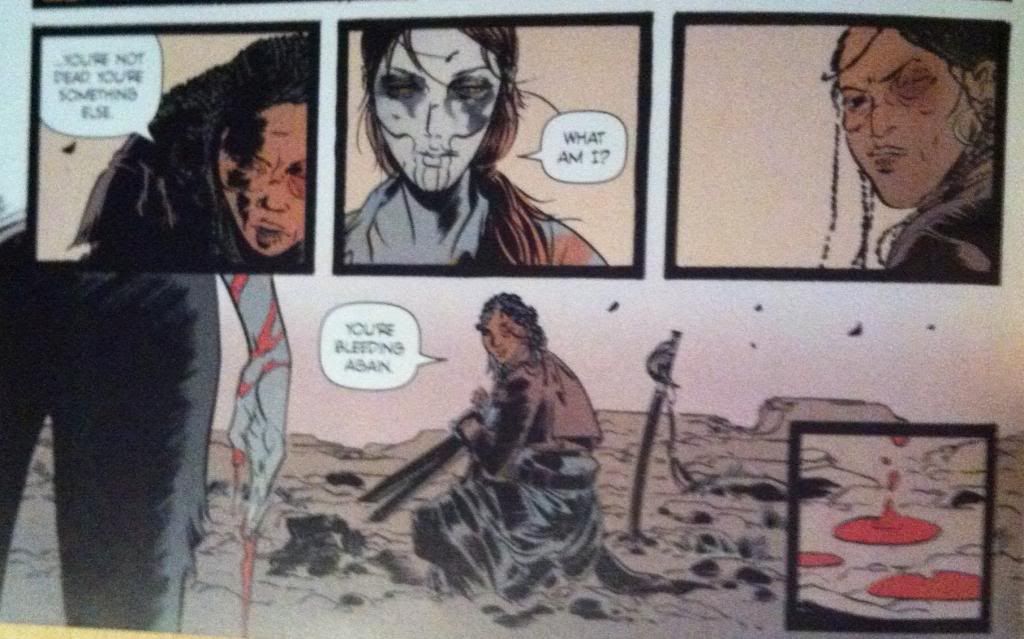
If the second issue of Pretty Deadly was defined by a symphony of violent beauty, Pretty Deadly #3 is governed by surprises and brutally effective sequences of conversation or exposition. This short sequence here is a good example of this issues approach to dialogue exchanges and how these conversations are these beautifully layered constructions of art and writing. 

From a writing/script perspective this exchange here is pretty damn cool just from the dialogue: 


            Sarah: "...you're not dead. You're something else."

            Ginny: "What am I?"

            Sarah: "You're bleeding again."

Even without any artwork or accompanying exposition or description, these three lines of dialogue convey a huge amount of information pertinent to the character of Ginny and Sarah, how they relate to each other, and is badass in a way that is very much the tone of Pretty Deadly. As much as I might focus more on elements of artwork or plot in these reviews, the dialogue in Pretty Deadly is amazing in and of itself and is fundamental to my enjoyment of the series. It's really, really good.


This dialogue, as good as it is, is coupled seamlessly to artwork that enhances every aspect of the exchange. The way the composition, colouring, and dialogue box placement leads the reader through this sequence adds enormous weight and characterization. The first two panels emphasize that Sarah is stooped and kneeling while Ginny is standing and conveys the power differential between the characters and the fact that Ginny has control over the situation. However this is undone in the third panel where Sarah draws herself up, with a look of defiance, and places herself compositionally on the same level as Ginny in the preceding panel. We visually see Sarah reject the power dynamic in the preceding panels. The artwork then takes us across the page to the fourth panel in reverse order (right to left) so that we read the "bleeding" dialogue before we see Ginny's hand with its bright flash of red blood. This is nifty for a couple reasons: it places defiant-Sarah in the third panel above the bloody hand, implying that her defiant strength is tied to her realization that Ginny is bleeding. It's also a cool bit of layout as it draws our eyes to Ginny's wrist so that our eyes can traces the red streams of blood down to her hand: we get to experience the blood running down her arm. It's great.

Another cool feature of this page is the isolated fifth panel of the blood dripping onto the ground. Due to it's corner position it is somewhat isolated from the rest of the sequence which gives it a certain remoteness and significance. It's also almost a panel form the tarot image banner that Sissy and Foxy use to tell stories: it seems to emphasize that the blood is the most important take away from this page. Ginny for all her badassery is mortal.

The thing about this sequence that is maybe more remarkable than the quality of the script or artwork alone is just how efficient it is. In five panels we learn a really impressive amount of information about Sarah and Ginny in a really interesting way. Ginny is cemented further as an exceptionally tough woman since she had to have it pointed out by another character that she was bleeding pretty profusely.  We also have it directly emphasized that Ginny is mortal: she can be hurt and she can be killed. We also get the impression that Rachel is herself a properly steely character as, even after seeing the violent power of Ginny, she still draws herself up in defiance, deduces Ginny's vulnerability, and manages to grunt out some bravado. This sequence also conveys a bunch of information about the relationship between Ginny and Sarah: it shows that while Ginny is in control, Sarah has no intention of remaining in her power. All of this in a minor sequence of five panels. 


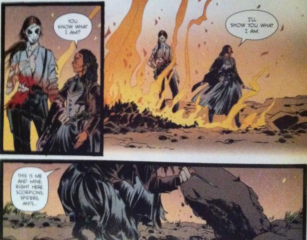
This big, long sequence contains Holy Shit Moment #1 and Holy Shit Moment #2 and perfectly encapsulates what I love about this series. It's brutal and beautifully drawn, the dialogue is intricate and complicated and just when the story seems to be going a certain way, it turns and rears unexpectedly in absolutely guttering directions. It's absolutely virtuosic comics and emblematic of how good Pretty Deadly can be.

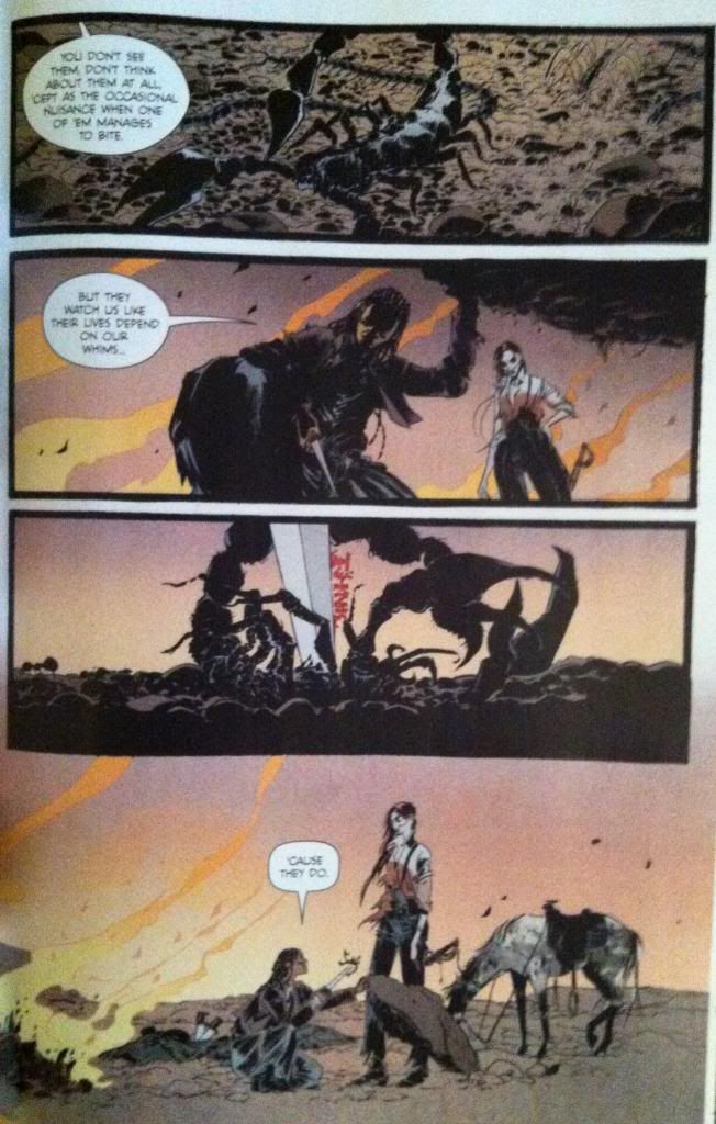
This extended sequence contains what I think is my favourite run of dialogue in Pretty Deadly to date. It starts with Sarah comparing herself to a bug at the mercy of a human, suggesting that the humans of Pretty Deadly are under tremendous threat by the whims of Ginny and the other supernatural elements of the comic. She stabs a scorpion to emphasize the point, which for me, is Holy Shit Moment #1. As a metaphor, it is brutally direct. This sequence than continues with Ginny AGREEING and using the metaphor to threaten Sarah into cooperating. It is Ginny argeeing that she is a merciless, godlike monster who views Sarah as a potentially useful bug. Which is Holy Shit Moment #2.

But beyond being a masterstroke sequence of dialogue and plot, this series has some really interesting comics going on in the artwork.


There are an absolute ton of small, elegant touches throughout this sequence. For one, the way the composition leads the eye through the stabbing and cutting of the scorpion so the eye darts along the path of the blade is brilliant and visceral. Another fantastic element are the flames burning in the background throughout the composition, which add an atmosphere of ruin and quiet menace to the entire sequence. And then there is the size differential between Sarah and Ginny throughout the sequence: Ginny is consistently portrayed looming over Sarah as a very clear visual signifier of their difference in power. It's just absolutely brilliant comics.


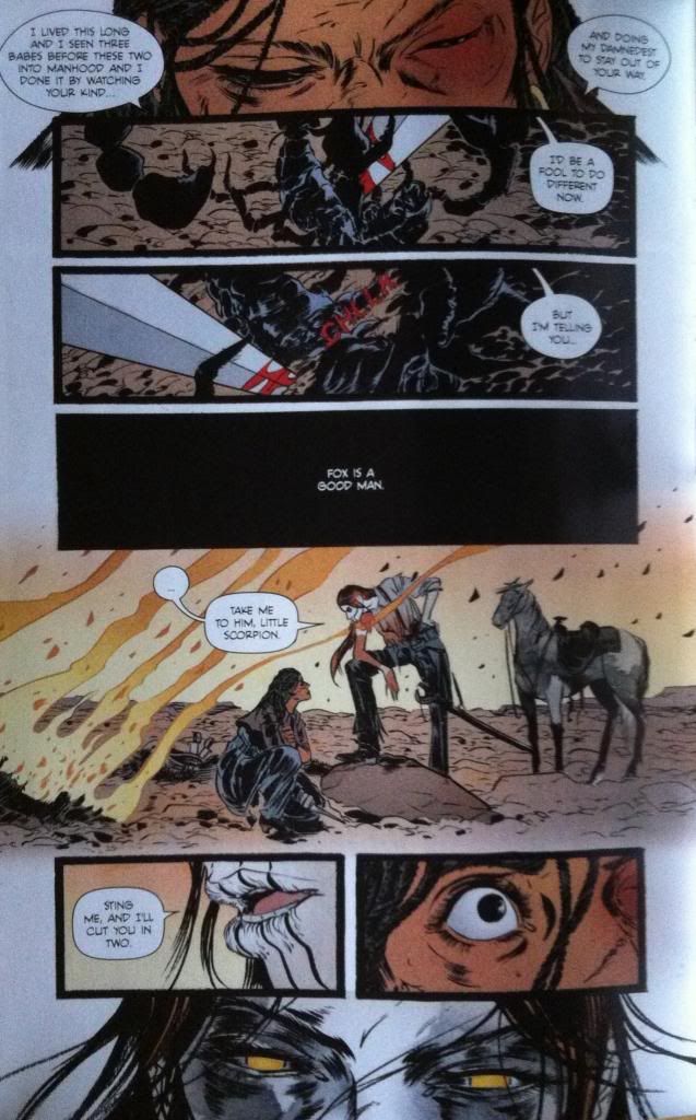
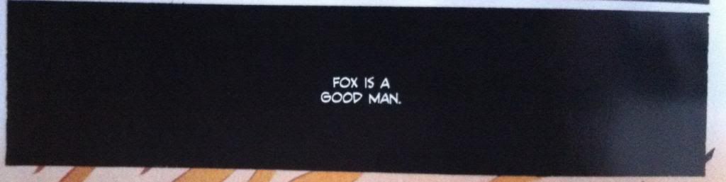
But I think my favourite thing about this sequence is this panel of dialogue here. From a story perspective, this panel has a black background as Ginny has kicked back over the rock the scorpions and bugs live under, so it conveys a nice bit of story information between panels. But what is brilliant about this panel is that the idea it contains, that "Fox is a good man" is portrayed in black and white. It is portrayed as an absolute. Which implies that Sarah, who says this, absolutely believes this idea. But, since we can't see Ginny listening to this statement this panel implies that she is deaf to it: Sarah is expressing this idea into a vacuum. What I love about the use of black and white here is just how solid and binary it is, its an idea you accept or an idea you reject and the fact that Sarah believes it and Ginny does not seems as if it will be the crux of their conflict. And this is all encapsulated in this single panel. Love it.


This sequence here is really great, largely for how it leads the reader so seamlessly through the composition and builds so much force and drama into every moment. The way the artwork captures the motion of Sissy crashing in a huff or spectacularly builds up the moment and explosive motion of Fox punching the rock face is great comics. The layout guiding even manages to capture the motion of Foxy's unstable stumble following the punch. And then the final three panels in the series beautifully and succinctly captures the emotions and status of all of the characters following the rage-punch. It's a really dramatic and efficient page.

Okay this next bit is going to be ginormous *SPOILERS* so please stop now if you haven't read the issue yet or if you are tradewaiting.


So the *SPOILER* intensive next section of the comic is the story of The Mason (the cuckolded husband of The Beauty who was the mother of Ginny). This section builds to a dramatic revelation which is Holy Shit Moment #3 and makes use of some really cool comics along the way.

This page here features one of the cooler mechanics at play during this section which is that Sissy is actively painting the story of The Mason, as related by Foxy, in the style of the Tarot images used for The Song of Death Face Ginny during a sudden rainstorm. This is kind of magical: it's a comic literally being made by a collaboration between Foxy and Sissy within another comic. And the way this process engages with the narrative and the fact that Pretty Deadly is itself a crafted comic leads to pretty interesting quirks. For instance, the two drawn panels in the middle third of the page: they depict The Mason holding his dead wife and deciding to die with her followed by another panel where the rain washes it away. This is a panel Sissy drew made of fantasy that is undone by the flow of reality. And then both of these panels are contrasted with the pose of Foxy immediately below them as he crouches on the ground in what can only be described as FORESHADOWING. (Incidentally, this is when I went "oh fuck, is that what's going on...?")

This page also features another really cool decision, which is the placement the panel about digging at the very bottom of the page, under the level of the ground. It's a panel about digging that is literally buried in the composition. It's a small, but very effective choice.


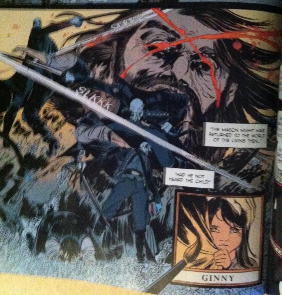
Foxy's story of The Mason eventually brings us to the *SPOILER* intensive Holy Shit Moment #3: Foxy IS The Mason. This fact is so brilliantly, brutally, obviously perfect that it is amazing. It explains so much of Ginny's motivation and Foxy's behaviour and adds a cord of dramatic connectivity to the entire series. It is also depicted on another amazing page that shows more of Pretty Deadly's trademark elegant composition in convention straining chaotic violence. This sequence of the blinding of Foxy/Mason by Death swirls about with seeming abandon, with Death and Foxy/Mason appearing almost randomly around the page in front of the giant, agonized face of Foxy. But closer inspection reveals a carefully arranged set of guides that steer the reader effortlessly through the chaos with the speed and exactness of Death's sabre: it's great comics.

It is also a pretty interesting sequence because of the contrast and similarities between the action/motion of Sissy's brush strokes and the strokes of Death's sabre. In the same way Ginny slashes her brush across say, Ginny's face in the last panel to draw a strand of hair, Death slashes across Foxy/Mason's head to carve the blinding X into the man's face. Which leads to a bunch of interesting ideas, like, what is the relationship between creation and destruction? Or what are the differences between enacting and depicting violence? Or, if we take things a little wider and look at the role of Team Pretty Deadly as slashers of pens and brushes, what is the relationship between violence and the creation of imagined violence. Pretty Deadly is a very thematically dense and complicated comic.

As dramatic and satisfying a revelation as Foxy's true identity is, it pales in comparison to how cool and amazing the revelation that comprises Holy Shit Moment #4 of the comic. But this moment is too perfect, too important to ruin here on the internet. So you will have to go and read Pretty Deadly #3 if you want to experience it. Which you should, because Pretty Deadly #3 is amazing.

Previously:
Pretty Deadly #2: Holy Shit Moments depicted with Holy Shit artwork
Pretty Deadly #1 pt. 2: The Song of Deathface Ginny
Pretty Deadly #1 pt.1: Breaking Rules