Showing posts with label Brandon Graham. Show all posts

Wednesday, 30 December 2015

Worshipping The Wicked + The Divine #17

Or a look at the importance of a blank page in WicDiv #17
by Kieron Gillen, Brandon Graham, Jamie McKelvie, and Matt Wilson; Image Comics


A thing about comics that I sometimes think doesn't get enough wonky attention is how important page order is to story experience. Individual pages function in printed comics are like discrete storytelling units, and controlling the rate and way readers encounter these units can dramatically alter the way the story is experienced. On a very basic level, the order of pages matters to how a comic is read much like how the order of panels matters. The most obvious example of this is the page turn, where readers suddenly get access to a new page that was previously hidden, making a kind of quick cut and the potential for a surprising reveal or comedic moment. But it goes beyond that, and I think WicDiv #17 does something interesting and really smart using a blank page to optimize the page reading order in the issue.

(This is also, a thing that I think is important to talk about because, incidentally corporate comics *SUCK* at this by jamming ads for like, beholder bobbleheads and Gumby the collectable card game into their magazines screwing with the delicate order.)

There will be *SPOILERS* for WicDiv #17 below. Like, serious spoilers!


Now before I try and convince everyone that what is basically a blank page is super interesting and ignoring the rest of the comic, I just want to point out that WicDiv #17 is pretty great ad features Brandon Graham's great artwork and style in the fantastic world of Gillen/McKelvie/Wilson's WicDiv world and that results of this collaboration are frequently pretty great. Like, there are few people who can draw an orgy that is somehow sexy and goofy looking and still somehow not exploitive or could make a scene where a dangerously unstable cat goddess wallowing outside the cage of a bird goddess look so lackadaisically charming. There are some really fun, unique moments in this comic.


(For the record, a 4.9 earthquake happened right now and... woah! It's been a while since a big one's hit in these here parts, and the first one I've lived on a double digit apartment floor for. Quite a lot of swing and torque, it turns out...)

There is also some really astute storytelling on display throughout the issue. I especially love this page and how it uses reader tracking to make the pacing of the page fit the action perfectly. The tangents in the first panel that cruise through the background lend that panel a sense of speed (which works beautifully against the static Baal). Or the second tier of panels which has a hard left-to-right directionality that captures the motion of the sequence wonderfully. The second panel also takes advantage of the transition from the first panel to the second row, and slams the reading motion in opposition to it making for an extra impactful panel (that additionally shows the a consequence of the motion that already happened). The next panel has also has a pretty great abrupt stop built into the panel. The bottom three panels have a looping meandering path through artwork and dialogue captures the lazy, calm after the intense top panels. Collectively this page, I think, captures the polarity of Sakhmet, her danger and fury, but also her playful laziness in how the page is read, and therefore experienced.


So knowing that WicDiv #17 is a pretty great comic for a lot of reasons, let's talk about how great the solid black page in the comic is. The story of this sequence is that Sakhmet has descended on her childhood home and murdered and eaten her father. This sequence works as well as it does because it reveals this information in a series of growing surprise reveals. The first page sets up the sequence, and looks downright benign, with Sakhmet reminiscing and smiling pleasantly (such a perfect panel btw) and then we get the all black page. It's ominous and empty, a long hard cut that it implies the passage of time and a significant story shift. The next page, which benefits from being after the page turn, shows cavalry arriving in an ominious situation. It's obvious something horrible has happened and that Sakhmet has been involved in some sort of altercation, probably violent and probably involving her dad. But it isn't until after the next page turn that we learn Sakhmet has *eaten* her father and the downright casual way she is reacting to that. It's a scene of slowly building horror that really benefits from having two adjacent page turns to ramp up and then up again the fuckedness quotient of the situation. And that black page shifts the other pages around just enough to make this construct work. Which is such a little thing, but such a smart, smart choice.


Monday, 2 November 2015

Visiting The Island #4: Multiple Warheads

Or a look at active speech bubbles in Island Comics #4 presents Multiple Warheads: Ghostown #2
by Brandon Graham; Image Comics


What's cool about Multiple Warheads is just how little this comic cares about conventional wisdom and how much its willing to play with storytelling elements in unorthodox ways to make interesting comics. In Island #4, Multiple Warheads shirks convention and does some pretty interesting and fun things with dialogue boxes.

There will be *SPOILERS* below.


I think the common wisdom behind dialogue boxes and lettering is to be as unobtrusive as possible. The dialogue boxes should avoid covering artwork and while they should do their job of conveying what the depicted characters say to each other, they shouldn't be overly each catching and distract from the artwork. I feel like this metric maybe lacks some nuance: lettering is often a powerful storytelling tool that uses its ability to draw reader's eyes as a subtle guide to how to read a page. Where this perspective and the common wisdom intersect though, is that the dialogue boxes are best when they are seamless, semi-invisible page components that work their magic without being the focus of the page.

What this instalment of Multiple Warheads does is make the dialogue boxes an active, obvious part of the page in a variety of ways that are pretty cool.


One of the realities of vocal dialogue is that it kind of has two parts: the words being spoken and the emotional tenor of the speaker. In Real Life, these two elements interact to create context and meaning. Someone saying "the dog is coming!" in a delighted voice (like I would) is saying something very different from someone screeching "the dog is coming!" in fear. Comics, which are a silent medium are great at conveying the word content of character dialogue but struggle a bit in layering in the emotional reaction.

Normally comics manage to encode emotion through character acting: the tenor of the dialogue is implied by the happy or sad or horny faces of the portrayed characters. But this isn't always perfect and sometimes, like when a comic is way zoomed out like above, the facial clues needed for this aren't available. Which is where smart comics happens: Multiple Warheads bakes the emotion of some dialogue boxes right into them with artwork that captures the feelings of the speaker. The above selection is, I think, pretty great because the uncomfortable glance in the dialogue box changes a kind of emotionally ambiguous moment of dialogue into something definite. It's really astute stuff.


Another fun example of using illustrations inside of dialogue is this selection. Instead of having the two stoned buds here discuss how Moontoone's nose looks kind of like a dick using words, the comic shows this using pictures. It's a great choice because it takes way less space/time to parse than the equivalent dialogue: the reader can at-a-glance suss out the phallic pictionary of the situation. It's also petty great because, I think, it changes the feeling of the sequence. Reading someone explain in words how someone's face looks like a penis would be actually pretty cruel, but seeing it here in pictures makes the entire situation feel a lot looser and sillier. Less a cutting criticism and more two dopes being goofy. (I mean, it's still kind of mean, but for me it's the difference between jerks and people being ignorant, y'know?) The choice to use images here instead of dialogue here, I think, just makes this sequence work in a way using text wouldn't.


Another cool bit of dialogue box trickery in Multiple Warheads is the above sequence. In the comic a dragon is smuggling back a magical weapon-thing in his belly that a wizard extracts from him through his speech bubble. While it might not be a generally applicable bit of comics, I love it when magic is depicted in comics as something impossible or fourth wall breaking. Magic for me has always been impossible, amazing things that violate the rules of the universe, and seeing that played with as a visual metaphor is always cool. 


I think my favourite example of fun dialogue box experimentation is this selection here. It might not be the smartest or more most experimental dialogue experiment in the comic, but it is just so charming and fun. The way the call box and the wonderful hand lettering combine to make a yawning face, is neat, and the way that enhances the weight of that yawn on the page is pretty smart stuff. I am also pretty keen on this choice because yawning is just such a visceral experience, more about the motion and the physical sensation of yawning mouths and scrunched faces than the actual noise of it. I think the choice to build the face into the sound here lets the dialogue box convey more of that physicality than just the text alone would. Which is effective storytelling.

(I mean, it's late here, and I am yawning up a storm trying to write this section, which is further evidence that this bit of comics is great.)

Multiple Warheads, still making the case that there is all kinds of ways to make good comics.

Previously:
Island #1: Multiple Warheads


Island #1: I.D. Part 1
Island #2: ID Part 2

So I Read Multiple Warheads Vol. 1
Multiplexed storytelling in Multiple Warheads

Monday, 27 July 2015

Visiting The Island #1: Multiple Warheads

Or a look at the busy town compositions of Multiple Warheads 2: Ghost Town
by Brandon Graham


Another great thing about the new Island comics anthology is that it appears that it's the vehicle for more of Brandon Graham's great comic Multiple Warheads. Which, I've gotta say, I'm pretty excited about. Brandon Graham is one of those comics artists with a distinct aesthetic and an approach to comics storytelling that I think runs contrary to a lot of mainstream wisdom. While I don't think you can drill this difference down to any single aspect of his work, there are a couple great examples of wide angle shots in the current instalment of Multiple Warheads that really showcase one of my favourite aspects of Brandon Graham's storytelling. Which are perhaps worth a bit of unpacking.

There will be *SPOILERS* for the Multiple Warheads in Island #1.


In a lot of cases good storytelling comes down to efficiently conveying the emotion or details of an event in a clear and concise way. Usually this entails the artist honing their composition in on the main characters, or key actions, or providing an evocative look at setting to provide spatial context. It's also often an action in limiting extra details to only what is necessary to sell the shot, to populate the scene with just enough detail to make the world look inhabited, but not so much to distract readers from the key things being portrayed. Or, TLDR, it's all about focus. 

Multiple Warheads essentially ignores this approach and throws a chaos of detail at the reader to sort through. And it is kind of great.

Take this double page spread which shows our protagonists going for a crazy brunch. The page is drawn wide angle to provide spatial awareness of the restaurant and to allow the world of Multiple Warheads to exist. 


The main story of the page has our protagonists order their meals (complete with a fun choose-your-own-advenutre moment), their weird Warhead thing order his meal, and their bird waiter person go and fill out the order. Despite the very busy layout, this central story is very easy to follow across the spread, taking advantage of lettering to draw attention and the effective tangent of the staircase to handle the transition from one clearly defined story region to another. Despite all of the seemingly extraneous detail on the page, the underlying core narrative is well constructed and clear.


Built into this main narrative is a smaller mini-strip within the spread focussed on world building. The restaurant our heroes are eating at is built on a whale and uses specially grown whale meat as the main ingredient. This smaller comic strip shows the cooks in the restaurant and explains a little bit about how the whale-restaurant functions. It's a fun little discursion that makes the whale-restaurant feel more real. It also, critically, slots into the main narrative very cleanly, fitting into the flow in an organic spot, and adding a nice sense of elapsed time before progressing to the final panel in the main story. 


Finally this page has little islands of crazy characters around the periphery. These characters largely function like extras, filling the restaurant with people and making the world feel more lived in. Except, unlike the standard idea of extras, who are meant to occupy a space without attracting undue attention, and are usually kind of bland, these extras are all crazy Multiple Warheads characters who are each unique weirdos. Which really helps build the veracity of the world: not only do the heroes of Multiple Warheads have fantastic, crazy stories, but so does everyone in this wild, post-apocalyptic world. It's a really charming choice.

In a lot of ways this double page spread violates the common wisdom of storytelling: it packs in tons of extra detail, includes fun, but irrelevant side stories, and generally makes the world instead of the core narrative the focus of the page. And yet this spread still manages to provide a clear, well built navigational path through the composition so information can be logically and effortlessly read. The result is this living world, seemingly bursting with life that navigates this really effective compromise between clutter and narrative focus. It's great comics and something Brandon Graham does really, really well.

Previously:

Island #1: ID and Emma Rios

So I Read Multiple Warheads Vol. 1
Multiplexed storytelling in Multiple Warheads

Monday, 13 July 2015

Illuminating 8house: Arclight #1

Or a look at the opening shot of 8house: Arclight #1
by Brandon Graham and Marian Churchland; Image Comics


Recently I've spent a lot of time kvetching about how advertisements in comics can ruin a good experience by blowing the timing of a joke, spoiling the tone of an ending, or just being insultingly pervasive. It makes me crazy. 8house: Arclight #1 is the opposite: it's a comic that eschews extraneous crap and focuses on delivering an immersive and memorable comic world. Since it's nice to highlight well made comics instead of complain about bad ones and because I think one of the choices Team 8house makes is interesting and instructive, I want to take a closer look Arclight #1.

There will be mild *SPOILERS* for 8house: Arclight #1 below.


The magic of 8house: Arclight #1 is just immersive the world is. As readers we are rapidly swept into this fantastic world of mystery, magic, and sweeping, gorgeous vistas. It's a world where we are informed by suggestion and implication, where we are invited to discover and make inferences and learn. Which, as an approach, is something I love because a fictional world that just goes about it's business while we gawk and culture shock like tourists feels so much more alive than a world detailed with exposition. 8house: Arclight is comics world building at its best.

One of the coolest things about this immersive experience is how it starts:


When you open 8house: Arclight #1 you are immediately, on the inner page of the cover, dropped right into a beautiful panorama of the world of 8house. There isn't an advertisement like a Marvel or DC comic sitting there asking for attention. There isn't a title credit page or recap article. Just a double page spread that instantly transports you into the comic world.  It's total immersion from the very first page, and it really sets the tone for the kind of comic and kind of experience that Arclight wants to be. It's a simple choice that is incredibly effective.

Of course, this choice to avoid nagging advertisement is continued throughout the comic maintaining that wonderful sense of immersive adventure established in this opening page.

If you are looking for an immersive, fantasy adventure 8house: Arclight #1 is a comic you should check out. It's really good. That said, it might be worth waiting for the trade: I love immersive comics, but getting a pamphlet sized glimpse is just such a tease. I figure reading the entire collection will be a truly magical experience.

Wednesday, 16 July 2014

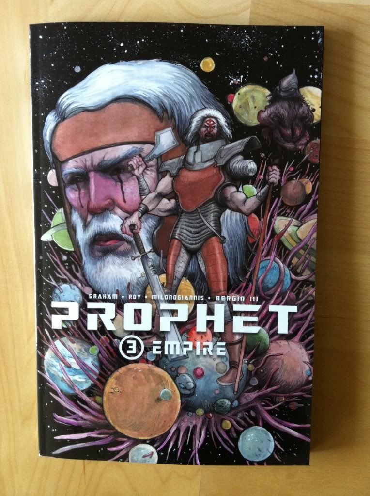
So I Read Prophet: Empire

A 250 word (or less) review of Prophet: Volume 3
by Brandon Graham, Simon Roy, Giannis Milonogiannis, Joseph Bergin III; Image Comics


Prophet: Empire continues the streak of Prophet being the most intriguing Science Fiction comic I'm reading. Empire brings the focus back to the Earth Empire and the summit of diverse Johns congregating following the activation of the beacon by the New Father while also touching base with the old man prophet and his counter-Empire team as the series builds momentum towards a cohesive integrated narrative. I've more or less said it all already: Prophet is that rare Sci-fi story that creates a truly alien future filled with challenging and strange concepts, creatures, and adventures and is a comic series filled with truly impressive artwork. It's great comics. But the thing that Prophet: Empire emphasized for me about the Prophet series is that it's kind of totally rad. Like, for all of its elegant designs and thoughtful Sci-fi, a lot of stuff in the series happens mostly because it would be totally cool. And I think this sense of fun is one of the cornerstones of why I like Prophet so much: it's pretty special to read a comic with such an aggressively auteurish sensibility that still manages to take such infectious pleasure in goofy tangents and over-the-top badassery. So, yeah, Prophet: Empire is the newest chapter in the big deal Science Fiction epic that is also totally bitchin'.

Word count: 218

Previously
So I Read Prophet: Remission

So I Read Prophet: Brothers

Friday, 27 June 2014

Deep Sequencing: Multiplex Warheads

Or a look at the crowded, populated aesthetic of Multiple Warheads,
by Brandon Graham


One of my favourite pieces of culture as a kid were the Where's Waldo books. Not so much for the finding Waldo, because frankly, I sucked at finding that striped toque wearing tourist, but because these books provided teeming worlds to visit. Waldo and his narrative (such as it is) was just a tiny facet of these grand, chaotic environments full of a million other stories, from battling samurai to space aliens. And so the Waldo books ended up being more about all the cool or silly little side stories taking place in these awesome, riotous, packed environments than any quest for Waldo. Basically, I loved the books for their roles as gateways to worlds of stories than the books' central conceit.

(Also, speaking of Waldo, did anyone else see the guy cosplaying him during, I think, the Ivory Coast  -vs- Japan game?)

Anyway, I bring all of this up because Multiple Warheads has that same magic. It's central narratives of Sexica and Nikoli going on a roadtrip vacation and Nura the organ hunter on the trail of god organs take place in this amazing world filled with all kinds of bizarre, silly, and cool discursions and embellishments. Like my beloved childhood Waldo books, Multiple Warheads is a gateway to a world populated with hordes of fun characters and brimming with minutely detailed environments. And, like Waldo, I enjoyed the comic as much for the fun world it creates as the actual narrative.

There will be mild *SPOILERS* for Multiple Warheads below.


This double page spread here really encapsulates the big crazy world building of Multiple Warheads. This spread takes place during the Nura narrative, of the organ hunter searching for some particularly potent organs. Nura and her ally, the Coat-of-Arms guy have tracked Ian Marx, a person of interest in their organ hunt, to a small island community perched on the back of a flying whale. Once there the two hunters discover a summit of many clone (?) versions of Ian Marx (the Marx men) before being waylaid by sky pirate organ hunters, The Puzzlemen (who swap hearts with one another). This page captures the heat of the raid of The Puzzlemen on the floating whale village. And it is exactly why I think Multiple Warheads is such a great comic.

It is also just a really technically great spread of comics. These pages are absolutely loaded with environmental detail, 6 simultaneous narrative streams, and a handful of fun peripheral characters and details. And yet, for all this business, this double page spread is immanently readable and balanced. And how it's pulled off is worth taking a closer look at. 


Stacked across the top of the spread are smaller panels that depict the protagonist's stories. Starting on the top left IN RED we have Nura fighting a Puzzlemen with a dialogue-box like pointer-arm showing where the action takes place in the larger environment. This way we get to see what's up with Nua but also how she fits into the larger world of the raid. Next to those panels,  IN BLUE, are panels depicting the naked Coat-of-Arms (fresh from an interrupted bath) acrobatically fighting more Puzzlemen right above the area where the action takes place. What's cool about this sequence is that the Coat-of-Arms action sequentially starts in the panels and ends in the larger environmental drawing. Like the background is the third panel in the story. 


And then we have IN GREEN the panels depicting Nura's loyal motorcycle hearing the whistle (which we've already seen in the RED Nura panels) and springing to action to help her. We then work out way back and see IN YELLOW the Cyst Ant assistant of Coat-of-Arms guy carrying garments and fleeing from a marauding Puzzleman.


We then work our way down to the bottom of the spread and see IN TEAL the Bored to Death burrowing rodent torpedos of the Puzzlemen digging their way into the flesh of the flying whale to reach its sensitive internal organs. Below that we have panels IN PURPLE that take place in the nerve centre of the whale where the denizens of the village are able to pilot the flying whale. These two narratives come together right before an explosion that is depicted on the following page.


And because Multiple Warheads is a comic depicting a cluttered world rather than just a focussed narrative, there are all over the periphery of the page IN ORANGE extra people and call outs which help increase the scope of the page.

So there you have it, a big chaotic world delivered in a really clear and interesting double page spread. You really ought to check out Multiple Warheads and visit its crazy world yourself.

Wednesday, 25 June 2014

So I Read Multiple Warheads

Or a 250 Word of The Complete Multiple Warheads (Vol. 1)
by Brandon Graham; Image Comics


Multiple Warheads is a pretty hard comic to categorize. For one, the series started out as a porn comic in which organ smuggler Sexica sews a werewolf penis (which she smuggled in her butt) onto her boyfriend Nikoli with sexy diphalic results. The series was then re-imagined as a kind of Science Fantasy love story/travelogue set in a bizarre post apocalyptic Russia that sees Sexica and Nikoli go on a travelling vacation across futuristic wastelands. There is also a so far unrelated story about a badass motorcycle bounty hunter tracking a bizarre godling filled with valuable organs across the same decimated landscape. Multiple Warheads is, as you might imagine, not a very plot driven comic. What is beyond imagining, and what is the real draw of the comic, is the art: Brandon Graham's wasted Russia is this mad, ornate place just littered with detail and weird little people and places and things. And so, so many puns. It's a comic that is beautiful in this really unusual, unique way that manages to pull off this cool, goofy vibe that is a lot of fun to read. Multiple Warheads, is as much as anything, a really cool looking comic made by a great artist just having fun with the page in a way that really shines through. I am not entirely sure what Multiple Warheads is exactly, but I know that I like it and that its different enough that you ought to check it out for yourself.


Word count: 247

Previously:

Friday, 22 November 2013

Deep Sequencing: Prophet Colour Visions

Or some clever use of colour in Prophet: Brothers
By Brandon Graham, Simon Roy, Farel Dalrymple, Giannis Milonogiannis, Joseph Bergin III, Ed Brisson; Image Comics


I am really interested in colouring as a force in comic book art. When done well it breathes a certain life into line art and can add a sense of atmosphere or mood to a composition that the line art alone might not be able to accomplish. When done poorly colouring can be this busy nightmare of rendering and gradients that can completely obscure the beauty of the underlying lineart and all of the depth of the inking. It's gloriously complicated and can alternately really enhance a comic or detract from it in really interesting and significant ways. It's important and I really want to talk about it.

The trouble is, beyond saying its good or bad, I find it really hard to find a substantiative angle on colouring.

The thing is, really good colouring becomes such an organic part of the finished comic that its often hard to point out aspects of the design that stand out or the logic to it. I might be dumb or just not know enough about the art of colourng, but the genius of colours often is too subtle for me, too clever and respectful of the rest of the comic to jump out. It's really only the most obvious, most experimental colouring that I really can write about in any meaningful way. It's like talking about a bassist, it's super important to the music but unless you know a lot about music or playing the base it can be hard to pick out how great it is. (You know, unless it's Geddy Lee doing something crazy.) So despite the dearth of colouring analysis here, I'm appreciate how important it is and try to think about it.

Prophet: Brothers, fortunately, has some really obvious and deliberate colouring that I think maybe lends itself to a discussion of some of the ways colour can affect the atmosphere of the comic and convey extra information.

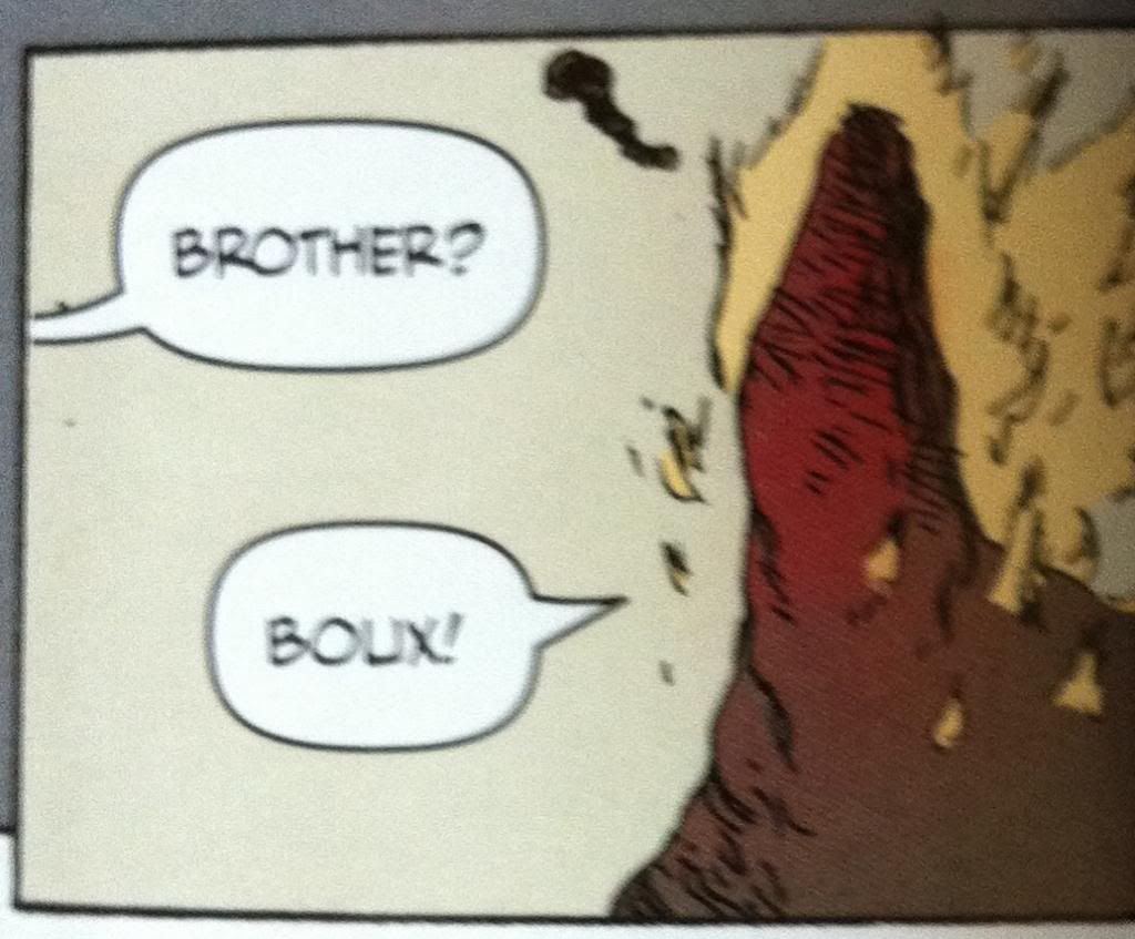
*SPOILERS* for Prophet: Brothers going forward. Proceed at your own risk. Boux!


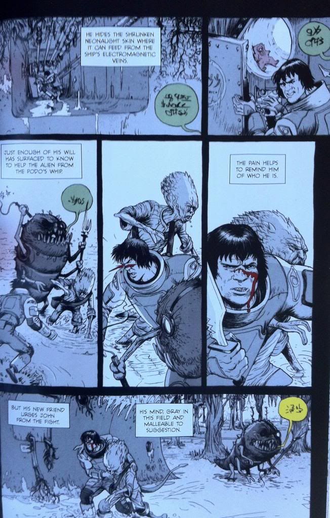
The plot of the chapter of Prophet I want to unpack tells a story about the Prophet guy with a tail, as he attempts to escort the Empire Mother back to Earth Empire space. To get there he and his team must bring the Sister through the Ixtano Circus, a perpetual space battle. Complications ensue and Brother-Tail finds himself taken prisoner on a manufacturing barge, a kind of prison/slave ship. On this ship all prisoners are mind controlled into servitude and this is conveyed to us by colour.


All of the scenes that occur within the influence of the mind control are done in greyscale. This lends these scenes a muted, drab quality distinct from the coloured scenes. It's as if a certain sense has been removed from the comic, colour, which resonates with the mental blanket and lack of full cognitive ability of the Brother-Tail while he is under mind control. And beyond that, the change from colour to greyscale is a terrific visual metaphor for being under mind control: Brother-Tail and our own perception of reality has changed in a way that is expressed on the page. It's unsubtle but pretty smart.


The thing is though, this Prophet chapter continues to use colour in moments that act against the mind control. For instance, when the Empire Mother psychically reaches out to Brother-Tail she brings with her the colour red. This shows that she is able to piece the grey-mind-control-fog to reach Brother-Tail's mind but, given the monochromatic nature of the red, brings another kind of control, another unitary element of control. It is also, I think, a visual signifier of the violence inherent in the Earth Empire's influence: their mental colour is the same as blood.


Another neat colour trick is that the overseer's commands speech bubbles are coloured. This shows that their commands are able to pierce the grey mind control blanket and, based on their colour in a grey-scaled page, become the most striking and important elements on the page and to Brother-Tail. It's simple and it's pretty great.


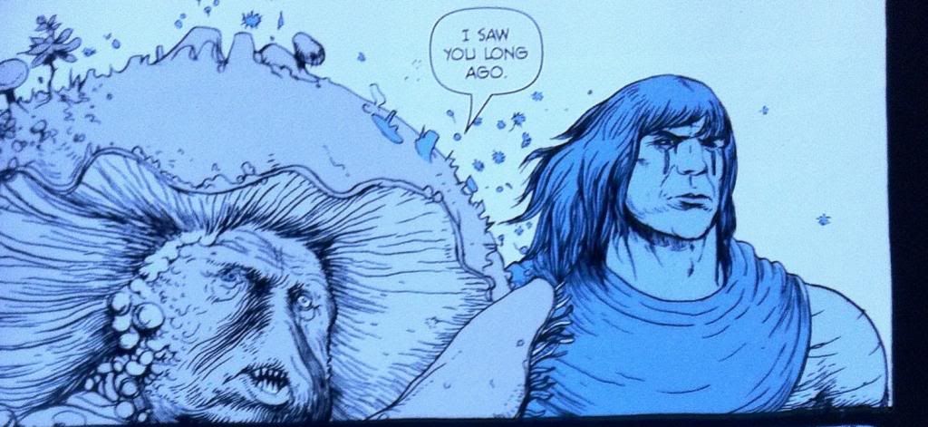
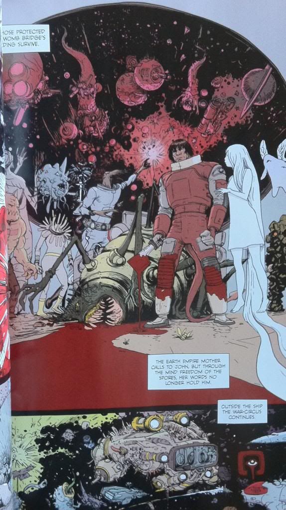
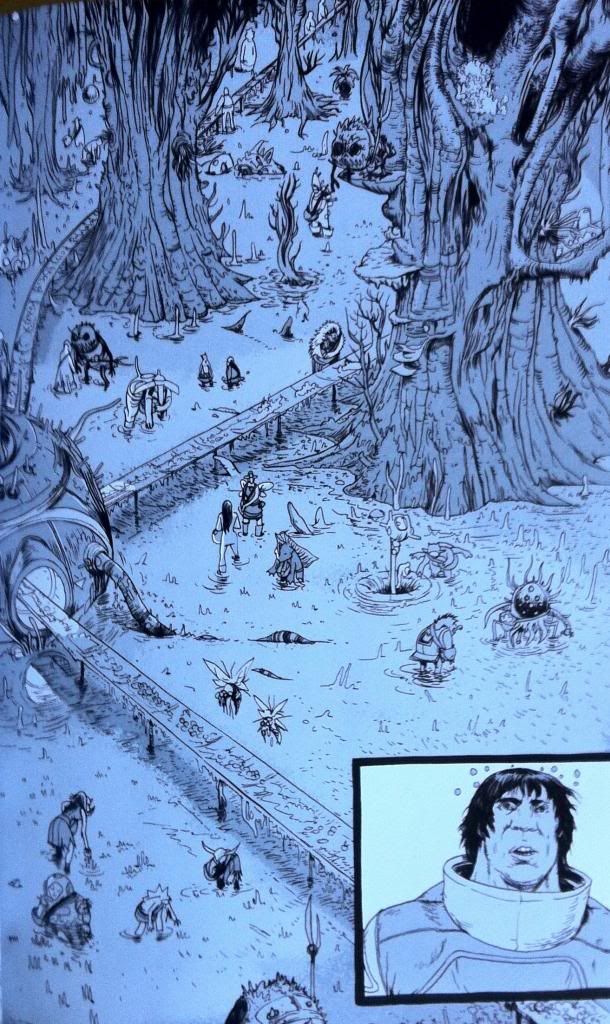
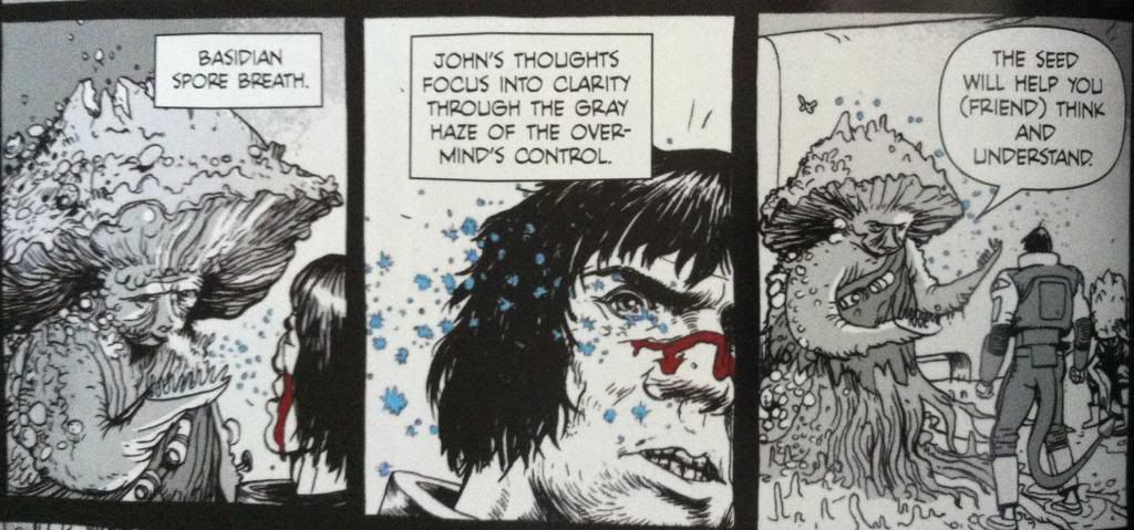
The thing that saves Brother-Tail from mind controlled slavery is encountering Yun-Heath the Basidian, who releases spores that induce an element of mental freedom on those who inhale them. This too is given a colour, the spores as blue motes on a grey background and in one frame shift the colour of prophet into a blue-overlayed greyscale. Again this shows a message that is able to get through the mind fog by adding an element of colour. It is also a great visual metaphor of regaining an element of mental freedom: some colour has returned to the world but not all of it. Again it is pretty obvious but still pretty smart comics.


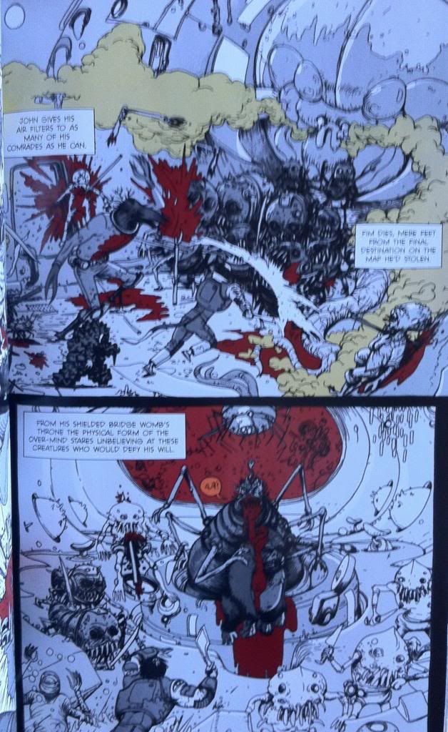
Eventually Brother-Tail and his fellow semi-free slaves rise up against their handlers and fight their way to the Over-Mind, the source of the mental control, to regain their freedom. This battle takes place mostly in greyscale, but certain elements are brought through as colour. Elements like blood and the toxic gas being spouted are coloured red and green respectively. It's as if the pain and the danger of the injuries, violence, and gas are sufficient to cut through the slave conditioning and awaken some basic Prophet survival mechanism that helps get Brother-Tail through the conflict. It also looks pretty darn cool.


And eventually Brother-Tail and company kill the Over-Mind and regain their mental freedom which returns normal reality to the characters and colour to the composition.

All in all, it's pretty deliberate and effective use of colour in comics. By using such straight forward and obvious colour choices Team Prophet is able to convey huge amounts of atmosphere and some pretty key story information visually. It made this chapter so much more engrossing and evocative than it would have been if it were coloured normally, or left black and white. Or, to put it another way, the colour was the visual effect that elevated the magic of the story above what it would have been otherwise. It's pretty great comics.

The thing is, good colouring is doing these kinds of things constantly in a way that is much less obvious and easy to talk about. It's always there tweaking the mood, providing extra visual information, and subtly improving the comic. It's there and when it's great, like in Prophet: Brothers, it's kind of magic.

Wednesday, 20 November 2013

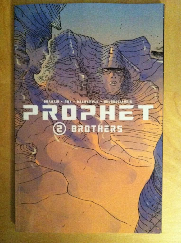
So I Read Prophet: Brothers

A 250 word (or less) review of Prophet Volume 2
By Brandon Graham, Simon Roy, Farel Dalrymple, Giannis Milonogiannis, Joseph Bergin III, Ed Brisson; Image Comics


This review will contain some mild *SPOILERS* for previous chapters of Prophet. For a *SPOILER* free review go here.


Prophet tells the story of the reawakened Earth Empire as it relaunches its ancient mission of interstellar conquest. It tells of the soldiers, the legion of far-flung John Prophet clone brothers, the insidious psychic Mothers, and the bizarre, alien galaxy in which they operate. Prophet: Brothers continues some of the storylines from the first chapters and focuses on the rebellious Old Man John Prophet as he gathers a fellowship of heroes to fight against the predations of the Earth Empire. Prophet: Brothers is another fantastically weird comic book: it has that magic of presenting truly alien places, and concepts, and people with this utter conviction. Everything feels at once totally real, but also impossibly strange. Which makes Prophet a pretty special work of Science Fiction. It's also worth noting that the art in this comic is gorgeous. Giannis Milonogiannis, who draws the majority of this collection, is just an incredible artist and storyteller. As weird and wonderful as the story of Prophet is, the artwork in Prophet: Brothers is worth the price of admission alone. In many ways Prophet as a series functions as an art book as much as a critically acclaimed Science Fiction comic story. Incidentally, Prophet: Brothers also adds a sense of continuance to the Prophet series: it really establishes the wildly different story threads of Prophet: Remission as elements of a single narrative with a unified purpose. The series is clearly going somewhere. Prophet: Brothers is a must read comic in a must read series. Boux!

Word count: 250

Previously
So I Read Prophet: Remission

Monday, 14 January 2013

Spinal Tapestry Pt. 2: Bringing the Sexy Back

On the under-appreciated art of comic book spines.

I love purchasing collected editions of comics and displaying them as art objects. They're attractive, a visible expression of my interests, and a constantly present collection of some my favourite things. Also, when the Big Earthquake comes, I'll have a great collection of reading material during the daylight hours. 

In the last post I talked about the idea that comic book spines are important in larger formats like tradepaperbacks or graphic novels because on a bookshelf the spine is the most visible part of the comic. I also used the Brian K Vaughan comics to show some examples of what I consider good and bad spine design.

This time I want to highlight some of the best and most interesting comic spines in my slowly growing comics library. These are the book spines that clearly show their designers understand how important a book spine is to a comic's on the shelf appearance. (And perhaps on the importance of standing out on a bookshelf from a retail perspective.)

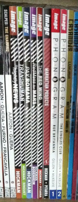
Phonogram: This is kind of the epitome of a good simple spine design for me. The "Phonogram" title uses the font of the cover title, with several logo elements incorporated. This clearly states the books identity in a clear and visually interesting way. Couple that with simple, agreeable colours that don't vary book to book and clean writing that is easily read and you get a great comic book spine. (By Kieron Gillen & Jamie McKelvie: Reviews)

Jonathon Hickman comics: This one is less aesthetically pleasing and more manipulative and clever. Every Jonathon Hickman book has a striped pattern on the spine. When rendered in black and white it is EXTREMELY eye catching (particularly when shelved as a group). The human eye is wired to pay attention to black-white-black lines and the illusion of movement these give off out of some mammals-of-the-savannah evolutionary quirk. So this Hickman block of books is super eye catching. While not the prettiest design, it is uniquely Hickman and identifies his work. More importantly, these books do not get lost on the shelf. (By Jonathan Hickman & Nick Pitarra, JM Ringuet, Ryan Bodenheim: Reviews)


(From a retail perspective this approach might be even more brilliant: only his books have this stripy pattern and its associated attention nabbing effect. If we accept the premise that the point of an eye-catching cover is to get a consumer to pick up a book, then this eye-catching spine design might represent a retail advantage.)

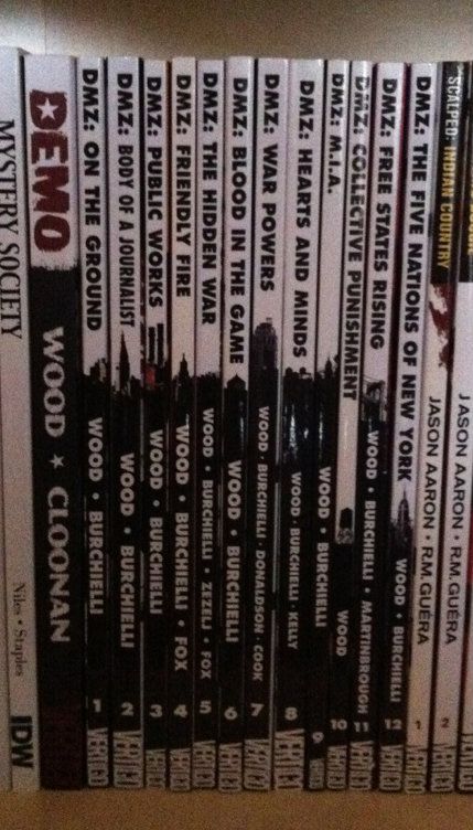
DMZ: This is one of the most clever and aesthetically appealing comic spine designs I've seen. Let me explain, DMZ is the story of a modern civil war fought between the US government and an insurgent movement. A key aspect of this story, and how it works, is the use of Manhattan Island as a war torn battlefield. It creates context for the story and serves to illustrate the horrors of modern warfare in a familiar setting. As such, a key character in DMZ is Manhattan itself. The spines of the DMZ comics are a visually pleasing design that is white behind the title writing and black behind the author text. Brilliantly, a New York landmark is included at the interface between the top and bottom half of the spine. When looking at an individual volume, it's a sharp design.  When looking at the entire series, it creates a miniature and very recognizable New York skyline effect. It's clean, unifying, unique, and highlights a key aspect of DMZ. It's great. (By Brian Wood & Riccardo Burchielli, and others)

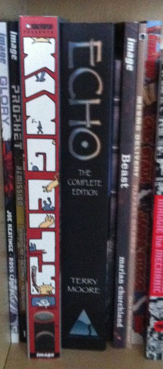
King City: This big, complete series trade shows off what you can do with the real estate of an extra wide collection. The letters that spell out King City, beyond being in an interesting and high catching graffiti-esque font, are also the frames of a tiny comic strips about a cat (presumably Earthling) stalking and dispatching a little cartoon man. It's silly, fun, really well thought out in this making-really-intelligent-use-of-space-and-storytelling kind of way, and pretty representative of the kind of comic King City is on the inside. The spine of King City is a better cover than a lot of covers. (By Brendan Graham: Review)

Also, just kind of as a case in point about the importance of interesting spine design, I've taken a picture of King City next to the extra-wide Echo The Complete Series collection. Echo actually has a pretty nice spine design: simple, has some pretty unique elements, and black always looks nice. But when you put it next to King City with its more creative use of space it kind of gets lost, doesn't it? (Echo by Terry Moore: Review)


Sweet Tooth:
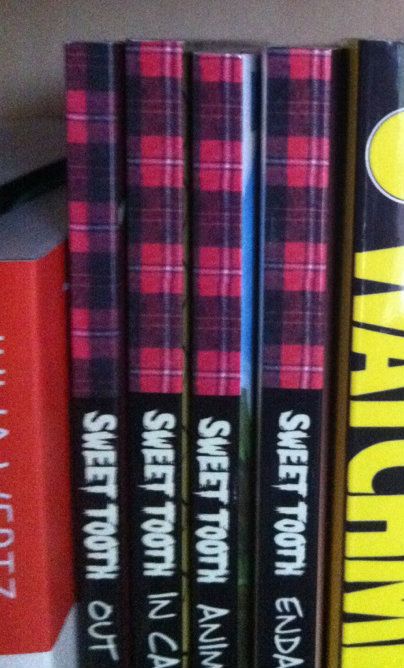
Okay, this one isn't about a good spine design... this is a little thing I noticed. So the concept of Sweet Tooth's spine is pretty solid: clean black spine, unique Sweet Tooth font, and a nice plaid pattern on the top bit of the spine. It catches the quirkiness of the series, and because a red plaid shirt is intrinsically tied to the design of title character Gus, it really catches the feel of the series. Trouble is, I think a mistake was made at some point during the design process. 
If we zoom in on the plaid pattern along the top you can see the plaid checker alternates between Volumes 1 and 2, but then doesn't ever change again. So instead of getting the checker pattern of a plaid shirt across the series (Vol. 1 and 3 matching and complement the opposite pattern on 2 and 4)... we get mismatched, unconnected plaid colours. Which all makes it feel like a great design that was compromised by a mistake or neglect. Hopefully it gets fixed on a future print? (By Jeff Lemire: Review)

In my opinion these are some of the better and more interesting comic designs out there. They manage to look good, make a statement about their series, and stand out from their competition. I certainly appreciate the extra effort.