Showing posts with label Daredevil. Show all posts

Monday, 29 June 2015

Describing Daredevil #16

Or a look at using background to drive storytelling in Daredevil #16
by Mark Waid, Chris Samnee, Matt Wilson, and Joe Caramagna; Marvel Comics


In my last post I wrote about how reducing background detail can be a tool to drive attention to the foreground in comics using a great example from Spider-Woman. Daredevil #16 has a great example of the opposite where background detail is used to drive storytelling in a vastly simplified foreground. So I thought it would be timely to take a look at this really, really smart use of background.

There will be *SPOILERS* for Daredevil #16.


An ongoing theme of this iteration of Daredevil is blindness. This series has continuously built really compelling stories and moments around Matt Murdock's lack of eyesight, either playing with the challenges this disability causes the man or, frequently, the ways in which he "sees" better than normal by not being limited by sight. This approach has led to some really compelling stories that examine how taken for granted sight is, and the manner in which this clouds our expectations. This approach has also generated some truly astonishing moments where our assumptions are challenged in really surprising and often ironic ways. Daredevil #16 has a fantastic example of this.

So you really ought to read the issue before reading on from here.

Daredevil #16 sees Matt Murdock turn to The Kingpin to strike a deal to help Daredevil protect his loved ones and disappear. Kingpin suggests that he wants to mull the offer over in his gallery, surrounded by his favourite art. The pair continues their conversation in the gallery where Murdock, due to his blindness, cannot appreciate the artwork and where we the reader only catch glimpses. It's a fun situation that initially just seems like Kingpin being a jerk to Murdock because he knows Murdock is blind...


Except when the background is finally revealed we see that this gallery is so much more than a collection of fine art. Unexpectedly, the Kingpin's gallery is made up of paintings depicting the death and torture of Daredevil over and over and over again. Which is deliciously ironic because Murdock thinks he is in control of the situation and we can all see, but he can't, that Kingpin's hatred of him is beyond his ken: unbeknownst to him he is probably in way over his head. It's also a wonderful twist because this museum of Fisk's hatred is revealed to us following Murdock saying ""I offer you the death of Matt Murdock. Interested?" Which, given the artwork, Fisk transparently is. It's just a perfect comics moment and emblematic of why I enjoy this comic so much.

It's also a great example using background to drive storytelling. Just like how background detail can be throttled down to emphasize foreground elements, backgrounds can also be emphasized to drive storylines. Here, we finally see the detailed, torturous paintings depicted in all their horrific splendour while the foreground is reduced to recognizable silhouettes and key colours (red, Daredevil; white, Kingpin) on a page that lacks dialogue. This combination makes the background the attention draw of the page and reveals the hidden psyche of The Kingpin in a way that clearly shows Murdock's ignorance. It is unspoken and separate from the foreground figure work, but it speaks volumes. It's a dramatic moment that works because of the strength of the background and the dramatic tension that exists between it and the foreground narrative. Great stuff.

Which is further evidence that backgrounds are really important and can directly participate as a storytelling device. It's also evidence that there is no single, right way to make comics and that all kinds of tricks, even opposite ones, can be used to make great comics moments.

Previously:
Describing Daredevil 12-15: storytelling highlights

Describing Daredevil 10 and 11: scope and character
Describing Daredevil 9: empathy
Describing Daredevil 3: onomatopoeia 
Describing Daredevil 34: before and after
Describing Daredevil 33: condensed motion
Describing Daredevil 30: the vectors of artwork
Describing Daredevil 29: A great page


Monday, 13 April 2015

Describing Daredevil #12-14

Or a look at the effortless comics in Daredevil #12-14
by Mark Waid, Chris Samnee, Matt Wilson, and Clayton Cowles; Marvel Comics


Daredevil is the maybe the comic that epitomizes workhorse for me. Every month it arrives and tells a pleasantly exciting superhero adventure story, often with a clever thematic twist, told in a consistently engaging visual style. It's the kind of comic you can set your clock to (if you could set your clock to a comic...). The more I've read this comic, the more I realize that what makes Daredevil so regularly good isn't any special flourish of elaborate design, which, I mean, it has some great examples of, but instead a commitment to clear, exciting storytelling. An approach to storytelling that is often unsung because it flies under the radar due to it's subtlety and clarity. And I think Daredevil #12, #13, and #14 have some examples in this vein that might help me articulate what I mean.

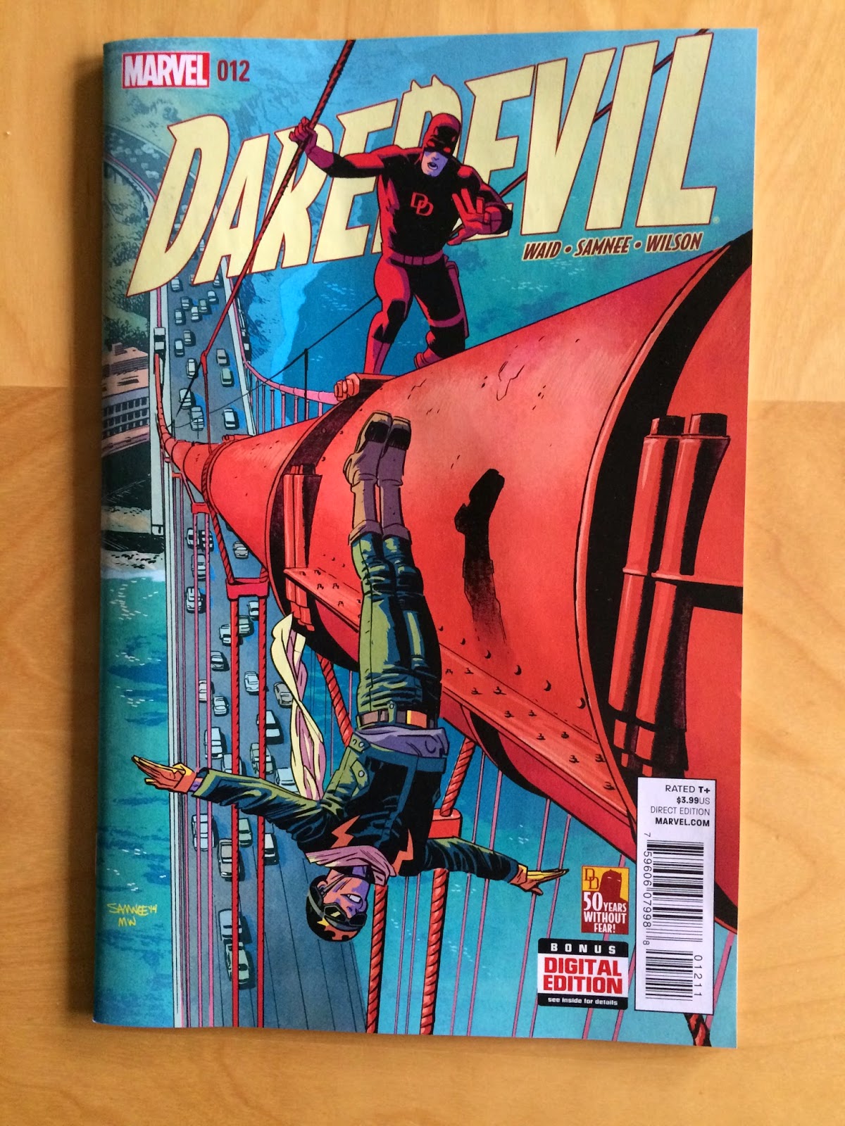
(Also how great are these covers!? The colours and the perspectives on #12 are dynamite!)

There will, of course, be *SPOILERS* for Daredevil #12-14 below.


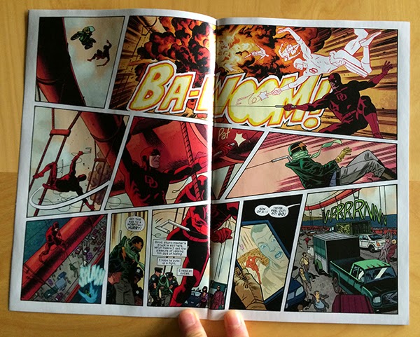
Take this great double page spread here. At first glance it looks deceptively simple, right? Sure it has some pretty dynamic action happening, and yes it is very clearly delivered, but I don't think it is instantly obvious that this page is filled with clever choices to maximize flow and kinetic motion. But the thing is, this page is a treasure trove of subtly smart comics.

Look at the first row of panels: there is a small, short, moment feeling panel that transitions into an especially wide panel of an explosion. It is like the layout of the comic itself has exploded outward. Theses panels also make a really good use of the way our eyes move across the page from left to right to have us move quickly along the blast path where the many silhouettes of DD quickly swing to safety. Then this layout makes a really elegant use of carriage return, the way our eyes quickly swing from the right hand corner of the top row of panels to the left-most panel of the next row, to physically trace the motion of Daredevil's rapid swing to safety. It makes this motion feel faster and more dramatic. In an even more exciting choice, our carriage returning eyes are caught by the swooping-speed-lines in the left-panel which drags our eyes along the path of Daredevil's hairpin twist in the air before firing his grapple to catch the falling Stuntmaster. A motion which is directly to the right across the page, again using our natural path through the page to make things feel fast and dramatic. The layout then uses yet another carriage return to get us moving DOWN on the bottom-left panel so we feel the looming chasm over which Daredevil and Stuntmaster are dangling. The double page spread then moves from left to right and into the next page. It's a simple looking page that takes amazing advantage of eye-motion to feel very fast, dangerous, and exciting. 


Here is another deceptively simple page that portrays another batch of exciting action using clever choices that might not be immediately obvious. Take the top row where the two panels are split by a diagonal break. This choice immediately lends this part of the page a kinetic quality because the panels feel less separated than a perpendicular gutter would dictate. This also has the added benefit of creating these vector cones that widen, and project in the direction of motion. In the first panel we have a fan opening in the direction of the leap, like the bike is exploding off the ramp. In the second panel the fan is towards us and down, creating the feeling the motorcycle is widening and approaching the reader. The next row of panels is even cooler: Daredevil surfs his car on two wheels between a truck and a streetcar. What is so neat about this panel is that the canted panel borders create a bunch of planes within this panel that precariously interact. Significantly, the most dominant of these box-planes, created by the panel borders, is perpendicular to the tilt of the car, which creates even more straining juxtaposition of orientation. The entire composition feels unbalanced and out of equilibrium which beautifully captures the moment being depicted. More great stuff. Finally, in the bottom row of panels the reader cruises from left to right and gets drawn to the sound effect along the motion of the car flopping back to four wheels. Which is simple, yet pleasantly evocative. This is a page absolutely filled with keen comics.


Another fairly subtle element in Daredevil #12 is the use of colour in characters. Stuntmaster has a colour design that is primarily green with yellow highlights while red daredevil drives a purple car. I know like, two things about colour theory, which is that some colours are opposites and clash in interesting ways. These are called "complementary colours". Meanwhile, similar colours blend together in a way that is interesting, but less obviously striking, and is called "harmonious colours". Green and yellow are harmonious colours, and red and purple are also harmonious. This means that each character has a consistent visual colour identity. Moreover, the colour identity of these characters are complementary: green is opposite red and purple is opposite yellow on a colour wheel. This means that the character palettes clash in an interesting and striking way. Which in turn means you can effectively mark alternating panels, like above, for either Green/Yellow Stuntmaster or Purple/Red Daredevil. Which helps keep all of the storytelling straight and quick.

The above sequence is also cool from a colour perspective in that the final panel uses colour in an especially interesting way. The background of the panel is yellow, which is harmonius with Stuntmaster's green costume and mostly clashes Daredevil's red costume. What this means is that Stuntmaster sort of blends into the background while Daredevil stands out. Which helps emphasize that Daredevil is victorious over Stuntmaster (he is fading away), and helps add a sense of depth to the panel (Stuntmaster is falling into the background, while Daredevil is popping out towards us). Colouring matters so much, and when used this adeptly it can be a huge storytelling tool. 


Speaking of attention to detail and colouring, I love this sequence from Daredevil #13. Beyond just being a lovely and efficient piece of story (I would pay good money to have Team Daredevil choreograph my date nights), this sequence makes a really thoughtful use of colour. The story of the page has Matt Murdock and Kirsten McDuffie going on a date that sees them eat dinner at a fancy restaurant, go dancing, and spend some romantic time at the beach. Looking at the page, it is really obvious which panels on the page translate to which period of the date. While some of this comes from what is drawn in the panel, when greyscaled the page break into six separate moments that don't immediately break into three venues and story sections. But if we only look at the colours, even if we blur out the scenes, it's apparent that there are three tiers of colour on the page that help set every sub-scene apart and give them each a visual identity. Which really makes this page read so much smoother: rather than mentally deciding how the panels fit together, the colours here subtley provide all of that information at a glance which lets us just enjoy the scene. 


This page is another great example of effortless looking storytelling built from a bunch of really astute choices. Virtually every element on this page is quietly constructed to make an optimal reading experience. The opening panel provides a cinematic, widescreen look at the pitcher, narrowed for focus and squinting like the angry pitcher. The second panel shows Matt Murdock, delivers some dialogue, and shows the man pointing to the outfield, and incidentally up to the next panel to optimize flow. We then see a great sequence of three panels that wonderfully sell the energy of a fastball. The pitch is so evocative here because of the progression of the three stacked panels: the ball increases in size as it moves down through the sequence while the panels themselves expand in size. This collectively creates the feeling that the ball is coming out of the page and towards the reader which is pretty exciting stuff. This thrown baseball also creates a guide path for the reader, drawing attention and steering eyeballs down the page and suddenly! into the moment of Matt hitting the baseball. This moment is perfectly executed as the vector of motion in the bat-strike panel is against the guide path of the thrown ball making the moment jarring and impactful. Essentially, our experience of the page is knocked askew by the moment of Matt hitting the ball, which is kind of perfect comics. 


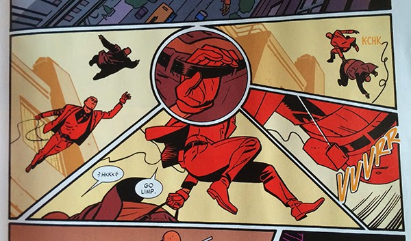
This is another pretty flawless sequence from Daredevil #14. What I love about this series of panels is how the central round panel works as a hub and draws the surrounding panels into its orbit. The action of the sequence drops down into the page, swings across the bottom, and launches back into the sky. With the round panel, everything gets a slightly curved path that lends the motion a smooth, effortlessness. Without this central hub panel, I suspect the page would read in straight lines, down, to-the-right, and up in crisp square lines which would feel more abrupt and choppy and would significantly change the fluid feel of the page. It's in the grand scheme of things a pretty short and minor bit of the larger story, but it is executed in a really interesting and dynamic way. Which is really emblematic of the entire Daredevil experience: everything is just so.

Post by Michael Bround

Previously:
Describing Daredevil 10 and 11: scope and character
Describing Daredevil 9: empathy
Describing Daredevil 3: onomatopoeia 
Describing Daredevil 34: before and after
Describing Daredevil 33: condensed motion
Describing Daredevil 30: the vectors of artwork
Describing Daredevil 29: A great page
Monday, 12 January 2015

Describing Daredevil #10 and #11

Or some of the excellent comics worksmanship in Daredevil #10 and #11
by Mark Waid, Chris Samnee, Matt Wilson, Joe Caramagna; Marvel Comics


Daredevil is an absolute horse of a comic, reliably providing exciting, interesting stories delivered with really adept artwork in every issue. It's the kind of comic that is always eminently readable just all round good comics experience. Except, of course, when it's great.

Daredevil #10 and #11 have a bunch of examples of great comics magic worth taking a longer look at.

There will be *SPOILERS* past this point.


One of the most consistently innovative elements of Dare Devil under writer Mark Waid and artists Marcos Martin, Paolo Rivera, Chris Samnee, Javier Rodrigues, and Matt Wilson, is how the comic deals with Daredevil's blindness in innovative ways. Blindness is, if you think about it, a deeply challenging condition to portray in a visually interesting way: it is by definition decreased or a lack of vision. At it's most extreme it would be a solid black panel. Daredevil has taken this head on by creating visual symbols to represent non-visual senses to try to communicate the way which Matt Murdock understands his world. This has included the bright pink topographic silhouettes generated by his radar sense or the really smart, integrated use of onomatopoeia to communicate the importance of sound to Daredevil. It's been really neat comics.


In Daredevil #10 we see the introduction of scent to the fray. When it comes to recognizing other humans, scent is this deeply intimate part of the equation. This is probably especially true for Daredevil who has superhuman smelling powers. So it is really a fantastic choice to use scent symbols, the floral scents of hygiene products for Matt Murdoch's girlfriend, Kirsten McDuffie, and the junkfood and chemo reek of Muroch's friend Foggy Nelson, as recognition keys. We are able to see the specific scent mixtures that act as fingerprints for both characters and how important smell is for Matt in his association with people. What's cool is that this information also provides character information, like Kirsten is scrupulous about her appearance and that Foggy is ill and also a gluttonous slob, which let's us actually recognize the characters using the scent cues. This let's us experience the world as Daredevil for a moment: we see vague radar sense silhouettes and smell symbols and from this we can "visually" identify people. Which is pretty great comics.


This sequence of panels here absolutely guts me. Now a big part of this is the context: Daredevil, Matt Murdoch, is depressed and given his long past with despair and his history of trying to tough it out, so him reaching out and actually asking for help is a HUGE moment. An act of profound bravery from The Man Without Fear. But this sequence is also remarkable for how beautifully it is executed. The simple framing and focus on the phone, heavy with its permanent promise of communication and outside help, really soldifies it's importance. THIS is a lifeline. The way the hand tentatively appears, pulls back, and then grasps the phone is amazing comics. To get that level of emotion from just hand gestures is really fantastic character work. And then there are the colours: a cold blue of isolation in a darkened room, then the introduction of dramatic red as the hand dithers about reaching out for help, and finally true colour as the hand reaches out for help and breaks through the blue murk of isolation. This is fantastic comics delivered with deceptive simplicity.


Daredevil #11 makes the quietly brilliant choice of having Daredevil face off against an actual daredevil, Stuntmaster. As a result, a key feature of this issue is motorcycle stunts! Now, motorbikes jumping things is a very movement based phenomenon, so translating the excitement and drama of these kinds of stunts into a static medium takes some smart choices. The most simple and fundamental of these choices is how page space is used to quickly create a sense of distance. In the above sequence Stuntmaster guns his bike towards a ramp for a jump stunt on a normal single page (one made even narrower seeming by the ad insert). A page turn follows and suddenly the page gapes with horizontal space in a bike jump that spans the complete width of the comic. The sudden contrast between the normal width panels leading up the jump and the wide, short panels, particularly the first double-page wide one, of the airborne motorcycle capture the distance, drama, and excitement of the motorcycle stunt. It's elementary stuff, but it is really effective. 


Daredevil #11 uses this double-page spread approach again to make another, even more dramatic stunt come to life on the page. In this sequence Stuntmaster plans to ride his motorcycle across the suspension wire of the Golden Gate Bridge defying death and common sense. Daredevil, who has been called out by the motorcycle daredevil, shows up to prove his mettle and have a talk with Stuntmaster and plays chicken with the stunt rider. This layout does a fabulous job conveying this story. The top row of panels uses the width of the page to really emphasize the scope of the stunt and the forward progression of Stuntmaster along the suspension wire. This row of panels is also pretty nifty in the the wire forms a clear vision guide that draws the reader quickly, like Stuntmaster's progression, from low left to top right where suddenly there is a Daredevil.  Another interesting aspect of this layout is how panel size is used in the lower portion of the page to amp up the tension. In the second row of panels we see the focus of the panels swap back and forth between Stuntmaster and Daredevil and narrow as the two come together. It creates a sense of increasing focus, proximity, and danger. In the bottom row of panels we see this construction repeated with a wide establishing shot of Stuntmaster and then a series of even smaller, more focused panels which swap between the characters. These tighter reaction panels, when contrasted with the larger ones in the previous row, feel even faster and create even more focus, a greater sense of proximity, and even higher levels of danger. Which brings the sequence to a dramatic head and the wonderfully long and drawn out SCREEEEECH! of the motorbike applying the breaks and skidding to a stop. It's a stunt brought together perfectly.

Daredevil is just so reliably excellent.

Post by Michael Bround

Previously:
Describing Daredevil 9: empathy
Describing Daredevil 3: onomatopoeia 
Describing Daredevil 34: before and after
Describing Daredevil 33: condensed motion
Describing Daredevil 30: the vectors of artwork
Describing Daredevil 29: A great page

Monday, 10 November 2014

Describing Daredevil #9

Or a look at a super effective page from Daredevil #9
by Mark Waid, Chris Samnee, Matt Wilson, and Joe Caramagna; Marvel Comics


Daredevil continues to be this consistently great comic that I read. The stories are always interesting and the book is always technically and visually dynamic. And  it always feels fresh, despite having a fairly a consistent creative team and being involved in a prolonged storyline. It's a comics work horse.

(Also how great is this cover? It sells the peril Daredevil faces from the mind-controlling Purple People in a way that tells you everything you need to know about the Purple Children and their relationship to the Purple Man. I don't like most comics covers, but I love this one.)

One of the strongest aspects of Daredevil is it's thoughtful approach to storytelling. Team Daredevil create some really compelling and really smart pages in their comic that are frequently worth taking a longer look at. Daredevil #9 has one of those great pages and I want to take a longer look at it.

There will be *SPOILERS* for Daredevil #9 below.


The story of this page is that The Purple children, with their mental powers, are leaking their own traumatic pasts and affecting everyone around them. Daredevil, who has his own tremendously dark history, something he has been striving to work past, finds this mental leak overwhelming and finds himself succumbing to his own despair. It's basically a weaponized empathy. It's a strong story beat that I'm definitely interested to see play out in the series. 

This page here makes this story element really come alive, and I feel like every single compositional element of this page is perfect to sell the experience of traumatic empathy. From a layout perspective we have stacked panels depicting parallel events with half faces placed along the inner edges of the panels. What this does is directly tells us that the Purple Child and Daredevil, whose half faces are pressed together, are remembering the similar events in the background, simultaneously and experiencing the same negative emotions. This effect is reinforced by the colours, which depict the two parallel panels with swapping analogous colours: red Daredevil with purple backgrounds, Purple Children ad red backgrounds. The analogous colours harmonize with each other to create a similar mood, and the use of the same two colours in both panels help emphasize that the characters are experiencing the same emotions. Yet, at the same time, the fact the colour palettes alternates helps to subtly differentiate the two panels: Daredevil and the Purple Children are all feeling anguish, but each specific memory is personal to the character remembering them, one is red and one is purple. And then there is the lettering which also helps with this effect by alternating sides down the page and dropping only one caption per tier of paired panels. What this does is it makes the reader treat each paired tier as a single story unit that takes place in the same moment, and that the "pain" and "loneliness" being narrated is true to both sides of the page, to both the Purple Children and Daredevil. The caption placement also forces the reader to scan back and forth across the page to quickly take in the events and faces on either side of the page to reinforce the association. It's every aspect of the comic working to create this feeling of terrible empathy.

But this page has even more worth looking at. Like, the gradual zoom in on the faces as the page drops down helps sell that the emotions are intensifying in Daredevil. Or the choice of purple for the colour of Daredevil's painful memories maybe insinuates that is an effect of the Purple Children's mind powers. And I absolutely love how Daredevil raises his fist in the last panel, creating the sense that he is getting ready to fight off the emotional weight and be heroic, before this is dispelled dramatically as he crumbles on the following page. This is just such an excellent page of comics.

Daredevil is a feat of collaborative comics, and I am still really enjoying it.

Post by Michael Bround

Previously:
Describing Daredevil 3: onomatopoeia 
Describing Daredevil 34: before and after
Describing Daredevil 33: condensed motion
Describing Daredevil 30: the vectors of artwork
Describing Daredevil 29: A great page

Monday, 2 June 2014

Describing Daredevl #3

Or some pretty excellent onomatopoeia in Daredevil #3
by Mark Waid, Chris Samnee, Javier Rodriguez, and Joe Caramagna; Marvel Comics


Daredevil is one of the most consistent comics in my top ten: it is always good. The stories from are fun and exciting and usually revolve around some thematic aspect of Daredevil's blindness. Couple that to some of the clearest storytelling in comics from Samnee and Rodriguez, and Daredevil just does not disappoint. One of my favourite things about Daredevil, is how the creative team works to represent Daredevil's powers in really interesting and innovative ways with topographic radar vision and some really adept use of onomatopoeia. Daredevil #3 has some really great examples of the use of sound effects I'd like to take a closer look at.

There will be *SPOILERS* for Daredevil #3. Typey typey type.


Usually I'm not a terribly big fan of onomatopoeia in comics (or typing it). When done poorly, it can look tacky and be a distraction from the dialogue and the acting in the panels... it's extra telling instead of showing. But in Daredevil it's just so thematically appropriate and handled with such skill that I kind of love it. From the blocky mechanical lettering of the gun action noises to the long, bright green arc of the whistle (itself dragging attention to Matt like a real life whistle) to the italicized, shakey sound of the phone vibrator, to the panel commanding in-your-face size of the SLAM, to the low-to-ground progression of the stomping, it's all perfect. In each instance the location, shape, size, and font of the lettering captures the emotional feeling of the sound. It really adds a lot to the comic.


While this is not onomatopoeia, per se, it's in a similar vein and I love it. The sort-of dialogue box with the deathstare symbol really captures the emotional weight of getting eye-knives thrown at you. A properly good glare is able to convey, non-verbally, a paragraph of information and the decision to give the glare here a dialogue box is very cognizant of this. A top-level deathstare also doesn't feel like just a person glaring at you, it feels like an entire universe of negative attention directed your way. So I think it's really adept that the deathstare logo means that Foggy is caught in the crossfire of two glares. The jolly-roger glare is such a small choice, but it really makes this panel and character interaction work for me. 


But this, this is my favourite bit of onomatopoeia in the entire issue of Daredevil #3. I had previously written a big long thing about why the ECG squiggle that is synonymous with heart sounds in comics bugs me because it's actually a symbol of the electrical signalling of the heart and has nothing to do with sound. It especially bothered me because hearts have a characteristic "lub dub" sound, so there really is no need to use the ECG squiggle (it's like using beep-beep-beep sounds instead of heart sounds in a film). But, since the ECG squiggle is so synonymous with heart rate in comics these days, as a symbol that conveys meaning its pretty important. What I LOVE about this onomatopoeia here is that it synthesizes the sound and the squiggle to create a new symbol that is based on sound of a heart beat but still has the ECG symbol that readers know means heart stuff. It's the perfect solution to my comics pet peeve and I fucking love it.

(Incidentally, I would love to know if Team Daredevil read my previous essay on heart sounds and if that had anything to do with the change in heart sound symbology. I'm going to have to go shopping for my next Science gig in the next year and think it would be super fun to have that on my CV...)

Previously:
Describing Daredevil 34: before and after
Describing Daredevil 33: condensed motion
Describing Daredevil 30: the vectors of artwork
Describing Daredevil 29: A great page
Friday, 10 January 2014

Describing Daredevil #34

Or a look at the beautiful transition pages in Daredevil #34
By Mark Waid, Javier Rodriguez, Alvaro Lopez, and Joe Caramagna; Marvel Comics


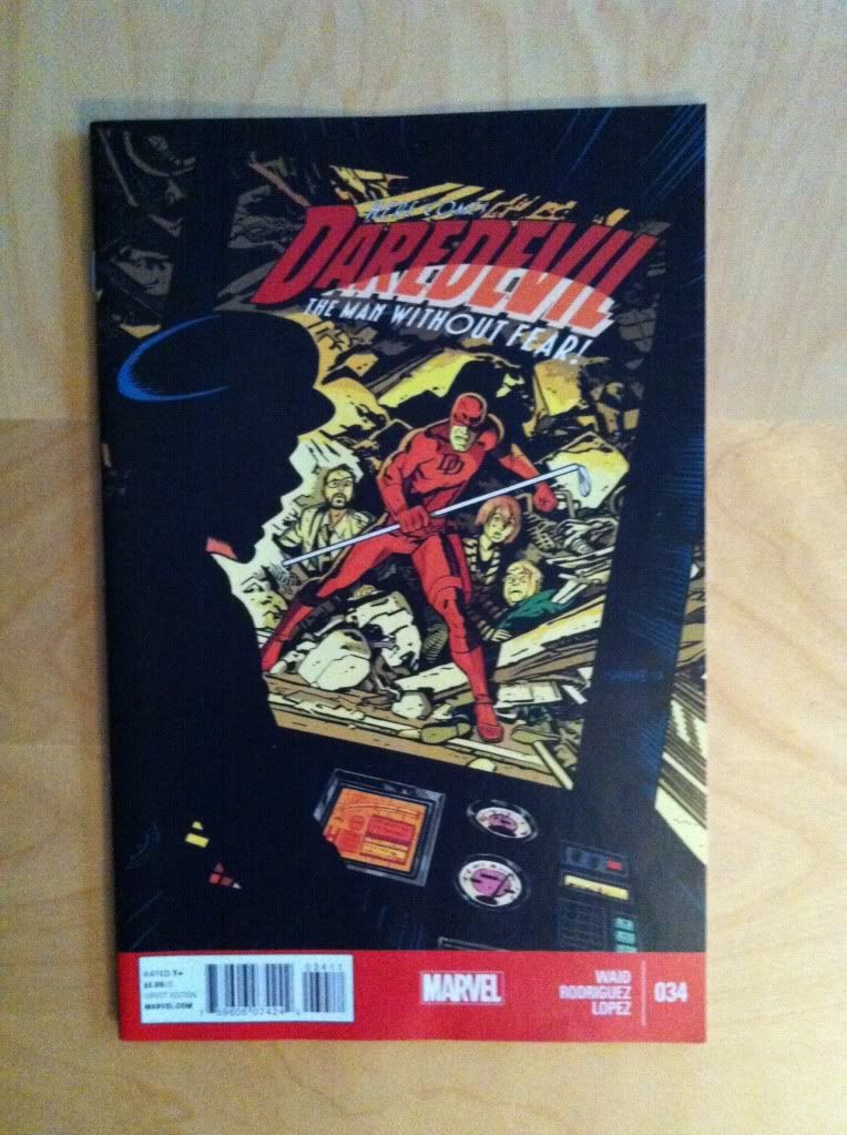
Daredevil continues to be one of the most consistently enjoyable Mainstream comics I've been reading. The stories are fun and unpredictable, and the artwork is always amazing and I am consistently left wanting the next instalment. One of the most noteworthy and interest aspects of Daredevil is the high level of design and technical storytelling that is present throughout the series. Daredevil #34 contains some great examples of design that make some excellent transitions worth a closer look.

There will be some mild *SPOILERS* for Daredevil #34 in this post.


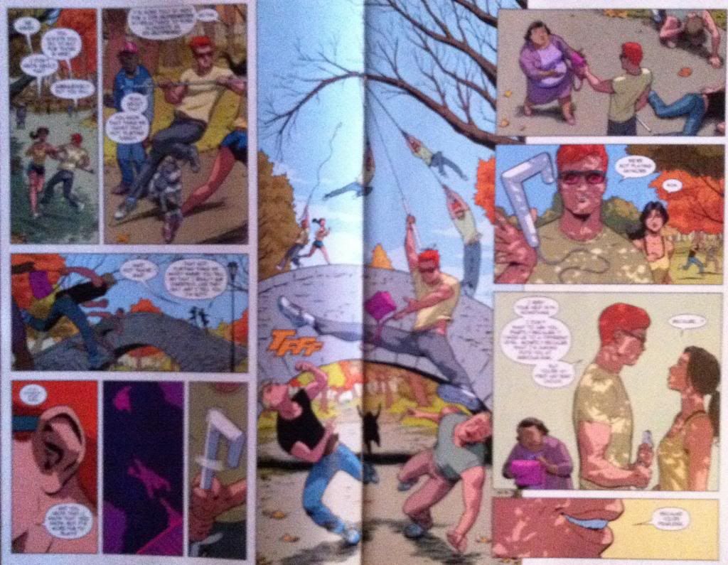
My favourite sequences in Daredevil #34 all have to do with transition sequences where the left side of the composition portrays one status quo, a dramatic event occurs in the middle that changes the situation, and a new status quo is established on the right side of the composition. This double page spread here essentially shows the transition from Matt-Murdock-as-Daredevil-is-a-flirtatious-game to Matt-Murdock-is-Daredevil-and-a-new-partnership with a beautifully constructed action sequence in the middle. This whole sequence was unexpected and changed the issue, and probably the series going forward. It's great, smart comics.


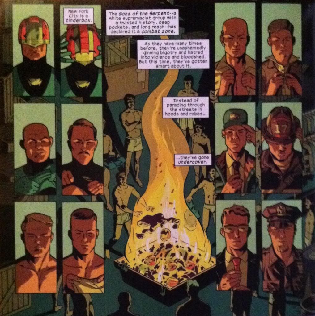
This sequence here is an even more efficient and elegant transition scene. From a plot perspective this page simply conveys that the Sons of The Serpent rascists have shed their identifying vestments and donned the clothes, and associated authority, or civil authority figures. Part of this page is the balance, we have a group of Serpents in vestmens on the left, balanced on the fulcrum of the fire, and then an equal group of undercover-Serpents on the right: this tells us everything we need to know about the plot of this page. But this page has extra elements of construction that elevate the composition even further. For one, the images of the Serpents in either column show a step-by-step story of the Serpents stripping out of their villain-ginch on the left, and putting on authoritative clothes on the right going from top to bottom. Beyond even this, there are extra parallels between the panels on the left and right with images having very direct parallels between the two columns which helps emphasize that even though they are different men in each column, and even if they are dressed differently, they are still serpents. It's subtle but really, really great. This sequence here is a testament to what can be done with well designed, architectural comics.

Previously:
Describing Daredevil 33: condensed motion
Describing Daredevil 30: the vectors of artwork
Describing Daredevil 29: A great page

Friday, 13 December 2013

Describing Daredevil #33

Or some nifty layouts that create big movements in small spaces in Daredevil #33
By Mark Waid, Chris Samnee, Jason Copland, and Javier Rodriguez; Marvel Comics


I am a sucker for an interesting layout or sequence. While I love big grand, mind blowing layouts as much as the next guy, I'm endlessly fascinated by the small blue collar layouts that manage to convey basic storytelling information in especially efficient ways. Because as much as comics is big, crazy double page splashes, it is more often the less exciting business of conveying story and movement in panels and the way creators design the artwork to optimize storytelling is really important.

Daredevil #33 has a couple layouts that are super efficient and worth taking a longer look at.

This will be *SPOILER* light, but you know, proceed with caution.


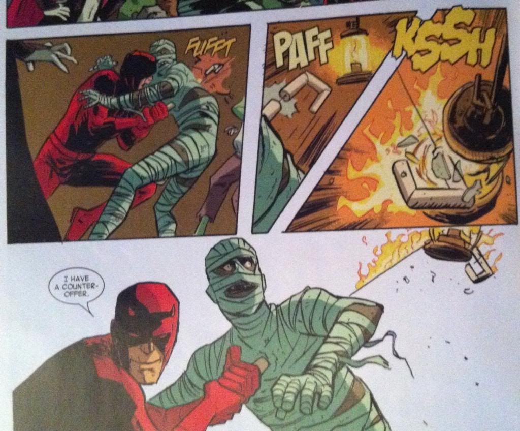
At first glance this is a pretty simple layout that tells a pretty straightforward bit of action. Daredevil drives his baton/grappling gun into the mummy, fires the grapple through the monster, bounces the grapple through a lantern and threatens the mummy with his greatest fear, fire. And then he negotiates. The thing is, this sequence is deceptively simple and involves all kinds of really clever, small choices to make it as clear and impactful as it is.


The actual motion of the moment happens almost entirely in the vertical direction, but takes place almost entirely in two rows of panels. So the challenge of the storytelling in this sequence is to convey this upwards-to-the-right followed by a down-and-to-the-left motion in a clear way in a small space. And the layout uses a pretty robust tool box to encode this information.


So the first way the motion of the sequence is encoded is the shape of the panels. The two main motion panels are vaguely triangular, which creates the feeling that they are exploding towards the widest end. In the second panel, the one with the upward motion, the point of the triangle is at the bottom, where the source of the motion is and widens out at the top. The downward motion has the opposite orientation. The panels immediately make it obvious that the motion has an upward and downward direction and also make it really obvious the two panels are moving in the opposite direction. It's pretty great comics.


The next encoding device is the grapple itself. A fired grappling hook has two really handy characteristics: it has a grapple head and the actual rope. What this does is it gives a grapple polarity, it provides a visual way to tell what the front of the direction the fired grappling hook is travelling. These characteristics also provide a way to follow the path of the grapple: the rope tells you where the grapple head has travelled. This sequence makes wonderful use of the grappling hook and uses the shape of the grappling hook, and line of the rope as visual guides to lead the audience through the panels. And this makes it really clear the direction and nature of the motion. 

(In fact, these paths are so clear the final panel is read right-to-left in a way that feels completely natural. Which is also pretty darn cool.)

The thing is though, these pathways do more than show the path of the grapple. The guide paths on this page add the feeling of the action taking place. As readers trace the path through the page they actually get to experience the grapple moving up, bouncing, and coming crashing back down. The readers get to slide down the rope in the bottom panel, just like the flames that are creeping down on the mummy. So despite the lack of vertical space in the layout, the panel manages to feel like the motion taking place. Which is pretty great.


This layout also makes really great use of colouring and lettering to help the reader move through the page more efficiently. The page has a drab brown or white background colour, while the key aspects of the composition, and especially the motion, have bright yellow colours and bright yellow onomatopoeia lettering. This makes these aspects pop off the page and helps steer the reader through the motion. The way the lantern is highlighted yellow in the second panel is particularly cool, in that it makes it very obvious that it is the target of the shot. The colouring also really emphasizes the flames as important to the composition in a really effective way. It's remarkable how smart lettering and effective colouring can enhance a composition.

And put altogether this makes for one very effective bit of comics.


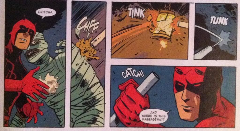
The sequence where Daredevil releases his mummy-hostage from his negotiating position is also pretty great and relies on a bunch of the same tricks. A few neat things is that the path is etched out largely by lettering and the handle of the grappling baton as it flies out of the panel. This is really cool in that the speed of the moment is encapsulated by the fact the panel only has the VERY END of the baton. It's as if the thing was moving so fast that the artist wasn't fast enough that he missed the perfect picture. Also, the way the colouring changes from the third to the fourth panel conveys that the lantern is snuffed out, which is pretty clever too. Basically, this is another great, clear sequence of comics.

And there you have it, two really simple storytelling moments told in super effective ways. 

Previously:
Describing Daredevil 30: the vectors of artwork
Describing Daredevil 29: A great page

Friday, 13 September 2013

Describing Daredevil #30

Or turning on and off the flow taps in Daredevil #30
By Mark Waid, Chris Samnee, Javier Rodriguez, and Joe Caramagna; Marvel Comics


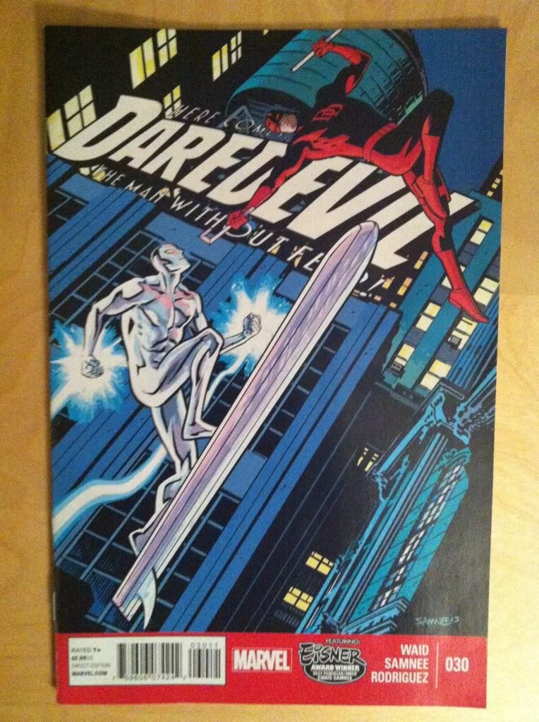
Daredevil #30 is this great, kind of a Silver-agey story about Daredevil teaming up with The Silver Surfer to fight a menace. It's a bit goofy, but filled with a lot of unexpected, fun moments and a kernel of despair that sets up what looks like an important plot thread. It's another great comic in a series known for being great comics.

It's also a comic that has some great examples of different approaches to panel progression that I think maybe bear a closer look.

This post will contain *SPOILERS* for Daredevil #30. So read the comic first.


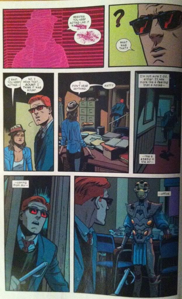
So, I'm pretty interested (obsessed?) with comic pages that exhibit especially fluid or directed storytelling. I'm interested in this because one of the problems sequential storytelling has to contend with is how to make a reader look at things in, well, the right sequence. If character A is reacting to event or character or speech B than the audience ought to see B before A for the best effect. And so the kinds of pages that lead the reader through the artwork in a way that correct queues events can add extra value and impact to the storytelling. Even in quiet talking scenes. And I think this page is a great example of a kind of holistic, natural approach to guiding the reader through events in the perfect order. It's all kinds of subtle, but damn if it isn't effective.


This page works its magic mostly by just framing events, and maybe subtly adjusting, the normal reading path of comics to create the perfect sequence for each storybeat. The view-path starts in the top left (the natural starting point) with the Daredevil-sense-silhouette of Kirsten McDuffie (love-interest/new lawyer partner) and then travels through the two conveniently placed word balloons to the edge of the first panel. You scan right, pick up the perfectly placed word balloon, and track across to Matt Murdock's confused face. You carriage return across the page and crash right into Matt's confused fez before carrying on the same view path to see Kirsten's reaction to his behaviour. You (or at least I) then dealt with this panel's word balloons before moving to the next panel taking in Kirsten standing and the first speech bubble before carrying on to Matt running out of the office and the second word balloon. Which is great because it basically splits this panel into two separate moments adding a sense of time and, as an added bonus, imparts the motion of Matt moving into the hallway. This neat movement effect is continued into the next panel where our eyes sweep around the corner, the actual motion of Murdoch, before crossing the page to the next row which is a continuation of Matts trajectory in this panel.  (Also, notice the split narration caption box adds to this sweeping motion.) The carriage return transition here also has the added bonus of being like a semi-page turn, making the shocked Matt in the bottom left panel suddenly appear adding a great extra weight to the panel. We then carry on across the page in the level of Matt's gaze straight (catching Matt in the next panel to add a nice sense of place) to the unexpected alien visitor. It's just a great page that uses really great layout, figure placement, and brilliant lettering to ensure everyone is seen and everything is read in just the right order while also adding extra drama to key events. It's great comics.

(I also love the use of green, which contrasts sharply with the red of Matt's glasses and hair to punch up the emotions of surprise in the top right and bottom left panels. Colour theory!)


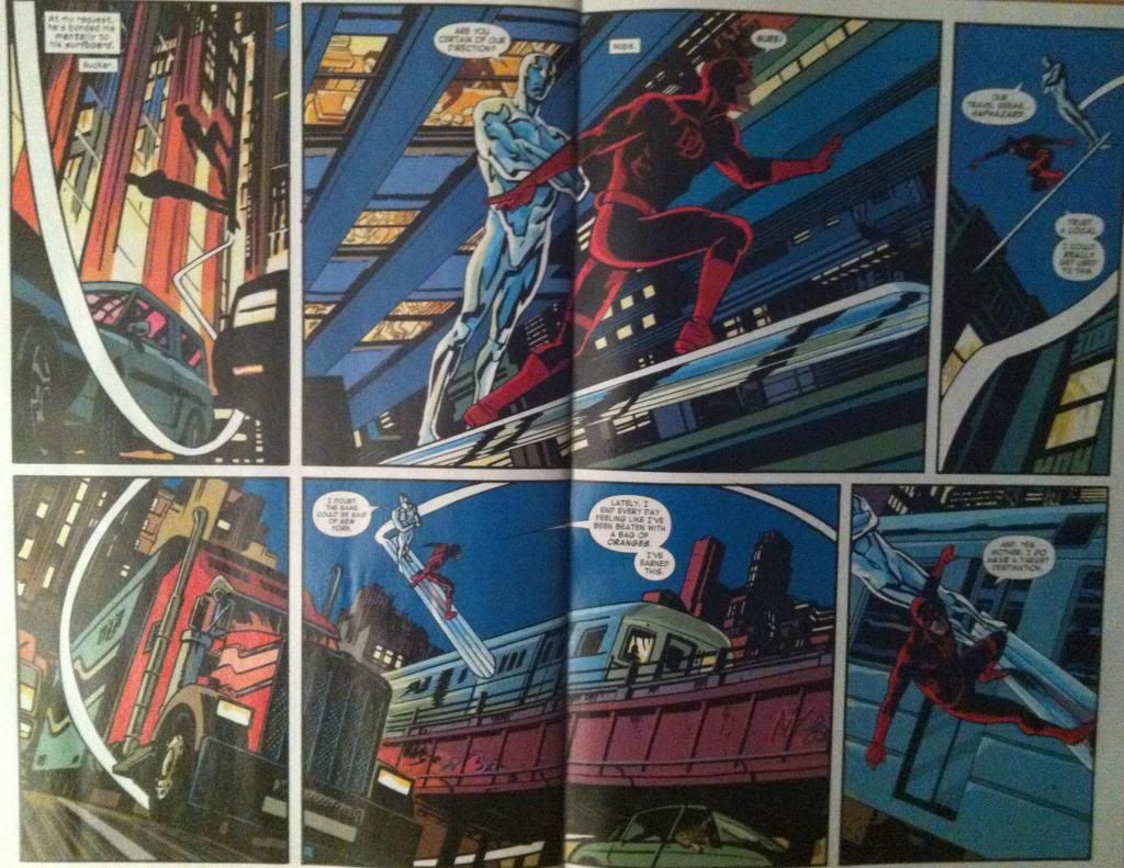
This layout here is also pretty cool. Not because it flows effectively from panel to panel... but because it deliberately doesn't. I mean, if you look closely at each panel there is a clear sequence of events portrayed: Daredevil drives the Silver surfboard up, turns it around, swoops down and around and carries on. But this series of events broken up in a way that adds a lot of chaos to the scene, a haphazardness that really sells that Daredevil is just screwing around and plays on the gag of a blind fellow driving (and maybe also a little bit on New York cabbies who used to take the long way for a higher fare...). It's a really interesting choice. 


How this double page spread works, at least for me, is that the surf board becomes the key guiding shape: the board being a straight guide, and the long swooping contrail acting to impart a directionality to the guide. Basically, I feel like the Silver Surfboard acts as a vector that directs the reader. However it directs the reader not to the next logical location in a smooth series, but instead points in random, even opposing, directions to create the haphazard feelings of the scene.
So starting in the top left panel we have a vector that points not to the next panel, but instead sharply up and off the page as if Daredevil and Surfer are flying off the grid. We then move to the left panel which has a board vector almost perpendicular to the previous one and then move to the third panel where the vector opposes the one in the previous panel. There is no smooth transition from each of these positions and makes it feel fast (too fast to tie together) and random. We then carriage return from the top right panel to the bottom left along the vector of the board in the top right panel, swooping rapidly down along the path of the characters flight (which is pretty great). We then jog right, across a panel split designed only to further dilate time and add a sense of velocity, and see an unexpected downward pointed Silver Surfboard before moving to the final panel with yet another unconnected vector. Basically, to my eyes at least, the layout is a series of directional snapshots that don't entirely sync up but in a way that better sells the dramatic nature of the sequence. It's cool stuff.
So there you have it, two very different pages with opposite approaches to panel flow, one very guided and one deliberately disjointed, that both add a lot of drama to their individual scenes. 


Previously:
Describing Daredevil 29: A great page