Friday 29 August 2014

Deep Sequencing: Telephonics

Or a look at smart telephone sequences in Exit Wounds, The Property and Hawkeye 
by Rutu Modan; Drawn and Quaterly and by Matt Fraction, David Aja, Matt Hollingsworth, and Chris Eliopoulos, Marvel Comics


Telephonic communication is a weird thing. It's a technology that let's you communicate, as if by magic, with another human at some great distance. With cell phones, this kind of awesome power to communicate at impossible, global distances becomes completely portable. I can literally speak with someone anywhere in the world with a thing I carry around in my pocket. And this is so commonplace everyday that it has more or less ceased to be remarkable. Which is mad!

Anyway, I bring all of this up because I think telephonic communication posses special challenges to sequential art storytelling because making a phone conversation look and feel cool in comics seems hard. Or at least it's seldom done in a way that really resonates with me.

I think the crux of the issue is that people speaking to each other, talking heads, can make for boring comics. How interesting is it to watch two people yakking at one another in a book where people can fly in space? Phone conversations are even worse, because they separate the characters and remove even the simple drama of them interacting and the visual interest of the characters playing off one another. Telephonics makes talking heads into talking head and talking head. And how can that be interesting?

Well, I think there are great examples of how smart storytelling can make phone conversations really visually interesting and emotionally effective.


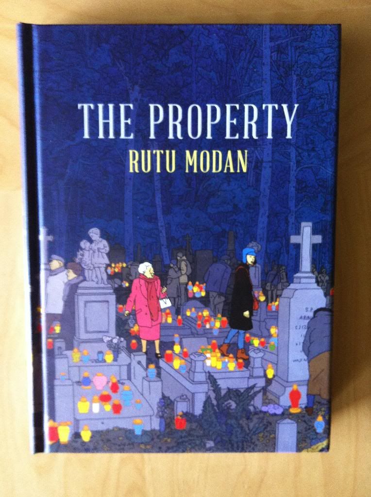
Rutu Modan draws comics about relationships. If you wanted to be dismissive of it (and why would you?) you could describe her output as a studies in talking head comics. And yet, Exit Wounds and The Property are really, really engrossing comics. Relatable stories and great, vivid characters are key elements, but so is the stripped down, beautifully minimalist art of Rutu Modan. Every moment in these comics are just presented with such simple clarity that they are kind of perfect. I'm not sure exactly how to articulate Modan's approach other than to say it's like good design: it's simple, yet exactly what it needs to be to work perfectly in every instance.

Her approach to phone conversations is a great example of this. Modan uses a simple six panel grid and splits the page between the two speakers, one in Israel and one in New York City, such that every word of dialogue in the conversation is drawn with the person saying it. This makes it super clear who is saying what and let's us see the characters react and even play off each other as if they are in the same room. And yet, the clear demarcation of the page into Poland-zone and Israel-zone emphasizes the physical, and for plot reasons, emotional separation between the two characters. Which collectively gives us the drama of the conversation and the weight of the distance of the call. It's emblematic of the simple, yet perfect layouts of Rutu Modan, and just a great clean example of how to make a phone feel interesting and engaging in a simple way.


Here is another really great example of a two different approaches to phone conversations happening simultaneously. Down the left side of the page, Mica, one of the characters is on the phone with her family's lawyer in a very stripped down series of panels. For the purpose of the story we only really care about her reactions as some dissapointing than interesting news is delivered to her. The lack of background and tightness of the panels emphasize how focussed on the conversation she is and the incomplete nature of her information. Meanwhile the right side of the page shows a conversation between a troublesome interloper and her aunt where they discuss some great news (which ironically is being debunked in the left-side panels). This one is a long distance call with the dude popping into the panel being in the same room as Mica in Poland and the woman being in Israel. I love the goofy way the two play off each other and the wonderful contrast between their shenanigans and the more serious conversation on the left of the page. The right panels are also great in that they show how telephonics can bring people at great distances together, as if they are in the same room. Which is also pretty fun.


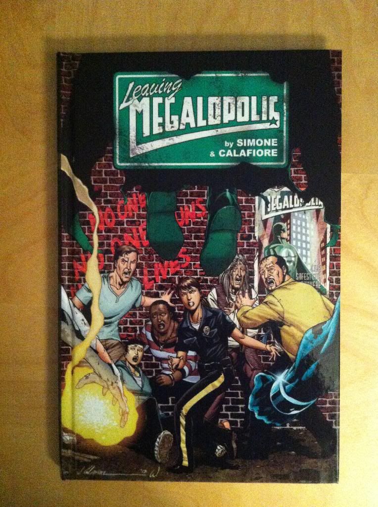
On the other end of the spectrum, we have a phone conversation from Hawkeye #3. This layout uses 24 tight panels arranged in an apparently chaotic cloud. Yet, by moving from the top left of the page, through the grid of small panels and finally into the bottom right corner there is a clear progression of events. This layout is really great because it effectively does the opposite of the Rutu Modan pages above: it muddles everything together in a whirlpool of conversation. Clint's panels intersperse with Kates, maybe Clint gets a few in a row, and now Kate barges into the conversation. We see tight shots of faces, that emote as the camera-angle of our perspective swirls a little. And this inherent chaos beautifully captures all of the emotional chaos of the scene. We see through layout the difficulty the two Hawkeyes have in communicating, the conflicting emotions that do not really sync up. It's miscommunication captured through layout complexity. 

Someone way, way more perceptive than me was able to gather from this page that Clint may be, or may have once been hard of hearing. And the fact that this was a thing that could be gleaned or built into a layout is something that still blows my mind.

Anyway, there is clearly no single right way to draw phone communication, but when it's done well it can as interesting as any other character interaction. I think maybe if there is one lesson to be taken from these, it's that maybe a lot can be gained by focussing on the conversation and call instead of putting the focus on a character moving through a setting. I mean, clearly there are situations where it is best to use a phone conversation to establish setting and move things forward, but the phone calls in comics that really stick with me are all focused character affairs.

Wednesday 27 August 2014

So I Read The Property

A 250 word (or less) review of The Property 
by Rutu Modan; English edition by Drawn and Quarterly


For whatever reason Superhero stories dominate the comic medium. They tend to tell stories with giant, earth smashing stakes filled with larger than life characters with elaborate, theatrically tragic stories. I kind of love them. But, what maybe these comics loose sight of is that every humble person also has a story. A story that's maybe filled with sadness and triumph, laughter and love. Stories that can, despite their mundane nature, be every bit as compelling and engaging as the largest Superheroic epic. The thing I love about The Property is how it brings to life these humble human stories in a way that is absolutely magical. The Property tells the story of Regina Segal and her adult granddaughter Mica as they travel back to Warsaw, Poland from Isreal to reclaim long lost property. Except the purpose of Regina's trip is more complicated than she lets on and Mica's Polish inheritance isn't quite what she expects. The Property is very much a human story filled with love, the exasperating comedy of family, the tragic echoes of occupied Poland, and a mystery worth solving. It's a great, accessible story. The Property is also beautifully crafted, with Rutu Modan's endlessly beautiful, minimalist line creating an endlessly expressive world. If you are looking for a non-genre comic to read, or are interested in a more literary/art comic that isn't experimental or depressing, I couldn't recommend a better comic to try tan The Property. It's great comics.

Word count: 243

Previously:
Exit Wounds

Monday 25 August 2014

Exposing The Secret Avengers #7

Or a spiffy layout that I like in Secret Avengers #7
by Ales Kot, Michael Walsh, Matt Wilson, and Cayton Cowles; Marvel Comics


Secret Avengers continues to be a comic that for all of it's jokesy good fun is also full of interesting comics decisions. One aspect of the comic that is consistently well done is the use of innovative layouts that convey extra story details or evoke additional emotional reactions in the reader. Secret Avengers has a pretty interesting and fun layout that I thought it would be fun to take a closer look at.

There will be *SPOILERS* for Secret Avengers #7


I love this page. The way the layout tells the story clearly and adds a swirling, perspective challenging element to the panels is pretty cool. It is inherently interesting because it is different and unconventional. But it is even more interesting when you consider the additional thematic and emotional information the layout provides. The story of this page is that Maria Hill is bringing Spider-Woman into the confidence of her secret border-line-paranoid-delusion conspiracy investigation and into the secret room where she keeps her notes. The long, spiralling layout helps emphasize the convoluted, labyrinthine passages the women travel to the lair as well as the winding, twisted psychological space in which they are travelling. The readers get that things are going to a secretive and warped place. The choice of a spiralling layout also, I think, helps emphasize the madness of the moment: an Archimedean Spiral is a symbol of hypnosis and psychosis in our culture and it's use here subtly alerts us that things are going to a potentially crazy place. The swirling effect of the shifting perspective also might play a role in suggesting a clear demarcation between what comes before and after. In certain old-school television shows, most notably Batman '66 (since that's one we are all familiar with) a spiralling perspective shot is used to signify hard, time-jumping edit points, and this layout, at least for me, evokes that same sensibility. So yeah, I think this is a pretty interesting page of comics.

Previously:
Secret Avengers #4: Colour as character symbols.
Secret Avengers #2-3: Smart layouts.

Friday 22 August 2014

Worshipping The Wicked + The Divine #3

Or a look at character design in The Wicked + The Divine #3
by Kieron Gilen, Jamie McKelvie, Matt Wilson, and Clayton Cowles; Image Comics


Good character design is one of those ineffable comics elements which has a profound effect on storytelling that maybe gets lost a little bit. If all you read is superhero comics character design might be invisible to you: Spider-Man looks like Spider-Man because he has looked like Spider-Man since before I, and maybe you, were born. The character design of long running characters has been subsumed by brand identity. But the way characters look is really important, and when they are designed well, it can provide us with a huge amount of information about that characters and make us feel certain ways about them.

Team WicDiv are wizards at character design. The subtle way they create visual motifs for their characters that are believable and iconic is really well done. Like, take Lucifer, with her androgenous styling, sweet white suit, and black devil-horn forelock. She looks sexy and subversive, business-like and stylish, and just the right amount of dangerous. She also look's like no one else in the comic. Character design is really well done across the board.

However, WicDiv #3 has a perfect example of great, effective character design that I think is worth taking a longer look at.

There will be *SPOILERS* for The Wicked + The Divine #3 in this post.


WicDiv #3 is largely an introduction to The Morrigan who apparently exists as three different aspects. Along with the regal, well known Morrigan persona, The Morrigan also transforms into furious, feral Badb, and placid, detached Gentle Annie. While the way these characters emote, speak, and act certainly inform their identity, a gigantic amount of information about them can be gleaned entirely by how they look, how they are designed.

First, from their design it is obvious the aspects of The Morrigan are linked. All three versions of the character sport her striking green eyes and have cheek piercings which, while still very human, are a somewhat idiosyncratic choice of piercing. All the aspects of The Morrigan also sport a goth-punk aesthetic, clothes that have a certain gowney structure, and involve motifs of ravens, feathers, and armour. And of course all three aspects sport a sleeve of raven tattoos on their right arm and some sort of black face makeup (or at least I think it's makeup?). You can look at all of these aspects and see that they are variations on a central theme.


Yet the key differences between the aspects are also really obvious from their design.

The Morrigan looks regal and poised. Her hair is stylishly cut and styled, shiney and black with cool blue highlight tones. Her black face makeup goes horizontally across her face like a mask or a veil and has a shape that reinforces a neutral facial expression (eyebrows level, mouth pressed into a line). Her clothing is a structured black gown with a high collar that looks like something royalty might wear. The entire effect is that The Morrigan looks controlled, powerful, and queenly. 

Badb on the other hand looks wild and unrestrained. Her hair is a gigantic tangle of red fiery locks, wild, unrestrained, and big. Her eye makeup looks like a mask of a different sort, with sharp lines that emphasize an angry expression (scowling eyebrows and cheeks drawn back in a snarl). Her face also has additional piercings: a pair of snake bite lip piercings give her fangs and a nostril piercing emphasizes her nose and gives her a bullish, wild aspect. Her fingernails are sharp black claws. Babd's clothing, while still gown-like is heavily influenced by armour. Her dress is highnecked, her bodice looks like a cuirass, and her left arm is sleeved in apparent scale-mail with a pauldron of feathers. Collectively Badb looks dangerous and powerful and angry. She is a wild warrior woman to the constrained royal of Morrigan. 

Gentle Annie feels entirely different with a design that is otherwordly and peaceful. Her head is largely bald, with a pair of tufts white-grey hair. This is a look that is deliberately strange: few young adult women deliberately shave their heads, and those that do seldom leave behind slightly asymmetrical locks of hair. This is also a hair style that is evocative of a variety of wildly different groups: there is something childlike about it, and something elderly, something sickly, and something reminiscent of monks and wellness.  Groups of people with interesting perspectives and, for a variety of reasons, peaceful demeanours. Groups that are also deeply paradoxical (one cannot simultaneously be old and young). Then there is her assymetircal face makeup. Instead of being across her face and eyes, the black is a vertical stripe on only one side of her face. This is a strange choice that is contrary to fashion and is also outside the paradigm of the other Morrigan aspects: Gentle Annie operates in ways that are outside of the other Morrigans. She also has wildly asymmetrical ear piercings with one naked ear and one ear with multiple studs and hoops: asymmetry is weird and contrary to the rules of biological attractiveness. Gentle Annie is also dressed in a much humbler outfit than her other aspects with less structure and showing more skin. She is dressed more like a goth monk or hippy than a queen or warrior woman. The net effect of the design of Gentle Annie is someone who operates outside of conventional thought and wisdom and who has a spiritual nature. Basically she looks weird but peaceful and kind.

This is all information you get just from how the characters look. Which makes this great bit of character design a great tool for informing and emotionally effecting readers. 

Such good comics.

Previously:
WicDiv #1 and popart head-splosions
WicDiv #2 and the use of black-space

Wednesday 20 August 2014

So I Read Leaving Megalopolis

A 250 word (or less) review of Leaving Megalopolis: Graphic Novel/Volume One
by Gail Simone, Jim Calafiore, and Jason Wright; Kickstarted


Leaving Megalopolis is the Kickstarted survival horror/superhero mashup comic by Gail Simone and Jim Calafiore. It tells the story of a small group of survivors trapped in Megalopolis, a sprawling city infested with murderous, insane superheroes. And its up to these survivors to escape the city and leave Meagalopolis before their former guardians can rip them apart. It's a great little comic with some fun moments, some properly horrific events, and a few clever plot twists. Leaving Megalopolis really plays to it's creators strengths: Jim Calafiore is a wizard at drawing deranged violence while the stripped down, straightforward plot allows the characterization that is Gail Simones greatest strength to really shine. In so many ways Leaving Megalopolis is exactly what I wanted from these creators . That said, I'm pretty unimpressed by the whole Kickstarter experience. While the comic is very good, it was delivered much later than initially promised, and for a pricepoint (with expensive Canadian shipping) that I feel like could have gone much further with a conventional publisher. And the fact that Leaving Megalopolis is now coming out from Darkhorse adds a certain amount of insult to injury. It's great that everyone can now read the book, but I bought into the Kickstarter because it was billed as the only way to get the comic. If I had known a conventional publishing option was forthcoming I would have waited. So, yeah, Leaving Megalopolis was a pretty great comic but a pretty poop Kickstarting experience. 

Word count: 247

Monday 18 August 2014

Gentlemen Of The Road Is A Good Book

Or why you should read Gentlemen of the Road by Michael Chabon


One of my favourite parts of vacation, particularly a beach one, is vacation reading. You get to spend time stretched out in the sun, a cool drink in hand, and read something fun and exciting and maybe a little breezy. More important though is the airplane book. Airplanes are basically my least favourite things in existence: squeezed into a too small seat with not enough legroom in an aluminum tube full of smelly, loud, sick strangers all while hurtling through the air. Between my fear of flying, my dislike for touching strangers, and the discomfort of contorting into an airplane seat, I'm DESPERATELY in need of powerful and fun distractions. A good airplane book has a bunch of characteristics: it needs to be a page turner, written in an accessible way (I once tried to read Gravity's Rainbow on a plane and... it was a bad choice), and it needs to be short enough to read entirely within the time of the flight. Gentlemen of the Road by Michael Chabon is a great book for either purpose.

Gentlemen of the Road is set in the Middle Ages and follows a pair of Jewish bandits as they travel along the Silk Road. These bandits, Amram, a hulking Abyssinian axeman, and Zelikman, a gangly Frankish Jew fleeing the pogroms of his homeland, find themselves entrusted with the safety of a refugee Khazar Prince and thrust into a civil war for control of the throne of Khazaria, a middle ages Jewish kingdom. The novel is functionally a beautifully written swashbuckling adventure novel and travelogue.

I would recommend Gentlemen of the Road for anyone looking for a fun, exciting, beautifully written novel to enjoy on a sunny beach. I would also recommend the novel for anyone in need of an easy to read, page turning novel that can be enjoyed in a 3-5 hour flight. It is just about the perfect vacation novel. It's also just a great story and would be well worth checking out even if you aren't currently a gentle person of the road yourself.

Previously:
Telegraph Avenue
Wonder Boys
The Amazing Adventure of Kavalier and Clay
The Yiddish Policemen's Union

Friday 15 August 2014

Atoll Comics Round 15

Or changes to my Top-Ten comics

Due to my spouse seeing how much I spend on comics and an urge to buy better comics, I have decided to be super-selective about which superhero comics I read. Harnessing the Awesome Power of Maths, I have determined that I can afford to read 10 ongoing titles. So I get to read 10, and only 10, titles published by either Marvel or DC as well as one trade paperback a week of my choosing.


A complication of this is that I am forced to drop an on-going title if I want to try reading a new on-going title, an act of very tough love. Being financially responsible is the worst.

I will be adding Rocket Raccoon and dropping Moon Knight.


Why Rocket Raccoon: I've always thought Skottie Young had a fun, Saturday-morning cartoon aesthetic. Unfortunately, most of his projects haven't quite synched up with my interests. Since I only get to read a few ongoing comics it's important for them all to hit some weird arithmetic ideal of characters I'm keen on and creative teams I'm interested in, and the Skottie Young abacus has pretty much always been missing that character hook to get me reading. But with Rocket Raccoon we've finally found a title I'm curious about that seems, with the ludicrous notion of a crazy gun-toting space-raccoon, to be an ideal fit for the frenetic energy of Young's artwork. The result is idiosyncratic and crazy and fun and worth a look. I'm a couple issues in, and while I'm not convinced that I'll be a longterm reader for the series, I'm having lots of fun with it right now.


Why not Moon Knight: I read Moon Knight purely for the strength of its creative team. A comic by Warren Ellis is always worth at least a try and the collaboration between a top tier artist Declan Shavley and living legend colourist Jordie Bellaire, an artistic team that actually live together, would be worth seeing regardless of the writer. Together, well, Moon Knight was fantastic. It was always good, always beautifully made, and occasionally, at it's best, was the kind of semi-experimental master comic that I love. However, Ellis/Shavley/Bellaire are moving on and I think I will be moving on with them. The new creative team looks to be quite talented, but I was reading this comic for Ellis/Shavley/Bellaire and not out of any great love for Moon Knight. I'm happier having had a really great six issue run then press on for the sake of inertia. And I'd much rather save my money and attention for Injection, the new creator-owned project from Ellis/Shavley/Bellaire.

(And real talk: I have feels about Brian Wood and while I might not completely swear off all Brian Wood projects, I'll have to really like the main artist (who spends way more time on a comic than the writer) and really buy into the premise of the project to give it a try. Marginal interest projects like this I'm more inclined to skip.)

Previously:

Wednesday 13 August 2014

So I Read Satellite Sam: The Lonesome Death Of Satellite Sam

A 250 word (or less) review of Satellite Sam: Volume One 
by Matt Fraction and Howard Chaykin; Image Comics


Satellite Sam is a love letter to the Golden Age of Live Television. The story takes place behind the scenes of Satellite Sam, a highly rated Space serial on the LeMonde network, as the show is rocked by the death of Carlyle White, Satellite Sam himself, under mysterious circumstances. Mysterious circumstances that reveal an illicit secret life of debauchery. Satellite Sam is a story of murder and sex and the history of TV. The story itself is shaping up to be an intricate and slow burning mystery with a generous helping of greed and perversion, and a surprising amount of information about 1950's television. The thing is, Satellite Sam might not be the easiest sell: it's a pretty complicated beast and I know Howard Chaykin's art isn't for everyone. Despite not usually being a big Chaykin fan, I really like him on this book: he really understands the period, and his gritty linework benefits tremendously from the Black and White colours in Satellite Sam. Although, that same black and white element can also make it a bit hard to keep the large cast straight at times (it's amazing how much I rely on colour for character identification). There are helpful character charts in the backup, which should help. The other thing I think you should know is that Satellite Sam is a slow builder, improving a bit every chapter, until ending on a really intriguing note. If you give it a fair, long chance you might be pleasantly surprised.


Word count: 249

Monday 11 August 2014

Eye on Hawkeye #19 pt. 2

Or a look at the use of layout and colour as thematic wayfinders in Hawkeye #19
by Matt Fraction, David Aja, Matt Hollingsworth, and Chris Elipoulos; Marvel Comics


Hawkeye #19 is another pretty special issue of comics. Like the Eisner winning Pizza Dog issue, it uses comics in unconventional, experimental ways to give us a unique comics experience. More importantly Hawkeye #19 also manages to teach us a bit about American Sign Language, provide a perspective of some of the challenges of being deaf, and, through the use of ASL, create an experience of deafness in readers that maybe gives us some clue as to what it feels like to be unable to understand and participate in communication. Which is all really cool, really noteworthy comics that people celebrate. The thing is, Hawkeye #19 is also a super formally interesting comic in more conventional ways.

Specifically, I am really interested in how Hawkeye #19 uses parallel layouts and colour tagging to instil emotional effects in readers and seamlessly convey varying time points.

There will, as always, be *SPOILERS* for Hawkeye #19 below.


Okay, this might be unsurprising, but I find design, infographics, and architecture really interesting. As a result I listen to a pretty great podcast called 99% Invisible which tells stories about the unseen thought that goes into pretty much every aspect of our manufactured world. A recent episode (which you can listen to here) discusses the hidden art of using architectural considerations to affect behaviour. There are people trying to figure out ways to subtly nudge you to walk a certain way or visit a certain store by using structural elements. They use obvious things like signs, but also really subtle things like the angle of a kiosk desk, sight-lines, and even floor tile patterns to guide your behaviour. It is called wayfinding and it strikes me as devilishly cool.

The thing is, Hawkeye #19 makes me think about this architectural wayfinding in the context of comics because it uses structural, layout choices and subtle colour to affect how we understand and emotionally experience the comic.


Interspersed throughout Hawkeye #19 are two different periods of time that depict Clint's struggles with deafness in the present as well as his childhood experience with deafness. None of this is explicitly stated in narration and instead this information is encoded in the artwork, layout structure, and colouring of the comic. The net effect of this is that we as the audience understand the time shifts and become emotionally invested in the parallelisms between the trials of child and adult Clint. But all of the little ways this information is encoded are worth examining.


The primary means of communicating the parallels come from the art. This two-page spread is the opening of the comic and is split between two distinct stories. Down one side of the page a doctor is handwriting a note about a deafness diagnosis for a little boy and his family. Down the right side of the page we see a series of similar images showing a deafness diagnosis being written out for an adult Clint. Now clearly the left side of the spread depicts young Clint and the right shows virtually the same diagnosis for adult Clint. We aren't explicitly told, but it's obvious.

Part of how this information is encoded is the use of related images. We see similar language used in the writing boxes, and a very similar doctor office layout with the same relationship between clint, his family, and the doctor on both sides of the layout. Critically, we finish the page on the left with child-Clint's face split over four panels, a pretty idiosyncratic layout choice, that is immediately reflected on the top panel of the next page in adult-Clint's face split over the same four panels. This instantly clues us in to the identity of the boy on the left, but really the various related images spread across the pages collectively convey this information.


The relationship between the two pages in the spread isn't, however, limited to the signs, the actual depicted events on the page. There is also subtle structural choices at work to establish that the events depicted are parallel and related. Specifically, the layours between the two pages use deeply related layouts. On both pages we have a large central panel bordered by two zones, one of which is split into two levels. What this parallel layout does is help reinforce that the events on the two pages are meant to reflect each other. However, the layouts are not identical, in that the two pages overall shape are actual inverted to one another. While this may have just been an aesthetic decision or designed to place the boy/adult Clint eye panels in close alignment for maximal effect, for me this choice helps to solidify the different place adult Clint is in: he has been here before. He is experiencing the events depicted on the right while remembering the traumatic events of his childhood deafness. And I feel this is reflected on the level of layout.


One of the aspects I find so impressive about this sequence, and comic in general, is how effortlessly and seamlessly it moves between the various time frames. A ton of this is done with tiny wayfinding choices peripheral to the central events. I mean sure, the most obvious indicator is whether Clint and Barney are depicted as children or beaten up adults but there are a wide variety of subtle indicators. The most important wayfinder is colour: the past events on the left are coloured in a brown-sepia wash that we have come to associate with aged, or old fashioned photography and the past, while the modern events are coloured in the purple/blue that we have come to associate with the modern-day Hawkguy status quo. It's straight forward, but unannounced and taking full advantage of our unspoken common colour biases. It's great stuff. 

And then there is all of the subtle set dressing choices made to indicate the span of time: past-male doctor -vs- modern-female doctor (something exceedingly rare during Clint's childhood) and the doctor using handwritten notes and having an old-fashioned phone -vs- the modern computerized workstation and phone of the modern doctor being the most obvious. And then there are the subtle things: the CT films and light boxes in the modern doctors office, the modern anatomy poster, the steel exam table, the modern firecode levered doorknob (as opposed to the disability unfriendly round doorknob), and in the historic office the wooden display table and old fashioned looking Snellen chart which seems indicative of older printing technology. All of these little setting choices help to ground the two scenes in specific moments in time and help reinforce the time changes for the rest of the comic. 

Also, I can't believe there was a time when a doctor would fill out a diagnosis pad with "with love and...". That's crazy!


You see all of these techniques used throughout Hawkeye #19, but I think the next best example is this double page spread. Again we have two different unlabelled time points that utilize directly corresponding images, sepia-vs-hawkeye colouring, and parallel layouts to accomplish the feelings of time displacement and narrative connectivity. What's maybe cool about this spread is the layouts are directly corresponding: the past left page scheme perfectly matches (well more or less) the present right page scheme. This might be reading into it too much, but I feel like this choice is to help cement that this is the end of the journey begun on the first double spread (the thing we looked at first) and is the point where clint is no longer reacting to his past traumas and is stepping forward into the future. I feel like the layout is meant to evoke that at the past and present narrative moment both child-Clint and adult-Clint feel a kind of parallel resolution to meet their challenges and situations head on. Regardless, it's great comics.

So yeah, once again Team Hawkguy create a remarkable experimental comic that is also a really smart comic in a conventional way too. This comic guys, this comic.


Previously:
Eye on Hawkeye #19 pt.1: Empathy Machine
Eye on Hawkeye #18: Colours and setting.
Eye on Hawkeye #15: Composition, Layout, and colours.
Eye on Hawkeye #16: Smart layouts and chilling moods.
Eye on Hawkeye #14: Repetitive panels as a device.

Friday 8 August 2014

Genetopia Is A Good Book

Or why you should read Genetopia by Keith Brooke


Genetopia is, I think, the first Keith Brooke novel to be released to a North American audience. It's also a novel that took some getting and taught me some lessons about using store fronts of store fronts within amazon. Seriously, woof.

Genetopia is a novel about a future were genetic engineering has run literally wild. In the novel true humanity clings to small settlements surrounded by dangerous, mutant wilds. To survive, True Humans leverage genetically altered humans as slaves. These slaves, called mutts, are treated as subhuman property and compelled to subservience by a genetically bred compulsion. True humans themselves are also in danger of becoming subhuman as any sign of change, birth defect, illness driven mutation, or deliberate exposure to the changing vats, turns the human Lost and throws them into exile or into slavery. It is in this world that Flint, a true human from a wealthy clan, finds his beloved sister Amber missing. Unsure if she has run away or been kidnapped, or even if she is still human, Flint must brave the wilds and travel the world to save her.

Genetopia is obviously an allegory about slavery . It uses genetic manipulation as a device to explore the way that people use labels and tribalism to dehumanize and posses other humans. Genetopia then explores just how awful humans behave when they do not consider a person human and just how fragile humanity and freedom are in such a system. It's an interesting approach.

The thing is, I'm a bit conflicted about Genetopia. I found the narrative engaging and pleasantly fast paced: Genetopia is a well written book. As a professional life scientist who feels that Sci-fi over focuses on robots and computers when we are so close to fully unlocking the fantastic potential of biology, I really appreciated the biotech world the novel creates. But, at the same time, I felt that the novel, maybe out of its brevity, was maybe not as nuanced or careful in its discussion or potrayal of slavery as I would have liked. I don't think Genetopia was necessarily bad in this regard, but slavery is a pretty heavy topic, and I feel like Genetopia could have done better negotiating it. Genetopia is good, but not perfect.

Also, I kind of hate the cover and title of this book. The title is too simplistic for the subject and doesn't catch the dystopian heart of the novel, while the cover I found aesthetically childish and, frankly, a little spoilery. If not for already being impressed with the author, this is a book I would never have picked off a bookshelf. If you accept the premise that the point of a cover and title is to convince a reader to pick up a book, then I think Genetopia failed a bit.

(Incidentally, Keith Brooke's The Accord was a book I picked off a store shelf purely based on the cover and title. It's a great example of smart design (or at least design that conforms to my taste)

I would recommend this book to routine Sci-fi fans looking for a new book: Genetopia is good enough to merit a try. If you are looking for a book about slavery or the complex way we accept or reject other peoples humanity, I'd recommend Octavia Butlers Seed to Harvest or John Wyndham's The Chrysalids instead. If you've never read a Keith Brooke book before, I'd suggest you try The Accord or Harmony instead of Genetopia and then maybe come back to Genetopia after. 

Previously:

Wednesday 6 August 2014

So I Read Bad Houses

A 250 word (or less) review of Bad Houses
by Sara Ryan and Carla Speed McNeil; Dark Horse Books


Some of my favourite stories in non-comics media, novels and movies and television, are really well made slice-of-life stories. While I love giant Earth-shattering tales of murder in a far and weird future, sometimes a quirky, character driven story with a relatable setting is what I want from my media. Bad Houses is exactly that kind of story. The graphic novel tells the story of Anna and Lewis, teenagers from the economically troubled, small town of Failin, Oregon and what happens after they cross paths at an estate sale. It's a story of teenage hopes and tribulations, small town history, and really nuanced character study. Bad Houses is also a comic that taps into the emotional weight of possessions in a way that seems to intersect with a bunch of zeitgeisty reality shows: antiquing, storage lockers, houses hunting, and horders all kind of appear. And I found it really interesting how this skeleton of common themes and events shared with such dubious television can be used so effectively in Bad Houses to tell engaging and human stories. Seriously, this comic is thematically crafted in a really interesting way. Most of all, though, Bad Houses is just a great, relatable story that manages to be dramatic, charming, and quirky in a way that I think should appeal to a lot of people: comic stalwarts, but also regular folks who are not genre fiction inclined. My spouse doesn't really like comics, but Bad Houses might just be the perfect comic for her.


Word count: 250

Monday 4 August 2014

Deep Sequencing: Zero Mercy

Or a look at the fine action sequence chapter in Zero: An Emergency chapter 4
by Ales Kot, Morgan Jeske, and Jordie Bellaire; Image Comics


In a recent post about Moon Knight #5, a fantastic asskicking comic, I suggested that there might be a formula to making extended action sequences interesting instead of drawn out and boring. In Zero volume one, there is another great example of a lengthy fight scene done right. While it's interesting in its own right, I find this sequence particularly interesting because it follows the same basic make-this-fight-interesting rules as Moon Knight #5. Which is maybe worth taking a look at.

This post will have extensive *SPOILERS* for Zero Vol. 1, specifically the Fourth chapter (Zero. Issue #4 if you're an issues person). While I don't think this post will ruin the whole trade for you, since each issue kind of stands alone, it is probably better to not read this post if you have plans to read Zero. Okay?


Rule 1: The comic must provide a clear and emotionally interesting reason for the fight. The argument here being, if readers don't understand why a conflict is happening it is difficult to get involved in it or if the reason for the fight is shallow the conflict will feel contrived and dumb.

Zero does a great job establishing the premise for the conflict. It is brutally clear: Agent Zero has been sent by his masters to assassinate the man with the eyepatch. His reason for doing this do not go beyond his masters wishes (Zero has been conditioned since childhood to be an obedient killer). Despite the initial simplicity of the premise, the emotional reasons for the fight are much more complex and delightfully transgressive. The man Zero has been sent to kill is a former agent who has found a worthwhile life following his escape and retirement from The Agency: he found love and, following its tragic end, has found meaning protecting and teaching child slum soldiers and improving their lives. In a way, this man represents the best possible future of Zero and yet Zero must kill him. So the emotional crux of the fight is that Zero must kill the eyepatched man for his masters, he doesn't have a choice, and yet it is against Zero's interests to do so. Basically this fight is driven by a deadly straightforward objective mired in the sordid context of Zero. It's great.


Rule 2: Fight scenes should have well defined and utilized settings to provide context to the action. Basically, readers can appreciate movement and better understand events when they are grounded in a place. This rule is less of an action rule, and more of just a comics one. Setting is super important.

Zero doesn't waste a lot of time establishing settings, but does clearly establish where events are taking place. Zero and the man fight on a rooftop in a slum built upon a hill. The fight turns into a car chase and then, while in a car tunnel, they crash and resume kicking the crap out of each other. It's a simple thing, but like a house foundation it provides the stability the story needs to work.


Rule 3: The action must be well composed to maximize kineticism, impact, and overall storytelling. This one is less a rule, rule and more a philosophy of approach. Action sequences are story chunks that rely almost entirely on the art for storytelling: these are dynamic regions where exposition just detracts from whats happening. So it is really important that the art be clear, interesting, and designed in a way that maximizes the motion and bone crunching impact of the depicted action.

Chapter four of Zero has a really brutal approach to fight storytelling. It uses disjointed panels, with wild perspectives to capture the feelings of madness and chaos of the fight while still being clearly readable. The comic also tends to emphasize on moments of impact, with the actual motions being somewhat peripheral to the blows. Take the kick in the above sequence which begins in the back corner of the fourth panel, is highlighted in a small, tight fifth panel, and lands with brutal effect, ghost quick in the sixth panel. It is clear that a kick is happening, but we get this information in a glimpsed, wild way that ends in a face-breaking blow. It's an approach to story telling that is emotional, heavy, and interesting.


Rule 4: The fight should have consequences. By which I mean, combatants should get hurt. In the real world violence carries awful, immediate consequences in the form of brutal injuries and if you want your fight to feel real and important and interesting it should reflect that. Now, clearly there are places where brutal injuries don't make sense, but in those instances it is imperative to create other stakes for the conflict. Basically, no one wants to see two invulnerable people hammering at each other with no damage to themselves or dramatic consequences.

Zero is a comic where cringe-worthy injuries make sense. And the action sequence in chapter 4 is appropriately gruesome. Agent Zero and his eye-patched adversary bleed, break, lose teeth and generally get fucking destroyed as they beat each other to death. All of this action then culminates in the eye-pathced guy cutting out zeros fucking eye with a fucking shard of glass before Zero turns the tables and stoves his opponents skull in with a car door. This is fucking brutal action at its best/worst.


Rule 5: Be interesting. Look, there are a lot of comics out there that have fighting and car chases and action in them. As a result readers see a lot of action sequences. A lot. So it is really important that any extended action sequence does something interesting. That is always doing something new, never wallowing in repetition or, even better, it's showing the reader something they haven't seen before.

Zero chapter four manages to be a very interesting action sequence. The disturbing premise of the fight gives it emotional depth, the simple and evolving setting keeps things varied, and the well composed, brutal action is fascinating and horrifying to look at. It's a really well done sequence that is engaging to read. Chapter four of Zero also manages to show me something I haven't seen before in a nifty way. This sequence above which depicts Zero pursuing Eye-patch guy into a car tunnel, crashing into him, which sends the pair tumbling in a massive accident that is really smartly portrayed. I particularly love the way the tunnel lights are used to establish the mood and speed of travelling through the tunnel, and then how that order is subverted and reapplied to convey the chaos and motion of the crash. It's great comics.

So the extended action sequence in Zero Vol. 1 Chapter 4 is pretty great and is another great example of how to keep prolonged fight scenes interesting.