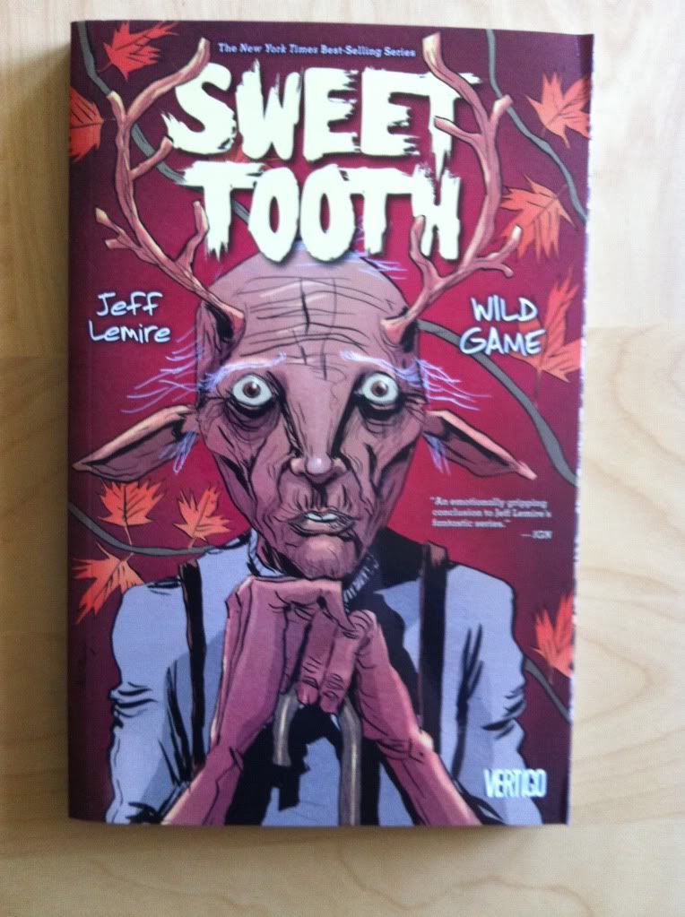
Or breaking conventions to enhance storytelling in Sweet Tooth: Wild Game
By Jeff Lemire; Vertigo Comics.
One of the essential characteristics of comics is that they follow a series of rules. The story is broken into images that contain text in a number of formalized boxes and balloons. The sequence of images, for American comics, run from top left to bottom right, moving across the page and then down a row. The pages are arranged in an order that goes from front cover to back cover. The point of these conventions is that everyone, readers and creators all, understand the basic structure of the narrative so that readers can focus on the story itself instead of exerting effort trying to figure out how to read it. It means that you and me can read a comic and pay absolutely no attention to how the comic works and still get a really great story.
The thing is, sometimes the conventions are not the best way to tell a particular story or sequence of events. Sometimes more dramatic information or atmosphere can be conveyed by breaking the rules and making comics that present the sequence of events in unpredictable and interesting ways. Of course, the trick to doing this is to create unconventional comics that don't confuse the readers. Sweet Tooth: Wild Games has a couple great examples of breaking the rules to make interesting comics.
This post will contain *SPOILERS* for Sweet Tooth.
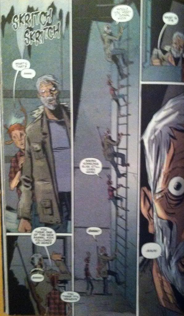
This page breaks the rules in a really simple, but effective way. The magic here is that instead of moving from the top left corner to the bottom right, the comics page has characters and events move from the bottom of the page to the top against the flow of conventions. This is pretty neat in that we literally get to travel up the ladder with the characters along a tall thin panel. The way this page leads readers through the unconventional ladder climb is pretty interesting too. Basically, this trick relies almost entirely on the speech balloons as a visual guide: in the bottom left panel, the speech balloon peaks into the tall middle panel which guides into the right starting point for the ladder climb. Then of course the speech bubbles along the climbing route keep everything on track. This sequence is rule breaking comics that elegantly enhances the moment, all while leading the reader through the page. It's simple, great comics.
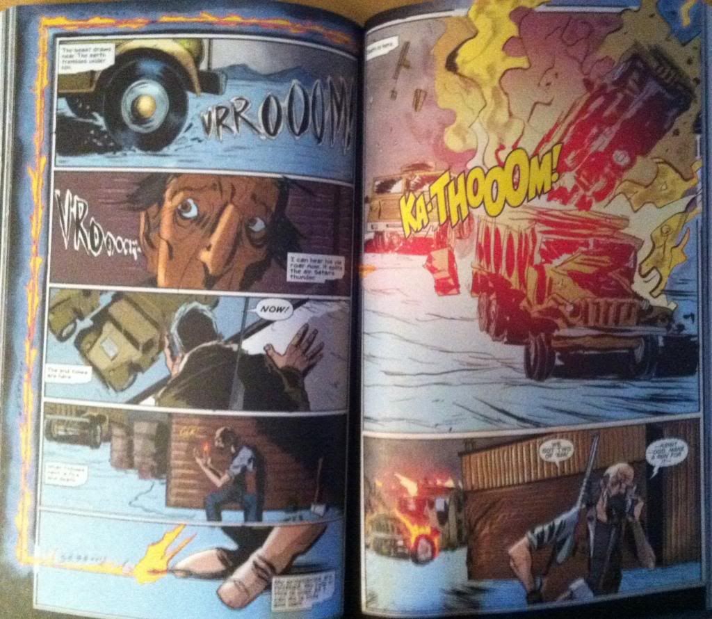
This double page spread does something even more unconventional and dramatic. In short, a trap is sprung that sees a series of hidden explosives destroy an incoming militia convoy. The convention breaking razzle-dazzle to this spread is the fuse, which does some pretty cool things. Rather than have the fuse go from left to right into the page gap seam, the fuse goes right to left, travels up the page, and then left to right across the top of the page. This does three really cool things. First it drags out the moment: like a real fuse which races breathlessly to an explosive the fiery line depicted here is so long that it holds the readers focus for the length of a real fuse. Second, the fact the fuse line in the comic runs from its origin to the explosion actually lets the audience trace the path of the burning fuse, which imparts a sense of time and motion to the fuse which adds so much drama. It's like the comics equivalent of the camera panning along the burning fuse in a movie. Third, this approach makes the explosion itself much more dramatic: by taking the reader the long way to the next page, the fuse stops the reader from getting to the explosion too quickly. Moreover, the fact the fuse breaks rules and requires extra reader concentration helps make the explosion pay off more... it's like a form of delayed gratification. This is a really, really great rule breaking sequence that hugely improves the sequence depicted.
So there you have it two convention shattering sequences from Sweet Tooth: Wild Game that exemplify the value of breaking the rules sometimes and how to do so in way that keeps reader in the loop. It's great comics.
Showing posts with label Sweet Tooth. Show all posts
Friday, 29 November 2013
Wednesday, 27 November 2013
So I Read Sweet Tooth: Wild Game
A 250 word (or less) review of the sixth, and final, collection of Sweet Tooth
By Jeff Lemire; Vertigo Comics
There will be mild *SPOILERS* for earlier Sweet Tooth collections. For a *SPOILER* free review, please go here.
Sweet Tooth started as the story of Gus, a deer/human hybrid, and Tommy Jepperd, a hardened human survivor, as they attempt to stay alive in an apocalyptic future that sees humanity ravaged by a mysterious plague. As the comic progressed we learned that Gus may be more than another strange kid born after the plague, but may instead be an important factor in solving the origin of the disease. Sweet Tooth: Wild Game is the final chapter in the story and sees Gus, Jepperd, and their adoptive family finally reach Alaska and the secret government lab that Gus originated from. In this collection we see all mysteries solved, all scores settled, and a pretty satisfying end to a great comic. Sweet Tooth: Wild Game is as creepy, tense, and as heartfelt as everything that came before and manages to make a great final statement on the meaning of family in the face of adversity. I love a good ending. If you haven't tried Sweet Tooth yet, you owe it to yourself to give it a shot. The whole series is waiting for you.
Word count: 183
Previously:
So I Read Sweet Tooth Volume 1-4
So I Read Sweet Tooth: Unnatural Habits (Vol. 5)
Wednesday, 24 July 2013
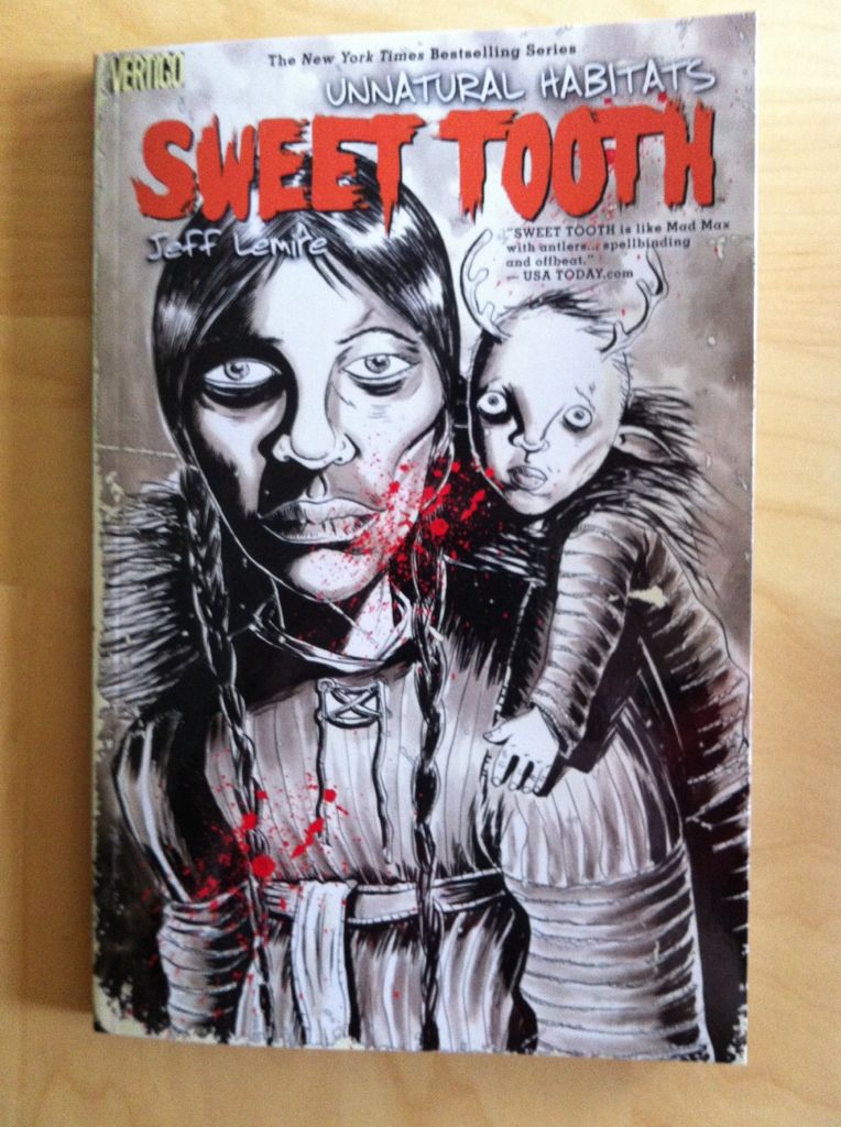
So I Read Sweet Tooth: Unnatural Habitats
A 250 word (or less) review of Sweet Tooth volume 5
By Jeff Lemire and Matt Kindt, Vertigo Comics
Sweet Tooth: Unnatural Habitats continues Jeff Lemire’s
post-apocalyptic story about a mysterious plague decimating humanity and the
emergence of mysterious animal-hybrid children. Specifically Sweet Tooth
focuses on Gus, a teenage human-deer hybrid, and Jeppard, a hard man and
consummate survivor, as they try to unravel the mystery behind the plague.
Unnatural Habitats is split into two stories. The first, set in 1911, tells the
tale of an expedition to Alaska to rescue Jesuit missionaries which uncovers a
horrible secret. The second chunk of Unnatural Habitats returns the lens of the
story to Gus and Jeppard and their journey to Alaska for answers. This part of
the comic feels like the conclusion of the second act: it concludes a bunch of
lingering storylines and seems to set the stage for the conclusion of the
story. It’s a satisfying read that pays off a lot of what comes before. Something
occurred to me while I was working my way through this chapter: the
juxtaposition of cartoony, animal-children with all the bleak and monstrous
things in Sweet Tooth is CREEPY. I mean, the expressionist artwork of Lemire
and Kindt is expressive and uncouth enough to generate a metric ton of
atmosphere alone, but render some adorable pig and deer kids and suddenly there
is this uncomfortable dramatic tension between the grim reality of post-plague
life and the optimism, potential, and innocence of children. It’s an effective
storytelling approach. Anyway, Sweet Tooth: Unnatural Habitats is a great
chapter in a great comic.
Word count: 248
Previously:
Monday, 14 January 2013
Spinal Tapestry Pt. 2: Bringing the Sexy Back
On the under-appreciated art of comic book spines.
I love purchasing collected editions of comics and displaying them as art objects. They're attractive, a visible expression of my interests, and a constantly present collection of some my favourite things. Also, when the Big Earthquake comes, I'll have a great collection of reading material during the daylight hours.
In the last post I talked about the idea that comic book spines are important in larger formats like tradepaperbacks or graphic novels because on a bookshelf the spine is the most visible part of the comic. I also used the Brian K Vaughan comics to show some examples of what I consider good and bad spine design.
This time I want to highlight some of the best and most interesting comic spines in my slowly growing comics library. These are the book spines that clearly show their designers understand how important a book spine is to a comic's on the shelf appearance. (And perhaps on the importance of standing out on a bookshelf from a retail perspective.)
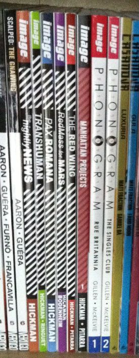
Phonogram: This is kind of the epitome of a good simple spine design for me. The "Phonogram" title uses the font of the cover title, with several logo elements incorporated. This clearly states the books identity in a clear and visually interesting way. Couple that with simple, agreeable colours that don't vary book to book and clean writing that is easily read and you get a great comic book spine. (By Kieron Gillen & Jamie McKelvie: Reviews)
Jonathon Hickman comics: This one is less aesthetically pleasing and more manipulative and clever. Every Jonathon Hickman book has a striped pattern on the spine. When rendered in black and white it is EXTREMELY eye catching (particularly when shelved as a group). The human eye is wired to pay attention to black-white-black lines and the illusion of movement these give off out of some mammals-of-the-savannah evolutionary quirk. So this Hickman block of books is super eye catching. While not the prettiest design, it is uniquely Hickman and identifies his work. More importantly, these books do not get lost on the shelf. (By Jonathan Hickman & Nick Pitarra, JM Ringuet, Ryan Bodenheim: Reviews)

(From a retail perspective this approach might be even more brilliant: only his books have this stripy pattern and its associated attention nabbing effect. If we accept the premise that the point of an eye-catching cover is to get a consumer to pick up a book, then this eye-catching spine design might represent a retail advantage.)
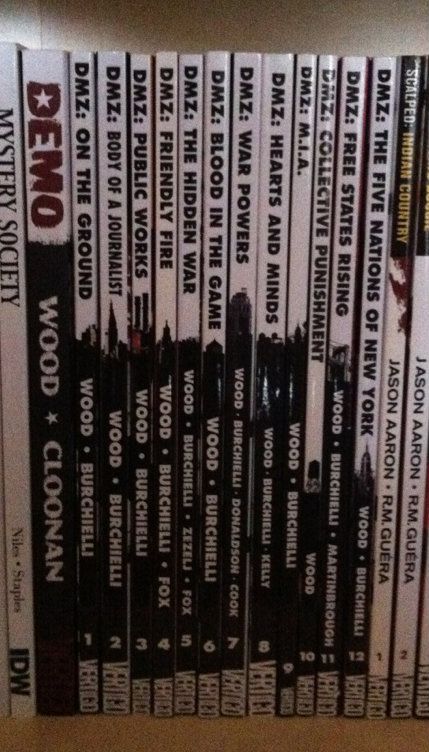
DMZ: This is one of the most clever and aesthetically appealing comic spine designs I've seen. Let me explain, DMZ is the story of a modern civil war fought between the US government and an insurgent movement. A key aspect of this story, and how it works, is the use of Manhattan Island as a war torn battlefield. It creates context for the story and serves to illustrate the horrors of modern warfare in a familiar setting. As such, a key character in DMZ is Manhattan itself. The spines of the DMZ comics are a visually pleasing design that is white behind the title writing and black behind the author text. Brilliantly, a New York landmark is included at the interface between the top and bottom half of the spine. When looking at an individual volume, it's a sharp design. When looking at the entire series, it creates a miniature and very recognizable New York skyline effect. It's clean, unifying, unique, and highlights a key aspect of DMZ. It's great. (By Brian Wood & Riccardo Burchielli, and others)

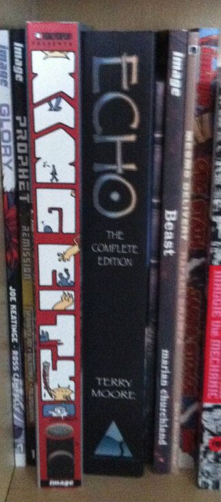
King City: This big, complete series trade shows off what you can do with the real estate of an extra wide collection. The letters that spell out King City, beyond being in an interesting and high catching graffiti-esque font, are also the frames of a tiny comic strips about a cat (presumably Earthling) stalking and dispatching a little cartoon man. It's silly, fun, really well thought out in this making-really-intelligent-use-of-space-and-storytelling kind of way, and pretty representative of the kind of comic King City is on the inside. The spine of King City is a better cover than a lot of covers. (By Brendan Graham: Review)
Also, just kind of as a case in point about the importance of interesting spine design, I've taken a picture of King City next to the extra-wide Echo The Complete Series collection. Echo actually has a pretty nice spine design: simple, has some pretty unique elements, and black always looks nice. But when you put it next to King City with its more creative use of space it kind of gets lost, doesn't it? (Echo by Terry Moore: Review)

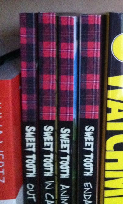
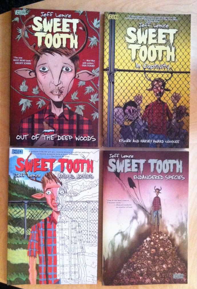
Sweet Tooth: Okay, this one isn't about a good spine design... this is a little thing I noticed. So the concept of Sweet Tooth's spine is pretty solid: clean black spine, unique Sweet Tooth font, and a nice plaid pattern on the top bit of the spine. It catches the quirkiness of the series, and because a red plaid shirt is intrinsically tied to the design of title character Gus, it really catches the feel of the series. Trouble is, I think a mistake was made at some point during the design process. If we zoom in on the plaid pattern along the top you can see the plaid checker alternates between Volumes 1 and 2, but then doesn't ever change again. So instead of getting the checker pattern of a plaid shirt across the series (Vol. 1 and 3 matching and complement the opposite pattern on 2 and 4)... we get mismatched, unconnected plaid colours. Which all makes it feel like a great design that was compromised by a mistake or neglect. Hopefully it gets fixed on a future print? (By Jeff Lemire: Review)
I love purchasing collected editions of comics and displaying them as art objects. They're attractive, a visible expression of my interests, and a constantly present collection of some my favourite things. Also, when the Big Earthquake comes, I'll have a great collection of reading material during the daylight hours.
In the last post I talked about the idea that comic book spines are important in larger formats like tradepaperbacks or graphic novels because on a bookshelf the spine is the most visible part of the comic. I also used the Brian K Vaughan comics to show some examples of what I consider good and bad spine design.
This time I want to highlight some of the best and most interesting comic spines in my slowly growing comics library. These are the book spines that clearly show their designers understand how important a book spine is to a comic's on the shelf appearance. (And perhaps on the importance of standing out on a bookshelf from a retail perspective.)
Phonogram: This is kind of the epitome of a good simple spine design for me. The "Phonogram" title uses the font of the cover title, with several logo elements incorporated. This clearly states the books identity in a clear and visually interesting way. Couple that with simple, agreeable colours that don't vary book to book and clean writing that is easily read and you get a great comic book spine. (By Kieron Gillen & Jamie McKelvie: Reviews)
Jonathon Hickman comics: This one is less aesthetically pleasing and more manipulative and clever. Every Jonathon Hickman book has a striped pattern on the spine. When rendered in black and white it is EXTREMELY eye catching (particularly when shelved as a group). The human eye is wired to pay attention to black-white-black lines and the illusion of movement these give off out of some mammals-of-the-savannah evolutionary quirk. So this Hickman block of books is super eye catching. While not the prettiest design, it is uniquely Hickman and identifies his work. More importantly, these books do not get lost on the shelf. (By Jonathan Hickman & Nick Pitarra, JM Ringuet, Ryan Bodenheim: Reviews)
(From a retail perspective this approach might be even more brilliant: only his books have this stripy pattern and its associated attention nabbing effect. If we accept the premise that the point of an eye-catching cover is to get a consumer to pick up a book, then this eye-catching spine design might represent a retail advantage.)
DMZ: This is one of the most clever and aesthetically appealing comic spine designs I've seen. Let me explain, DMZ is the story of a modern civil war fought between the US government and an insurgent movement. A key aspect of this story, and how it works, is the use of Manhattan Island as a war torn battlefield. It creates context for the story and serves to illustrate the horrors of modern warfare in a familiar setting. As such, a key character in DMZ is Manhattan itself. The spines of the DMZ comics are a visually pleasing design that is white behind the title writing and black behind the author text. Brilliantly, a New York landmark is included at the interface between the top and bottom half of the spine. When looking at an individual volume, it's a sharp design. When looking at the entire series, it creates a miniature and very recognizable New York skyline effect. It's clean, unifying, unique, and highlights a key aspect of DMZ. It's great. (By Brian Wood & Riccardo Burchielli, and others)
King City: This big, complete series trade shows off what you can do with the real estate of an extra wide collection. The letters that spell out King City, beyond being in an interesting and high catching graffiti-esque font, are also the frames of a tiny comic strips about a cat (presumably Earthling) stalking and dispatching a little cartoon man. It's silly, fun, really well thought out in this making-really-intelligent-use-of-space-and-storytelling kind of way, and pretty representative of the kind of comic King City is on the inside. The spine of King City is a better cover than a lot of covers. (By Brendan Graham: Review)
Also, just kind of as a case in point about the importance of interesting spine design, I've taken a picture of King City next to the extra-wide Echo The Complete Series collection. Echo actually has a pretty nice spine design: simple, has some pretty unique elements, and black always looks nice. But when you put it next to King City with its more creative use of space it kind of gets lost, doesn't it? (Echo by Terry Moore: Review)
Sweet Tooth: Okay, this one isn't about a good spine design... this is a little thing I noticed. So the concept of Sweet Tooth's spine is pretty solid: clean black spine, unique Sweet Tooth font, and a nice plaid pattern on the top bit of the spine. It catches the quirkiness of the series, and because a red plaid shirt is intrinsically tied to the design of title character Gus, it really catches the feel of the series. Trouble is, I think a mistake was made at some point during the design process. If we zoom in on the plaid pattern along the top you can see the plaid checker alternates between Volumes 1 and 2, but then doesn't ever change again. So instead of getting the checker pattern of a plaid shirt across the series (Vol. 1 and 3 matching and complement the opposite pattern on 2 and 4)... we get mismatched, unconnected plaid colours. Which all makes it feel like a great design that was compromised by a mistake or neglect. Hopefully it gets fixed on a future print? (By Jeff Lemire: Review)
In my opinion these are some of the better and more interesting comic designs out there. They manage to look good, make a statement about their series, and stand out from their competition. I certainly appreciate the extra effort.
Labels:
Brandon Graham,
Brian Wood,
DMZ,
Echo,
Jamie McKelvie,
Jeff Lemire,
Jonathan Hickman,
Kieron Gillen,
King City,
Phonogram,
Riccardo Burchielli,
Spinal Tapestry,
Sweet Tooth,
Terry Moore,
Waxing Philosophic
Thursday, 28 June 2012
So I Read Sweet Tooth
A 250 word (or less) review of Sweet Tooth trade collections
1-4
By Jeff Lemire, Vertigo Comics
When I first picked up Sweet Tooth, one of the staff at my
comic shop described Jeff Lemire’s comics (particularly Essex County) as the comics
equivalent of Tragically Hip songs: things are literary, expressive, and direly
bleak in a Canadian prairies kind-of-way. Sweet Tooth to a certain extent fits this
description. The story takes place years after the majority of humanity was
wiped out by a mysterious plague and follows Gus, an animal-human hybrid (an
apparent byproduct of the plague) leaving his home for the first time, and
Jeppard, a violent man with questionable motivations, as they attempt to navigate
through the dangers of their world. The mystery of the animal-hybrid children
and the plague and… well, other things, are also integral to the plot, and the
deliberate and relentless unfolding of answers is a huge part of what makes Sweet
Tooth so engrossing. The interplay between characters is the other impetus to
the book as, cataclysmic plague and
pseudo-science-mythology aside, Sweet Tooth is mostly about family and human
connectedness even in the face of fantastic tragedy. Jeff Lemire writes a
thrilling and visceral script filled with unexpected twists and downright
merciless plot developments. His artwork; a kind of minimalist, sketchy,
expressionism often suffused with soft watercolours; punches home the
surrealism and bleakness of this plague ravaged world. I kind of feel Sweet
Tooth represents a bridge between the more genre and literary based comics
traditions: Jeff Lemire is a unique talent worth checking out.
Word Count: 245
Subscribe to:
Posts (Atom)