Showing posts with label Simon Roy. Show all posts

Wednesday, 10 August 2016

Deep Sequencing: Talking About Talking

Or a look at the interaction of speech and sound in Black Widow #5, Island: Habitat, and Cerebus: High Society
by Chris Samnee, Mark Waid, Matt Wilson, and Joe Caramagna; Simon Roy; and Dave Sim, respectively.


I've been thinking about word balloons lately. Specifically how they represent sound, and how sound is experienced by an audience. Listening to speech is an active process by an audience, they have to like, actually listen. I've been keeping my eye out for comics that play with this fact to create some interesting comics moments. And I have some examples for you!

There will be *SPOILERS* for Black Widow 5, Cerebus: High Society, and Island: Habitat.


The first example is from Black Widow #5. In this case the third panel in the bottom row has a cut off repeat of the speech bubble from the second panel. It is recognizably the same bubble of text, but it isn't actually fully legible in the panel. On the one hand, this little snippet of half seen text acts as a time stamp and makes sure the reader recognizes that panels 2 and 3 happen simultaneously. But, I think it's more than that. I think the fact the text is cutoff makes it... out of focus. It's like sound that is happening but not actually being listened to. I think is meant to show that the guy with the gun to his head isn't paying attention to what is being said and is instead thinking about something else. Which given the his following words and actions, makes me believe that this character is centring himself for what is about to happen in this panel. If you buy into this theory, the way this speech bubble is used here is very smart.


The next example is from Habitat, a comic that I originally read as part of the Island anthology. This comic portrays a damaged spaceship where the crew and interior has gone feral. So like, instead of a futuristic crew there are people wearing loin clothes and throwing spears organized into tribes based on their ancestors (I think) section specialization (security, engineering, etc). It's a comic that works because it creates a fully realized tactile world of human desperation in a huge, thoughtfully constructed world of wilderness and technology. I think this example of how speech is used is a great example of the kind of suspension of disbelief that makes this comic effective. In the above scene, one of the feral crewmen boards a battlemech type thing and is sealed in a cockpit. Outside the cockpit, overlaid by the green of the cockpit's glass is another feral crewman barking orders. This choice conveys the separation between in the cockpit and out, but it also really sells a sense of realism: there is muffled, tertiary sound. Which is a fascinating choice. Many comics make an effort to streamline narrative information and to use the readers focus. This is unrealistic, since in real life out of context people, events, and noises are always happening. So creating out of focus sound like this helps build a sense of a busy, populated world. And the use of glass here to create clarity and separation in this example is cleverly simple solution to making this work. 


I think my favourite example of the interaction between speech narration and an audience is this one from Cerebus: High Society. In this example a man is giving a speech to a crowd announcing who the next Prime Minister would be, but as soon as the crowd hears Cerebus' name announced they go bananas and sound of their celebration drowns out the rest of the speech. This is represented visually by the jubilant crowd's silhouette actually overlapping and blocking out the speech bubble. Which is just a wonderful graphical approach to this: it captures the emotion and action of the crowd and creates a clear, visual symbol of an audience over powering a speaker. It is a moment of very accomplished comics.

Wednesday, 16 July 2014

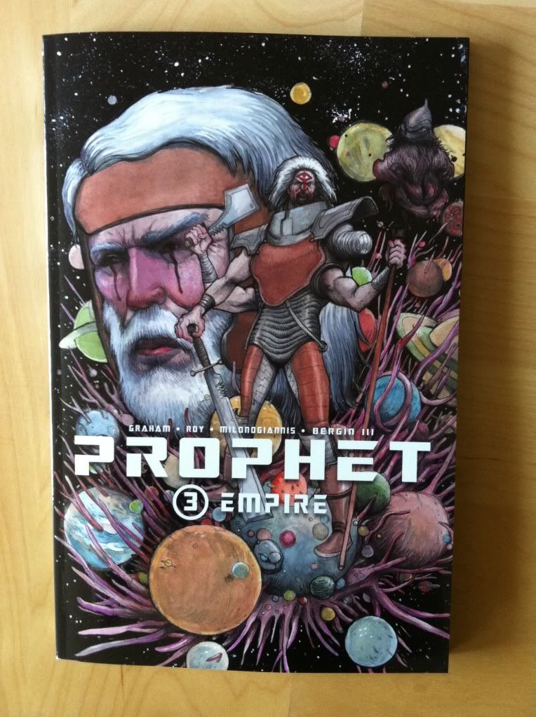
So I Read Prophet: Empire

A 250 word (or less) review of Prophet: Volume 3
by Brandon Graham, Simon Roy, Giannis Milonogiannis, Joseph Bergin III; Image Comics


Prophet: Empire continues the streak of Prophet being the most intriguing Science Fiction comic I'm reading. Empire brings the focus back to the Earth Empire and the summit of diverse Johns congregating following the activation of the beacon by the New Father while also touching base with the old man prophet and his counter-Empire team as the series builds momentum towards a cohesive integrated narrative. I've more or less said it all already: Prophet is that rare Sci-fi story that creates a truly alien future filled with challenging and strange concepts, creatures, and adventures and is a comic series filled with truly impressive artwork. It's great comics. But the thing that Prophet: Empire emphasized for me about the Prophet series is that it's kind of totally rad. Like, for all of its elegant designs and thoughtful Sci-fi, a lot of stuff in the series happens mostly because it would be totally cool. And I think this sense of fun is one of the cornerstones of why I like Prophet so much: it's pretty special to read a comic with such an aggressively auteurish sensibility that still manages to take such infectious pleasure in goofy tangents and over-the-top badassery. So, yeah, Prophet: Empire is the newest chapter in the big deal Science Fiction epic that is also totally bitchin'.

Word count: 218

Previously
So I Read Prophet: Remission

So I Read Prophet: Brothers

Friday, 22 November 2013

Deep Sequencing: Prophet Colour Visions

Or some clever use of colour in Prophet: Brothers
By Brandon Graham, Simon Roy, Farel Dalrymple, Giannis Milonogiannis, Joseph Bergin III, Ed Brisson; Image Comics


I am really interested in colouring as a force in comic book art. When done well it breathes a certain life into line art and can add a sense of atmosphere or mood to a composition that the line art alone might not be able to accomplish. When done poorly colouring can be this busy nightmare of rendering and gradients that can completely obscure the beauty of the underlying lineart and all of the depth of the inking. It's gloriously complicated and can alternately really enhance a comic or detract from it in really interesting and significant ways. It's important and I really want to talk about it.

The trouble is, beyond saying its good or bad, I find it really hard to find a substantiative angle on colouring.

The thing is, really good colouring becomes such an organic part of the finished comic that its often hard to point out aspects of the design that stand out or the logic to it. I might be dumb or just not know enough about the art of colourng, but the genius of colours often is too subtle for me, too clever and respectful of the rest of the comic to jump out. It's really only the most obvious, most experimental colouring that I really can write about in any meaningful way. It's like talking about a bassist, it's super important to the music but unless you know a lot about music or playing the base it can be hard to pick out how great it is. (You know, unless it's Geddy Lee doing something crazy.) So despite the dearth of colouring analysis here, I'm appreciate how important it is and try to think about it.

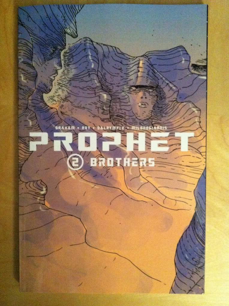
Prophet: Brothers, fortunately, has some really obvious and deliberate colouring that I think maybe lends itself to a discussion of some of the ways colour can affect the atmosphere of the comic and convey extra information.

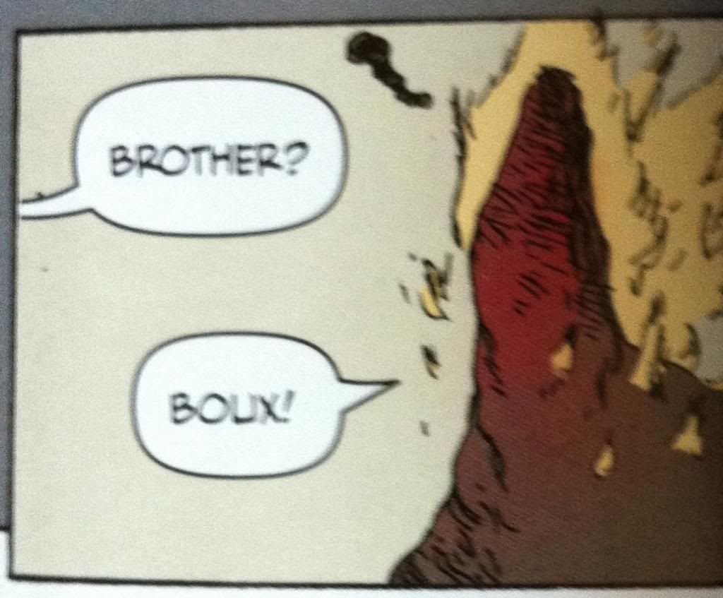
*SPOILERS* for Prophet: Brothers going forward. Proceed at your own risk. Boux!


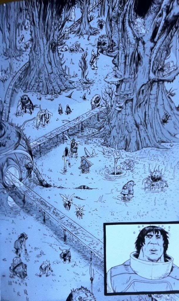
The plot of the chapter of Prophet I want to unpack tells a story about the Prophet guy with a tail, as he attempts to escort the Empire Mother back to Earth Empire space. To get there he and his team must bring the Sister through the Ixtano Circus, a perpetual space battle. Complications ensue and Brother-Tail finds himself taken prisoner on a manufacturing barge, a kind of prison/slave ship. On this ship all prisoners are mind controlled into servitude and this is conveyed to us by colour.


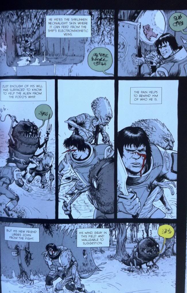
All of the scenes that occur within the influence of the mind control are done in greyscale. This lends these scenes a muted, drab quality distinct from the coloured scenes. It's as if a certain sense has been removed from the comic, colour, which resonates with the mental blanket and lack of full cognitive ability of the Brother-Tail while he is under mind control. And beyond that, the change from colour to greyscale is a terrific visual metaphor for being under mind control: Brother-Tail and our own perception of reality has changed in a way that is expressed on the page. It's unsubtle but pretty smart.


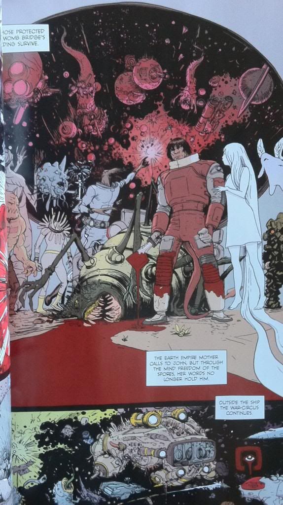
The thing is though, this Prophet chapter continues to use colour in moments that act against the mind control. For instance, when the Empire Mother psychically reaches out to Brother-Tail she brings with her the colour red. This shows that she is able to piece the grey-mind-control-fog to reach Brother-Tail's mind but, given the monochromatic nature of the red, brings another kind of control, another unitary element of control. It is also, I think, a visual signifier of the violence inherent in the Earth Empire's influence: their mental colour is the same as blood.


Another neat colour trick is that the overseer's commands speech bubbles are coloured. This shows that their commands are able to pierce the grey mind control blanket and, based on their colour in a grey-scaled page, become the most striking and important elements on the page and to Brother-Tail. It's simple and it's pretty great.


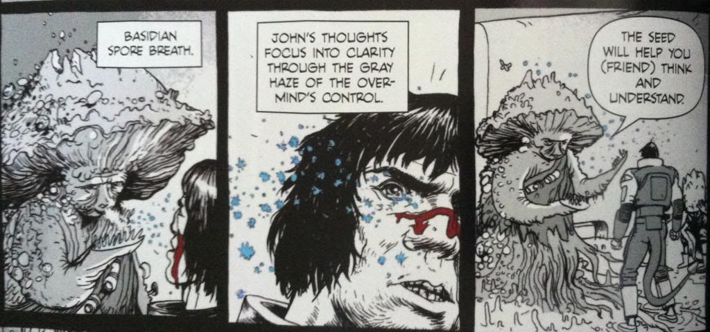
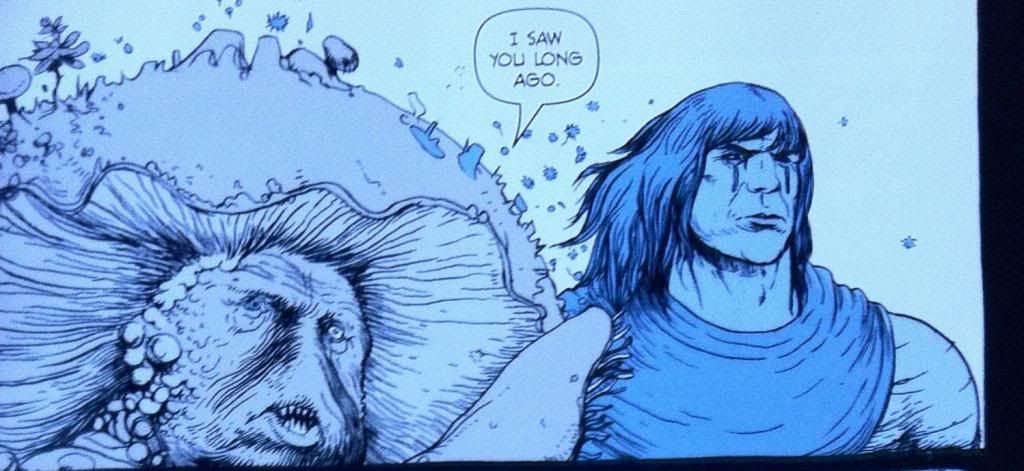
The thing that saves Brother-Tail from mind controlled slavery is encountering Yun-Heath the Basidian, who releases spores that induce an element of mental freedom on those who inhale them. This too is given a colour, the spores as blue motes on a grey background and in one frame shift the colour of prophet into a blue-overlayed greyscale. Again this shows a message that is able to get through the mind fog by adding an element of colour. It is also a great visual metaphor of regaining an element of mental freedom: some colour has returned to the world but not all of it. Again it is pretty obvious but still pretty smart comics.


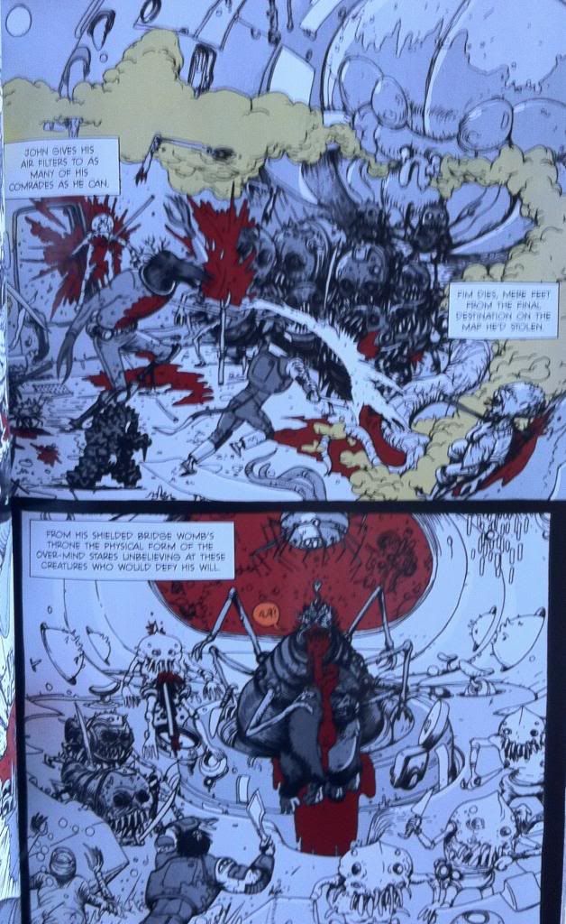
Eventually Brother-Tail and his fellow semi-free slaves rise up against their handlers and fight their way to the Over-Mind, the source of the mental control, to regain their freedom. This battle takes place mostly in greyscale, but certain elements are brought through as colour. Elements like blood and the toxic gas being spouted are coloured red and green respectively. It's as if the pain and the danger of the injuries, violence, and gas are sufficient to cut through the slave conditioning and awaken some basic Prophet survival mechanism that helps get Brother-Tail through the conflict. It also looks pretty darn cool.


And eventually Brother-Tail and company kill the Over-Mind and regain their mental freedom which returns normal reality to the characters and colour to the composition.

All in all, it's pretty deliberate and effective use of colour in comics. By using such straight forward and obvious colour choices Team Prophet is able to convey huge amounts of atmosphere and some pretty key story information visually. It made this chapter so much more engrossing and evocative than it would have been if it were coloured normally, or left black and white. Or, to put it another way, the colour was the visual effect that elevated the magic of the story above what it would have been otherwise. It's pretty great comics.

The thing is, good colouring is doing these kinds of things constantly in a way that is much less obvious and easy to talk about. It's always there tweaking the mood, providing extra visual information, and subtly improving the comic. It's there and when it's great, like in Prophet: Brothers, it's kind of magic.

Wednesday, 20 November 2013

So I Read Prophet: Brothers

A 250 word (or less) review of Prophet Volume 2
By Brandon Graham, Simon Roy, Farel Dalrymple, Giannis Milonogiannis, Joseph Bergin III, Ed Brisson; Image Comics


This review will contain some mild *SPOILERS* for previous chapters of Prophet. For a *SPOILER* free review go here.


Prophet tells the story of the reawakened Earth Empire as it relaunches its ancient mission of interstellar conquest. It tells of the soldiers, the legion of far-flung John Prophet clone brothers, the insidious psychic Mothers, and the bizarre, alien galaxy in which they operate. Prophet: Brothers continues some of the storylines from the first chapters and focuses on the rebellious Old Man John Prophet as he gathers a fellowship of heroes to fight against the predations of the Earth Empire. Prophet: Brothers is another fantastically weird comic book: it has that magic of presenting truly alien places, and concepts, and people with this utter conviction. Everything feels at once totally real, but also impossibly strange. Which makes Prophet a pretty special work of Science Fiction. It's also worth noting that the art in this comic is gorgeous. Giannis Milonogiannis, who draws the majority of this collection, is just an incredible artist and storyteller. As weird and wonderful as the story of Prophet is, the artwork in Prophet: Brothers is worth the price of admission alone. In many ways Prophet as a series functions as an art book as much as a critically acclaimed Science Fiction comic story. Incidentally, Prophet: Brothers also adds a sense of continuance to the Prophet series: it really establishes the wildly different story threads of Prophet: Remission as elements of a single narrative with a unified purpose. The series is clearly going somewhere. Prophet: Brothers is a must read comic in a must read series. Boux!

Word count: 250

Previously
So I Read Prophet: Remission

Wednesday, 30 January 2013

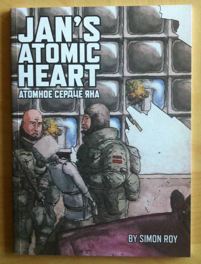
So I Read Jan’s Atomic Heart

A 250 word (or less) review of the Jan’s Atomic Heart comic
By Simon Roy, New Reliable Press


Science fiction, at its atomic heart, is about nifty futurist ideas bootstrapped to a compelling fictional story. A good piece of science fiction pops with dozens of great concepts that are elaborated to the reader as the story progresses. Great Sci-fi immerses you in a different world where you are expected to piece together the futurisms on display through inference instead of instruction. Jan's Atomic Heart is an example of this kind of great Sci-fi. Jan's Atomic Heart is about a man, Jan, who finds himself in a temporary robotic body after his real body is destroyed in a car accident. He learns that his new robotic body is the same model used as mobile bombs by terrorists and begins to worry that he too is a bomb. Jan’s Atomic Heart is a beautifully rendered comic with a compelling story with some great futurisms and twists. The comic, for being a fairly short story, also does a huge amount of world building. Roy brilliantly works in small peripheral details and snippets of tangential dialogue - a panel here, a panel there - that manage to convey the stories environment and broader context without distracting from the main plot and characters. It's a pretty great technique for packing in setting detail without losing too much page real-estate. Jan's Atomic Heart is a brilliant Sci-fi book and well worth checking out if you can find it.

Word count: 234

Wednesday, 2 January 2013

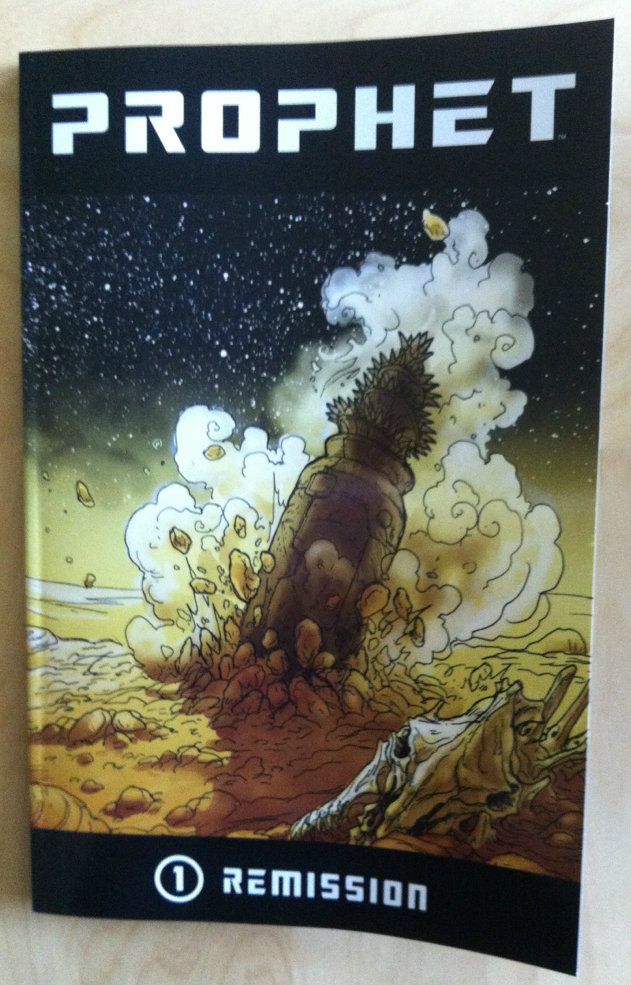
So I Read Prophet: Remission

A 250 word (or less) review of the first collected Prophet trade
By Brandon Graham, Simon Roy, Farel Dalrymple, and Giannis Milogiannis. (and Emma Rios.)


Prophet is a reboot of an old Rob Liefeld book that was essentially about an astronaut-barbarian, which is all you need to know about that since this new Prophet is radically different. Under Graham Prophet is a high concept science fiction epic about, well, something intriguingly enigmatic at this point. The story opens in the future, thousands of years after the fall of something called the Earth Empire, on an Earth made into a hostile alien wilderness by time. The plot revolves around a man named John Prophet as well as other agents of the fallen Earth Empire as they carry out missions to reinstate the Earth Empire. I think my favourite thing about Prophet is the pervasive strangeness of it. The worlds that the writers and artists of Prophet create are at once immense and granular and believable but also bizarre and radically different than anything we have experienced. The aliens in Prophet are, well, alien: they look, interact, and behave in ways that are fundamentally not human. Better yet, even the human, relatable characters are slowly revealed to deviate widely from our social norms. It’s a refreshing thing in Sci-fi when you are confronted with the truly strange. The artwork in Prophet: Remission is every bit as great as the neat concepts and intriguing story. Every one of Prophet’s rotating artists is fantastically talented, and brings a slightly different dynamic and character to the work and builds upon what the last artist did. Remission is a must read.

Word count: 250

Previously:
So I Read King City