Or the under-appreciated art of comic book spines
Book spines are, I think, the
most overlooked component of book design in collected editions of comics. Whether because of all the emphasis placed on cover pages or the comic industry's infatuation with staple bound invertebrate single issues, comic spines don't generally get the love they deserve. Which is a shame, because in most settings, be they home bookshelf or retail bookshelf, the comic spine is the only part of the comic visible. Ignoring this portion of the comic's exterior hurts a print comics value as an art object (which I think is one of the key value-added features of the print format) and probably has an adverse effect on a comics retail performance.
Paying attention to it can make comics look great and stand out from the crowd.
When dealing with long comics series in collected editions, I think one of the key design choices that can really improve the look and visual impact of a series is a unifying design. By tying individual books together with common elements, a series gains an identity and becomes instantly recognizable as an aggregated whole. Generally, one of the keys to this seems to be choosing a few colours to give the comics a harmonious relationship. By wildly varying spine colours, you can pretty much ruin the look of a series.

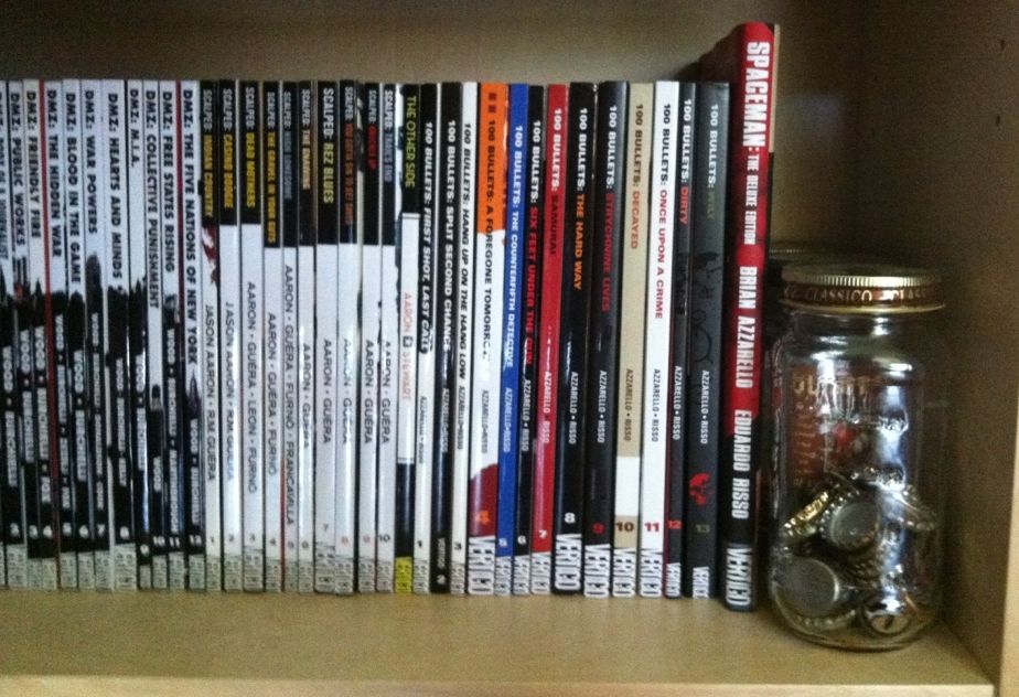
100 Bullets, by Brian Azzarello and Eduardo Risso, is a fantastic crime comic about the opportunity to avenge injustice wrapped in a grand conspiracy. The interior of the comic is gorgeous, absolute brutality drawn with precise elegance by Risso, and the covers of the series (including these collections), by Anthony Johnson, are perfect. That said, the spines of this series are terrible. It seems the choice was made to make the spines of the 100 Bullets collections entirely dependent on cover art, which makes the spines lack identifiable common elements or common colours. When put next to the clean, unified design of
Scalped, or
the brilliant design of
DMZ, 100 Bullets looks like a mess of random comics instead of a lovingly appointed series. And I think it's shelf presence suffers for that.
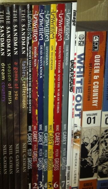
The Unwritten, by Mike Carey and Peter Gross, is a great comic about the power of literature to affect society and people with the bourgeoning power to tap into it. The Unwritten is also another comic with great interior art and superb covers, by Yuko Shimizu, but poor spine design. The Unwritten makes that fairly common mistake of giving each edition its own colour to make a rainbow effect. The problem is that this breaks up any cohesion over the entire series and doesn't really tell us anything about the identity of the Unwritten. Varying colours like this is almost never the best choice.
But like all rules there are exceptions.
Scott Pilgrim and
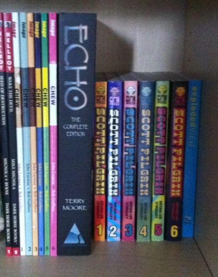
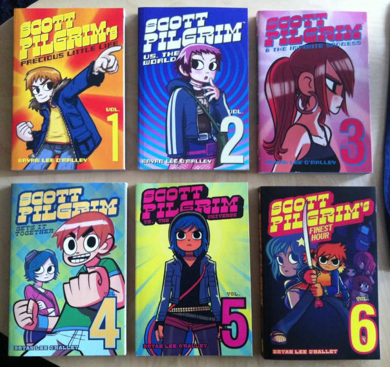
Chew are two comics that absolutely break what common sense suggests is good book design. They use bright, obnoxious colours that change and clash between books. And while they do maintain common elements between books (Chew's cutout and Scot Pilgrims weighty logo), their overall look is just garish as hell. The thing is, this WORKS for these comics. Chew, by John Layman and Rob Guillory, is an insane comic about people with mental food powers solving ridiculous food crimes: the plot is crazy, the art is bombastic and cartoony, and the aesthetic of the book is frankly pretty garish. So a cover spine design that clashes between issues and uses bright, cartoony colours completely sells the identity of the book. Similarly Scott Pilgrim, by Brian Lee O'Malley, also has a cartoony look and bombastic style. Scott Pilgrim is a comic about being brave enough to love while being an adrift 20-something, and has a style influenced by manga and 1990's video games that is just really inviting and fun. The spines of the Scott Pilgrim books, with their garish bright colours, manga-ish book size, and pixelated logo font absolutely evoke the visual identity of the book. What I am saying, basically, is that these comics, by having insane cartoony spines, are able to convey their visual identity instantly. And that is, I think, the core of book design.
Previously:
Spinal Tapestry 1
Spinal Tapestry 2