Showing posts with label Ed Brisson. Show all posts

Friday, 25 September 2015

Deep Sequencing: The Rodent Royalty Line Of Succession

Or a look at the art hand off in Rat Queens Volume Two
by Kurtis J Wiebe, Roc Upchurch, Stjepan Sejic, and Ed Brisson; Image Comics


When it comes to comics I think there are two essential, but opposing truths: the very soul of a comic book is indelibly linked to its artist, and it is really difficult logistically for a single artist to indefinitely draw a monthly comic book. This often leads to a conflict between what makes for the best reading experience and the production cycle of a comic. Often this conflict is handled in systematic ways: delays between chapters for an artist to catch up, or alternating artists between distinct episodes in a story where art hand offs are a feature. Sometimes, though, due to unfortunate circumstances, art changes have to occur within a story, which risks the visual style and, in my eyes, the very identity of a comic.

Rat Queens had one of these hand offs, and I think it's instructive how it went.

There may be *SPOILERS* for Rat Queens Vol. 2 below.


Rat Queens Vol. 2 tells a single concrete story about vengeance and consequences and the eponymous Rat Queens facing off against the latest threat to shadow fair Palisade. Every chapter in the comic is meant to follow directly into the next and there is no in story reason for their to be substantial shifts in the artwork between chapters. Or, in other words, there isn't a creative reason within the comic to swap artists. 

That said, sad real life stuff meant that a change in artist was needed midway through Rat Queens volume two. The first chapters were drawn by Roc Upchurch, the series regular artist and co-creator of the Queens. Following his departure, the comic was taken over by Stjepan Sejic. And I think, given the circumstances, this creative change was handled exceedingly well.


While no two artists are ever completely interchangeable, since, you know, artists are actual human beings and not soulless art machines, I feel that Upchurch and Sejic have highly complementary styles. Both artists are quite skilled at facial acting and employ a highly painted style that emphasizes light in their composition. This means that the trademark character work the series relies on is well served by either artist. It also means the colours, which I think are under appreciated for their ability to impart a distinct visual tone and identity, do a really good job bridging the change and maintaining a consistent feel.  I mean, there are still obvious differences: Sejic uses bolder inks and a more photo-realistic style than Upchurch, but to my eyes I think the two artists share a common aesthetic while working on Rat Queens.


And I think this complimentary style really saves Rat Queens Volume 2. What was already a turbulent change in creative team was minimized in the actual comic by being judicious about  the creation of a new team. This meant, essentially that while the people behind Rat Queens changed, the comic itself remained familiar and visually Rat Queens. Which I think was massively important to my enjoyment of the book.

While I still think switching artists, particularly mid story is pretty much never the best creative decision, I think Rat Queens Vol. 2 teaches us that with careful attention to style, disruptions to a comic can be mitigated.

Wednesday, 16 September 2015

So I Read Sheltered

A 250 word (or less) review od Sheltered Vol. 1-3
by Ed Brisson, Johnnie Christmas, Shari Chankhamma; Image Comics


Sheltered is a comic that distills some of the most paranoid and perplexing corners of libertarian survivalism and takes a long, hard look at their potential consequences. In the comic a group of rugged survivalists establish, Safe Haven, a remote settlement of bunkers, stockpiles, and weapons with the intention of hunkering down to survive perceived looming disasters. When Lucas, a charismatic youth, becomes convinced the end times are imminent, he convinces the children of Safe Haven to murder their parents and take control as the only means to survival. Victoria, the rebellious and smart daughter of a recent joiner of Safe Haven, is not included in the plan and is horrified when her father is killed in the uprising. With the children in charge, Lucas must find a way to keep control of his followers to ensure their survival while Victoria will do anything she can to escape and find justice for her father. Sheltered is a comic with an incredibly interesting and incisive premise that is examined with brutal honesty and portrayed with some really adept storytelling and stylish artwork. This is a comic that really exemplifies taking a high concept idea and completely unpacking it in an interesting and fascinating way. And in so doing, Sheltered becomes a kind of definitive story of children raised in a survivalist compound and approaches a kind of ideal. Or, at the very least, manages to be a pretty exciting and entertaining comic.

Word count: 241

Post by Michael Bround

Friday, 3 July 2015

Deep Sequencing: Openings Are Always Cold On The Moon

Or a look at the fantastic cold open n Shutter: Vol. 1
by Joe Keatinge, Leila Del Duca, Owen Gieni, and Ed Brisson; Image Comics


First impressions are important. I mean, ultimately people and stories will be judged by their content, but before all that, they live or die by first impressions. A cover can get someone to pick up a book or comic, a well delivered opening line of prose can hook a reader, and a great opening page of a comic can instantly transport a reader to a fiction world. When first impressions are well made with fiction the reader is invested from the opening moment and bought in to the ongoing story. 

Leveraging first impressions is interesting to me. I mean, it's been more than a year, but "A screaming comes across the sky", the opening sentence of Gravity's Rainbow, still has its hooks in me and captures the spirit of that Matterhorn of prose. Or the opening of Bitch Planet, which is a simple seeming intro that is really a wonderfully layered and granular machine that provides the reader with everything they need to know about the setting and themes of the comic. Or the opening to Shutter which...

...which I want to take a closer look at.

Okay. So Shutter Vol. 1. You open the comic and bam!


This is what you see. The barren, cratered desert of the moon, a field of stars, and a child in retro-sci-fi spacesuit asking to go home like it isn't a big deal on a double page spread. Bam! Pa-Zow!

It's kind of perfect.

Shutter is a comic that plays with the tropes of genre adventure stories in an imaginative, brilliantly crazy world. Ninja ghost assassins led by a steampunk robot riding a chicken-monster-thing have a fight in the middle of a city with police driving flying saucers. Minotaur business men ride the subway to work. Shutter is a comic filled with a riot of wonder that gleefully defies logical rules and begs for us to buy into the fun and mayhem. This double page spread captures the spirit of this perfectly. The cheerfully bright spacesuit, with it's impractical, exaggerated form and child proportions, casually running on the moon is a bold, crazy image. It's an absurd image and, since sending humans to the moon is one of the pinnacles of human technical achievement,  a very powerful one. The huge size of the splash makes it feel huge and impressive and epic. And yet, here is this kid expressing boredom. This is amazing, yet the kid just wants to go home. Which creates the unspoken question: what else is happening in this world that makes standing on the moon seem mundane. I would argue that this doublepage spread, this single image, absolutely nails the spirit of Shutter: we have raw, unadulterated wonder mixed with fantasy, a character jaded by it, and the promise of wilder things to come. Seeing it I instantly had an impression of Shutter and knew I was going to enjoy it. 

So I turned the page again.

And was pleased with what I found.

Shutter Vol. 1 has a brilliant cold open and has a story that lives up to it.

Post by Michael Bround

Previously:
So I Read Shutter

Wednesday, 1 July 2015

So I Read Shutter: Wanderlost

Or a 250 word or less review of Shutter: Vol. 1
by Joe Keatinge, Leila Del Duca, Owen Gieni, and Ed Brisson; Image Comics


There is a certain vein of adventure media from my youth that would pair a dashing adult explorer-type with their kid and send them on amazing quests filled with mystery, magic, horror, and generally impossible things. These stories would always be action packed, but would always turn out alright for the heroes who would learn life lessons and maybe enjoy a wholesome beverage at the end of every misadventure. Shutter is kind of like the comic that wades into this nostalgia-hazed sub-genre and applies real world rules and consequences to this hyper-fantastic world. Which, it turns out, makes for a pretty compelling read! Specifically, Shutter tells the story of Kate Christropher, the only daughter and partner of legendary explorer Chris Christopher, a decade after his death. While she still lives in a fantastic world filled with a cat-alarm clock robot, minotaurs, fairies, UFO police, and a billion other crazy things, she is trying to build a mundane and comfortable life for herself. Except on her 27th birthday Kate is ambushed at her father's grave by ninja ghosts and a steampunk robot and now finds herself the target of assassins and kidnappers working for a mysterious force. Now Kate must return to the life of danger and adventure to survive and confront whoever it is behind these attacks. Shutter is, as I've mentioned before, a compelling read.

Word count: 226

Post by Michael Bround

Wednesday, 4 March 2015

So I Read The Fuse: The Russia Shift

A 250 word (or less) review of The Fuse Vol. 1
by Antony Johnston, Justin Greenwood, Shari Chankhamma, Ed Brisson; Image Comics


I love a good Police Procedural. There is just something about the formula of bedraggled arbiters of justice solving a mystery and bringing the law down on criminals that I just find endlessly watchable. I am also a huge fan of Science Fiction and am of the opinion that most genres can be improved by setting them in space. The Fuse #1 is a detective story set on an orbital power station. Ralph Dietrich, a new detective fresh off the shuttle from Earth, stumbles straight into the crime scene of a murdered vagrant Cabler. Dietrich and Klem Ristovych, a wily veteran murder detective of the Russia Shift, attempt to close the case and find themselves investigating an even larger crime that goes all the way to City Hall. The Fuse: Russia Shift, for what it is, is perfect. The procedural elements are flawless: the mystery is compelling with enough twists to keep it interesting and the detective are charismatically uncharismatic to an ideal. Even more importantly, unlike many police procedurals, The Fuse manages to transcend genre limitations and offer a really empathy filled story that doesn't punch down. Also, it is in space! So if you want to read a really enjoyable genre comic that tells a pitch perfect police procedural story and sets it in a fun Sci-fi setting than The Fuse is a must read. 

Word count: 227

Post by Michael Bround


Friday, 22 November 2013

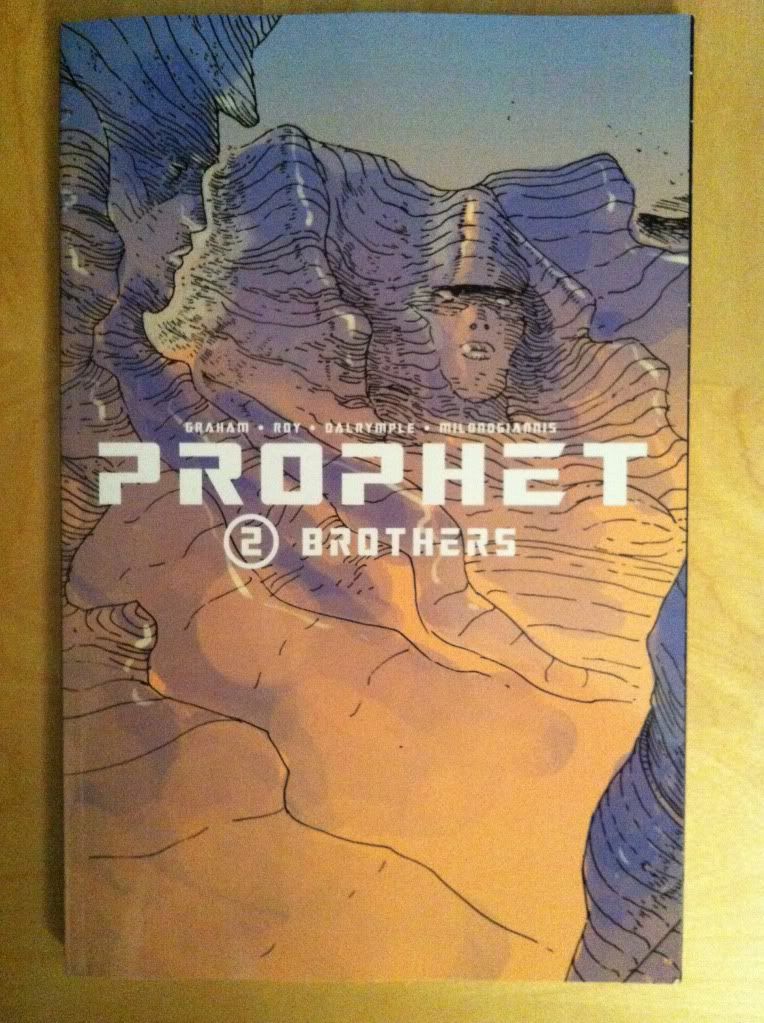
Deep Sequencing: Prophet Colour Visions

Or some clever use of colour in Prophet: Brothers
By Brandon Graham, Simon Roy, Farel Dalrymple, Giannis Milonogiannis, Joseph Bergin III, Ed Brisson; Image Comics


I am really interested in colouring as a force in comic book art. When done well it breathes a certain life into line art and can add a sense of atmosphere or mood to a composition that the line art alone might not be able to accomplish. When done poorly colouring can be this busy nightmare of rendering and gradients that can completely obscure the beauty of the underlying lineart and all of the depth of the inking. It's gloriously complicated and can alternately really enhance a comic or detract from it in really interesting and significant ways. It's important and I really want to talk about it.

The trouble is, beyond saying its good or bad, I find it really hard to find a substantiative angle on colouring.

The thing is, really good colouring becomes such an organic part of the finished comic that its often hard to point out aspects of the design that stand out or the logic to it. I might be dumb or just not know enough about the art of colourng, but the genius of colours often is too subtle for me, too clever and respectful of the rest of the comic to jump out. It's really only the most obvious, most experimental colouring that I really can write about in any meaningful way. It's like talking about a bassist, it's super important to the music but unless you know a lot about music or playing the base it can be hard to pick out how great it is. (You know, unless it's Geddy Lee doing something crazy.) So despite the dearth of colouring analysis here, I'm appreciate how important it is and try to think about it.

Prophet: Brothers, fortunately, has some really obvious and deliberate colouring that I think maybe lends itself to a discussion of some of the ways colour can affect the atmosphere of the comic and convey extra information.

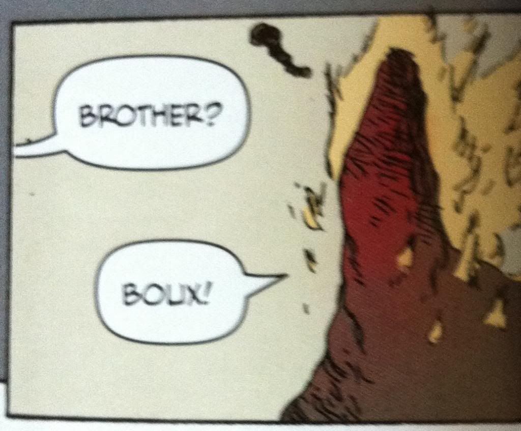
*SPOILERS* for Prophet: Brothers going forward. Proceed at your own risk. Boux!


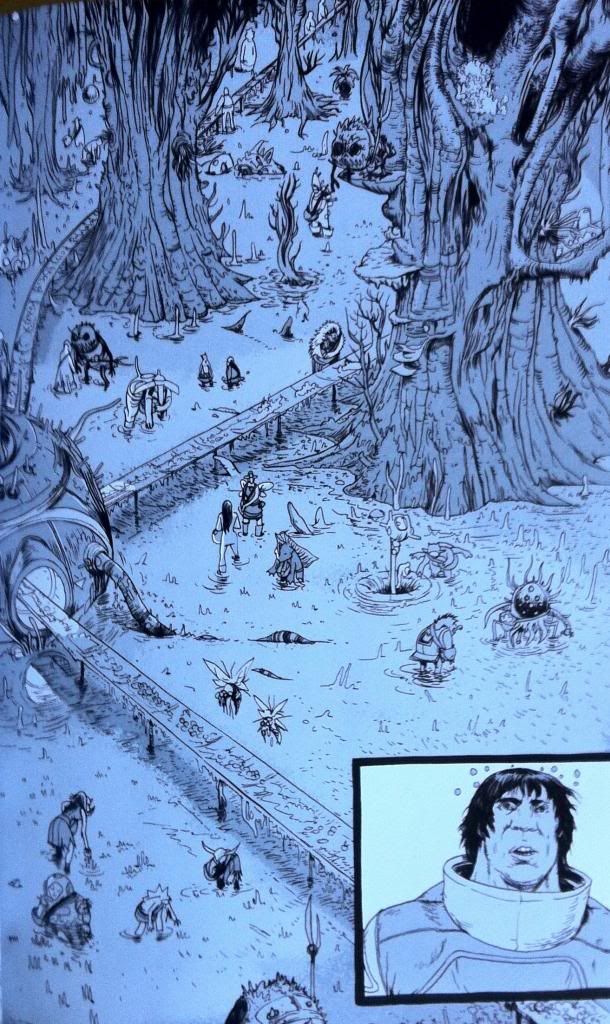
The plot of the chapter of Prophet I want to unpack tells a story about the Prophet guy with a tail, as he attempts to escort the Empire Mother back to Earth Empire space. To get there he and his team must bring the Sister through the Ixtano Circus, a perpetual space battle. Complications ensue and Brother-Tail finds himself taken prisoner on a manufacturing barge, a kind of prison/slave ship. On this ship all prisoners are mind controlled into servitude and this is conveyed to us by colour.


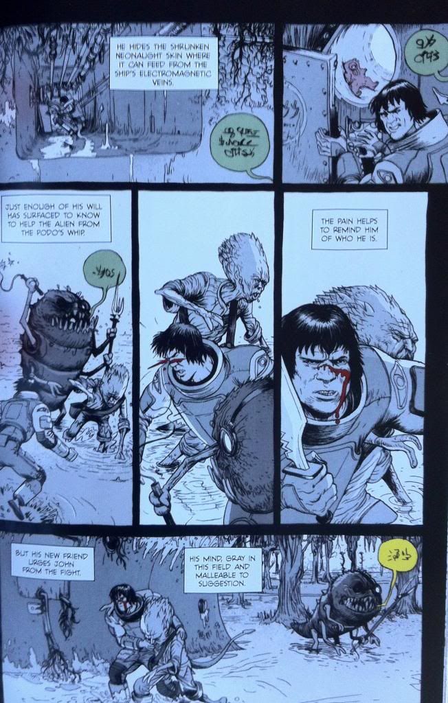
All of the scenes that occur within the influence of the mind control are done in greyscale. This lends these scenes a muted, drab quality distinct from the coloured scenes. It's as if a certain sense has been removed from the comic, colour, which resonates with the mental blanket and lack of full cognitive ability of the Brother-Tail while he is under mind control. And beyond that, the change from colour to greyscale is a terrific visual metaphor for being under mind control: Brother-Tail and our own perception of reality has changed in a way that is expressed on the page. It's unsubtle but pretty smart.


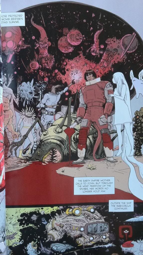
The thing is though, this Prophet chapter continues to use colour in moments that act against the mind control. For instance, when the Empire Mother psychically reaches out to Brother-Tail she brings with her the colour red. This shows that she is able to piece the grey-mind-control-fog to reach Brother-Tail's mind but, given the monochromatic nature of the red, brings another kind of control, another unitary element of control. It is also, I think, a visual signifier of the violence inherent in the Earth Empire's influence: their mental colour is the same as blood.


Another neat colour trick is that the overseer's commands speech bubbles are coloured. This shows that their commands are able to pierce the grey mind control blanket and, based on their colour in a grey-scaled page, become the most striking and important elements on the page and to Brother-Tail. It's simple and it's pretty great.


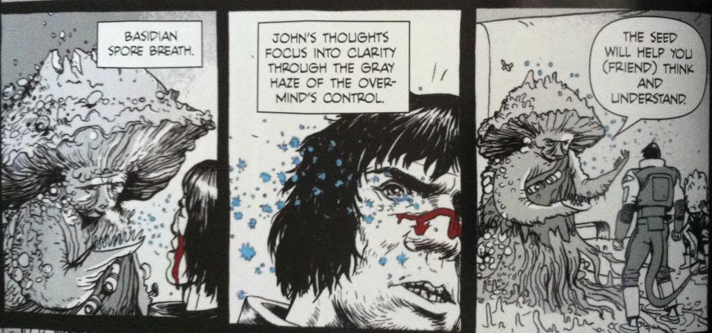
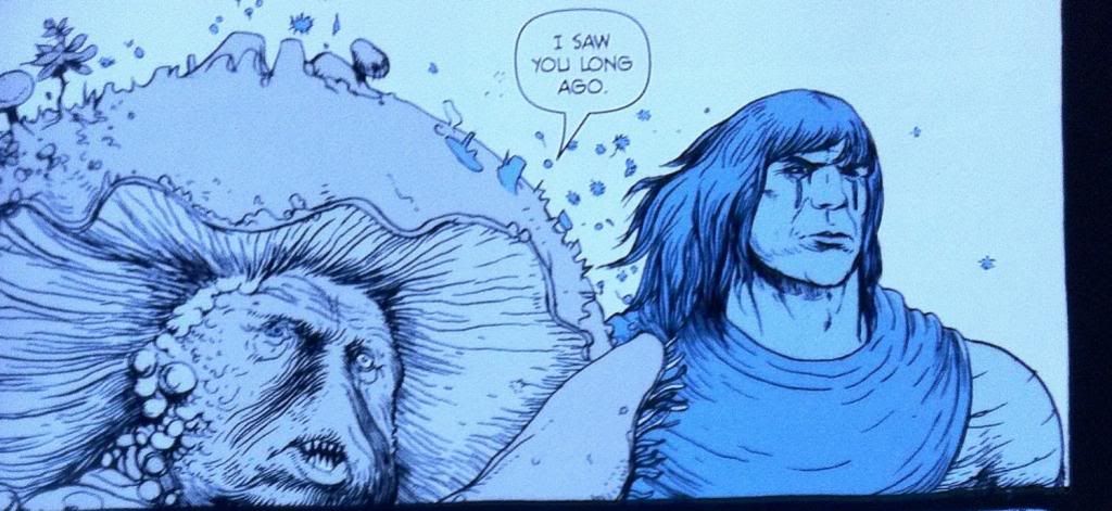
The thing that saves Brother-Tail from mind controlled slavery is encountering Yun-Heath the Basidian, who releases spores that induce an element of mental freedom on those who inhale them. This too is given a colour, the spores as blue motes on a grey background and in one frame shift the colour of prophet into a blue-overlayed greyscale. Again this shows a message that is able to get through the mind fog by adding an element of colour. It is also a great visual metaphor of regaining an element of mental freedom: some colour has returned to the world but not all of it. Again it is pretty obvious but still pretty smart comics.


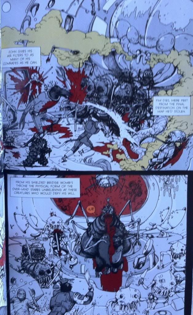
Eventually Brother-Tail and his fellow semi-free slaves rise up against their handlers and fight their way to the Over-Mind, the source of the mental control, to regain their freedom. This battle takes place mostly in greyscale, but certain elements are brought through as colour. Elements like blood and the toxic gas being spouted are coloured red and green respectively. It's as if the pain and the danger of the injuries, violence, and gas are sufficient to cut through the slave conditioning and awaken some basic Prophet survival mechanism that helps get Brother-Tail through the conflict. It also looks pretty darn cool.


And eventually Brother-Tail and company kill the Over-Mind and regain their mental freedom which returns normal reality to the characters and colour to the composition.

All in all, it's pretty deliberate and effective use of colour in comics. By using such straight forward and obvious colour choices Team Prophet is able to convey huge amounts of atmosphere and some pretty key story information visually. It made this chapter so much more engrossing and evocative than it would have been if it were coloured normally, or left black and white. Or, to put it another way, the colour was the visual effect that elevated the magic of the story above what it would have been otherwise. It's pretty great comics.

The thing is, good colouring is doing these kinds of things constantly in a way that is much less obvious and easy to talk about. It's always there tweaking the mood, providing extra visual information, and subtly improving the comic. It's there and when it's great, like in Prophet: Brothers, it's kind of magic.

Wednesday, 20 November 2013

So I Read Prophet: Brothers

A 250 word (or less) review of Prophet Volume 2
By Brandon Graham, Simon Roy, Farel Dalrymple, Giannis Milonogiannis, Joseph Bergin III, Ed Brisson; Image Comics


This review will contain some mild *SPOILERS* for previous chapters of Prophet. For a *SPOILER* free review go here.


Prophet tells the story of the reawakened Earth Empire as it relaunches its ancient mission of interstellar conquest. It tells of the soldiers, the legion of far-flung John Prophet clone brothers, the insidious psychic Mothers, and the bizarre, alien galaxy in which they operate. Prophet: Brothers continues some of the storylines from the first chapters and focuses on the rebellious Old Man John Prophet as he gathers a fellowship of heroes to fight against the predations of the Earth Empire. Prophet: Brothers is another fantastically weird comic book: it has that magic of presenting truly alien places, and concepts, and people with this utter conviction. Everything feels at once totally real, but also impossibly strange. Which makes Prophet a pretty special work of Science Fiction. It's also worth noting that the art in this comic is gorgeous. Giannis Milonogiannis, who draws the majority of this collection, is just an incredible artist and storyteller. As weird and wonderful as the story of Prophet is, the artwork in Prophet: Brothers is worth the price of admission alone. In many ways Prophet as a series functions as an art book as much as a critically acclaimed Science Fiction comic story. Incidentally, Prophet: Brothers also adds a sense of continuance to the Prophet series: it really establishes the wildly different story threads of Prophet: Remission as elements of a single narrative with a unified purpose. The series is clearly going somewhere. Prophet: Brothers is a must read comic in a must read series. Boux!

Word count: 250

Previously
So I Read Prophet: Remission