Wednesday 29 April 2015

So I Read The Unwritten: The Unwritten Fables

Or a 250 word (or less) review of The Unwritten Vol. 9
by Mike Carey, Bill Willingham, Peter Gross, Mark Buckingham, Steve Leiahola, Inaki Miranda, Russ Braun, Dean Ormston, Chris Chuckry, Todd Klein; Vertigo Comics


This review is on part of an ongoing series. For a *SPOILER* free review of the first issues go here. But, this comic has like, nothing to do with the series proper, so you should be fine to read the review.


Once upon a time I read a pretty big chunk of Fables, something like the first 7 trade paperbacks. I found them endlessly charming, filled with adventure and romance and just enough tragedy. I remember this time fondly and have always meant to get back to the series. But, man, judging from The Unwritten Fables, Fables proper has gotten fucking bonkers. The Unwritten Fables is a crossover comic between The Unwritten and Fables, two comics that have no real overlap. In the comic, Tom Taylor, the maybe-a-fictional-boy-wizard hero of The Unwritten is waylaid by the fables of Fables and drafted into their war against Mister Dark, AKA the Bogeyman. Tom Taylor is transformed into his boy-wizard-self and, along with the desperate surviving Fables, mounts a last, cataclysmic stand against their all-powerful foe. And this comic sucked. If you read this blog, you know I try to be nuanced in my criticism, but this comic is a creative failure.  It fails as an Unwritten story since the story doesn’t advance the series plot. It better have failed as a Fables story, or been a what-if for that series, because it's fucking bonkers. It fails as a crossover because the comic lacks all the smart nuance of the Unwritten and the charm of Fables. I cannot imagine picking this comic up, as a fan of either series, and being tempted to try the other title. The art was frequently terrible and rushed.  This chapter feels like a betrayal of long-term Unwritten readers.

Word count: 250

Post by Michael Bround


Tuesday 28 April 2015

Light Is A Good Book

Or why you should read Light,
by M John Harrison


The synopsis on the back of Light sets up a mystery about a human skeleton,  a pair of bone dice, and abandoned spacecraft on an asteroid beneath the Kefahuchi Tract and suggests the novel will explain what these objects are doing there. Light itself, though, really functions as three distinct and largely separate stories about broken horrible people that eventually culminate in the scenario described. The first story is about Michael Kearney, a computer scientist trying to produce the first quantum computer who also happens to compulsively murder women in a bid to escape The Shrander. The second story follows Seria Mau Genlicher, a young K-ship captain and rogue on a quest to open a package belonging to a mysterious Dr. Haends. The final story is about Ed Chianese, a tank addicted twink out of money, time, and luck who is on the run from the Cray Sisters and the enigmatic Sandra Shen. The three stories, despite being set in radically different times and spaces, thematically weave together a larger story about the depths and lengths people will go to when haunted by their demons.

Light is a fractured thing, functioning at once as a horror story set in contemporary London, a space opera set in the farthest reaches of the Kefahuchi Tract, and a cyberpunk noir set in the squalor of the slums of New Venusport. It is a rich and eclectic mix of genres that at once feels daring, intellectual, and schizophrenic. Which is really a feeling that permeates the novel: the various protagonists of Light are all bold, compelling, and horribly flawed people. Michael Kearney is clearly brilliant and charismatic but also dangerously insane while Seria Mau is a cold blooded murderer who is also a traumatized girl suffering from profound dysmorphia and Ed Chianese is a compassionate junkie with the amorality of someone with nothing left to live for. It is a cast that is at once charming, despicable, and pathetic. Which is really what Light was for me: a very winning novel that was intellectually challenging and soul-soilingly dark. 

But damn if it wasn't compelling to read.

I would recommend Light to any mature reader looking for something bizarre and genre. Light  plays with a lot of familiar genre elements in really deft and creative ways and creates an interesting and original world. Even as a stalwart Sci-fi reader this book felt fresh and new. But it was also a dark and twisted read filled with horrible people doing dubious and down right awful things. This is not a feel good story or one suited to young readers. It's worth reading, but get ready to want a soul shower at the end of it.

Monday 27 April 2015

Deep Sequencing: Zero Atlas

Or a geographic plot map of Zero Vol. 1-2
by Ales Kot, Michael Walsh, Tradd Moore, Mateus Santolouco, Morgan Jeske, Will Tempest, Vanesa R Del Rey, Matt Taylor, Jorge Coelho, Tonci Zonjic, Michael Gaydos, Jordie Bellaire, and Clayton Cowles; Image Comics


One of my favourite comic things is when a comic rigorously annotates time, date, and location. I think it adds a level of reality to the narrative that makes the comic feel much more authentic. It also means I can take the times, dates, and locations and make annotated plot maps! Zero is a globe trotting Sci-fi espionage comic that lends itself to making a plot-atlas. 

I guess there are kind of *SPOILERS* in it.

This version includes events in Zero Vol. 1 and 2. Click on the image for a larger version of the Zero plot-atlas. 


Previously:
So I Read Zero: Vol. 1
So I Read Zero: Vol. 2

Deep Sequencing: Brutal Action
Deep Sequencing: Gun fight!

Friday 24 April 2015

Deep Sequencing: The Firefight at the heart of it all

Or the fantastic gun play in Zero Vol. 2
by Ales Kot, Jorge Coelho, Jordie Bellaire, Clayton Cowles; Image Comics


Zero is the transgressive, Sci-fi espionage comic that bleeds sincerity. It is also a showcase comic where a rotating cast of artists work with writer Ales Kot and legendary colourist Jordie Bellaire to make comics magic happen.  Every chapter of Zero is its own, interesting world with a distinct style and some aspect of comics storytelling done impeccably. Zero: Vol. 2 is no exception and the chapter drawn by Jorge Coelho has what might be the best gunfight I've read in comics. Specifically, there is a certain pair of pages that I think really showcase wha makes this chapter of Zero so special.

There will, as always, be *SPOILERS* below.


The thing about a firefight with multiple gunmen is that they are not linear, clear events. There are numerous participants, all moving through cover, trying to out position one another and gain an unexpected angle of attack. Every armed person can kill at range. Bullets can pass through unexpected barriers, or ricochet and careen,  wounding and killing in unpredictable ways. Basically, firefights are fluid, chaos situations that are composed of staccato moments of terror. 

I think this layout here absolutely captures the chaos, fluidity, and terror of a firefight perfectly. The chopped, quick panels that focus on consequences, the multiple interspersed narratives, and the sheer speed of the page make for a truly visceral and exciting experience.  It is, purely on the surface, awesome comics.


The thing that elevates this sequence for me even more is that I am still not entirely sure what the correct reading order is for these pages. I think you can read the pages either left and then right, or altogether as a double page spread, and be able to draw out a reasonably equivalent narrative experience. Or at the very least a logical chain of events. Whether this is intentional, or a side effect of me being a dummy, what this does for me is make the pages so much more chaotic and fluid, this firefight is so slippery that it defies an obvious reading order. And I think that is amazing comics, and such a great thing that I hope it was on purpose.

I love this sequence so much.

It's also a emblematic of the kind of comics discoveries that can be found in Zero. It's a great comic to be floored by something unexpected in.

Previously:
So I Read Zero: Vol. 1
So I Read Zero: Vol. 2

Deep Sequencing: Brutal Action

Wednesday 22 April 2015

So I Read Zero: At The Heart Of It All

A 250 word (or less) review of Zero Vol. 2
by Ales Kot, Vanesa R. Del Rey, Matt Taylor, Jorge Coelho, Tonci Zonjic, Michael Gaydos, Jordie Bellaire, Clayton Cowles; Image Comics


This review is for an ongoing series and will have *SPOILERS*. For a clean review of Zero go here.


Zero is a remarkably interesting comic. From a story perspective Zero is a transgressive, brutal, and charmingly peculiar espionage comic. In Volume 1 we learned about Edward Zero and his childhood of conditioning, some of the terrible things he has been commanded to do, and the disastrous mission that killed the love of his life. In At The Heart Of It All we see the consequences of this as Agent Zero becomes unmoored and everything spirals out of control. From a more mechanistic perspective Zero Volume 2 works as a series of loosely connected stories designed to forward the overall narrative and also showcase a diverse group of hyper-talented artists. What this means is that every chapter of At The Heart Of It All is distinct and that the comic reads as a great infiltration comic and then a perfectly designed tale of betrayal and then the best fire fight I've ever seen portrayed before two chapters that are absolutely heart rending. Zero: At The Heart Of It All is a patchwork of different styles and tones, but each and every one of them tells a great story and is remarkably constructed comics you should be reading. I really can't wait until I can read the next chapter.


Word count: 208

Post by Michael Bround

Previously:

Tuesday 21 April 2015

A Canticle For Leibowitz Is A Good Book

Or why you should you should read A Canticle For Leibowitz by Walter M Miller Jr.


There is a wonderfully cliched saying that those who fail to understand history are doomed to repeat it. Inherent to this idea is the hope that people can learn from the mistakes of the past and progress past them. That things can get better. The trouble is, human history, depending on how you look at it, is filled with cycles of destructive stupidity. Which begs the question: is there something inherent to humanity and its societies that leads to these cycles of progress and destruction? Is it even possible to escape the roundabout nature of our history?

A Canticle For Leibowitz explores these ideas through the institution of the Catholic Church, possibly the most enduring institution in human history. The novel takes place in a post-nuclear war apocalypse and centres on the Abbey of the Albertian Order of Leibowitz, a monastery in the desert wilds of what was once the American Southwest. The Order of Leibowitz is an order of monks founded to preserve pre-apocalypse knowledge and to protect relics of the past. A Canticle For Leibowitz has three discrete phases which map the shape of human history. Fiat Homo, part I, takes place firmly in the dust of the lawless dark ages and tracks the story of the beautification of Leibowtiz in a rudimentary time of poverty. Fiat Luxe, the second part, is set hundreds of years in the future and is set in a time of burgeoning empires and the first signs of intellectual enlightenment and tells a story of scholastic exchange. Fiat Voluntas Tua, the final act, is set yet another few hundred years later in an advanced future of continental superpowers locked in a cold war with the weapons of Armageddon and focuses on the church's plan to escape the cycle of history.

A Canticle For Leibowitz is another great thought experiment Science Fiction novel that makes masterful study of its themes of the cycle of history and the tensions between the secular and religious world. It is absolutely a classic work of Sci-fi. As such, I would recommend this book to any fan of the genre. I'd also suggest that it is another essential read for anyone who considers themselves serious Science Fiction readers. It's a great, timeless book, that you should read.

Monday 20 April 2015

Atoll Comics: Round 19

Or changes to my Top-Ten comics

Due to my spouse seeing how much I spend on comics and an urge to buy better comics, I have decided to be super-selective about which superhero comics I read. Harnessing the Awesome Power of Maths, I have determined that I can afford to read 10 ongoing titles. So I get to read 10, and only 10, titles published by either Marvel or DC as well as one trade paperback a week of my choosing.


A complication of this is that I am forced to drop an on-going title if I want to try reading a new on-going title, an act of very tough love. Being financially responsible is the worst.

I will be adding The Unbeatable Squirrel Girl and dropping She-Hulk.


Why The Unbeatable Squirrel Girl: Because it's Unbeatable, obviously. Why fight something that can't be beaten? That's just stupid. But really, it's delightful. TUSG #1 portrays a world where Doreen Green, Squirrel Girl, is going to college and thus must create a secret identity for herself as an Ordinary Person. And so she moves out of her "secret apartment" in the attic of the Avengers Mansion and into her college dormitory with Tippy-Toe her number-one squirrel.  Hijinks and super crime ensues, like it does. Squirrel Girl is a comic that I'm invested in reading because of how relentlessly fun it is. It's just, look, Squirrel Girl is inherently kind of ridiculous, and this is a comic that celebrates the joy, absurdity, humour, and well, whimsy of the character in a really charming way. I'm the kind of person who can get caught grinning like an idiot at sufficiently delightful things, and The Unbeatable Squirrel Girl made my face ache with gormless smiles. It's smiling kryptonite (in that it admits smiling radiation, not that it kills smiles... okay maybe this was an imperfect analogy...). I guess, what it boils down to is, sometimes I just like nice things and TUSG is pretty much the crystal statue of a unicorn surfing of nice things. You should read it.


Why not She-Hulk: Because court is adjourned. She-Hulk has pled her case, made her closing remarks, and verdict is in and now the jurors get to go home. Or to put it another way, the current incarnation of the comic has ended. I have pretty mixed feelings about this too! She-Hulk delivered a great comics experience: authentic, engaging crime procedurals, sprinkled with just enough superheroics, and drawn in super stylish, dynamic artwork. I will miss it in my monthly comics purchase pile. But, it also got to tell a complete story, and I kind of love when comics get a chance to tell closed, satisfying stories in serial formats. Endings are sad, but also deeply important to the experience of fiction. Also, as great as She-Hulk was, it was also VERY idiosyncratic, and while I enjoyed it a lot, I feel like the premise may have had a limited lifespan for me, so maybe it's better that She-Hulk told a great, but closed story. There is one thing that cannot be legally refuted though: She-Hulk was good comics.

Friday 17 April 2015

Sussing Spider-Woman #6

Or a look at a panel using layered narratives in Spider-Woman #6
by Dennis Hopeless, Javier Rodriguez, Alvaro Lopez, and Travis Lanham; Marvel Comics


Spider-Woman continues to be a pretty fun comic featuring some pretty impressive comics. The story of Jessica Drew as a down-on-her-luck private investigator looking into the kidnapping of d-list villain's families is charming. Like, riffing on City Llamas levels of charming. Spider-Woman also continues to be a comic that showcases some really clear, adroit storytelling that does some interesting things. And there is one panel in particular that I want to take a closer look at.

There will be *SPOILERS* for Spider-Woman #6 here.


The story of the sequence here is that Jessica Drew confronts Mister Luck, who has just held up the Chicken Top fast food restaurant, in an effort to learn who has been kidnapping the loved ones of supervillains. Mister Luck, not appreciating the questions, spins his dynamo/roulette wheel thing which charges up his glove-blaster things. So while the wheel is spinning, Spider-Woman springs to action and incapacitates Mister Luck before his wheel stops spinning. Which is a pretty straightforward bit of story.

What impresses me here is how well Team Spider-Woman sells the action-packed moment of combat here and the really interesting comic machinery that makes the panel work.


The magic of this page, for me, is how it layers multiple narrative paths of action into the same panel. This approach packs in the narrative information and really hammers home the feeling of a flurry of activity happening in a single moment. Which makes for a chaotic feeling panel that is still very clear and easy to read. It's pretty smart stuff.

The lynchpin of this effect, I think, is the inclusion of the spinning dynamo/roulette wheel across the page. The importance of the wheel in the action panel is set up in the top row of panels which emphasize the spinning wheel as a key feature of the situation. This choice helps draw attention to the wheel in the busier main panel and helps make it one of the viable narrative paths through this page. The bright blue, green, and yellow colours of the wheel on the mostly red page also plays an important role in drawing the reader to the spinning wheel. If the reader takes the bait, the spinning wheel and its sound effect provide a reading path through the page, with the wheel's carnival arrow pointing the way. When read this way, with the dynamo/roulette wheel as the focus, this sequence emphasizes the timeframe of the action and makes the fighting a blur of motion around the slowing clock. Which was the really cool way I first read through the page.


While I think the spinning wheel might be the dominant way to move through the page, there are two other plausible pathways established by the artwork. If one focuses on the characters, there is a route through the page established by the heavy black limbs of Spider-Woman's costume. In this case we are drawn along her arm, through her body, and down into her slam motion. This provides a very quick frictionless way to read the page and encodes time with the multiple posses of the characters within the single snapshot of the panel; Jessica moves to fast to be caught in one position by the "camera". The other plausible path is one shaped by the lettering. If you were to read the text of the page first, you would enter in the top right, cruise the sound effect and then find through the motion and onomatopoeia of the page in another clear route. This route is also noteworthy in that it emphasizes speed with it's quick path and in the way the fairly short dialogue is broken across the sequence and motion of the panel. When combined with the wheel path, this gives the page three built in routes through the panel.

I think this is a really exciting choice. I would argue that the reader is forced to engage with all three of these narrative paths to fully experience the story. This basically triples the information packed into a single unit of story-time, which creates the sense that a massive amount of activity is happening very quickly. It also, while giving clear narrative paths, creates a certain sense of chaos and wildness to the panel which makes it really fun to read. This is fantastic comics.


Another element I really like about this page is how the vectors of motion interact with the reading paths to make the action feel very dramatic and impactful. Spider-Woman punches right-to-left and then slams Mister Luck straight down into the table. This is pretty cool in that it places the direction of the punch *against* the left-to-right reading paths which makes this punch feel unexpected and brutal. What's more the the downward table slam follows the reading paths which makes it feel fast until it abruptly slams into the table where all the reading paths jog to the right corner. Which, of course makes this motion feel like a rapid slam and bone-crunching smash. Again this uses the reading paths and direction of motion to really drive home the brutality and feeling of the action. It's great composition.

This is a really superlative panel of comics and while I think it is the best example in Spider-Woman #6, it's really representative of the quality and excitement of the whole comic. Spider-Woman, with this creative team, is certainly worth checking out.

Previously:
Spider-Woman #5: Character Design and composition

Wednesday 15 April 2015

So I Read Satellite Sam Volume 2

A 250 word (or less) review of Satellite Sam and the Snuff-Fuck Kinescope
by Matt Fraction and Howard Chaykin; Image Comics


This review contains *SPOILERS*, for a clean review of Satellite Sam Vol. 1 go here.

Satellite Sam is about the murder of Carlyle White, the star of a popular children's program show during the Golden Age of television. It's also a comic about all of the subtextual sex, violence, and social problems of the 1950s. I found the first volume of the comic a little difficult to get into, with a huge cast of characters and an idiosyncratic approach to storytelling that came with a learning curve.  The comic did improve as it went and I was really invested in it by it's conclusion. Fortunately, The Snuff-Fuck Kinescope picks up right where the first chapter left off both in terms of story and quality: it is immediately an engrossing and interesting comic. This chapter essentially thickens the plot, and starts to peel back the layers of the mystery of who killed Satellite Sam. This comic also delves right into the layers of corruption, perversion, and social injustice that occurs just off the screen of the popular television program. The way Satellite Sam plays with the wholesome image of Golden Age television and all of the darker aspects of the 1950s is really interesting, and one of my favourite aspects of the comic. If you maybe gave up on Satellite Sam in its early chapters, I really encourage you to go back and give it another look. It may not be the easiest comic, but it really is shaping up to be a remarkably interesting one.

Word count: 240

Post by Michael Bround

Previously
Satellite Sam Vol. 1

Tuesday 14 April 2015

As She Climbed Across The Table Is A Good Book

Or why you should read As She Climbed Across The Table
by Jonathan Lethem


In my day job I'm doing a PhD in Cardiac Cell Biology in an academic research lab. I spend my days devising ways to figure out how things work in biological systems that are endlessly complex and completely indifferent to my efforts. Science is inscrutable, with every discover creating more questions in this endless singularity of searching. Research is brutal, filled with mistakes and failed experiments. It's the kind of career that rewards obsession and can absorb you completely if you aren't careful. And so managing a healthy work life balance, making sure I spend enough time working on my relationships is a central challenge of my adult life.

So when I read As She Climbed Across The Table it cut me like a knife.

As She Climbed Across The Table tells a story of academic obsession and unrequited love. In the novel Philip Engstrand, an anthropologist who studies other researchers, is madly in love with Dr. Alice Coombs, a partical physicist. When an experiment meant to create a new universe goes awry and stabilizes as a mass-less, energy-less point of absorption, Alice becomes obsessed. This hungry absence, this Lack, is more than just a physical phenomenon and begins to display preference in what it consumes. Lack will absorb some things but not others, and Alice finds this fact irresistible. Philip begins to suspect that Alice is in love with the Lack and that he is losing her to this point of nothingness. But Philip is in love, and so he will do whatever it takes to win her back.

So you can see why this novel guts me. Its portrayal of research as an act of unrequited love bestowed on an unfeeling nothingness at the expense of human relationships is biting. The novel's depiction of loving an obsessed Scientist as being a jilted lover chasing another kind of absence is a cautionary tale. And the exploration of unrequited love as an obsession with an unfeeling absence that you want to pour yourself into completely is beautifully, uncomfortably spot on. As She Climbed Across The Table is just spectacularly engrossing.

I would recommend this book to virtually any reader. I'm not sure this novel will resonate with everyone at the same frequency, since a lot of what cut me so deeply was so particular to my experience. But being crushed by unrequited love is a pretty universal experience, right? And that aspect of this novel alone is beautiful and scary and a little funny and should capture any reader. So if you are a Scientist with a loved one or someone who has had their affections ignored, than As She Climbed Across The Table is a book you should read.

Post by Michael Bround

Previously:
Motherless Brooklyn
Gun, With Occasional Music

Monday 13 April 2015

Describing Daredevil #12-14

Or a look at the effortless comics in Daredevil #12-14
by Mark Waid, Chris Samnee, Matt Wilson, and Clayton Cowles; Marvel Comics


Daredevil is the maybe the comic that epitomizes workhorse for me. Every month it arrives and tells a pleasantly exciting superhero adventure story, often with a clever thematic twist, told in a consistently engaging visual style. It's the kind of comic you can set your clock to (if you could set your clock to a comic...). The more I've read this comic, the more I realize that what makes Daredevil so regularly good isn't any special flourish of elaborate design, which, I mean, it has some great examples of, but instead a commitment to clear, exciting storytelling. An approach to storytelling that is often unsung because it flies under the radar due to it's subtlety and clarity. And I think Daredevil #12, #13, and #14 have some examples in this vein that might help me articulate what I mean.

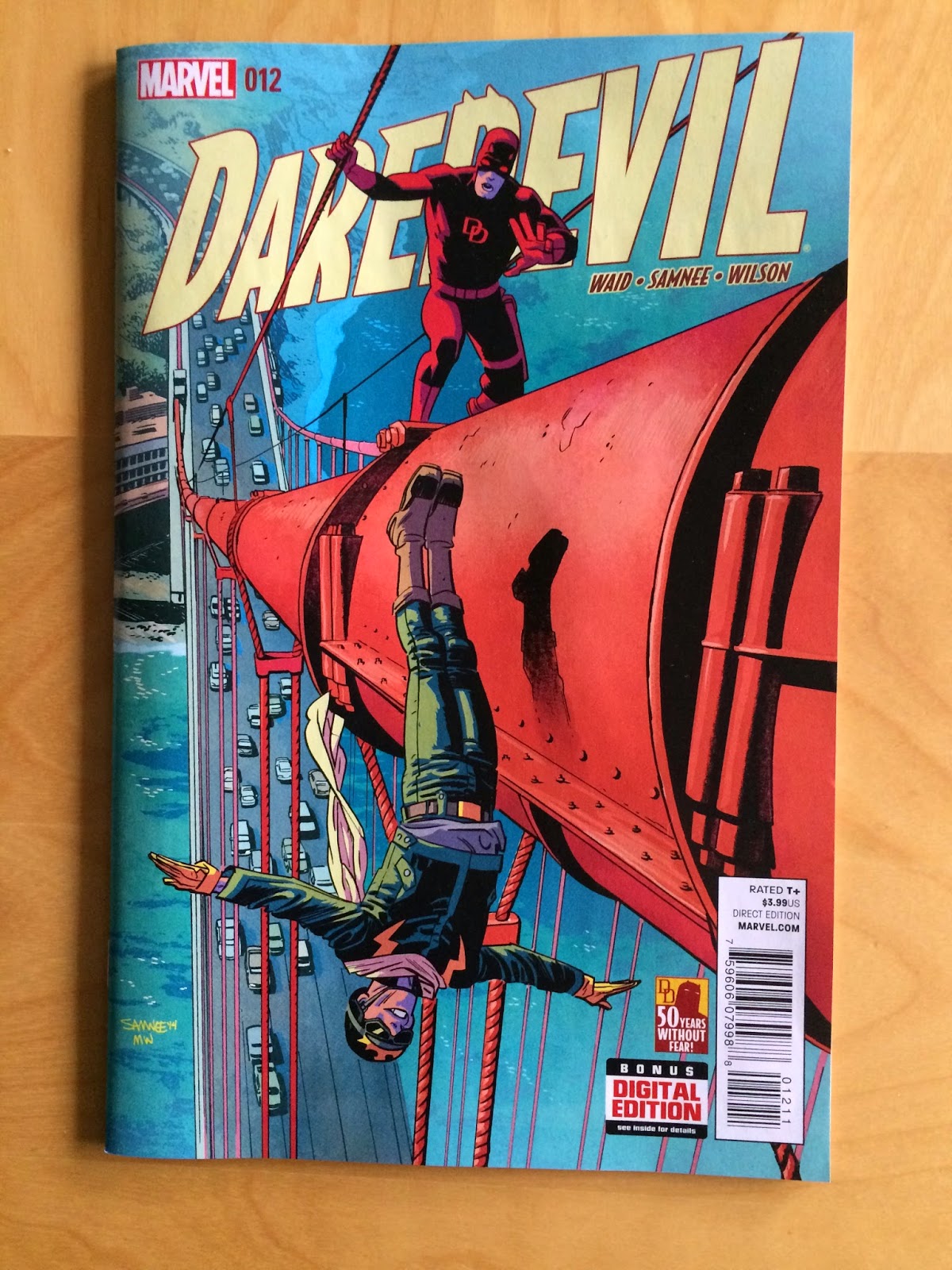
(Also how great are these covers!? The colours and the perspectives on #12 are dynamite!)

There will, of course, be *SPOILERS* for Daredevil #12-14 below.


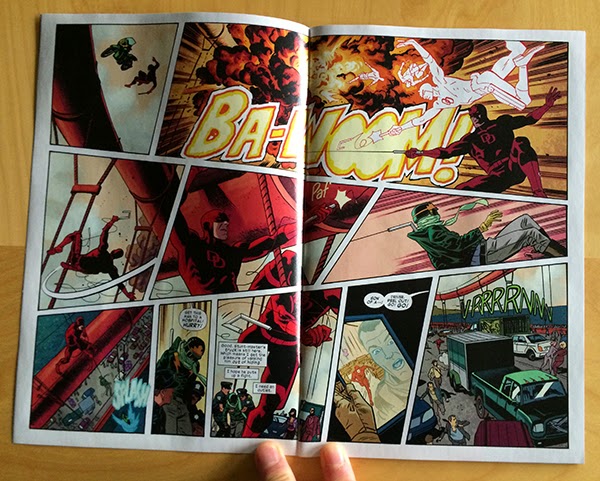
Take this great double page spread here. At first glance it looks deceptively simple, right? Sure it has some pretty dynamic action happening, and yes it is very clearly delivered, but I don't think it is instantly obvious that this page is filled with clever choices to maximize flow and kinetic motion. But the thing is, this page is a treasure trove of subtly smart comics.

Look at the first row of panels: there is a small, short, moment feeling panel that transitions into an especially wide panel of an explosion. It is like the layout of the comic itself has exploded outward. Theses panels also make a really good use of the way our eyes move across the page from left to right to have us move quickly along the blast path where the many silhouettes of DD quickly swing to safety. Then this layout makes a really elegant use of carriage return, the way our eyes quickly swing from the right hand corner of the top row of panels to the left-most panel of the next row, to physically trace the motion of Daredevil's rapid swing to safety. It makes this motion feel faster and more dramatic. In an even more exciting choice, our carriage returning eyes are caught by the swooping-speed-lines in the left-panel which drags our eyes along the path of Daredevil's hairpin twist in the air before firing his grapple to catch the falling Stuntmaster. A motion which is directly to the right across the page, again using our natural path through the page to make things feel fast and dramatic. The layout then uses yet another carriage return to get us moving DOWN on the bottom-left panel so we feel the looming chasm over which Daredevil and Stuntmaster are dangling. The double page spread then moves from left to right and into the next page. It's a simple looking page that takes amazing advantage of eye-motion to feel very fast, dangerous, and exciting. 


Here is another deceptively simple page that portrays another batch of exciting action using clever choices that might not be immediately obvious. Take the top row where the two panels are split by a diagonal break. This choice immediately lends this part of the page a kinetic quality because the panels feel less separated than a perpendicular gutter would dictate. This also has the added benefit of creating these vector cones that widen, and project in the direction of motion. In the first panel we have a fan opening in the direction of the leap, like the bike is exploding off the ramp. In the second panel the fan is towards us and down, creating the feeling the motorcycle is widening and approaching the reader. The next row of panels is even cooler: Daredevil surfs his car on two wheels between a truck and a streetcar. What is so neat about this panel is that the canted panel borders create a bunch of planes within this panel that precariously interact. Significantly, the most dominant of these box-planes, created by the panel borders, is perpendicular to the tilt of the car, which creates even more straining juxtaposition of orientation. The entire composition feels unbalanced and out of equilibrium which beautifully captures the moment being depicted. More great stuff. Finally, in the bottom row of panels the reader cruises from left to right and gets drawn to the sound effect along the motion of the car flopping back to four wheels. Which is simple, yet pleasantly evocative. This is a page absolutely filled with keen comics.


Another fairly subtle element in Daredevil #12 is the use of colour in characters. Stuntmaster has a colour design that is primarily green with yellow highlights while red daredevil drives a purple car. I know like, two things about colour theory, which is that some colours are opposites and clash in interesting ways. These are called "complementary colours". Meanwhile, similar colours blend together in a way that is interesting, but less obviously striking, and is called "harmonious colours". Green and yellow are harmonious colours, and red and purple are also harmonious. This means that each character has a consistent visual colour identity. Moreover, the colour identity of these characters are complementary: green is opposite red and purple is opposite yellow on a colour wheel. This means that the character palettes clash in an interesting and striking way. Which in turn means you can effectively mark alternating panels, like above, for either Green/Yellow Stuntmaster or Purple/Red Daredevil. Which helps keep all of the storytelling straight and quick.

The above sequence is also cool from a colour perspective in that the final panel uses colour in an especially interesting way. The background of the panel is yellow, which is harmonius with Stuntmaster's green costume and mostly clashes Daredevil's red costume. What this means is that Stuntmaster sort of blends into the background while Daredevil stands out. Which helps emphasize that Daredevil is victorious over Stuntmaster (he is fading away), and helps add a sense of depth to the panel (Stuntmaster is falling into the background, while Daredevil is popping out towards us). Colouring matters so much, and when used this adeptly it can be a huge storytelling tool. 


Speaking of attention to detail and colouring, I love this sequence from Daredevil #13. Beyond just being a lovely and efficient piece of story (I would pay good money to have Team Daredevil choreograph my date nights), this sequence makes a really thoughtful use of colour. The story of the page has Matt Murdock and Kirsten McDuffie going on a date that sees them eat dinner at a fancy restaurant, go dancing, and spend some romantic time at the beach. Looking at the page, it is really obvious which panels on the page translate to which period of the date. While some of this comes from what is drawn in the panel, when greyscaled the page break into six separate moments that don't immediately break into three venues and story sections. But if we only look at the colours, even if we blur out the scenes, it's apparent that there are three tiers of colour on the page that help set every sub-scene apart and give them each a visual identity. Which really makes this page read so much smoother: rather than mentally deciding how the panels fit together, the colours here subtley provide all of that information at a glance which lets us just enjoy the scene. 


This page is another great example of effortless looking storytelling built from a bunch of really astute choices. Virtually every element on this page is quietly constructed to make an optimal reading experience. The opening panel provides a cinematic, widescreen look at the pitcher, narrowed for focus and squinting like the angry pitcher. The second panel shows Matt Murdock, delivers some dialogue, and shows the man pointing to the outfield, and incidentally up to the next panel to optimize flow. We then see a great sequence of three panels that wonderfully sell the energy of a fastball. The pitch is so evocative here because of the progression of the three stacked panels: the ball increases in size as it moves down through the sequence while the panels themselves expand in size. This collectively creates the feeling that the ball is coming out of the page and towards the reader which is pretty exciting stuff. This thrown baseball also creates a guide path for the reader, drawing attention and steering eyeballs down the page and suddenly! into the moment of Matt hitting the baseball. This moment is perfectly executed as the vector of motion in the bat-strike panel is against the guide path of the thrown ball making the moment jarring and impactful. Essentially, our experience of the page is knocked askew by the moment of Matt hitting the ball, which is kind of perfect comics. 


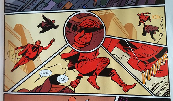
This is another pretty flawless sequence from Daredevil #14. What I love about this series of panels is how the central round panel works as a hub and draws the surrounding panels into its orbit. The action of the sequence drops down into the page, swings across the bottom, and launches back into the sky. With the round panel, everything gets a slightly curved path that lends the motion a smooth, effortlessness. Without this central hub panel, I suspect the page would read in straight lines, down, to-the-right, and up in crisp square lines which would feel more abrupt and choppy and would significantly change the fluid feel of the page. It's in the grand scheme of things a pretty short and minor bit of the larger story, but it is executed in a really interesting and dynamic way. Which is really emblematic of the entire Daredevil experience: everything is just so.

Post by Michael Bround

Previously:
Describing Daredevil 10 and 11: scope and character
Describing Daredevil 9: empathy
Describing Daredevil 3: onomatopoeia 
Describing Daredevil 34: before and after
Describing Daredevil 33: condensed motion
Describing Daredevil 30: the vectors of artwork
Describing Daredevil 29: A great page