Tuesday, 10 February 2015

Half A King Is A Good Book

Or why you should read Half A King by Joe Abercrombie


Half A King is a novel about Yarvi, the youngest prince of the nation of Gettland. As the youngest prince, Yarvi is not heir to the throne and is instead training to join the Ministry, to be an advisor to the King and representative of the Over-King. Which is good because Yarvi is a thin, uncharismatic youth marked by the misfortune of having a lame hand. However, when his father and elder brother are murdered Yarvi finds himself suddenly the king of Gettland and weighted with the duty of avenging his fallen family. But that quest is betrayed, and Yarvi finds himself on a much longer, much harder path to revenge.

Half A King is many ways a straight forward Epic Fantasy tale. There is a young hero sent on an epic quest for revenge which is complicated and requires the hero to grow and gain experience points and eventually complete the quest and return home a changed person. It is also a fairly well written novel: the characters are vivid, the story has some decent twists, and the grim reality of the story and moral complexity of the plot are treated with a maturity that is frequently lacking in Fantasy novels. Basically Half A King is a short, well written, Epic Fantasy machine that doesn't pander and was fun to read.

This is kind of one of the problems with it. I am a HUGE Joe Abercrombie fan! His more substantial, more adult novels are kind of my ideal for epic fantasy. They are gritty, darkly hilarious, and filled with granular characters who are all bastards. These are books where largely awful people do the selfish, greedy, well meaning, and horrific things that real human people would do in an epic fantasy setting. His other novels are also really articulate and smart examinations of genre, either subversive deconstructions of Epic Fantasy as a whole or interesting experiments that combine genres and examine tropes. I mean, these are books that are highly enjoyable as pure Epic Fantasy adventures, but they are also mature literature and uncompromising. Against these other works, these substantial meals of literature, Half A King is a snack. It is by no means a bad novel, it's just not as in depth or as literary as the other books. I enjoyed it, but less than Abercrombie's other works.

The thing is, Half A King is ostensibly a Young Adult novel. Perhaps motivated by wanting to write something he could actually share with his children before they were adults or out of a desire to write some shorter, lighter books before returning to his harsher adult works, Joe Abercrombie has made a foray into YA fiction. And while Half A King maybe was not the most satisfying novel for me, an adult reader, it is freaking perfect as a YA book. It's lacks in girth, unflinching horribleness, and thematic complexity make it far more accessible to a younger, more casual reader. And yet, Half A King's insistence on consequences, moral relativism, and round characters make it a fairly mature book that doesn't wallow in grit, but unlike many YA offerings, doesn't condescend either. This is a book I would have really, really enjoyed as a tween reader. I'm also quite impressed with the diversity of the novels characters: Ambercrombie does a really good job including characters of different ethnic backgrounds and genders and affords all of them agency and personhood that is depressingly rare in Fantasy novels, especially those geared to younger readers. Unlike some of my childhood favourites, I don't feel hinky recommending this book to any youthful reader. Seriously, this will be a book I thrust on youths in the future, particularly male youths who often have a hard time connecting to books and think swords are awesome.

So would I recommend this book? It depends. If you are a youth or looking for a book for a youth than YES! This book is great for that reading demographic! If you are an adult looking for a Fantasy novel, well, maybe. If you have never read a Joe Abercrombie novel, I would recommend his adult books first, probably the Second Law trilogy. If you are already a Joe Abercrombie fan who is on the fence about reading his YA book, I'd suggest that you give it a try: some Abercrombie is better than no Abercrombie and a lot of his skills at plotting and character come through. If you are just a big 'ol fantasy fan who is always looking for more novels to read, go for it. It might be a bit predictable and familiar, but its good and you'll probably enjoy it. I'd also suggest this one as a travel book: it's hardcover, slim, and the perfect length to read during your average ocean or continent spanning plane flight.

Post by Michael Bround

Previously:
The First Law, Best Served Cold, The Heroes
Red Country


Monday, 9 February 2015

Uncaging Bitch Planet #2

Or a look at some of the most exciting layout choices in Bitch Planet #2
by Kelly Sue DeConnick, Valentine De Landro, Cris Peter, and Clayton Cowles; Image Comics


Bitch Planet gets a lot of justifiable praise for how it, middle fingers raised, delves into the way society vilifies women who don't conform to certain expectations of behaviour and appearance. A lot of people seem to really respond to the comic's belligerent approach to feminism, the patriarchy, body image, and angry women rioting. Which makes total sense, because it's pretty awesome and not something you tend to see very often in comics. The thing is, Bitch Planet is also a technically a really great comic that features some outstanding storytelling choices that make it a really great and effective comic to read. Since I am wildly unqualified to try to explain why the feminism in Bitch Planet, I'm going to show some of the great layout choices in Bitch Planet #2 that I think showcase some of what makes the comic so impressive.

There will be *SPOILERS* for Bitch Planet #2


Bitch Planet #2 opens with a really fascinating page. Much like Bitch Planet #1, which has one of the best cold open pages I've ever seen, this page uses a twelve panel grid to introduce the sexist world of Bitch Planet and to show the Conformist women who operate inside the rules. The three tiers set in a common space like this let's us see the Conformist women hustling to serve men, travelling across the panels of the page while stationary men tell them how to behave and harass them. The spread also makes a great use of canary yellow clothes to highlight the women and make them the centre of attention on the page. (And maybe to set these Conformist women as kind-of prisoners akin to the orange and yellow clothed NC prisoners.) What I think is most fascinating here is that the two times we have seen Conformist Women, we have seen them within twelve panel grids. Twelve panel grids are a very traditional, very standard layout approach that come with a certain amount of rigidity. I think it is a deliberate choice to show Conformist women in a layout that feels very conformist to comic book conventions. I also think it's significant that the gutters of a twelve panel grid bear a striking resemblance to window prison bars: it's as if we are seeing these scenes of Conformist women through the window of a prison cell. Taken together these twelve panel pages instantly remind us that these Conformist women are operating inside very strict, old fashioned rules and are in a very real way prisoners in a corrupt system. It's really smart comics.


This is another page with a lot of really cool comics elements. The story of the page is that Kamau is being held in a special solitary confinement cell and after several hours without food or sleep she is now being harangued by hologram-warden lady over her supposed crimes. This is a page and moment of hopelessness for Kam, and I think the page does some exciting things to sell this. For one the page is dramatically canted to a weird angle so that we are looking down at Kam. This makes her look very small and powerless and creates the sense that not only is she in a cell, but trapped at the bottom of a deep inescapable pit. The confining nature of her situation is further emphasized by the grid of screens that make up the walls of her cell: the grey gaps between individual screens create criss-crossing grey lines that are evocative of cage bars. But maybe the coolest choice on this page is the lettering which literally weaves around Kam on the page and looks like a snare or some kind of binding. It's another example of explicitly interacting lettering providing additional storytelling effects. All of this combines to make for a page that lets us feel just how trapped Kam is physically and rhetorically and how hopeless she is at this exact moment. It's a great page.


Bitch Planet #2 is very much the exposition issue. With the premise has been established, this issue has the job of setting up the central conflict of this chapter of the comic. This means, among other things, a lot of exposition and information. The thing is, Bitch Planet #2 does a really great job providing this information in interesting ways so that it never really feels like an infodump. 

My favourite example of this is the treadmill scene which essentially lays out the NC's plan to use the Megaton fighting match for their own ends while meanwhile solidifying some of the core cast of characters. Besides the efficiency of the sequence, I love how the page uses depth to create layers of action and add visual interest and dynamism to the exposition. The page has the NC's running on a treadmill for enforced exercise and the page has three zones of depth associated with the NC's position on the exercise machine. Additionally there is a plane of action right behind the treadmill where Penny Roll incites a riot, and background planes that depict prisoners doing what looks like yoga and giant screens showing retro aerobics videos. What all of this depth does is create a rich page that has relevant setting information in the far background, a charming brawl in the near background, and an interesting zone in the foreground planes for characters to play off one another. Just on a surface level it is a pretty cool setup.

It's also an amazing space for character development. The way this depth let's us see Penny Rolle go fuck it to running on a treadmill and just start fighting guards is fanatastic and fun and super endearing. Penny Rolle is the best. We get a sense of Violet as a brash joiner in the way she dives headfirst into the brawl. We get to see Meiko, in a fairly clever and smug way, absolutely stun Kam into sliding into the background with her secret. And we get to see the NC's act out as the isolated fight grows to a broiling riot. All, of course, while important story information is being delivered. It's a really clever setup that manages to multiplex the information being delivered while also showing a thoroughly entertaining riot. This is big deal comics.

Which is how I feel about Bitch Planet as a whole. It might be a fists raised, feminist manifesto, but it's also just a really, really well made comic. Even if all you want from a reading experience is a great, entertaining comic, Bitch Planet is still something you ought to be reading.

Previously:
Uncaging Bitch Planet #1
Surviving Bitch Planet #1

Friday, 6 February 2015

Spinal Tapestry Pt. 4: Blast-off

Or the fantastic book spine design of Rocket Girl Vol. 1
by Brandon Montclare and Amy Reeder; Image Comics


One of my comic book obsessions is the design of the comic book spines. I love collecting physical books because I vastly prefer the reading experience and because I love decorating my home with these books as art objects. It's a lot like filling my living space with physical idea machines. So it is important to me that comics look nice. The trouble is that comics seem to focus their attention making the covers of the comics look nice (which is important) and neglect the design of the spines of the comics. Which is tragic because most of the time when you look at comics on book shelves all you see is there spine. So I really wish more attention was put into making the spine of comics more memorable and visually interesting.

(I would also make the case that most comics shops, aside from highlighted and new titles, display their comics spines out, so there is an economic incentive to put more effort into spine design.)


Rocket Girl Vol. 1 is a comic with a great, memorable spine design. It is really a comic that jumps off a book shelf by doing something creative: including the protagonist, the Rocket Girl herself, on the book's spine.  Which is a perfect choice.


The reason this is a perfect choice is that the character design of Rocket Girl is pretty fantastic. The comic itself is really good: a super fun time travel story that bounces between a gonzo future and a stylish, 1980s past. It's a really great comic that taps right into the nostalgia of the best sci-fi media from the '80s. At first glance though, you don't know any of this. But, if you've seen Rocket Girl with her rocket jetpack and great retro-futurist costume, I think there is a pretty strong chance you're intrigued by the comic. I know that I decided to try Rocket Girl largely because of Amy Reeder's artistic track record and by how cool and fun Rocket Girl the character looked. I think, on a purely marketting standpoint, the design of Rocket Girl is one of the comic's strongest assets.


By prominently featuring the awesome character design of Rocket Girl on the spine of the comic, Team Rocket manages to make their comic stand out from type-logo only comics and showcase the fantastic design of their character. Which is a great advertisement for the comic in a store, and for me, as a collector and reader, a great reminder of the essence of the comic and why I enjoyed it so much. It is absolutely the kind of comic spine design I'd like to see more of.

Previously:
Spinal Tapestry 1
Spinal Tapestry 2

Spinal Tapestry 3

Thursday, 5 February 2015

Sound Adivice: Captain Marvel Volume 1.1

Captain Marvel Volume 1: In Pursuit of Flight
Kelly Sue DeConnick, Dexter Soy, Emma Rios, Jordie Bellaire, Clayton Cowles; Marvel Comics


So, you’ve heard Marvel is producing a film called Captain Marvel in 2018 and want to know where to start reading about this hero?  You have come to the right place.

Captain Marvel is Carol Danvers, a former USAF pilot, current Avenger, and my all-time favorite super hero. I feel like it’s only fair to tell you before we move on: I have an ongoing Carol Danvers Situation, capital S necessary. There is a bias in this post, and the bias is that I think Carol Danvers is actually THE BEST.

Marvel Studios’ recent Phase 3 announcement brought us the news that a Captain Marvel film  will be hitting the big screen in July of 2018. I’m completely floored by the news, but for many people, the announcement bought questions about who this character is, why she should be the character to land the Marvel Cinematic Universe’s first female-led title, and why this matters. With In Pursuit of Flight, collecting issues 1-6 of Kelly Sue DeConnick’s 2012 run of Captain Marvel, we see many of the story elements that have me excited for the hero Carol Danvers to gain a wider audience.

As I talk though these points, *SPOILERS* will arise, so continue at your own risk.

------

1. She looks like a female superhero should look.

Carol Danvers looks strong and powerful without surrendering her femininity. Jamie McKelvie’s redesigned uniform drew me to Captain Marvel in the first place—here we have a woman fighting in a flight suit instead of a bathing suit, wearing something that fans refer to more frequently as Carol’s “uniform” than her “costume.” Though a costume change may seem like a small thing, consider my own comics experience—thought I’ve been reading comic books since I was a kid in the late 1990’s, the look of a superhero was never intriguing enough for me to pick up a book until Carol’s Captain Marvel uniform hit the stands in 2012.

The art of In Pursuit of Flight supports this strength. Dexter Soy, who provides the art for the first part of this trade, is a favorite artist of mine because of how powerful Carol looks, and how dynamic his world feels on the page.


Emma Rios, who provides art for the second portion of the trade, brings a completely different style, one in which Carol has never looked more ethereal and magical.


Both artists avoid exploitive poses or costumes, and both are masters at showing emotion in their drawing.

2. Carol Danvers is confident about who she is and what her strengths are.

For all that this book touches on the question of names and titles and how those concepts impact our identity, Carol is very clear about who she is—She’s an Avenger. First and foremost, Carol Danvers is fighting to protect, save, and to serve, because that is what heroes do. She also clearly knows that she’s good at it—Her dialogue during fight scenes is some of the best I’ve read, because Carol is very aware that she excels at punching and blasting. Her confidence borders right on the edge of cockiness, and it’s a sort of confidence I think we see very rarely from female super heroes. “These girls have never seen anything like this in their lives,” she narrates as she begins to face down some powerful alien tech. “I’m an Avenger…we call this Tuesday.”

This is not, I should point out, to say that Carol Danvers isn’t smart. All the time she is reacting in the moment, she’s also putting together the pieces of what’s going on, considering her plan, and adjusting as new information arises. The USAF veteran is also a tactician, one who often adapts her plans on the fly, even if she sometimes does so recklessly, disregarding her own safety.

3. Her weaknesses are just as familiar to her.

The central plot of In Pursuit of Flight circles around a time travel adventure that sees Carol dropped unexpectedly into the era of WWII. She realizes this when she runs into the Banshee Squadron, an all-women group of WWII pilots, and realizing the potential of altering history Carol fully acknowledges that she has no idea what she should be doing. Though I’m usually not one for time travel plots, this one calls itself out early on. Time travel is a compelling problem for Carol to face, because it isn’t one she can't easily fight head on.


4. Carol maintains interpersonal relationships with other women.

For some reason, varied relationships between female characters can be hard to come by in comics. In just the first volume, we see a number of these relationships in Carol’s life, such as a supportive friendship with Jessica Drew, Spider-Woman, a friendship with Tracy, a older friend and former coworker who Carol is supporting through a fight with cancer, and even her relationship with Helen Cobb, clearly someone Carol views as a hero or mentor, and later, when the time travel plot brings Carol together with Helen’s young self, as competition. We see Carol relate to the Banshee Squadron as a fellow soldier and as a leader, as well. As a medium, comics can sometimes forget that friendships can cross generations, and that relationships have a huge spectrum of variation, In Pursuit of Flight remembers.

5. She considers the value of legacy.

First we see it at the start of our story, when Carol has to decide if she’s going to take on the mantle of Captain Marvel. It’s clear that part of her is worried it somehow lessens Mar-Vell’s legacy for her to do so—and part of her clearly wants the power and history of that legacy to become part of her own story. We see it again when Helen Cobb leaves Carol her plane in her will—Carol’s first act is to set off to prove that Helen Cobb’s flight record is accurate.

The whole of this arc of Carol’s story also considers a broader legacy—that of the women that came before her. The Banshees are our first reminder, couched in this fictional world, of a very real sexism experienced by women throughout history – women could not be pilots in the armed forces in WWII, so women much like the Banshee Squadron served in civilian support roles, even though they often were putting their lives on the line just as much as enlisted forces.  They thought of themselves as soldiers, even if no one else would recognize them as such.


Our second reminder comes with another jump to the 1960s, where the women pilots of Mercury 13 are facing down the injustice of a system that won’t allow them to pursue a NASA training program. Their hopes are dashed by their gender and their era, and it’s heartbreaking to witness these women’s devastation for both the reader and for Carol.


This story is absolutely about the legacy of women such as the Banshees and the Mercury 13 left for women who came after, an unashamedly feminist statement about how important it is for us to remember and honor their struggle for equality. DeConnick does her best to honor them in story, and Carol clearly recognizes how these women helped pave the way for her own service and the pursuit of her own dreams to fly.

6. For as much as legacy is valued, Carol sees the importance of continuing to move forward.

It’s a letter from Helen that is the final push Carol needs to take the title of Captain Marvel. “Helen would punch holes in the sky,” she reasons to herself, sitting at the edge of space thinking about her place in the world. When in the final arc of the book, she finds herself in a position to reset, to remove the weight of legacy, Carol can see the value of who she is, and when the moment comes, she rushes right in because someone needs saving, and that is what heroes do. Not only is this who she is, but it’s who she wants to be.


Carol’s story is one of continuing to dream and to push forward. She encourages it in others and expects it of herself. “You and me’ve always been like this,” Helen writes in her letter. “Always dreaming. Of higher, further, faster, more. The Lord put us here to punch holes in the sky, and when a soul is born with that kind of purpose, it’ll damn sure find a way.”

------

In Pursuit of Flight is the beginning of Carol Danvers’ tenure as Captain Marvel, and is as much about the shift in how she names herself as it is about the time travel shenanigans and fighting bad guys. The volume features an adventurous plot and a cast of characters to be marvelled at. The dialogue is snappy and engaging, a balance between being believable and sounding exactly like what a super hero would say.  I can, at the same time, relate to Carol’s relationships and wish I could have abilities as awesome as hers. It’s a fantastic volume if you’re new to super hero comics, or if you’re just looking for a new hero to love.

And Carol Danvers? I believe this list is just a few of the many reasons Carol Danvers as Captain Marvel has resonated with so many people. Carol is everything I want in a hero: she’s strong and confident. She lifts up and encourages those around her, but still banters playfully with her friends. While she’s facing down a challenge, she knows her strengths and her weaknesses, and isn’t afraid to own that there are some things that are not her forte. She’s both confident and questioning, strong and soft.  She flies fast, kicks ass, and looks fly as hell while she’s doing it.

I often describe Captain Marvel as the book I wish someone could have handed to 12-year-old me, but the truth is I need to hear what she has to say even now, on a pretty much daily basis. I needed a hero like this at 8 and 12 and 16 and 19 and even now at 26. When she’s on the big screen in 2018, girls won’t have to wait until they’re an adult to see a hero they want to be.


Fly. Be bold. Honor those that came before you, but never stop pushing for your own dreams. Punch holes in the sky.

Post by Jennifer DePrey

Previously:

Wednesday, 4 February 2015

So I Read Rocket Girl: Times Squared

A 250 word (or less) review of Rocket Girl Vol. 1
by Brandon Montclare and Amy Reeder; Image Comics


As someone who grew up mostly in the '90s I consumed a huge amount of the best of '80s culture. Despite being too young to have experienced landmark movies and cartoons as they happened, I subsisted on VHS tapes of a certain kind of '80s movie; a certain kind of '80s movie with an infectious sense of fun, a sort of goofy science fantasy premise, and a timeless sort of charm. Rocket Girl is the comics embodiment of this kind of '80s movie and I find it endlessly winning. The comic is a time travel adventure which bridges our 1986 past with an alternate 2014 filled with amazing technology that is run by the Quintum Mechanics corporation. Detective Dayoung Johansson, a jet-pack sporting Teen Cop from alternate-2014 deduces a dangerous secret and travels back in time to 1986 to solve the case and stop her future from ever happening. What follows is a comic full of rocketpack adventure, high concept conspiracy, and '80s nostalgia depicted with some solid comic storytelling and masterful character acting. Sure, it's a little goofy at times (time traveling teen cops with jet packs?), but it's deeply charming and tons of fun (time travelling teen cops with jet packs!). If you can suspend your disbelief a little and give it some time to assert itself you'll almost certainly enjoy it. I did.

Word count: 226

Tuesday, 3 February 2015

Recommendations From A Nomadic Nerd: Day Magic Reads From 2014

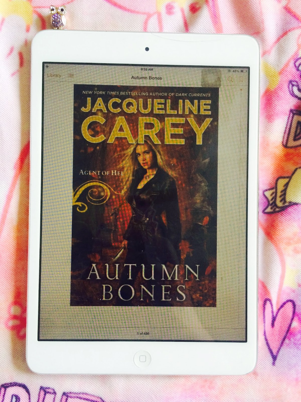
Or why you should read the Magpie Lord trilogy, the Agent of Hel series, and The Stormlight Archive
by KJ Charles, Jacqueline Carey, and Brandon Sanderson, respectively. 

Meet Katrina, a hopefully periodic contributor to Atoll Comics. I've known Katrina since high school where she was maybe one of the geekiest of my classmates and friends. Unlike me, who was pretty insecure about being a dork then, Katrina wore her nerdery on her sleeve attacking every new thing with an infectious and fervent enthusiasm that remains my ideal of what fandom should be. Katrina was also the most bookish of my high school friends, and when I realized I'd need help on the oars to do weekly prose novel reviews, she was the first person I asked. These days Katrina lives all around the world teaching, learning tools to teach better, and writing. I'm excited to have her on board and want to welcome her to Atoll Comics. -MB

What do you call magic in fantasy that follows a clear set of laws? Holly Black coined the phrase “day magic” in opposition to the dreamy illogical magic of fairy tales and things that go bump in the night. The following universes and stories have systems of magic that are imaginative and thoroughly defined.


In the “Magpie Lord” trilogy, K.J. Charles combines day magic with several other kinds of fantasy dear to my heart: historical, queer, and urban. Set around Victorian era London, the novellas follow Lucien Vaudrey, newly returned from exile to claim his title. Unfortunately for him, the curse that killed his father and brother is now driving him to suicide. Enter Stephen Day, magic practitioner/police, whose complicated history with the Vaudrey family creates automatic friction between him and Lucien. Breaking the curse is just the beginning of the sinister mystery that surrounds Lord Crane, but will Stephen risk his honour and his heart to solve it?

Stephen is able to draw out magic from the ether around him, but he’s a special case. Magical ability in the Magpie World is limited to accessibility – not all practitioners can use ether as a source, so in thirst for power they draw it from other people: from their blood, bone, or “birdspit.” While stopping warlocks who draw magic from illegal sources is Stephen’s calling, he’s underpaid, understaffed, and uninterested in excuses from psychotic killers. Charles establishes a detailed, dangerous alternate universe that will leave you eagerly awaiting her next instalment.


Jacqueline Carey’s ‘Agent of Hel’ series finished this year with “Poison Fruit”. In this alternate universe, the old gods of Norse and Greek mythology have relocated and Daisy, our half-demon heroine, is Hel’s liaison. The gods establish demesnes where all supernatural creatures flock, from fairies to werewolves to spirits and it’s up to Daisy to establish order for Hel. However, when a half-demon lawyer legally procures Hel’s land for another god, Daisy must enlist help from all the creatures to fight them and, in the process, come to terms with her own demonic birthright.

As a smart, sassy badass, Daisy is a charming protagonist. Her struggles to reconcile Hel’s old world expectations with modern politics are offset by her sarcastic commentary, and the cast of supernatural creatures is varied and often hilarious. The gods are the power source in this universe: for example, the werewolves are unable to shift unless they are within a god’s demesne. So when another god tries to take over Hel’s desmense for a holiday home, the lives of all the creatures in Daisy’s community are at stake. The tension created between creatures and magics from different cultures is fascinating to read and will keep you engrossed till the very end.


‘The Stormlight Archive’ by Brandon Sanderson is an awesomely written high fantasy story with a diverse cast of characters and incredibly rich world-building. In fact, the world is so detailed that it has its own wiki. Two of the main characters are Shallan and Kaladin, and while “The Way of Kings” introduces and explores their backstories, in “Words of Radiance” they are brought together against an array of enemies. Sympathetic characters, masterful storytelling, so what is the catch? The series is projected to be a ten-part saga and so far only two books have been published (I have reconciled myself to spending basically the rest of my life in anticipation of the next one).

Whether the magic systems of ‘The Stormlight Archive’ technically count as day magic is up for debate because much knowledge of the old lore has been lost due to religious purges and the passage of time. Although the rules seem set, particularly gaining energy for magical instruments through precious stones, so I'm including the series here. Regardless, the stories are absolutely riveting, despite the time commitment, and well worth the read.


So if you want to read some great Day Magic Fantasy stories I would recommend you try The Magic Pie Lord Trilogy, The Agent of Hel Series, and The Stormlight Archive. They are all great reads.

Post by Katrina

Monday, 2 February 2015

Worshipping The Wicked + The Divine #7

Or a look at some cool lettering effects in WicDiv #7
by Kieron Gillen, Jamie McKelvie, Matt Wilson, and Clayton Cowles; Image Comics


The Wicked + The Divine, along with telling a fun story filled with high concepts, cultural criticism, and sexy, sexy gods, is also a comic that demonstrates how the various components of a comic fit together to tell really dynamic stories. It's a comic that uses everything, from story to character design to acting and colour, and even production wonkery to optimize the final comic as much as possible. In a lot of ways, The Wicked + The Divine is this casual paragon of the kind of comics that can be made by a skilled collaborative team. 

WicDiv #7 is another interesting comic that I think really showcases another element of the comics craft.

There will be *SPOILERS* for The Wicked + The Divine #7


First of all, there is a setting map infographic in WicDiv #7. As the record shows, I LOVE infographics and setting maps. When a comic has this level of planning involved in the setting it adds a level of verisimilitude to comics that I really appreciate. (And it let's me try to figure out where every scene in the comic falls on the map... because I am a total nerd!)


The component of comics that I think WicDiv #7 really showcases, though, is lettering. Comics are words set to pictures, and lettering is the interface that delivers the words to readers. Which, of course, makes lettering an absolutely essential component of comics. That said, I feel like good lettering is often an overlooked part of the comic: in most circumstances the goal of lettering is to clearly convey narration or dialogue in a way that flows nicely and distracts from the artwork as little as possible. It's the art being indispensably invisible. 

But lettering can be so much more, and given the attention grabbing nature of caption boxes, can interact with the rest of the artwork and change the way we experience the story.

Like, take the above sequence. Laura is in a crowd, she is accosted by a seemingly anonymous person, who she eventually recognizes is Cassandra. The sequence makes a great use of reduced detail to showcase the isolation of being in a crowd and the surging, dehumanizing amalgam of people in a crowd. It's great. I especially love the extra panel it takes Laura to recognize Cassandra. As someone who is very bad at faces, this choice speaks to the mental stutter I experience seeing even longtime friends before my brain will interpret vague features into a familiar face. It's kind of a transcendent moment of comics for me. And I think part of what makes this work so well is the placement of the dialogue boxes: the way Cassandra's dialogue in the bottom row bridges the second, unrecognized panel to the third, recognized panel helps with the flow and helps nail that mental stutter of recognition perfectly. It's nearly invisible, but it is a great choice. 


Of course, the effects of lettering don't have to be subtle. Sometimes things like caption placement can be deliberately obvious and, in so doing, provide whole other storytelling effects. In the first panel above the way that the narration caption actually completely obscures the art perfectly captures the experience of being overwhelmed with thoughts and emotions and living in your head for the moment needed to process the torrent. All of the thoughts in this caption are literally overwhelming Laura's face and also acting a s a physical barrier between her, the reader, and the world of the rest of the comic. It's a beautiful metaphor for being very upset and very introverted. 

I also think the caption placement in the following panel, while not as exotic, is also really well done and interesting. The fact we see the "I have to go." before seeing that Laura is already turned away and leaving really emphasizes how Laura has already checked out. She might still be leaving, but with her action preceding her words, she is already gone. 

And... yeah, I had a very unpleasant human be unpleasant to me in what was not a "you can fuck right off" context, and the experience was literally these two panels. These panels just absolutely capture that experience of being infuriated, having too much to say, knowing you can't say any of it even if you wanted to, and just deciding to walk. the. fuck. away. for your own good. It's another really resonant comics moment for me. 


I think, though, the most interesting lettering moment of The Wicked + The Divine #7 is on this page. The story of the page is that Baphomet is leading Laura to a secret party deep, deep underground. The idea of the page is to sell a sense of downward travel, but also of a labyrinthine, twisting route that leaves Laura literally and thematically lost at the end of. And I think the lettering contributes to making this effect work. The art of the page shows Baphomet leading Laura on a winding route down the page, back and forth and down, down down. The route of these two characters is an unbroken stream that moves against the default reading direction and serves to give the page a very long, winding feeling. The lettering also moves back and forth across the page and down, down, down in an unbroken chain that violates page conventions and creates a similar sense of distance and windiness. The thing is, I found that the two streams, art and text, didn't quite sync up which made it hard for me to experience both in a single unbroken pass through the page. This caused me to do a lot of doubling back and switching between the two paths which made the page feel even more convoluted and maze like. For me the lettering and art play off each other to actually complicate the page and add to the emotional effect of the comic. Which is pretty dang cool stuff.

Lettering, it's an important part of comics and in The Wicked + The Divine it's yet another tool to make some innovative comics work.

Post by Michael Bround

Previously:
WicDiv #1 and popart head-splosions
WicDiv #2 and the use of black-space
WicDiv #3 and character design

WicDiv #4 and body language 

WicDiv#5 and facial acting

WicDiv #6 and possessions as character